UI/UX Design Mistakes & How to Fix Them: A Practical Guide for Better User Experience
.jpg)


Summarize with Ai


Key Takeaways
- The difference between good and bad UX design.
- Real-world examples of common UX mistakes.
- How to identify and fix usability problems.
- A complete blueprint for improving user experience.
- A practical UX checklist to guide every project.
Good ui and ux design isn’t just about how something looks. It’s about how it works.
That’s where User Experience (UX) design comes in.
A great UX feels effortless. You tap a button, scroll through a page, or fill out a form; everything just makes sense. A bad UX, on the other hand, feels like work; it confuses you, makes you think too hard, or stops you from completing what you came to do.
In this post, we’ll explore 11 real-world bad UX design examples and how to fix them. You’ll see what went wrong, what a better version looks like, and what lessons you can apply to your projects.
Because the truth is simple:
Good UX = Happy users, more sales, and stronger brand loyalty.
Bad UX = Frustrated users, abandoned carts, and negative reviews.
Why UX Design Matters More Than Ever
We live in a fast, digital-first world. People expect websites and apps to just work.
User research shows that 88% of users are less likely to return after a bad user experience. That’s nearly 9 out of 10 people leaving, possibly for good, after a single poor interaction.
For businesses, that’s a costly mistake.
A few extra clicks in checkout, a confusing form, or a broken mobile layout can make users give up entirely. In contrast, a clean and intuitive experience can build trust, boost conversions, and even turn casual visitors into loyal customers.
In short:
- Good UX builds confidence and drives action.
- Bad UX creates frustration and drives people away.
What Makes UX “Bad”?
Bad UX isn’t just about ugly visuals. It’s about how something feels to use.
If users can’t easily figure out what to do next, the experience fails, no matter how beautiful it looks.
Here are the most common traits of bad UX design:
- Too many steps: The process feels long and tiring.
- Confusing navigation: Users can’t find what they’re looking for.
- No clear feedback: Buttons don’t confirm actions.
- Accessibility issues: The design excludes certain users.
- Overloaded interfaces: Too much information at once.
In short, bad UX forces people to think too hard, or worse, gives up entirely.
What Makes UX “Good”?
Good UX is almost invisible. It’s so smooth and natural that people don’t even notice it; they just get things done.
Here’s what good UX usually looks like:
- Intuitive: Users instantly know what to do next.
- Efficient: Tasks take minimal time and effort.
- Consistent: Familiar patterns across pages or screens.
- Accessible: Works for everyone, including those with disabilities.
- Delightful: Small touches like animations or helpful microcopy that make it enjoyable.
The best UX often comes from simplicity, clear communication, and empathy for the user’s needs.
Still confused between UX and UI? Here’s the difference explained clearly.
Common ui ux Design Mistakes (and How to Fix Them)
A good website does more than look nice. It should help people find what they need easily and enjoy the process. But many websites fail because of small design mistakes that confuse or frustrate users.
Let’s look at the most common web design mistakes, and how you can fix them.
1. Confusing Navigation
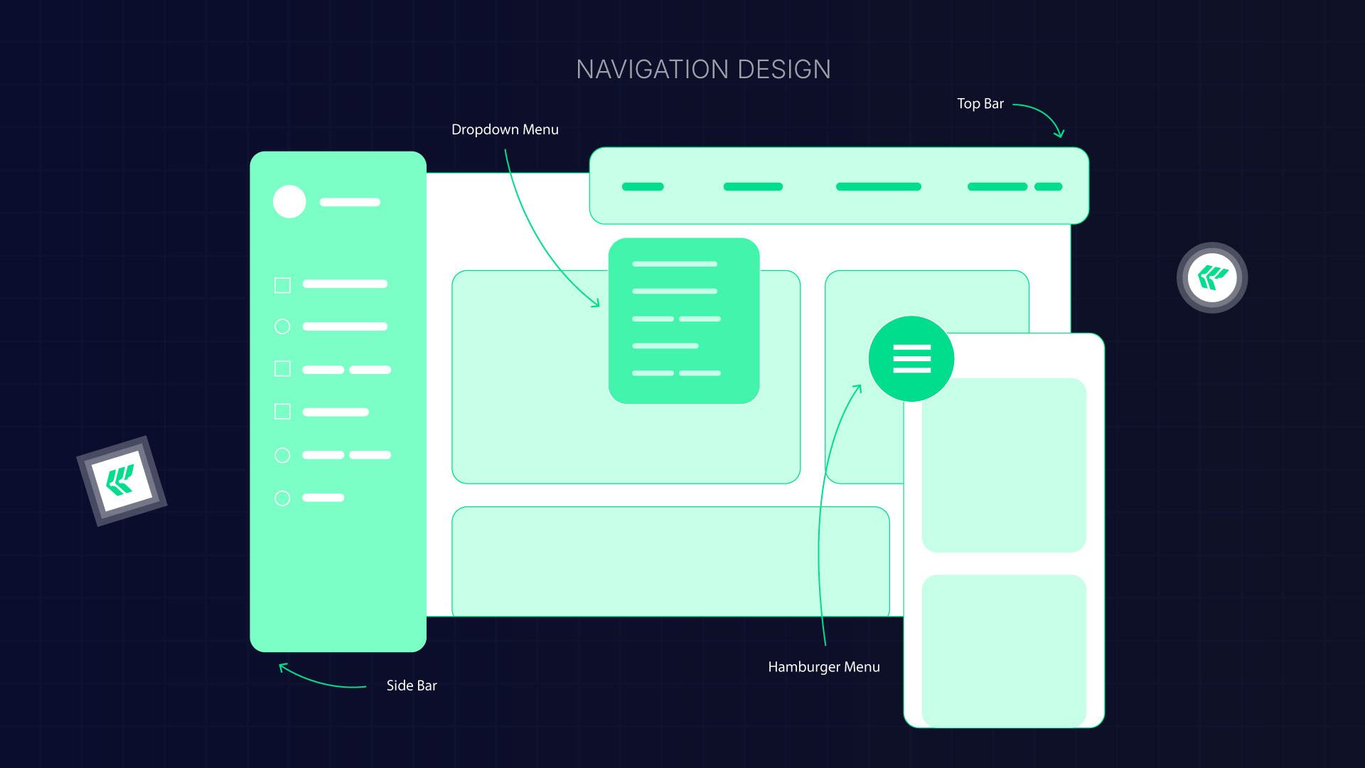
When your menu is hard to understand, users feel lost. Complicated menus, unclear labels, or missing breadcrumbs make people unsure of where they are on your site.
Why it’s a problem:
If visitors can’t find what they need quickly, they’ll leave.
How to fix it:
- Keep your menu simple.
- Use clear, familiar words for menu labels.
- Show breadcrumbs so users can see their path.
- Make sure important pages are just one or two clicks away.
Good navigation helps people explore your site with confidence.
2. Poor Mobile UI Design

More than half of internet users browse on their phones. If your site isn’t mobile-friendly, you’re losing visitors.
Common mistake:
Shrinking a desktop site to fit a phone screen. This makes the text too small and the buttons hard to tap.
How to fix it:
- Design with mobile-first in mind.
- Test your layout on different devices.
- Use larger tap areas for buttons.
- Make sure text is readable without zooming.
- Adjust the layout so it fits any screen.
A responsive design makes your website easier to use and helps it rank better in Google.
3. Cluttered Design
Too many colors, fonts, or animations can overwhelm visitors. When everything stands out, nothing really does.
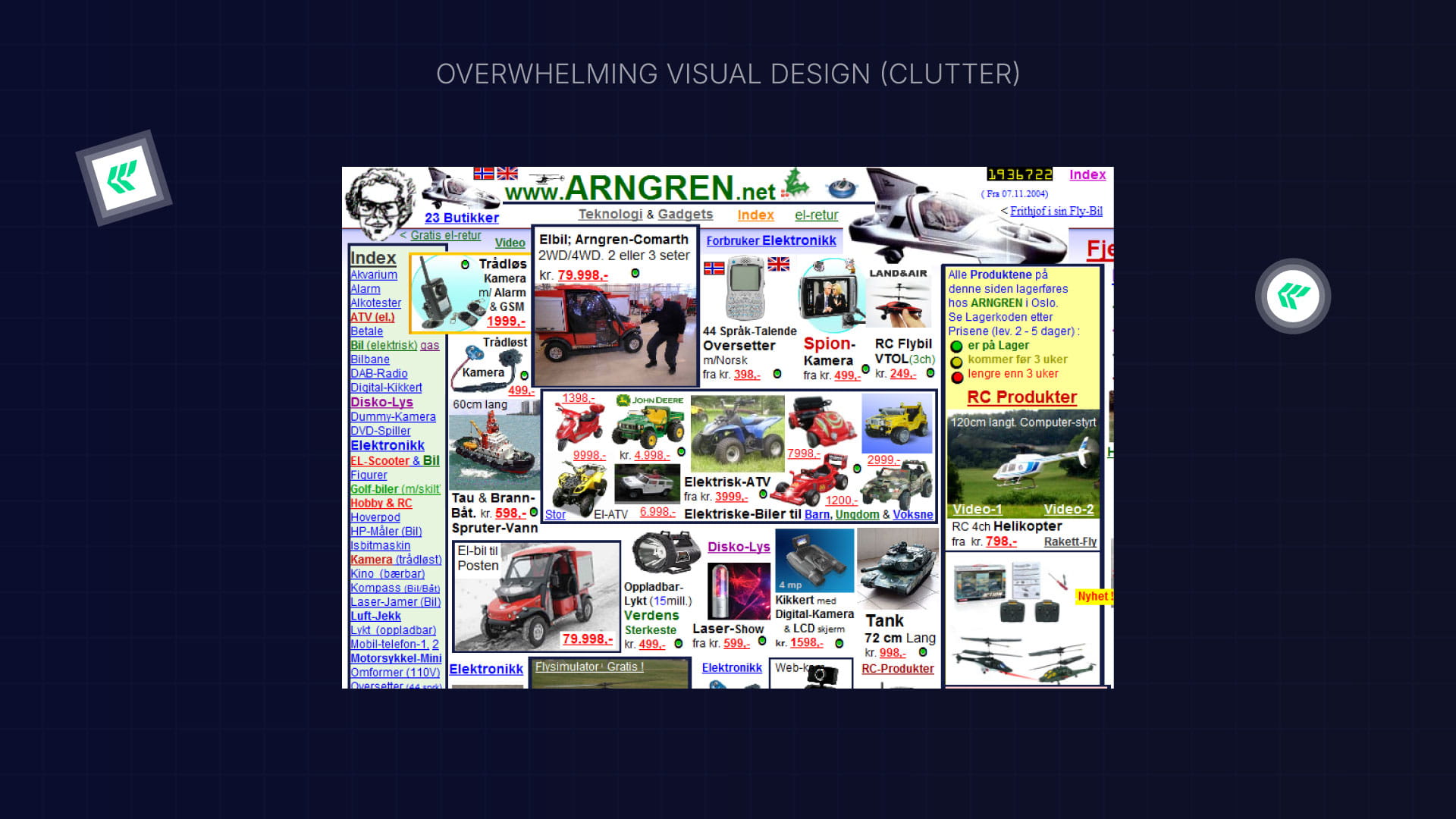
How to fix it:
- Keep your layout clean and simple.
- Use space between sections so content can breathe.
- Focus attention with clear headings and good contrast.
- Remove anything that doesn’t add real value.
Less clutter means more clarity and better focus for users.
4. Inconsistent Look and Feel
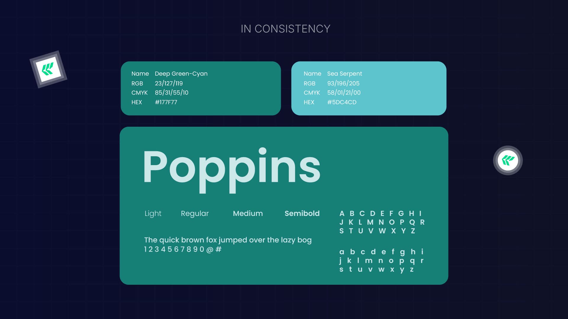
If every page looks different, visitors get confused. Buttons, fonts, and colors should stay consistent throughout the site.
Why it matters:
Consistency helps people learn how your site works. When each page feels new, they have to think harder, and that slows them down.
How to fix it:
- Create a style guide with your fonts, colors, and button styles.
- Use the same design elements on all pages.
- Check your site regularly for inconsistencies.
A consistent design feels professional and trustworthy.
5. Weak Error Messages or No Feedback
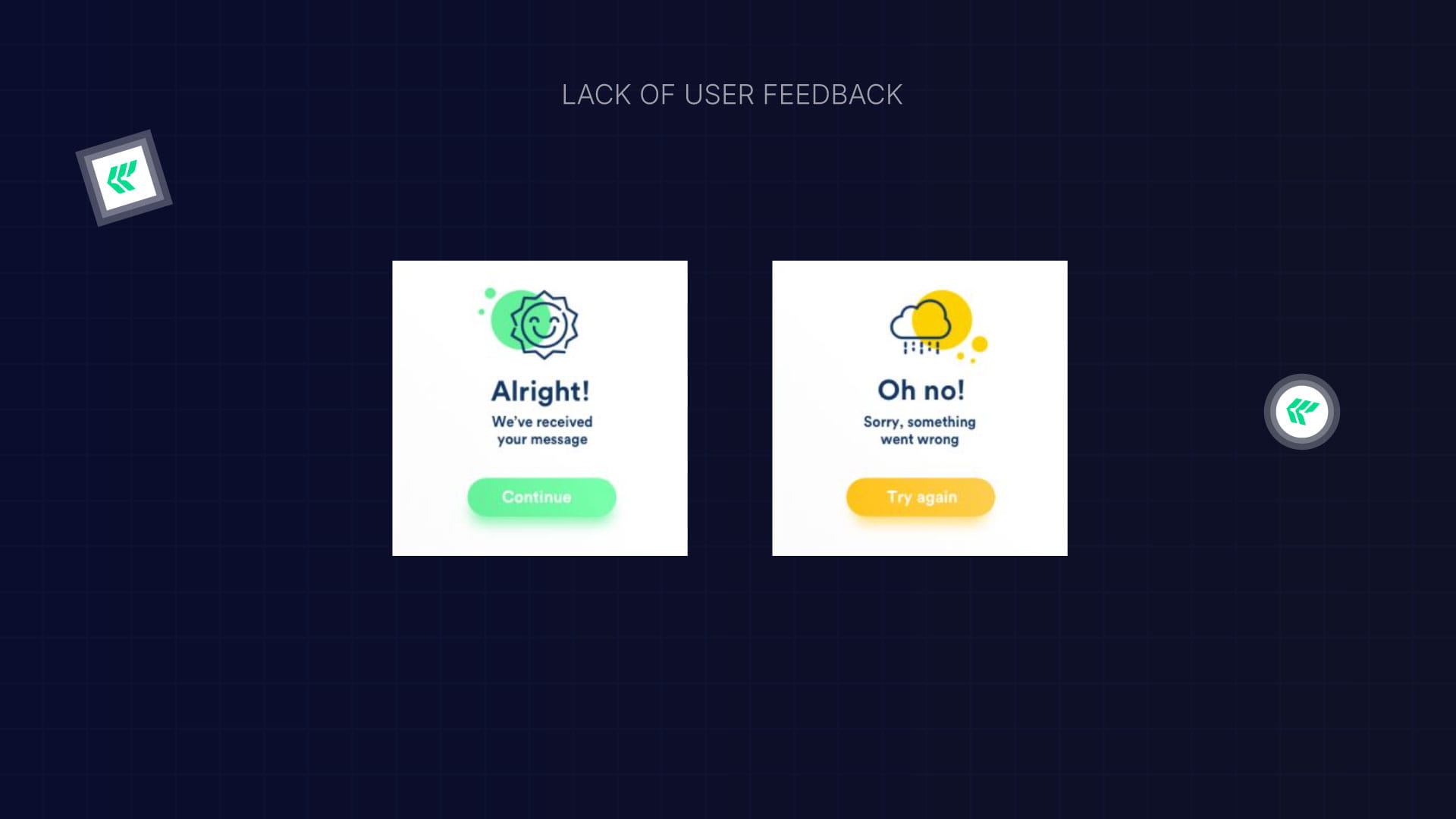
When something goes wrong, users want to know what happened and how to fix it. A plain “Error” message doesn’t help anyone.
How to fix it:
- Write friendly, clear messages that explain what went wrong.
- Add inline messages for form errors.
- Show loading or success messages when actions are completed.
Good feedback keeps users calm and helps them fix problems faster.
6. Endless Scrolling Without Purpose
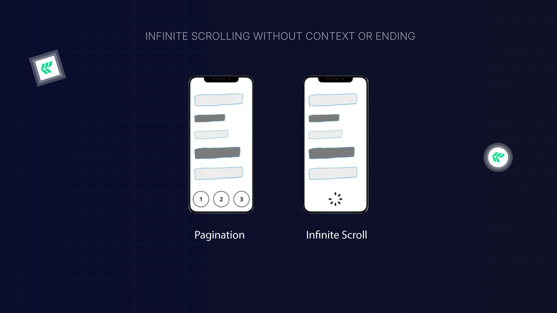
Infinite scrolling can make users feel stuck with no clear end or structure.
How to fix it:
Give users context, add page numbers, progress indicators, or clear sections. Help them know where they are on the page.
7. Misleading Buttons or Text (Dark Patterns)
.jpg)
Tricky language like “Check this box to opt out” confuses users and damages trust.
How to fix it:
- Use simple, honest wording for all buttons and forms.
- Avoid double negatives or hidden options.
- Be clear about what will happen when users click something.
Transparency builds credibility and keeps users coming back.
8. Hard-to-Read Text
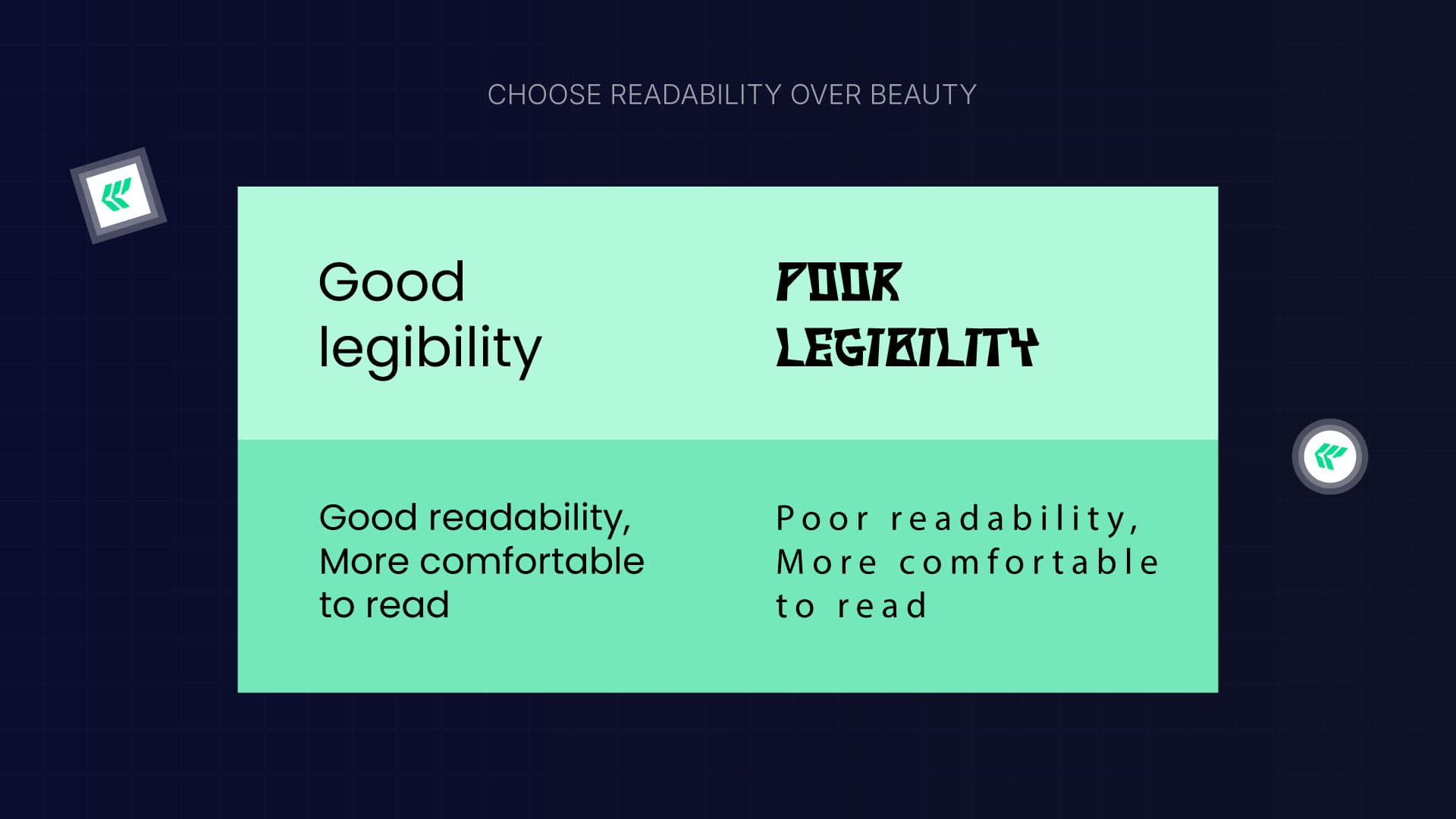
Good typography makes your site easier to read and understand. Poor font choices or long lines of text tire the eyes.
How to fix it:
- Use 16–18px for body text.
- Keep lines around 40–80 characters long.
- Choose clean, easy-to-read fonts like Inter, Open Sans, or Roboto.
- Make sure the text has enough contrast with the background.
- Don’t use too many different fonts.
Readable text helps people stay focused and engaged.
9. Poor Color Choices

Color can guide attention or create confusion. Low contrast makes text hard to read, while too much contrast can feel harsh.
How to fix the design process:
- Use colors that stand out from the background.
- Highlight important information with color, but don’t overdo it.
- Add headings, images, and visuals to break up long text.
Good color use creates balance and helps users scan your content easily.
10. Weak Visual Hierarchy
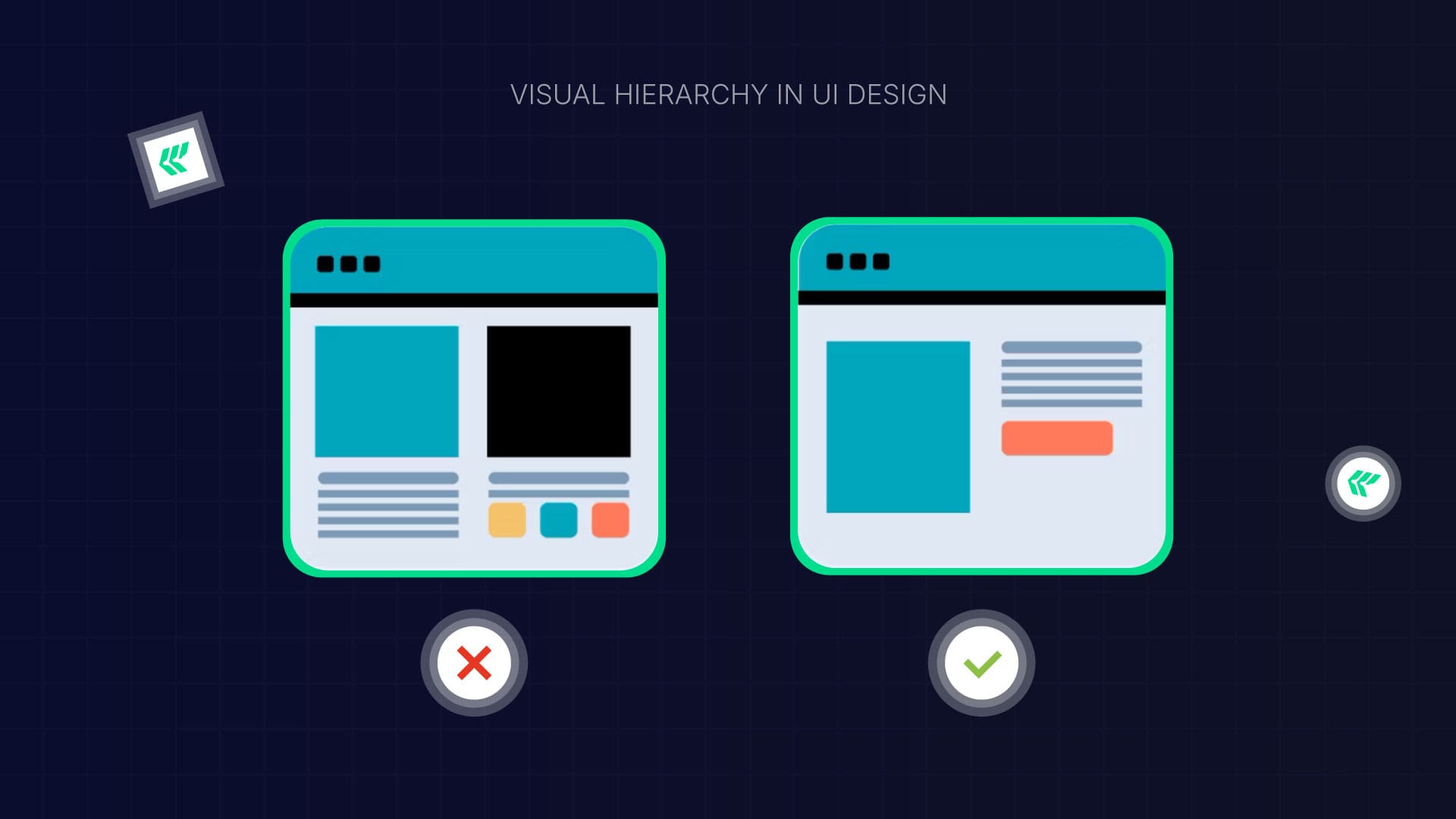
Visual hierarchy is about showing what’s important first. Without it, users don’t know where to look.
How to fix it:
- Make important elements larger.
- Use contrast to draw attention to headlines or buttons.
- Keep alignment and spacing consistent.
- Group related items together.
- Use white space to keep things clear and easy to read.
Users can navigate naturally when everything on your page has a clear purpose and order.
11. Bad Search Bar Design
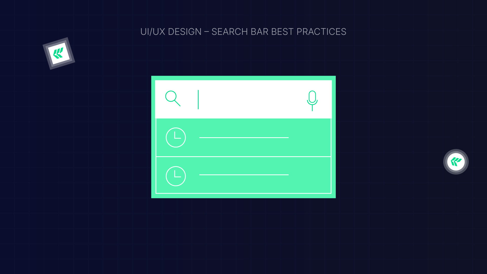
A search bar is essential, especially for websites with lots of content. Users get frustrated if it’s hard to find or doesn’t work well.
Best practices:
- Always include a text box and a search button.
- Put it where users expect it, usually the top right or center.
- Use a magnifying glass icon so it’s easy to spot.
- Add placeholder text and autocomplete suggestions.
- Make sure it works smoothly on mobile.
A simple, visible search bar helps users find what they need faster.
Quick UX Audit Checklist
Want to know what’s next in digital design? — Explore the Current UI Design Trends to Watch in 2026
Ready to Turn Frustration into Conversions?
Bad UX silently kills engagement, trust, and sales, but it doesn’t have to.
👉 Need a UX audit for your SaaS or website?
Or, if you’re ready to redesign with purpose
✨ Explore our UI/UX Design Services
to craft experiences that delight users and drive measurable growth.
FAQ: UI/UX Design Mistakes & How to Fix Them — A Practical Guide for Better User Experience
1. What makes a good user interface and product design?
A good design combines clear information architecture with thoughtful design choices to meet real user needs. It guides user behavior smoothly, reduces user frustration, and works seamlessly across every mobile device.
2. How does a UX designer improve user satisfaction?
UX designers observe real users, run user testing, and adjust the interface based on user behavior. By focusing on user experience design and aligning it with actual needs, they create intuitive products that keep users happy and engaged.
3. Why is understanding user needs important in user experience design?
Understanding user needs ensures your product design solves real problems. When UX designers tailor the user interface to what users expect and reduce friction, it boosts satisfaction and prevents frustration on both desktop and mobile devices.
Enter your website URL to receive a detailed website analysis report in just 5 minutes!
Should I hire an agency to improve my UI/UX?
Hiring an agency can help you improve your UI/UX efficiently, create a seamless user experience, and boost engagement and conversions, especially if you want expert guidance or a full website redesign.
Want to discuss your project?
Grow your project with Webflow Experts
Related Articles
.webp)
Artificial intelligence is changing modern digital design faster than ever. In 2026, AI is helping businesses build smarter, faster, and more personalized user experiences.
From UX research and wireframing to automation and personalization, AI is now a major part of modern UI/UX workflows.
Today, many companies use AI-powered design systems to:
- Speed up product development
- Improve user experience
- Automate repetitive tasks
- Generate wireframes faster
- Personalize interfaces in real time
- Improve accessibility and usability
This shift is especially important for SaaS companies, startups, and enterprise platforms looking to scale digital products faster.
How AI Became Part of Modern Design Workflows
Traditional UI and UX design relied heavily on manual work. Designers spent hours creating layouts, testing interfaces, and analyzing user behavior.
Now, AI tools help automate many of these tasks.
Modern AI-powered workflows improve:
- Design speed
- Team collaboration
- UX testing
- User research
- Product scalability
This is why many businesses are investing in:
- UI design services
- UX UI design services
- SaaS UI design agency solutions
- AI UI design consulting
Why Designers Are Adopting AI Faster
AI helps designers work more efficiently without removing creativity from the process.
Key reasons designers use AI:
- Faster workflows
- Better data analysis
- Reduced repetitive tasks
- Smarter UX decisions
- Faster product launches
AI is becoming essential for teams offering:
- UX/UI design services
- Custom UI design consulting
- Enterprise UI design services
- Product design solutions
[[question-block]]
Key Benefits of AI in UI/UX Design
Faster Workflows
AI can generate layouts, components, and prototypes within seconds. This helps design teams move from concept to launch much faster.
Smarter Decision-Making
AI tools analyze user behavior and provide real-time UX insights for better design decisions.
Personalized User Experiences
Modern AI systems create adaptive interfaces based on user preferences and actions.
Automation at Scale
AI design systems make it easier to manage large SaaS products and enterprise platforms.
Bonus: UI Design Trends to Watch in 2026
AI-Powered UX Design: Key Transformations
1. AI Tools for UX Research
.webp)
AI-powered UX research tools can quickly process large volumes of user data.
These tools help teams:
- Analyze user behavior
- Track heatmaps
- Predict user actions
- Generate UX insights
- Improve conversion rates
Benefits
- Faster user analysis
- Smarter product decisions
- Better customer understanding
- Improved UX optimization
AI UX research is becoming a major trend in SaaS UI design services and enterprise UX strategies.
2. AI Wireframe Generators & Prototyping
.webp)
AI wireframe generators are transforming early-stage product design.
Instead of creating layouts manually, designers can now generate interfaces using prompts and AI suggestions.
Popular AI wireframe features:
- Prompt-based UI generation
- Automated layouts
- Interactive prototypes
- Smart design suggestions
- Faster collaboration workflows
Benefits
- Reduced manual effort
- Faster validation
- More creative freedom
- Rapid design iterations
Many modern UX/UI design agencies now use AI-assisted prototyping to speed up product delivery.
3. Rise of AI Design Systems
AI design systems are becoming essential for scalable products.
AI-powered design systems include:
- Auto-generated components
- Smart UI suggestions
- Adaptive layouts
- Design consistency automation
Why It Matters
Large SaaS platforms need scalable design operations. AI helps maintain consistency across multiple devices and products.
This is especially useful for:
- SaaS UI design agency projects
- Enterprise UX UI design
- Product design systems
- Web application UI design services
4. AI in Web Design & User Experience
.webp)
AI is improving how users interact with websites and digital products.
AI-powered web experiences include:
- Personalized recommendations
- Adaptive layouts
- Dynamic interfaces
- AI accessibility improvements
- Predictive user journeys
Benefits
- Higher engagement
- Better conversions
- Smarter user experiences
- Improved customer retention
Modern UI design companies are now focusing heavily on AI-driven personalization strategies.
[[inner-cta]]
Top AI-Driven UI/UX Design Trends in 2026
Several trends are shaping the future of UI and UX design.
Hyper-Personalized User Experiences
AI can customize interfaces based on user behavior and preferences in real time.
Voice & Gesture-Based Interfaces
Voice UI and gesture-based interactions are growing rapidly across apps and smart devices.
AI-Generated UI Components
AI can instantly generate buttons, layouts, forms, and navigation systems.
Predictive UX Design
Predictive UX helps businesses anticipate user behavior before problems happen.
AI Accessibility & Inclusive Design
AI tools now automatically improve accessibility and inclusive user experiences.
How to Use AI in UI/UX Design
.webp)
Step 1: Use AI for UX Research
AI tools help collect:
- Heatmaps
- Behavioral analytics
- User insights
- Feedback analysis
Step 2: Generate Wireframes with AI
AI wireframe tools create layouts quickly using prompts and automation.
Step 3: Create Interactive Prototypes
AI-assisted prototyping speeds up validation and product testing.
Step 4: Optimize UI with AI Suggestions
AI can improve:
- Accessibility
- UX consistency
- UI layouts
- Design performance
Step 5: Test User Experience with AI Analytics
Predictive analytics tools help identify UX problems before launch.
Even you are making misatke this will help: UI/UX Design Mistakes & How to Fix Them if
Popular AI Design Tools for UI/UX in 2026
1. Galileo AI
Generates UI screens from simple prompts.
2. Uizard
Popular for fast wireframing and collaborative design workflows.
3. Visily
Helps teams create AI-generated layouts and prototypes quickly.
Will AI Replace UI/UX Designers?
AI will change how designers work, but it will not replace human creativity.
Design still requires:
- Empathy
- Strategic thinking
- Human psychology
- Brand storytelling
- Creative problem-solving
The future is AI-assisted design, not AI-only design.
Future Skills Designers Need
To stay competitive in 2026, designers should focus on:
- AI literacy
- Product thinking
- Human-centered design
- UX strategy
- Systems thinking
Designers who combine creativity with AI workflows will have a major advantage.
Challenges of AI in UI/UX Design
AI also creates new challenges for design teams.
Common Challenges
- Over-automation
- AI bias
- Privacy concerns
- Ethical design issues
- Loss of originality
Designers still need to validate AI-generated experiences carefully.
Best Practices for Using AI in UI/UX Design
Combine AI with Human Creativity
AI should support creativity, not replace it.
Prioritize Accessibility
Always ensure AI-generated experiences remain inclusive and user-friendly.
Maintain Brand Identity
Avoid generic AI-generated interfaces that reduce uniqueness.
Validate AI Outputs
Review all AI-generated layouts, recommendations, and prototypes carefully.
Traditional vs AI-Powered UI/UX Design
Final Thoughts
AI is transforming UI/UX design into a faster, smarter, and more scalable process.
The future is not about AI replacing designers. It’s about designers using AI to create better digital experiences.
At ideapeel, modern UI/UX workflows combine intelligent automation with human-centered creativity to build scalable SaaS and digital products.
Businesses that adopt AI-powered UX strategies early will create more engaging, personalized, and future-ready experiences in 2026 and beyond.
[[last-cta]]

You're running a B2B SaaS company. You have a Webflow site. And you want more qualified organic traffic, the things that actually turn into a pipeline.
The problem? Most SEO agencies don't understand Webflow. And most Webflow agencies don't understand B2B SaaS SEO.
That gap is where deals get lost and growth stalls.
This guide covers everything you need to know: what a real Webflow SEO agency does, what problems they fix, what the process looks like, and how to choose the right partner for your growth stage.
What Is a Webflow SEO Agency?
A Webflow SEO agency is a team that specializes in search engine optimization specifically for websites built on Webflow. That word, specifically, matters more than it sounds.
The best Webflow SEO agencies combine deep Webflow platform knowledge with a proven SEO strategy. They build sites with SEO in mind from day one, not as an afterthought after the design is done.
For B2B SaaS companies, this combination is critical. Your buyers are sophisticated. Your competitors are investing in organic. You can't afford an agency that's learning the platform at your expense.
Is Webflow Good for SEO?
Yes, Webflow is one of the best platforms available for SEO when it is set up correctly.
Here's why:
Webflow gives you full control over meta titles, meta descriptions, canonical tags, Open Graph settings, image alt text, URL structure, and heading hierarchy. It generates clean HTML by default, which search engines prefer. It also produces sitemaps automatically and supports custom robots.txt configuration.
Webflow vs. WordPress for B2B SaaS SEO
This is one of the most common questions SaaS marketing teams wrestle with. Here's a direct comparison.
WordPress has a larger plugin ecosystem, including well-known SEO tools. But it also carries technical debt, security vulnerabilities, plugin conflicts, and a heavier dependence on developers for routine updates. Many B2B SaaS teams find that their WordPress site slows them down rather than accelerating their marketing.
Webflow offers cleaner code, faster load speeds out of the box, and a visual editor that lets marketing teams publish and update without engineering support. The tradeoff is a smaller plugin library, but most core SEO capabilities are built directly into the platform.
Read the full guide WordPress vs Webflow SEO
[[question-block]]
What a Full Webflow SEO Strategy Looks Like
Good SEO is not a one-time project. It's an ongoing system. Here's what a quality engagement looks like from start to finish.
Step 1: Discovery and Business Understanding
Before anything else, the agency needs to understand your business. Who are your buyers? What are they searching for? What does your competitive landscape look like? What's working today and what isn't?
Step 2: Comprehensive Site Audit
A thorough audit covers technical health, on-page optimization, content gaps, internal linking, URL structure, crawlability, page speed, Core Web Vitals, and backlink profile. This surfaces quick wins and longer-term strategic priorities.
Step 3: Keyword Research and Content Strategy
For B2B SaaS, keyword research goes well beyond search volume. The agency maps keywords to real buyer intent across every funnel stage, from awareness-level informational content at the top to high-intent commercial pages at the bottom.
For example, a SaaS company might simultaneously target:
- A TOFU blog post like "how to do SEO in Webflow."
- A MOFU comparison post like "Webflow vs WordPress SEO."
- A BOFU landing page targeting "best Webflow SEO agency" or "Webflow SEO services."
Each piece serves a different buyer at a different stage of their decision.
Step 4: Technical SEO Implementation
With the audit complete, the team executes fixes: site speed improvements, crawlability corrections, schema markup deployment, canonical tag cleanup, URL structure optimization, and Core Web Vitals improvements.
Step 5: On-Page Optimization
Every page gets reviewed and optimized for its target keyword cluster, headings, internal linking, meta tags, content structure, and keyword placement. The goal is always alignment with search intent, not keyword stuffing.
Step 6: Content Strategy Execution
New content gets created based on the keyword map, landing pages, blog posts, comparison pages, and use case pages. The content is written to serve real buyer questions, not just to hit word counts.
Step 7: Authority Building
Rankings also depend on your domain's authority relative to competitors. A good agency builds this through high-quality backlinks, editorial mentions, content partnerships, digital PR, and link-worthy assets that earn citations from authoritative sources.
Step 8: Ongoing Tracking and Optimization
Rankings shift. Search behavior evolves. Google updates its algorithm. A good agency monitors your performance continuously and adjusts the strategy based on what the data shows, not on gut feel.
Best Webflow SEO Agencies in 2026
Finding the right Webflow SEO agency is not easy. There are many options. Some are great. Some just look great.
This list cuts through the noise. We reviewed seven of the top Webflow SEO agencies. Each one has real clients, real results, and real Webflow experience.
Here is what you need to know about each one.
1. ideapeel - Best Webflow SEO Agency for Startups and Businesses
.webp)
Website: ideapeel.com/service/seo Location: Atlanta, GA Founder: Shazzad Shoikat
What they do:
ideapeel is a Webflow website design & development and SEO agency built for founders, startups, and growing businesses. They rank your site higher on Google and make sure that traffic actually converts. Their approach combines technical SEO, on-page optimization, and conversion-focused design all inside Webflow.
Who they serve:
Startups, SaaS companies, service businesses, and anyone running a Webflow site who wants more organic traffic and better leads.
They also handle local SEO. If you are based in Atlanta or anywhere in Georgia, they optimize your Google Business Profile, build local citations, and help you rank in the local pack.
Key Webflow SEO services:
- In-depth keyword research
- Technical SEO audit and fixes
- Site architecture optimization
- On-page optimization of titles, headings, and content
- Blog and CMS SEO setup
- Internal linking strategy
- Image optimization
- Metadata and schema implementation
- SEO migration from WordPress, Wix, or any other platform
- Monthly monitoring and progress reports
Email Now
2. Amply: Best for B2B SaaS on Webflow
.webp)
What they do:
Amply is a Webflow-focused agency built for B2B companies. They handle technical SEO, on-page fixes, content strategy, and authority building, all inside Webflow.
Who they serve:
B2B SaaS, fintech, cybersecurity, healthcare, and more.
What makes them different: They only work with Webflow. Every fix, every update, every SEO change happens directly in the platform. No workarounds. No delays.
Key services:
- Full technical SEO audit
- Keyword and content optimization
- Core Web Vitals improvement
- Mobile performance fixes
- Backlink building
- Ongoing SEO monitoring
Notable result: Helped Nivati increase organic traffic immediately after migrating from WordPress to Webflow.
Best for: B2B SaaS teams that want a Webflow-native SEO partner with a clear, step-by-step process.
3. Flowout: Best for Fast Execution and Unlimited Requests
.webp)
What they do:
Flowout is a certified Webflow agency that offers SEO as part of a full-service subscription model. They write clean code, set up advanced CMS structures, and optimize every page for search.
Who they serve: SaaS, fintech, enterprise, AI companies, and healthcare brands.
What makes them different: They offer unlimited Webflow requests. You submit tasks. They work through them fast. No back-and-forth. No contract headaches.
Key services:
- Clean, semantic code for better SEO
- On-page optimization
- Blog and content structuring
- Advanced CMS setups
- Ongoing monitoring and updates
Trusted by: Jasper.ai, Stripe, Kajabi, Riverside.FM, ActiveCampaign, and Clipboard Health.
Best for: Teams that need fast delivery, clear pricing, and a reliable partner who knows Webflow inside out.
4. Veza Digital: Best for Enterprise SEO and AEO
.webp)
What they do: Veza Digital is a B2B SEO and AEO agency. They rank Webflow websites on Google and also optimize them for AI search tools like ChatGPT, Perplexity, and Google AI Overviews.
Who they serve: B2B SaaS, fintech, healthtech, AI companies, and enterprise brands.
What makes them different: They use a proprietary framework called WAIO, Website AI Optimization. It helps your brand show up in both Google results and AI-generated answers.
Key services:
- Technical SEO and on-page optimization
- Off-page SEO and link building
- Answer Engine Optimization (AEO)
- Generative Engine Optimization (GEO)
- Schema markup (6+ types per site)
- AI crawler configuration
- Monthly reporting via GA4 and Ahrefs
Best for: B2B companies that want to rank on Google AND get cited by AI tools like ChatGPT and Perplexity.
Bonus: Webflow seo checklist
5. RSA Creative Studio: Best for Design-Focused SEO
.webp)
What they do: RSA Creative Studio is a full-service Webflow agency with 7+ years of experience. They combine website design with a strong SEO strategy to help brands rank higher and convert better.
Who they serve: SaaS, HR, cybersecurity, sales, and real estate companies globally.
What makes them different: They have a 20-person team of designers, developers, and strategists working together. Design and SEO are not separate at RSA. They happen at the same time.
Key services:
- Detailed SEO audits
- On-page optimization
- Technical SEO
- Keyword research and strategy
- Link building
- Performance tracking and reporting
Best for: Brands that want a polished Webflow site and solid SEO built together from the start.
6. Flow Ninja: Best for Webflow Enterprises and Large Teams
.webp)
What they do: Flow Ninja is one of the most established Webflow agencies in the world. They are a Webflow Enterprise Partner and focus on organic growth through SEO, AEO, and full-stack Webflow execution.
Who they serve: Enterprise brands, scaleups, manufacturing, finance, healthcare, and technology companies.
Key services:
- Technical SEO and AEO foundation
- Content strategy and execution
- On-page optimization
- Authority building
- Quarterly strategic initiatives
- Webflow-native implementation
Best for: Large teams and enterprise brands that need a full-stack Webflow growth partner with a long track record.
7. Omnius: Best for B2B SaaS and Fintech SEO
.webp)
What they do: Omnius is a B2B SEO and GEO agency. They work exclusively with SaaS, fintech, and AI companies. Their approach covers both Google and AI search channels like ChatGPT and Perplexity.
Who they serve: B2B SaaS, fintech, and AI startups and scaleups.
What makes them different: They keep everything under one roof, content writing, design, SEO, GEO, and reporting. No handoffs. No silos. They also prioritize bottom-of-funnel content first to generate leads faster.
Key services:
- Market research and keyword mapping
- Technical SEO and data tracking
- Content creation and landing pages
- GEO and LLM optimization
- Link building
- AI visibility audits
- Monthly and quarterly reporting
Best for: SaaS and fintech companies that want serious organic growth on both Google and AI search platforms.
Quick Comparison at a Glance of Webflow SEO Agencies
How to Pick the Right Webflow seo agency?
Here are three simple questions to help you decide.
Are you a B2B SaaS company on Webflow? Start with ideapeel. They know Webflow deeply and have real SaaS results.
Do you need to show up in AI search, too? Look at Veza Digital, ideapeel, Flow Ninja, or Omnius. All three do AEO and GEO in addition to traditional SEO.
Do you need design development and SEO at the same time? ideapeel is the right fit. They build and optimize together.
What is AEO?
Answer Engine Optimization is the practice of structuring your website content so AI systems can retrieve, interpret, and cite it in their responses. Unlike traditional SEO, which optimizes for ranking position, AEO optimizes for selection. When a buyer asks ChatGPT which Webflow SEO agency to use, AEO determines whether your brand appears in the answer.
A related discipline, Generative Engine Optimization (GEO), covers the broader set of optimizations for all generative AI surfaces.
For B2B SaaS companies, being visible in AI-generated answers is increasingly tied directly to the pipeline. Buyers who use AI to research vendors trust those AI recommendations. If your brand isn't being cited, you're invisible to a growing segment of your potential customers.
Ready to Grow Your Webflow Site Organically?
The right Webflow SEO agency won't just improve your rankings. They'll build a system that consistently attracts the right buyers, supports your sales team, and compounds in value over time.
If you're a B2B SaaS company and your Webflow site isn't working as hard as your product, that's the gap worth closing.

Webflow SEO helps businesses create fast, search-friendly websites that rank better on Google and attract more organic traffic.
With the right Webflow SEO strategy, companies can improve search visibility, generate better leads, and grow online more effectively.
Understanding Webflow SEO pricing, SEO services, and technical optimization is important for getting long-term results.
This guide explains how Webflow SEO works, what Webflow SEO costs in 2026, and how the right optimization plan can improve website performance and online growth.
What is Webflow?
Webflow is a no-code website builder that helps businesses design, build, and launch websites visually.
It is widely used by startups, agencies, and SaaS companies because it removes the need for heavy development work.
Key points:
- Visual website builder
- No coding required
- Fast and scalable
- Built for modern design
- Good for SEO-ready websites
Webflow gives full control over design and structure, which makes it strong for SEO when used correctly.
Webflow SEO Function
Webflow includes built-in SEO tools that help websites rank on Google.
Main SEO functions:
- Editable meta titles and descriptions
- Clean HTML structure
- Fast hosting with CDN
- Mobile responsive design
- Custom URL control
- Automatic sitemap generation
- SSL security
These features help search engines understand and index your website easily.
Process of Webflow SEO
Webflow SEO is not automatic. It needs a clear process.
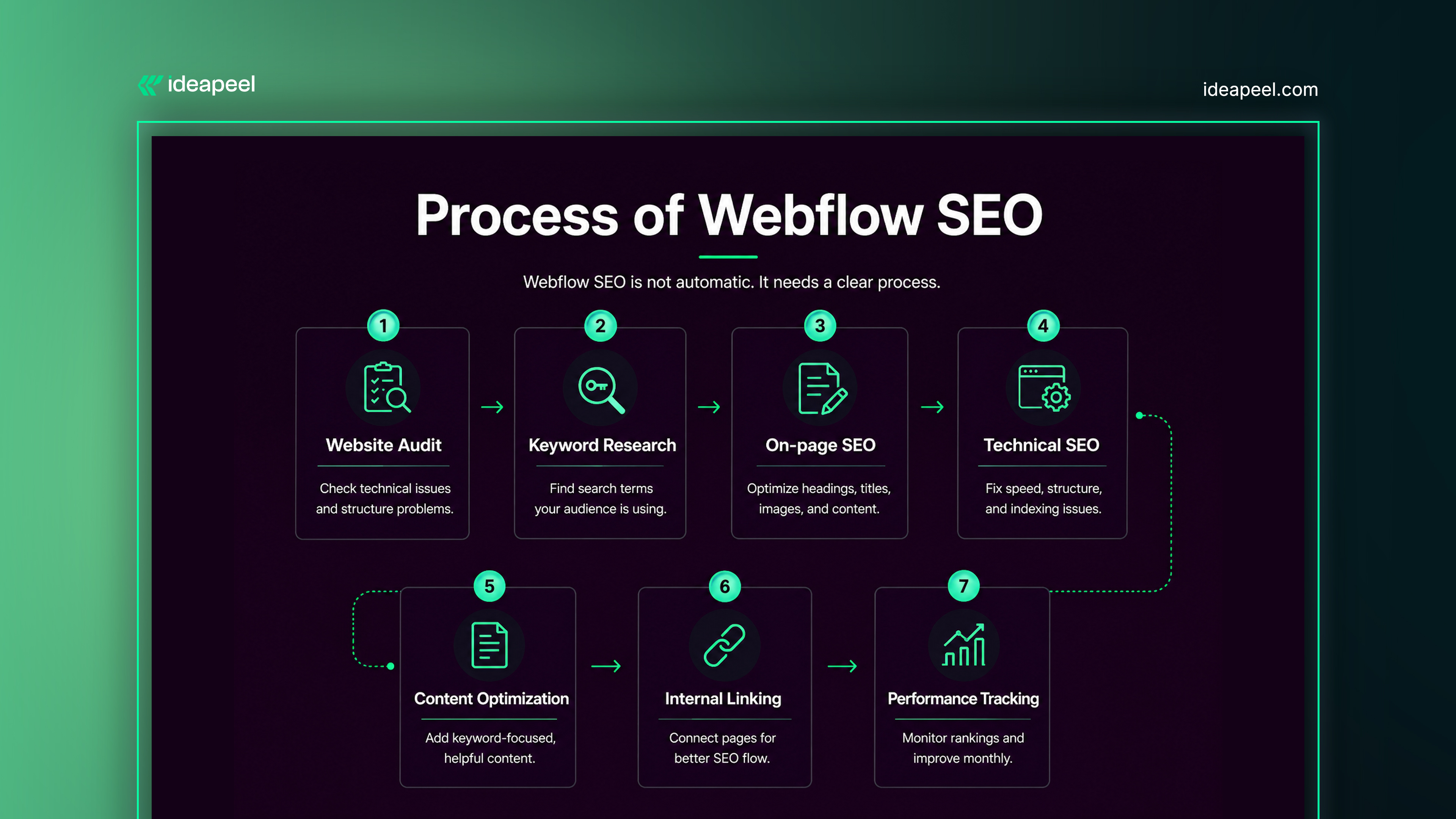
Step-by-step process:
1. Website Audit
Check technical issues and structure problems.
2. Keyword Research
Find search terms your audience is using.
3. On-page SEO
Optimize headings, titles, images, and content.
4. Technical SEO
Fix speed, structure, and indexing issues.
5. Content Optimization
Add keyword-focused, helpful content.
6. Internal Linking
Connect pages for better SEO flow.
7. Performance Tracking
Monitor rankings and improve monthly.
If you're comparing website platforms, this Webflow vs WordPress SEO comparison breaks down which platform performs better for rankings, speed, and long-term SEO growth.
How SEO Helps Prebuilt Webflow Sites
Prebuilt Webflow templates are fast to launch but not always optimized for SEO.
SEO improves:
- Search visibility
- Page structure
- Content relevance
- User engagement
- Conversion rates
Without SEO, prebuilt sites often stay invisible on Google even if the design is strong.
Types of Webflow SEO Services
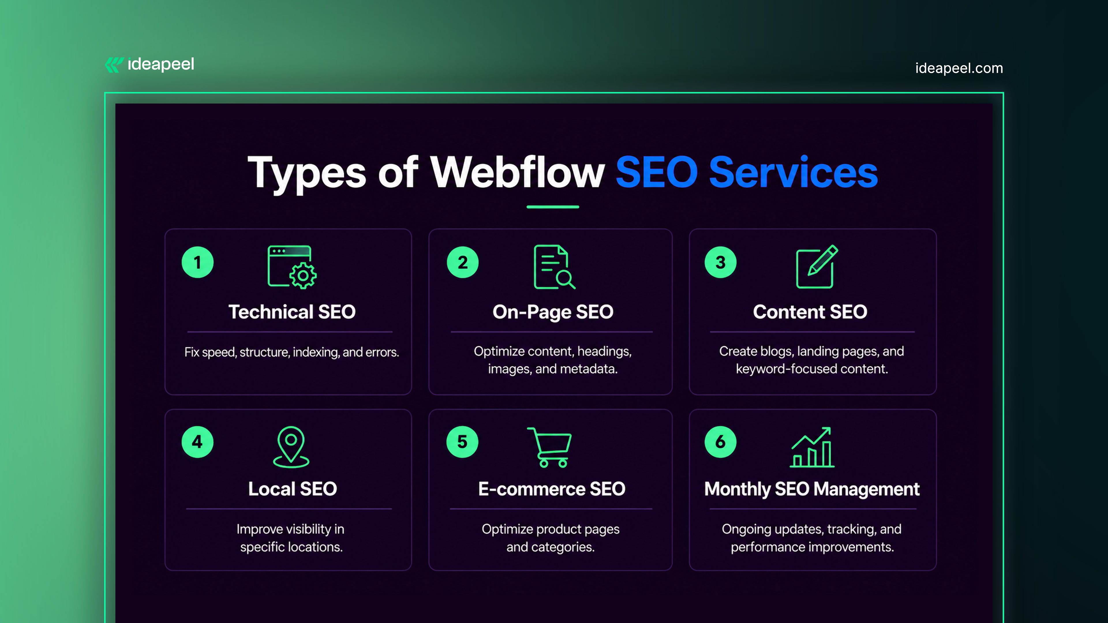
1. Technical SEO
Fixes speed, structure, indexing, and errors.
2. On-page SEO
Optimizes content, headings, images, and metadata.
3. Content SEO
Creates blog posts, landing pages, and keyword content.
4. Local SEO
Helps businesses rank in specific locations.
5. E-commerce SEO
Optimizes product pages and category structure.
6. Monthly SEO Management
Ongoing updates, tracking, and improvements.
[[inner-cta]]
2026 SEO Pricing Packages (Algorithm Focused)
Webflow Pricing Plans Explained Simply
When planning a Webflow website, one of the first things to understand is how Webflow pricing works. Webflow offers different workspace plans and site plans, and each one affects your total cost.
For example, a starter plan is good for basic projects, while a cms plan is better for a marketing site that needs blogs or dynamic pages. If your business grows, you may need to upgrade to a business plan for better hosting and more cms items.
The cost can also increase if you add features like:
- Custom domain
- Localization
- Extra add-ons
- Better Webflow hosting
These features improve your website, but they also increase Webflow costs. That’s why choosing the right Webflow pricing plan is important from the start.
The good news is that Webflow combines hosting, content management, and design tools in one place. This gives businesses better design flexibility and helps save money on Webflow compared to using multiple platforms.
Extra Costs to Consider Beyond the Plan
The monthly Webflow plan is only part of the full cost in 2026. Many businesses also spend money on Webflow development, web design, and ongoing maintenance costs.
For example, hiring a Webflow agency to build a custom site can add to your budget, especially if you need:
- Custom layouts
- Custom code
- SEO setup
- Advanced animation
If you run an online store, Webflow e-commerce plans may also include transaction fees, which increase your monthly expenses.
These extra costs matter when deciding if Webflow is worth the cost. While the upfront price may be higher, Webflow often saves money in the long term by reducing plugin costs and making updates easier.
So when reviewing Webflow pricing in 2026, it’s best to look beyond the basic plan and consider the full value of hosting, flexibility, and easier website management.
[[question-block]]
1. Starter SEO
$700/month
Best for small local businesses needing basic visibility.
Includes:
- Keyword & intent research
- On-page SEO optimization
- Google Business Profile optimization
- Technical SEO basics
- 2 SEO articles/month
- Basic schema setup
- Monthly reporting
Focus:
- Local rankings
- Technical foundation
- Basic AI visibility
2. Growth SEO
$1,500/month
Best for service businesses that want lead growth.
Includes:
- Advanced keyword mapping
- Topical cluster strategy
- Technical SEO optimization
- 4 SEO articles/month
- Internal linking strategy
- Entity optimization
- Conversion-focused pages
- Monthly reporting + strategy call
Focus:
- Topical authority
- Better rankings
- AI citation readiness
3. Authority SEO
$2,500/month
Best for brands in competitive niches.
Includes:
- Full content cluster plan
- Semantic SEO optimization
- Technical SEO improvements
- 6 authority articles/month
- Advanced schema
- Brand/entity optimization
- Link outreach
- CRO improvements
- AI search optimization
Focus:
- AI Overviews
- Brand authority
- High-intent lead generation
4. AI SEO / Enterprise SEO
$4,000-$5000+/month
Best for SaaS, law firms, and enterprise brands.
Includes:
- Full AI SEO strategy
- Entity SEO
- Knowledge graph optimization
- Semantic content architecture
- 8+ SEO assets/month
- Digital PR + authority links
- Conversion funnel SEO
- AI search visibility optimization
- Dedicated SEO strategist
Focus:
- Google AI Overviews
- Brand mentions
- Authority dominance
- Enterprise growth
One-Time 2026 SEO Services
5. AI SEO Audit
$500-$2500
Includes:
- Technical audit
- Entity audit
- AI visibility audit
- Content gap analysis
To build a stronger SEO foundation, follow this Webflow SEO checklist for 2026, covering the essential steps for improving crawlability, site structure, and search visibility.
SEO Master Site Plan or Roadmap
A strong SEO roadmap builds long-term growth.
Strategy includes:
- Website audit
- Keyword mapping
- Content planning
- SEO structure setup
- Technical improvements
- Content production
- Link building
- Monthly optimization
- AI search readiness
This helps build consistent organic traffic over time.
Benefits of Webflow SEO
- Higher Google rankings
- More organic traffic
- Better lead generation
- Strong brand visibility
- Faster website performance
- Improved conversion rates
- Long-term business growth
SEO turns a Webflow website into a real growth system.
Weaknesses and Remedies
Weakness:
- SEO takes time to show results
- Needs consistent updates
- Requires content strategy
- Competition affects ranking speed
Remedies:
- Regular blog content
- Strong keyword targeting
- Monthly SEO optimization
- Technical improvements
- Link building strategy
Conclusion
Webflow is a powerful platform, but SEO is what makes it successful. A well-optimized Webflow site can rank on Google, attract traffic, and generate leads consistently in 2026. Without SEO, even a good design will not perform.
If your goal is better rankings, this guide on how to rank #1 with Webflow SEO shares proven strategies to improve performance and increase organic traffic.
[[last-cta]]
Ready to turn your website into a growth asset?
