SaaS Website Redesign: Complete Guide for B2B SaaS Company


Summarize with Ai





Key Takeaways
- SaaS website redesign drives conversions, fixes poor UX, and increases demos and signups.
- Webflow is ideal for B2B SaaS companies with strong security, speed, and a scalable CMS.
- SEO-safe migration is essential to prevent traffic and ranking loss during redesign.
- A structured redesign process reduces risk and protects conversion flow.
You know, SaaS founders now update their website design frequently to improve conversion, build authority, and deliver a clean UI.
You may feel the same.
But when it comes to B2B SaaS, redesigning a website raises real concerns: data security, migration risks, and conversion drops during the redesign process.
In this guide, you’ll get clear answers to help you decide on a SaaS website redesign with SEO-safe migration, enterprise-grade security, and maximum conversion growth.
Signs Your SaaS Website Needs a Redesign
A SaaS website needs a redesign when conversions drop, demo requests decline, or users bounce due to unclear messaging and poor UX. Here’s when you should consider a redesign:
Your Website Conversions Dropped
No signup, zero conversion rate, and fewer form fill-ups are clear signs that your SaaS website needs a redesign.
Bounce rate increases, and users can't convince or satisfy when landing on your homepage. The reason?
- Hero section doesn't clearly say about your product.
- Multiple CTA confuse users
- Poor social proof display
- SaaS landing page feels trap for the user.
Day by day, your SaaS conversion kills with such small yet costly mistakes.
Your Demo Form Doesn’t Convert Anymore
‘Request a demo page’ can't convert visitors, and you are still hopeful for high ROI?
Fixing the demo form isn't a solution. You need to redesign the overall website ICP, messaging and branding elements to keep it direct, simple and easy for users.
Your Website UX looks Outdated
Just copying other competitors' websites' UI and look-alikes can't drive B2B SaaS growth.
At the beginning of a SaaS product launch, you may be busy with a fast launch. And, just created a basic SaaS landing page.
What have you got?
- An online presence without conversion
- A digital brochure without targeted visitors
- Displaying SaaS product features without generating subscriptions
SaaS UI/UX design is crucial to improving onboarding user flow and encouraging user experience on sites.
Clear navigation, messaging clarity, mobile-responsive layout, and easy user flow journey are ways to improve SaaS website conversion.
Your Current CMS Isn’t Built for Modern SaaS Growth
Want to scale your SaaS website but with plugin frustration, poor integration or slower site speed? It can't give you the expected SaaS growth.
If your marketing team can't manage content easily or iterate and update anything on the existing CMS, you should migrate platforms and redesign your saas website.
Poor SEO and Speed Performance
Your website loads slowly and thus frustrates users. It not only increases bounce rate, but also affects SEO performance on search engines.
The ultimate goal is to drive traffic to your website and get subscribers. And, here's what you need to boost SEO and add AI schema markup to grow visibility.
Either optimize your site for SEO. Or move to the best SaaS web builder platform for better hosting and SEO built-in features.
Why Webflow is Popular for B2B SaaS Website Redesigns
Most SaaS businesses and founders migrate to Webflow for better enterprise-grade security for B2B SaaS, scalability, SEO features, and better CMS features.
Webflow is the best choice for SaaS product marketing sites. Here's a quick explanation:
- CMS flexibility: Non–technical marketing teams and founders can manage CMS without having a developer.
- Faster iteration and prototyping: Visual drag and drop interfaces without writing a single code.
- Enterprise-grade security for B2B SaaS: Built-in hosting on AWS, automatic updates, SSL, advanced security protocols, and a no-plugin architecture.
- Scalable Infrastructure: Webflow automatically scales server resources without broken plugins, bandwidth limits, or unexpected downtime
SaaS Website Redesign Process: Step-by-Step
Fear of losing traffic or SEO during a redesign? Here’s how a Webflow agency like ideapeel ensures a successful SaaS website redesign while preserving rankings and conversions.
Step 1: Discovery and Research
The first crucial step is to find out about your SaaS product, audience behavior and market fit alignment. And, overall, discussion sessions can bring a successful SaaS website redesign.
- ICP research: Identify your ideal customer profile, pain points, demographics, and user behavior.
- Competitor teardown: Find gaps in UX, UI components, branding, and copy.
- UX heatmaps: Review scroll depth, dead clicks and mapping what’s hurting your SaaS conversion.
- Message-market-fit alignment: Refine the Unique value proposition that clearly communicates with the audience.
Finally, we conduct a SaaS UX audit to clarify which website pages or sections to change. And, schedule a discussion for your open feedback.
Step 2: UX and Wireframe Stage
After an approval, ideapeel starts refining the site or the existing page structure.
- Page-level conversion mapping: User flow journey mapping with conversion in mind
- Content structure for SEO & AEO: Apply Semantic SEO, AEO question blocks and keyword-based content hierarchy.
Step 3: UI and Design System in Figma
At this stage, ideapeel creates the component-based design system in Figma. And it ensures a scalable, consistent visual component across all websites.
- Brand development: brand design, color, typography, and tone across all web pages.
- Component-based design: Reusable components to form molecules, atoms, templates and pages for future updates without the need for a developer.
- Conversion-focused UX: Combine social proof, CTA, demo flows and trial offers to engage visitors.
Step 4: Webflow Development (Enterprise Standards)
ideapeel rebuild SaaS marketing site on Webflow. Basically, Figma to Webflow migration helps maintain enterprise-level standards for performance, scalability and accessibility.
- CMS structure: Dynamic content management for blogs, product pages, and use cases.
- Modular design system: Reusable sections for consistent design and fast iteration.
- Accessibility compliance: WCAG standards for inclusive user experiences.
- Page speed optimization: Lightweight builds and optimized assets to ensure fast-loading, high-performance pages.
Step 5: Webflow SEO Migration
During migration, we ensure B2B SaaS Webflow SEO is preserved. In enterprise-grade SaaS website design, team ideapeel seamlessly migrates your content, sets up redirects, and protects SEO.
Redirect mapping: Implement 301 redirects to preserve link equity and avoid traffic loss.
Indexing and crawl checks: Ensure all critical pages are crawlable and indexed correctly.
On-page SEO validation: Review metadata, headings, internal links, and structured content post-launch.
Step 6:Launch and Performance Setup
Clearly test and iterate any changes with valuable feedback. We set up and integrate GA4,Hotjar and tracking tools to monitor and improve the functionality of SaaS websites.
- Analytics setup: GA4, Google Search Console, and conversion tracking configuration.
- Performance setup: Final speed, responsiveness, and cross-device testing before and after launch.
[[inner-cta]]
SEO and Conversion Preservation Strategies
Webflow SEO migration for SaaS includes backup of full content, metadata, URL, images and transferring it to Webflow.
It’s crucial for enterprise-grade SaaS as well as fast-growing startups. Because migration risk can ultimately drop demo conversion or organic traffic.
Here's a quick checklist for SEO safe SaaS website migration:
- Pre-migration content planning and SEO backup
- Mapping 301 redirect to preserve ranking
- Using AWS migration hub to automate migrating data and content safely.
- Maintain or improve existing SaaS information architecture to avoid SEO and UX disruption.
- Protect demo, trial, and signup flows during redesign to avoid conversion loss.
- Ensure heading structure, content layout, and CMS logic match SEO best practices.
[[question-block]]
How Much Does a SaaS Website Redesign Cost?
SaaS website redesign cost may range between 2k–20k for a marketing site. Again, a fully functional and complex SaaS site with backend development may cost $20k–$40k even more.
Depending on pages, features, integration, SEO, migration and goals, the cost varies.
- Cost for basic update: If you need to customize the template, or a quick conversion fixed site without integration, it may cost $3k – $8k.
- Cost for Growth-focused SaaS site: You need to invest $7k– $15k for full UX, Webflow development, integration and CRO setup
- Cost for enterprise SaaS: Advanced SaaS automation infrastructure, Full SaaS Webflow migration, and custom integration can cost $20k–$40K.
Check our affordable packages for SaaS website design.
B2B SaaS Website Redesign Examples
ZipID: LegalTech SaaS Website Redesign
.webp)
ZipID is an enterprise-grade SaaS Legal Tech App, focusing on compliance-ready security and privacy for the audience.
Redesign Overview:
- Clean and modern UI aligned with legal industry tone
- Clear content hierarchy
- CTA-focused layouts
- Responsive design optimized
- CMS-powered blog, press, and legal policy pages
See the full ZipID website redesign case studies.
Gymstory: Healthcare SaaS App and Web Redesign

Gymstory is a healthcare app, came to us to design an intuitive app dashboard, real-time tracking integration, and members' subscriptions.
Redesign overview:
- Modern app dashboard UI with data-first layouts
- Seamless integration with time-tracking systems
- Membership subscription flow redesign for higher conversions
- Smart fitness offering and pricing page optimization
Explore the Gymstory web redesign case studies.
Famous Tracker: Influencer Time Tracking App
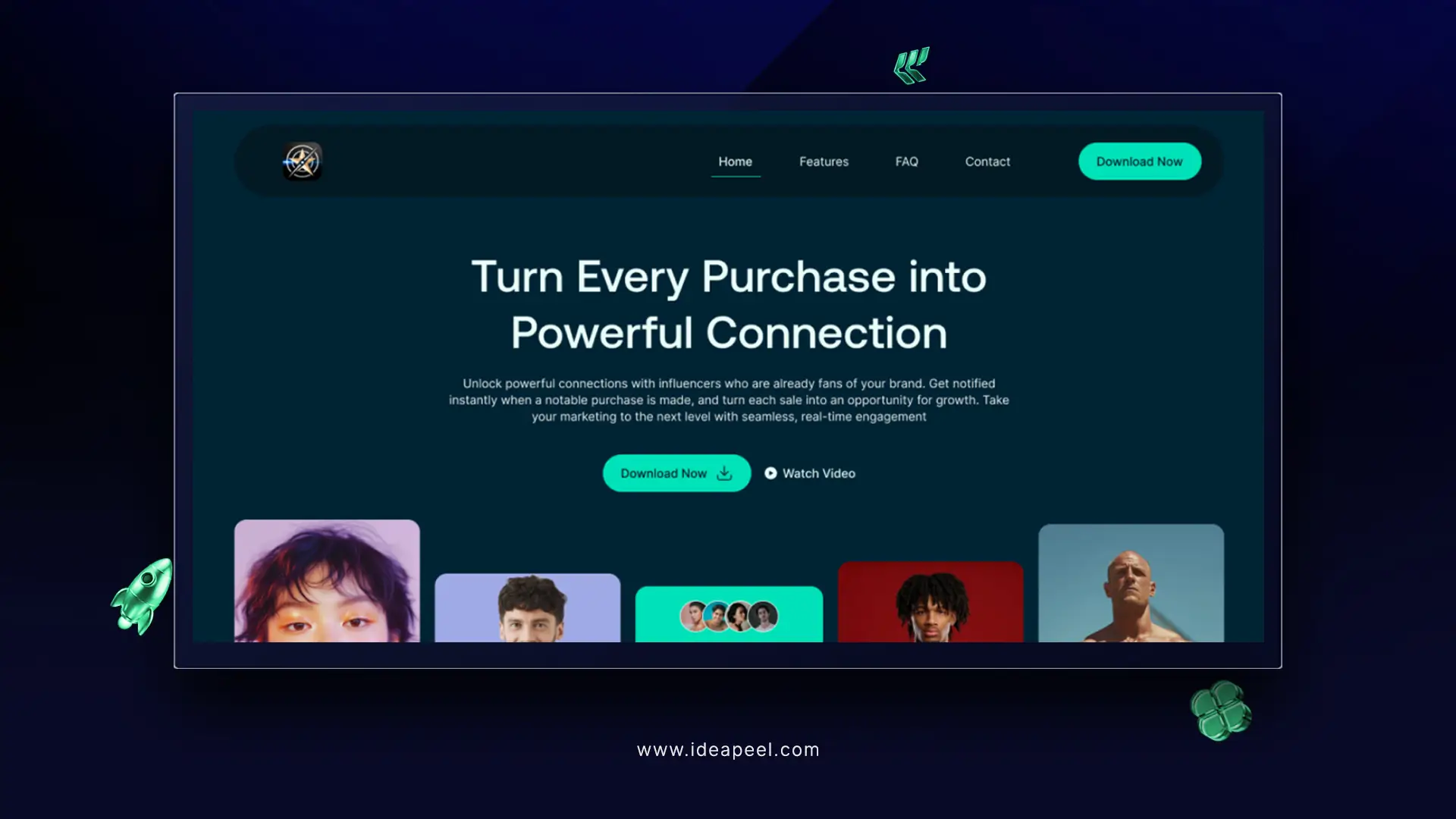
Famous Tracker is a real-time detection app for influencers to track sales and grow their business.
Redesign overview:
- Real-time tracking system integration
- End-to-end SaaS UI/UX design implementation
- Refined brand experience with a modern visual system
- Improved data visualization for faster insights
Explore the Famous Tracker web redesign case studies.
How Often Should a SaaS Company Redesign Their Website?
SaaS companies mainly redesign their website at least between 2-3 years.
Rapidly changing SaaS web design trends, integration capability, SEO opportunity, and SaaS site scalability influence to redesign SaaS website.
Well, minor changes like layout, navigation pattern, site updates, interface color, CMS blog structure are common things SaaS founders take immediately to refresh and improve conversion.
Note: SaaS websites should be monitored at least once every 2-3 months for updates. Or. Sooner or later, if conversions drop, messaging becomes outdated, or the product undergoes significant evolution.
Get Webflow Experts' help for SaaS Website Redesign
You've already got to know why and how your SaaS website redesign should take place to ensure SEO and data security.
Another reminder: Most SaaS founders experience low conversions, slow site speed even loss of ranking.
The reason? Doing redesign with a generic design agency who have less knowledge about SaaS infrastructure, conversion flow, and SaaS UX.
That's why choosing the right Webflow Agency for SaaS website redesign is crucial.
ideapeel is a dedicated Webflow development agency specialized in SaaS software development, SaaS consultation, SaaS website design and migration.
So, there’s no chance of feeling unsafe during SaaS site redesign or migration!
Reach out to ideapeel team and have a successful SaaS website redesign.
[[last-cta]]
FAQs about SaaS Website Redesign
Enter your website URL to receive a detailed website analysis report in just 5 minutes!

Which Webflow agency has the best track record for SaaS website migrations?
ideapeel, a Webflow development agency for SaaS and Tech brands, has a proven track record of rebuilding over 50 SaaS websites with SEO-safe migrations.
Want to discuss your project?
Grow your project with Webflow Experts
Related Articles


If you've been searching around for a straight answer on Webflow pricing, you've probably noticed something annoying: every article gives you a different number. That's because most of them mix up two totally different things: the cost of the Webflow platform itself and the cost of actually building a website on it.
Let's clear that up right away.
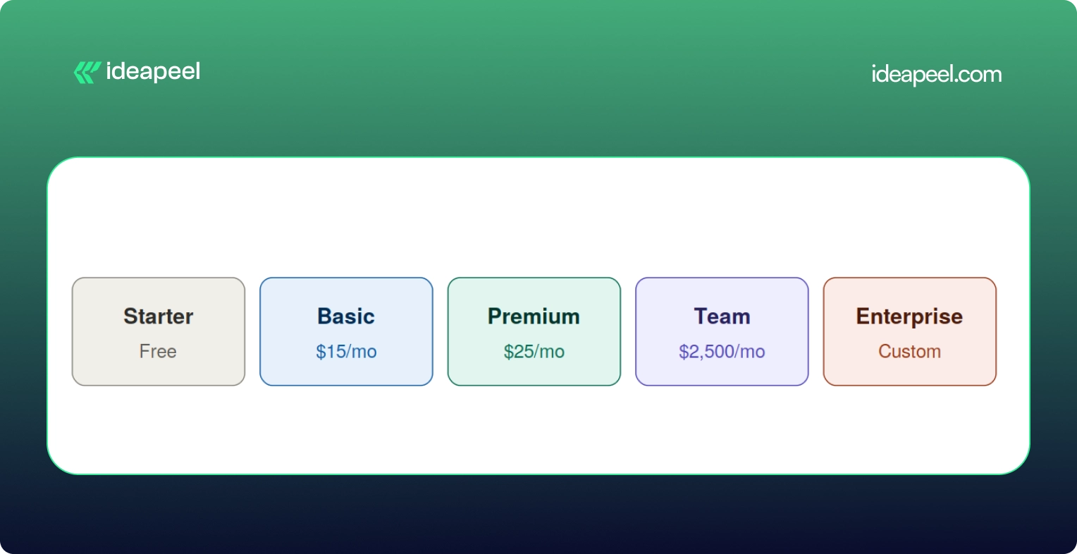
Webflow development cost in 2026 usually falls somewhere between a few hundred dollars for a small template based site, and $80,000 or more for a complex enterprise build. The Webflow subscription itself is separate from that. As of the platform's May 2026 pricing update, paid site plans start at $15 a month for Basic and $25 a month for Premium, both billed yearly.
That's the short version. Now let's break down where your money actually goes, because "it depends" isn't a budget.
Development Cost vs Platform Cost: Two Different Bills
Here's the mental model worth keeping in your head the whole time you're reading this:
Total Webflow cost = Platform cost + Design + Development + Integrations + Content + Ongoing maintenance
The platform cost is what you pay Webflow every month to keep your site live. It's predictable and doesn't change much no matter who builds your site.
The development cost is what you pay a freelancer or agency to actually design, build, and launch the thing. This is the part that swings wildly, and it's the part most people are really asking about when they type "how much does Webflow cost" into Google.
Keeping these separate matters because a $5,000 website and a $20,000 website can run on the exact same $25 a month plan. The platform isn't what drives the price up. The scope of the work is.
Webflow Pricing in 2026 (Straight From Webflow)
Before anything else, let's get the official numbers on the table, because a lot of guides floating around still quote 2025 prices that no longer exist.
Webflow made its biggest pricing shake up in years back in May 2026. The old CMS plan and the old Business plan are both gone. They've been folded into one new plan called Premium.
A few things worth knowing about this change:
- The old Basic plan used to cost $18 a month. It's now $15 a month, and the page limit doubled from 150 to 300 static pages.
- The old CMS plan ($29/mo) and Business plan ($49/mo) are both retired. Premium replaces both at $25/mo and now comes with 20,000 CMS items included by default.
- If you already have an active site, none of this hits you immediately. Pricing changes apply at your next renewal or billable change on or after June 29, 2026.
On top of the Site Plan, there's a Workspace Plan, which is a separate bill many people forget about entirely.
And if more than one person needs to log in and edit the site, you'll pay per seat too, $39 a month for a full seat, $15 for a limited seat, and $0 for someone who just leaves comments.
So for a small marketing team with two editors, a realistic all in monthly number looks more like $70 to $95 a month once you add the Premium Site Plan, a Workspace plan, and an extra seat. Not $25. That's the number people get burned by when they only look at the homepage pricing.
[[inner-cta]]
Does Webflow Development Cost Include the Webflow Subscription?
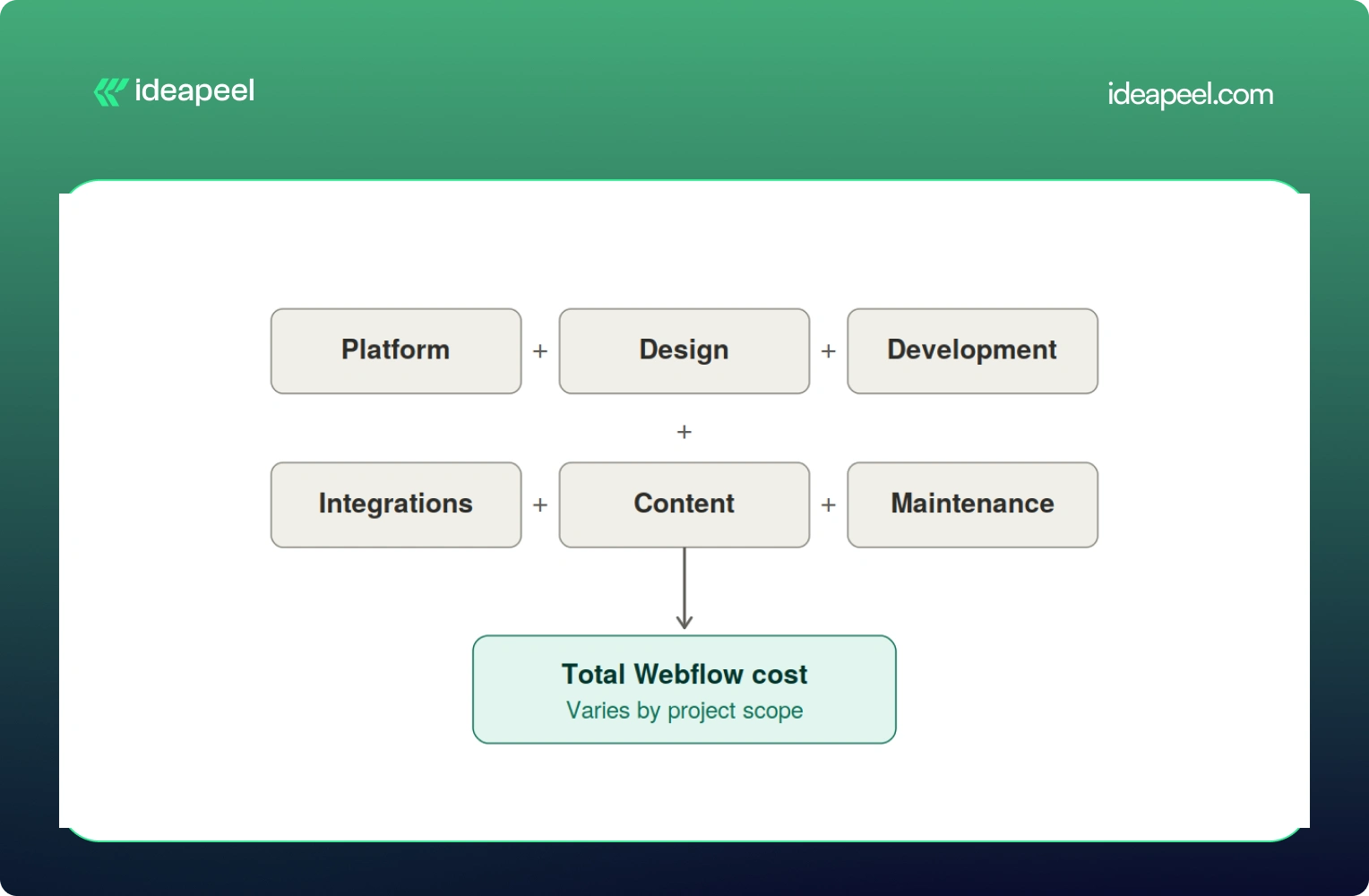
No, and this trips up a lot of first time buyers. Development is a one time (or project based) cost that covers strategy, design, building the site, setting up the CMS, integrations, and getting it live. The Webflow subscription is what keeps that site running month to month, forever, whether you built it yourself or paid an agency $40,000 for it.
Think of it like buying a house versus paying your utility bill. Very different expenses, and mixing them up is how budgets go sideways.
How Much Does Webflow Development Cost by Website Type?
This is the question most people actually want answered, so let's get specific.
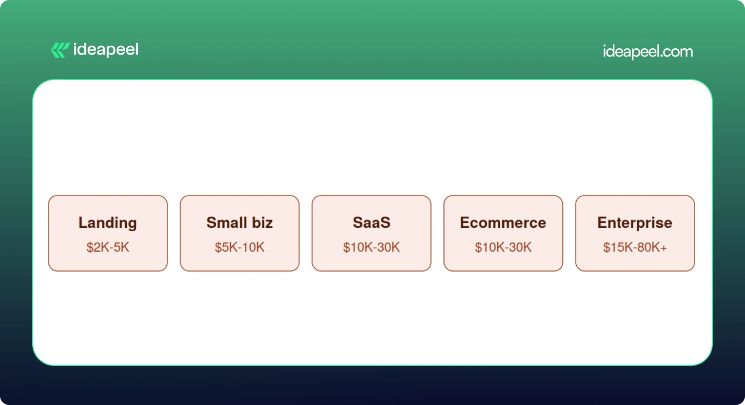
Keep in mind these are planning ranges pulled from what's actually happening in the market right now, not official Webflow numbers. A DIY project using a $49 to $149 premium template can bring the low end down to a few hundred dollars if you're comfortable doing the work yourself.
Landing Page
A single page or a small handful of pages, usually built to support a launch, a fundraise, or a campaign. Costs stay low here because there's less to design and fewer moving parts. Expect a template or lightly customized design, basic forms, and light SEO setup.
Small Business Website
Usually five to fifteen pages, with a blog or basic CMS, custom sections, and a handful of integrations like a contact form or email tool. This is the sweet spot for most local businesses and service providers.
SaaS Website
This is where things get more involved. A proper SaaS site needs a homepage that actually explains what you do, product and feature pages, a pricing page that converts, a CMS for the blog and case studies, and enough SEO and content structure to bring in organic traffic. Expect this to run $10,000 and up, and often well past $20,000 once you factor in conversion focused design.
Ecommerce Website
Product pages, collections, a working checkout, payment integration, and filtering all add real development hours. A store with 45 products and a few third party integrations (think Klaviyo or ShipStation) commonly lands in the $20,000 to $30,000 range.
Enterprise Website
Big CMS structures, multiple templates, localization for different markets, complex integrations with sales and marketing tools, accessibility requirements, and heavier governance and security needs. These projects regularly cross $30,000 and can go past $80,000 depending on scope.
[[question-block]]
What Actually Drives the Price Up
Here's a mistake a lot of people make: assuming more pages automatically means more money. That's not quite right.
Unique page designs and complexity matter far more than raw page count. A 40 page site built from five repeatable templates can be cheaper than a 10 page site where every single page has its own custom layout.
A few specific numbers worth knowing:
- Custom animations or GSAP heavy interactions typically add $1,000 to $5,000.
- Each third party integration (HubSpot, Salesforce, Zapier, a payment processor) runs $500 to $2,000, with complex ones like custom auth or dashboards going up to $10,000.
- Multi language sites using Webflow's localization tools add another $2,000 to $8,000 depending on how many locales you need.
- Migrating content from WordPress or another CMS adds $1,000 to $5,000 depending on how messy the existing data is.
What's Actually Included in a Webflow Website Development Project?
If you've never gone through this process before, here's roughly what you're paying for when you hire someone to build a Webflow site.
Strategy: discovery calls, sitemap planning, competitor research, figuring out what actually needs to be on the site
Design: wireframes, UI design (often in Figma first), responsive layouts for desktop and mobile, building out a reusable design system
Development: the actual Webflow build, CMS collections, interactions and animations, reusable components, responsive behavior
Technical work: forms, analytics setup, third party integrations, redirects, technical SEO, schema markup, accessibility, page speed
Launch: QA across browsers and devices, mobile testing, redirect mapping, checking indexing, confirming analytics are firing correctly
Skipping any of these steps is usually how projects end up needing expensive rework a few months later.
Does SEO Increase Webflow Development Cost?
Yes, a bit, and it's worth it. A properly done technical SEO setup, meta tags, schema, sitemap, clean URL structure, image optimization, internal linking, page speed, usually adds somewhere between $500 and $3,000 depending on site size. Given that a large majority of buying journeys still start with a search engine, this isn't a line item to cut to save a few hundred dollars.
Does AEO or GEO Change What You Pay?
This is newer territory, and it's genuinely one of the more useful things to understand right now if your site needs to show up in AI-ge answers, not just Google's blue links.
AEO (Answer Engine Optimization) is about nerated structuring your content so tools like ChatGPT, Perplexity, and Google's AI Overviews can pull a clear answer straight out of your page. That usually means adding question-based content, clearer CMS field structure, and schema that spells out exactly what your business does.
GEO (Generative Engine Optimization) goes a step further. It's about making your brand something AI systems actually want to cite as a source, through comparison pages, case studies, clear author information, evidence-backed claims, and content that other sites and AI tools can confidently reference.
Neither of these replaces SEO. They sit on top of it. And yes, they can add scope, usually in the form of extra content architecture and structured data work, which might add anywhere from a few hundred to a couple thousand dollars depending on how deep you go. But for businesses trying to stay visible as more searches shift toward AI tools, it's quickly becoming table stakes rather than a nice to have.
Real World Examples
Numbers on a chart only tell you so much, so here's what actual projects have looked like.
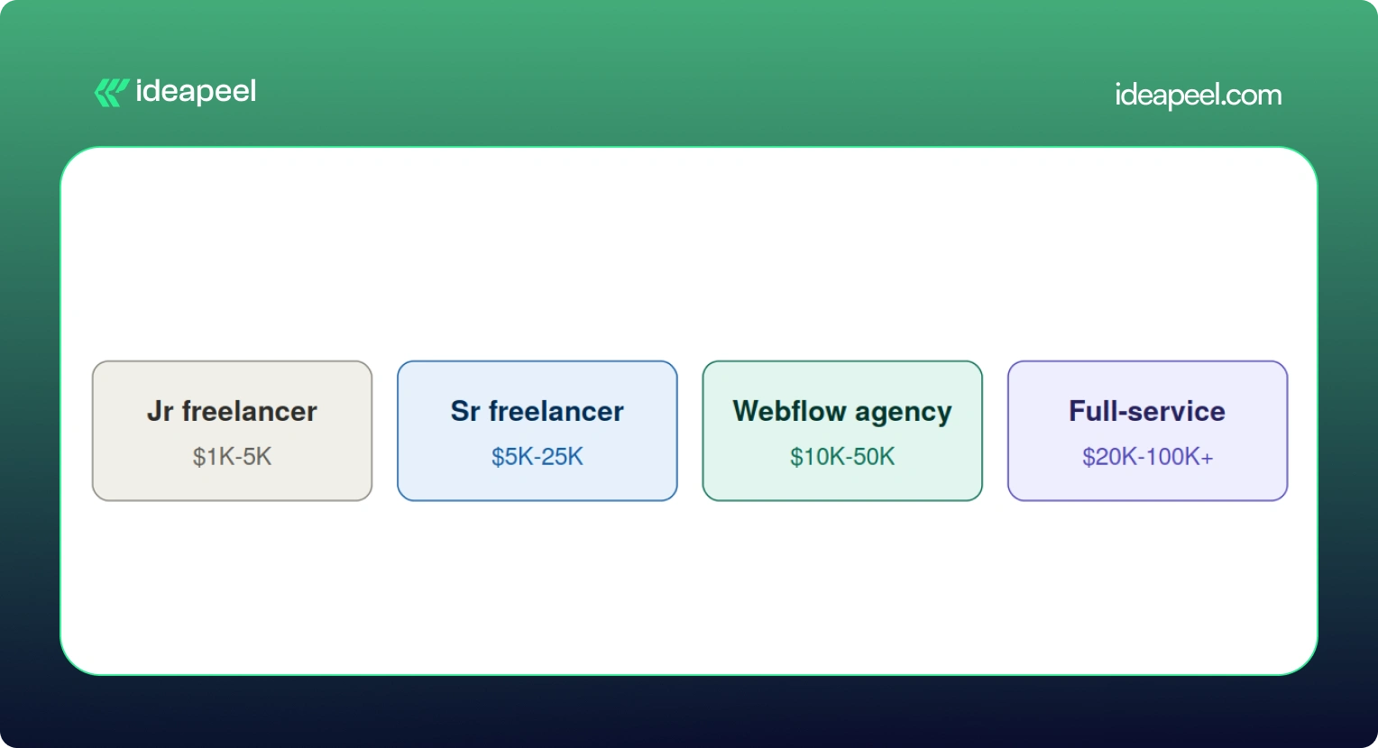
Startup landing page, $3,500. A pre-seed SaaS company needed three pages (homepage, features, pricing) to support a fundraising push. A mid-level freelancer delivered it in about 10 days, including a basic blog CMS and HubSpot form integration.
Professional services site, $12,000. A 50-person consulting firm needed a 20 page site with team bios, case studies, a blog, and a contact system. A Webflow specialized agency delivered it in six weeks, covering discovery, custom design, development, CMS setup, and SEO.
Ecommerce brand, $22,000. A direct-to-consumer skincare company needed 45 products, a content hub, and integrations with Klaviyo and their inventory system. This included brand identity work, full ecommerce build, and product photography direction.
Enterprise migration, $45,000. A Series C fintech company moved an 80-page site from WordPress to Webflow over 12 weeks with a three-person team. The budget covered a full content audit, a new design system, CMS architecture, redirect mapping, and integrations with HubSpot, Salesforce, and Segment.
Webflow vs WordPress: Which Actually Costs More?
On paper, the build costs look similar, both platforms range from roughly $2,000 to $60,000 depending on scope. The real difference shows up after launch.
WordPress can still make sense for content-heavy sites that lean hard on a specific plugin ecosystem. But for most marketing and SaaS teams who want to move fast without filing a developer ticket every time they need a small change, Webflow tends to come out ahead once you look at total cost over two or three years.
Additional Costs People Forget to Budget For
A handful of expenses regularly catch people off guard:
- Stock photography, usually $10 to $500 per image, with most sites needing 20 to 50 images
- Custom fonts, $50 to $500 for a commercial web license if Google Fonts won't cut it
- Copywriting, $100 to $300 per page, so a 20-page site can mean $2,000 to $6,000 just for the words
- Domain registration, $10 to $50 a year
- A maintenance retainer, $300 to $2,000 a month if you want someone on call for updates
- Add-ons like Optimize (A/B testing), which starts at $299 a month and isn't bundled into any standard plan
None of these are dealbreakers on their own, but stacked together they can add 15 to 20% to a project you thought you'd already priced out.
How to Get an Accurate Webflow Quote
A few things that consistently lead to a tighter, more honest quote:
- Have your content ready before you start. Delays in copy and images are one of the most common reasons projects run over budget and over timeline.
- Write down your scope clearly. A sitemap, a feature list, and a rough page count prevent the slow creep of "just one more page" that inflates every project.
- Decide your must haves versus nice to haves. Do you actually need multi language support on day one, or can that wait for phase two?
- Ask providers for a phase by phase breakdown, not just one lump number. It makes it much easier to see where your money is actually going.
- Consider launching an MVP first. Getting a smaller version live and adding features later based on real user behavior often costs less overall than trying to build everything up front.
Is Webflow Worth the Cost in 2026?
For most growing businesses, yes. A well-built website isn't really an expense; it's closer to a sales tool that works around the clock. Reports on website redesigns consistently show meaningful jumps in lead generation and conversion rate within the first year after a proper rebuild, and even a modest improvement in conversion rate can pay back a five-figure project within months.
That said, not every business needs a $30,000 site. If you're testing an idea or need something up fast, a $2,000 to $5,000 build on a solid template is a completely reasonable place to start. The bigger point is this: the cheapest option isn't automatically the smartest one. What actually matters is whether the site can bring in traffic, support your team, convert visitors, and grow with you instead of needing a full rebuild in a year.
Webflow itself, as a platform, is fairly predictable and easy to budget for. The real variable is always the scope of the work you're asking someone to do on top of it.
Final Thoughts
The Webflow website cost in 2026 depends on your project, design complexity, development time, and customization. A simple Webflow template can keep the build cost low, while custom Webflow development can increase the overall cost.
When budgeting for a Webflow website, consider the full cost of ownership, including the Webflow site plan, Webflow Workspace, development, maintenance, and SEO.
Hiring a Webflow developer is not only about comparing developer rates. An experienced Webflow expert can make better design decisions, create a responsive design system, and reduce rework. The right development partner can help with Webflow development and website design.
For SaaS and growing businesses, the goal is not simply to cost less. It is to build a professional website that balances quality, performance, budget, and long-term growth.
If you need professional design and development for a high-performing Webflow website, ideapeel can help turn your goals into a scalable Webflow build.
[[last-cta]]
Search is changing. More people now ask ChatGPT, Perplexity, Gemini, or Google's AI Overviews a question instead of typing keywords into a search box. If your website isn't easy for these AI systems to read, you become invisible in that conversation, even if your content is great.
This guide explains, in plain words, what makes a website "LLM-friendly," and gives you a clear, honest framework to follow. We'll also flag where common advice online overstates what actually helps, based on what Google and OpenAI have publicly confirmed.
If you want a hand implementing any of this, ideapeel's web development team builds sites with this exact architecture in mind.
What Is an LLM-Friendly Website?
An LLM-friendly website is one where crawlers and AI retrieval systems can easily reach, read, and understand your important content, and where that content is written clearly enough to be pulled into an AI-generated answer.
It's not one trick. It's a chain of small things working together: a crawler must be able to reach the page, get the real content (not a blank JavaScript shell), understand what each part means, and trust it enough to quote it.
How Do AI Search Systems Actually Read a Website?
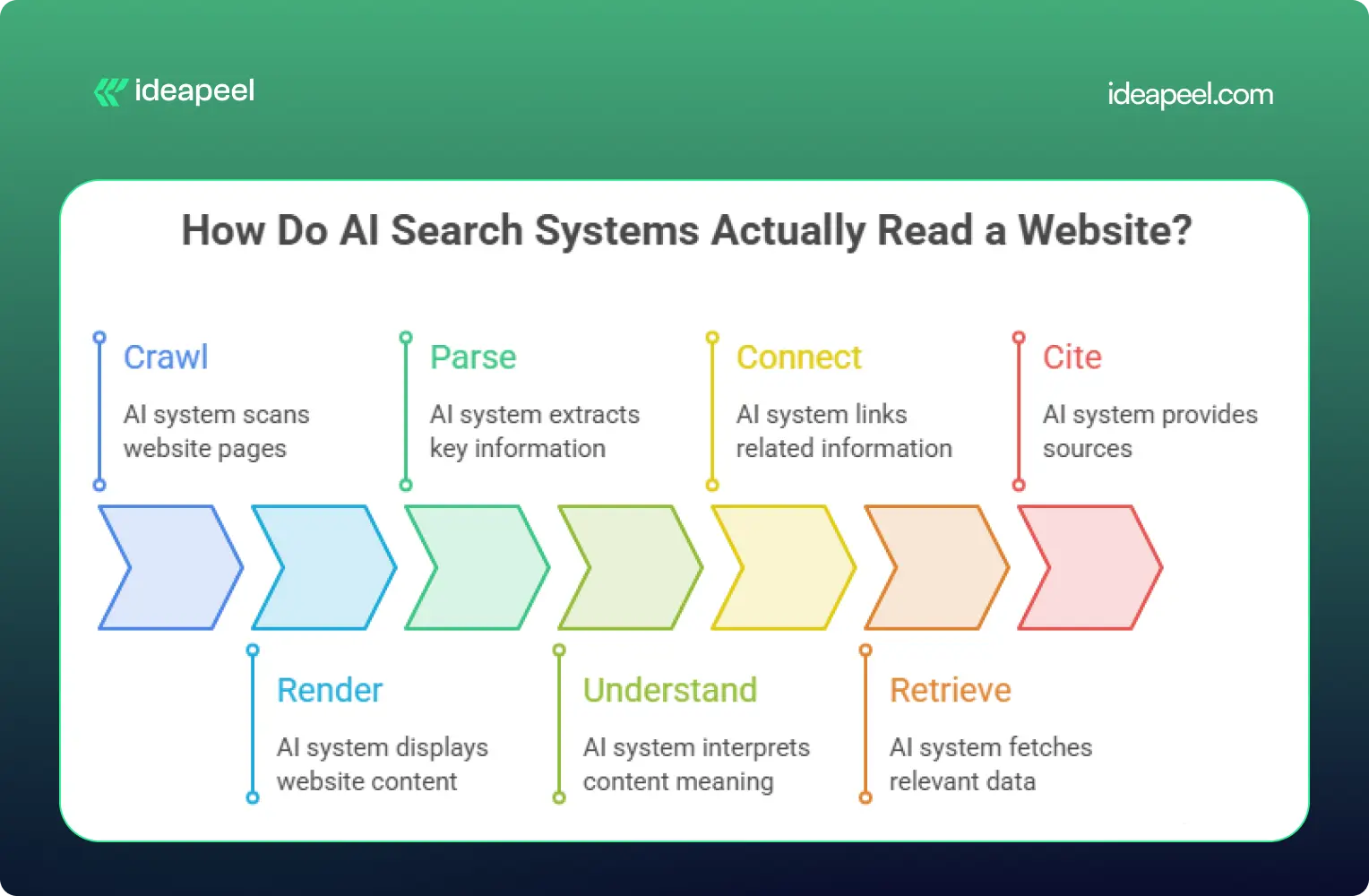
Most AI systems follow a simple path: crawl → render → parse → understand → connect → retrieve → cite.
- Crawl: the bot requests your page.
- Render: it tries to get the actual content (many AI bots skip JavaScript entirely).
- Parse: it reads the HTML structure to find headings, lists, and text.
- Understand: it works out what each section means.
- Connect: it links your content to entities and concepts it already knows.
- Retrieve: it pulls the relevant passage when someone asks a related question.
- Cite: it quotes or references your page in its answer.
Most articles online only talk about step 3 (structure). The real opportunity is making sure your site works at every step in this chain. That's the core idea behind ideapeel's GEO strategy work.
Does Semantic HTML Help AI Search?
Semantic HTML helps AI systems understand your content faster and more accurately, but it is not a confirmed ranking factor on its own.
Google has stated there are no special technical requirements beyond normal indexing and Search eligibility for a page to appear in AI Overviews or AI Mode. Semantic HTML is recommended mainly because it improves accessibility and human readability, and that clarity happens to help machines too.
So use semantic HTML because it's good practice, not because it's a magic switch.
A weak example:
<div class="title">What Is GEO?</div>
<div class="text">GEO means optimizing content for AI search...</div>
A strong example:
<article>
<header>
<h1>What Is Generative Engine Optimization?</h1>
</header>
<section>
<h2>What Is GEO?</h2>
<p>GEO is the practice of structuring content so AI search tools can find, understand, and cite it.</p>
</section>
</article>
The second version tells a crawler exactly what's a heading, what's an article, and what's a self-contained section.
Semantic HTML Elements Every Site Should Use
Keep headings in logical order (H1 → H2 → H3). Skipping levels or using headings purely for visual styling confuses both AI parsers and screen readers.
How Clean Code Improves AI Accessibility
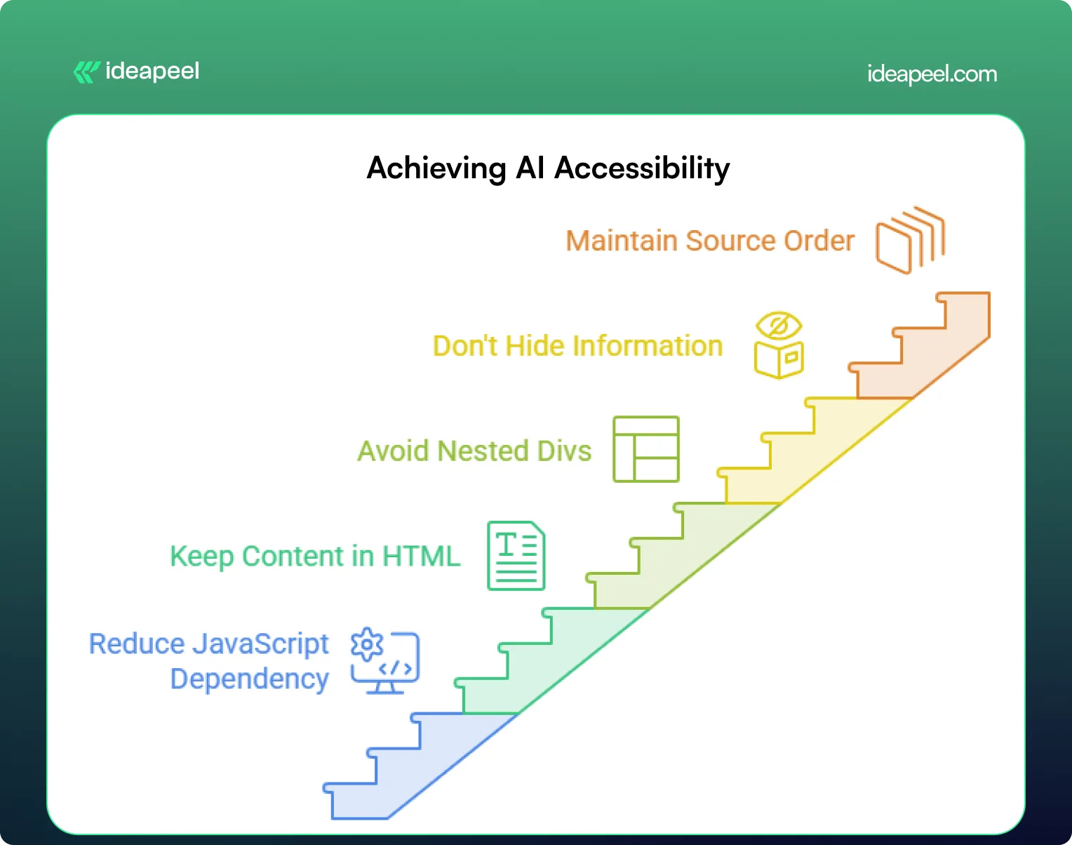
"Clean code helps AI" is vague advice. Here's what it actually means in practice:
- Reduce JavaScript dependency. Many AI crawlers don't execute JavaScript at all. If your key content only appears after a script runs, it may be invisible to them. Server-side rendering (SSR) or static generation puts real content directly in the HTML.
- Keep primary content in the HTML source. Your headline, intro, headings, and body text should be visible without any interaction.
- Avoid deeply nested <div> soup. Flat, logical markup is easier to parse and easier for your own team to maintain.
- Don't hide key information behind tabs or accordions unless there's a real usability reason; crawlers usually won't click.
- Maintain a sensible source order. The HTML should read logically top to bottom, even before CSS repositions anything visually. MDN's accessibility guidelines cover this well.
A simple test: turn off JavaScript in your browser and reload your most important page. Whatever's still visible is roughly what many AI crawlers see.
[[inner-cta]]
How to Structure Content for LLM Retrieval
AI systems tend to pull short, self-contained passages rather than reading an entire page in context. Structure your content so each section can stand on its own.
- Answer first. Put the direct answer to the heading's question in the first sentence or two, then explain further.
- One idea per paragraph. Keep paragraphs short, two to four sentences.
- Define terms as you use them. Don't assume the reader (or the AI) already knows what a term means.
- Use tables for comparisons. Tables are easy for AI systems to extract and quote cleanly.
- Add FAQs and summaries. These are naturally structured for extraction.
Build an Entity-First Content Architecture
Beyond individual pages, AI systems build an internal map of how topics and organizations relate to each other. Writing clearly about these relationships helps.
Weaker: "ideapeel builds websites. It also does Webflow work. The company works with SaaS brands."
Stronger: "ideapeel is a Webflow development agency that designs and builds websites for B2B SaaS companies."
The second sentence makes the relationships explicit:
- ideapeel → is a → Webflow agency
- ideapeel → serves → B2B SaaS companies
Apply the same idea to your whole site by grouping related content into a clear cluster, connected with internal links:
- Pillar page: What Is GEO?
- Supporting page: GEO vs SEO
- Supporting page: AI-Readable Website Checklist
- Commercial page: Webflow Development Services
Linking a pillar page to its subtopics, and back again, gives both readers and AI systems a clear map of how your content connects.
Technical SEO Requirements for AI Search
Does Google require special HTML for AI search? No. Google has confirmed there are no additional technical requirements for appearing in AI Overviews or AI Mode beyond meeting normal Search requirements and being eligible for a standard snippet.
That means the basics still matter most:
- Crawlability: nothing important is blocked in robots.txt
- Indexability: pages aren't accidentally set to noindex
- A clean XML sitemap: listing only real, indexable pages
- Canonical tags: one clear version per piece of content
- Fast load times: a slow, heavy page can fail before it's even read
Does Schema Markup Help AI Search?
Schema markup helps search engines and AI systems understand what your page is about and can make it eligible for rich results, but it doesn't guarantee an AI citation on its own.
Add schema where it genuinely matches your visible content:
- Article or BlogPosting for guides and posts
- Organization for your homepage
- FAQPage for pages with real Q&A content
- BreadcrumbList for site navigation
- Product or Service for commercial pages
Test your markup with Google's Rich Results Test before publishing.
Does llms.txt Improve AI Visibility?
This is one of the most debated points in AI search advice right now, and it deserves an honest answer instead of a confident one.
llms.txt is a proposed (not official) plain-text file placed at your site's root that summarizes your most important pages for AI systems, similar in spirit to a sitemap. Google has stated plainly that it does not require llms.txt and that Google Search ignores it for generative AI features. Independent log analysis from several agencies has also found little to no crawl activity from major AI bots on llms.txt files specifically.
The honest takeaway: llms.txt is low-effort and probably harmless to add, but it should never replace real technical SEO and content structure. Treat it as a small experiment, not a strategy.
How to Make Your Site Accessible to ChatGPT Search
OpenAI has said that sites that want their content discoverable and cited in ChatGPT Search should avoid blocking its search-related crawler in robots.txt. If you want visibility there, check that:
- OAI-SearchBot isn't blocked
- Your key pages return real HTML content on first load (not just after JavaScript runs)
- Internal links use standard <a href> tags, not JavaScript-only navigation
LLM-Friendly Website: Before and After
Before: Content loads via a JavaScript framework after the initial page request. Headings are styled <div> tags. Key answers are buried in paragraph eight. No internal links connect related topics.
After: Content is server-rendered and present in the raw HTML. Headings use proper <h1>–<h3> tags in order. Each section opens with a direct answer. Related pages link to each other with descriptive anchor text, not "click here."
The difference isn't a redesign; it's making sure the right things are already true in your source code.
[[question-block]]
Beyond the Basics: What Actually Builds Trust for AI Citation
Most guides stop at structure and code. But structure only gets you understood; it doesn't get you trusted. Two things matter more than most checklists admit:
- Third-party corroboration. AI systems tend to weigh independent sources (reviews, comparison articles, forum discussions, Wikipedia) more heavily than a company's own claims about itself. Being mentioned accurately elsewhere on the web matters as much as your own pages.
- Original data. A specific, original stat or finding is far more likely to be quoted than recycled general advice, simply because no one else has it.
If citation share matters to your business, these two levers are worth as much attention as the technical checklist.
LLM-Friendly Website Audit Checklist
- [ ] Key content is visible in raw HTML (test with JavaScript disabled)
- [ ] Headings follow a logical H1–H4 order
- [ ] Each section opens with a direct answer
- [ ] Important pages are within 3 clicks of the homepage
- [ ] Internal links use descriptive anchor text
- [ ] Robots.txt doesn't accidentally block useful AI bots
- [ ] XML sitemap is accurate and up to date
- [ ] Canonical tags are set correctly
- [ ] Relevant schema markup is added and validated
- [ ] Site loads quickly with minimal render-blocking scripts
Make Your Website Ready for AI Search With ideapeel
Building an LLM-friendly website is no longer just about making a page accessible to search engines. As AI changes how people discover businesses, your website needs a strong technical and content foundation that helps both traditional search and AI systems understand what you offer.
That starts with clean HTML, logical semantic HTML, and a clear content structure. Proper H1 and H2 headings, descriptive URLs, accurate metadata, accessible navigation, and relevant structured data markup help crawlers understand how your pages are organized. At the same time, important content should not depend entirely on JavaScript, CSS, or complex framework behavior that can make it harder for a crawler to access and parse.
But technical optimization is only one piece of the process.
Connect SEO, AEO, GEO, and LLM Optimization
An AI-ready website brings multiple disciplines together. SEO helps search engines discover and index your pages. Semantic HTML and accessibility make the information easier to interpret. Structured data gives additional context about your content. And LLM optimization focuses on making your information clear enough for AI systems to understand, retrieve, and potentially reference.
This requires a consistent workflow across your website:
Crawl → Parse → Understand → Connect → Retrieve → Answer
Your HTML structure, content architecture, internal links, metadata, APIs, and CMS should all support that workflow.
For businesses building on Webflow, this is where a technically strong development partner can make a difference.
How ideapeel Builds AI-Ready Websites
ideapeel combines web development, SEO, content architecture, and AI-search thinking to help SaaS and technology companies build websites that are designed for both people and machines.
Our approach can include:
- Semantic HTML and accessible website structures
- SEO-friendly headings, metadata, and URLs
- Clean Webflow development and CMS architecture
- LLM-friendly content and page structures
- Structured data and relevant schema markup
- Technical SEO and indexing best practices
- Internal linking and topic-cluster architecture
- Content structures designed for AI search and answer engines
- Performance-focused development with unnecessary JavaScript dependencies reduced where appropriate
If you're building a new website, redesigning an existing one, or trying to improve your AI search visibility, these elements should be considered from the beginning rather than added after development.
Explore ideapeel's Web Development Services to see how we approach modern website architecture, or learn more about GEO for AI search and Webflow development.
Your Website Should Be Easy for AI to Understand
The future of search is not only about ranking a URL. It is increasingly about whether your website can be found, understood, connected, and referenced when someone asks an AI system a question.
You do not need to rebuild everything around AI or add every new technology. Start with the fundamentals: clean HTML, semantic structure, accessible content, logical headings, strong SEO, reliable indexing, useful structured data, and a content architecture that clearly communicates what your business does.
Then build on that foundation with AEO and GEO.
If your website is difficult for a crawler to access, difficult for a search engine to index, or difficult for an LLM to parse and understand, great content may never reach the people searching for it.
ideapeel helps SaaS and technology brands turn their websites into clearer, faster, search-ready digital experiences built for the next generation of AI-powered search.
Ready to make your website AI-ready? Talk to the ideapeel team for an AI search, SEO, and website architecture assessment.
[[last-cta]]
%20for%20B2B%20SaaS_%20How%20to%20Get%20Cited%20in%20AI%20Search.webp)
More B2B buyers are starting their research in ChatGPT, Perplexity, and Google AI Overviews before they ever open a search results page. If your SaaS company isn't structured for those systems to find, understand, and cite it, you're invisible at the exact moment someone is deciding who to shortlist.
This guide breaks down what Generative Engine Optimization actually means for a B2B SaaS company, how it's different from (and connected to) SEO and AEO, and what to change on your website so AI systems can accurately represent your product - and hopefully recommend it.
Quick answer
Generative Engine Optimization (GEO) for B2B SaaS is the practice of structuring your website, content, and external presence so AI systems like ChatGPT, Perplexity, and Google AI Overviews can understand what your product does, who it's for, and why it's credible enough to cite. It builds on SEO fundamentals but adds a heavier emphasis on entity clarity, evidence, and machine-readable structure.
Key takeaways
- GEO isn't a replacement for SEO - it's what happens when SEO, entity clarity, and evidence-backed content work together for AI systems instead of just search rankings.
- AI search engines don't rank pages the way Google does. They gather evidence, compare it, and decide what's worth citing. That changes what "good content" looks like.
- Comparison pages, case studies, and author pages carry more weight in GEO than in traditional SEO, because they give AI systems something concrete to evaluate.
- No platform - not ChatGPT, not Perplexity, not Google - guarantees citations. The realistic goal is improving your eligibility and likelihood of being cited, not forcing a result.
- Webflow now ships native AEO tooling (Enterprise tier) and an MCP server (available on every plan, including the free tier) that both play into a GEO strategy in different ways.
What is Generative Engine Optimization for B2B SaaS?
.webp)
Traditional SEO helps your SaaS website compete for rankings on a results page. GEO helps make your company easier for AI systems to understand, evaluate, and potentially cite when someone asks for a recommendation.
The difference matters because the underlying task is different. A search engine matches a query to a set of pages and ranks them. A generative engine has to do more work: it interprets what the user actually needs, pulls together information from multiple sources, compares options, and produces an answer - with citations attached, if it's confident enough in what it found.
Take a query like "best Webflow development agencies for a B2B SaaS company." To answer that well, an AI system has to:
- Understand what the user actually needs (not just match keywords)
- Identify companies that plausibly fit
- Compare them against each other
- Evaluate the evidence available for each one
- Decide which sources are trustworthy enough to cite
- Generate a recommendation
- Attribute it to specific pages
Every one of those seven steps is a place where a well-structured SaaS website has an advantage over a vague one - and where GEO work actually pays off.
[[inner-cta]]
GEO vs. SEO vs. AEO vs. LLM optimization
These terms get used interchangeably a lot, which causes confusion. They're related, not identical, and none of them replaces the others.
A strong SEO foundation feeds AEO, which feeds GEO, which feeds how well LLMs represent your brand when someone asks about you in a completely different context. Treat them as layers on the same foundation, not four separate strategies competing for budget.
Why GEO matters for B2B SaaS specifically
B2B SaaS buying decisions involve research, comparison, and validation - which happens to be exactly the kind of query AI search engines are built to answer. Someone evaluating a new tool isn't typing one search and clicking the top result. They're asking follow-up questions, comparing named competitors, and asking an AI system to summarize the trade-offs.
If your product only exists as marketing copy with no comparison content, no evidence, and no clear entity definition, an AI system has very little to work with. It'll either skip you or, worse, describe you inaccurately based on scraps of information from third-party sites you don't control.
The 6E framework for GEO readiness
.webp)
Most GEO advice stops at "write good content." That's not specific enough to act on. Here's a framework built around what AI systems actually need to extract and trust information about a B2B SaaS company.
Entity - Clearly identify the company, the product, the people behind it, and the concepts it's associated with. An AI system needs to know what category you belong to before it can decide whether you're relevant to a query.
Explanation - State plainly what the company does. Not "we help companies grow," but a specific, checkable description of the product, who it serves, and the problem it solves.
Evidence - Back up claims with something concrete: numbers, named clients, measurable outcomes, third-party validation. Claims without evidence are easy for an AI system to ignore.
Experience - Show first-hand knowledge. Case studies, original research, documented projects. This is what separates a company that clearly does the work from one that's just describing a service category.
Ecosystem - Connect your company to the broader landscape: technologies, industries, partners, and related concepts. Isolated pages read as thin. Pages embedded in a network of related content read as authoritative.
Extraction - Structure content so a specific, useful answer can be pulled out cleanly. Clear headers, direct answers near the top, tables where comparison is the point.
Put together: GEO readiness = Entity + Explanation + Evidence + Experience + Ecosystem + Extraction.
How to structure a B2B SaaS website for GEO
.webp)
Generic advice to "create quality content" doesn't tell you what to build. Here's the actual architecture.
Homepage - Company description, core value proposition, primary services, target customers, industry expertise, differentiators, and proof (logos, numbers, testimonials).
Service or product pages - What it is, who it's for, the problem it solves, the process, deliverables, pricing context where it makes sense, FAQs, related case studies.
Case studies - Client, industry, the specific problem, the solution, how it was implemented, the results, the technology used, and a timeline. Vague case studies ("we improved their results") give an AI system nothing to cite.
Comparison pages - Product A vs. Product B, honest use cases, real limitations, pricing context, and who each option is actually best for.
Author pages - Name, role, expertise, experience, credentials, publications, and relevant work. This matters more than most companies realize - AI systems weigh author credibility as part of trust signals.
[[question-block]]
How to create content AI search engines can cite
.webp)
AI systems cite specific claims, not vague marketing language. Compare these three versions of the same statement:
Weak: "ideapeel builds high-converting Webflow websites."
Stronger: "ideapeel specializes in Webflow development for SaaS and technology companies, combining UI/UX design, Webflow development, CMS architecture, and SEO."
Evidence-rich: "ideapeel specializes in Webflow development for SaaS and technology companies. Its portfolio includes [named project], where the team handled [specific scope of work] and achieved [a verifiable, specific outcome]."
The third version is the only one an AI system can actually use as a citable claim, because it's specific enough to check.
Why comparison content matters more than you'd think
A large share of AI search queries are inherently comparative: "which is better," "what's the best tool for X," "alternatives to Y," "X vs. Y." That's the natural language version of how B2B buyers actually shop.
That means comparison pages, alternative pages, "best for" pages, and use-case pages carry real weight in a GEO strategy. The catch: thin competitor pages built purely to manipulate rankings don't hold up. Give readers genuine differences, real limitations, honest use cases, and pricing context. AI systems (and skeptical B2B buyers) can tell the difference between an honest comparison and a sales pitch dressed up as one.
.webp)
Optimizing for Perplexity
Perplexity describes itself as a web-first answer engine that provides cited answers, and it weighs site-level trust factors - including whether a site identifies its authors and corrects mistakes - as part of its source evaluation.
Its crawler, PerplexityBot, follows robots.txt directives. Block it, and Perplexity won't index the page's text content, though it may still index the domain, headline, and a brief factual summary pulled from elsewhere.
A practical checklist:
- Confirm robots.txt allows PerplexityBot
- Use clear, specific page titles
- Include visible author information
- Publish original information, not repackaged summaries
- Build external authority and third-party mentions
- Keep content dated and current
Optimizing for ChatGPT Search
OpenAI's current documentation states that public websites can appear in ChatGPT Search and recommends allowing OAI-SearchBot to crawl your content - but it also explicitly says placement isn't guaranteed.
That's the honest framing to use: you can't force ChatGPT to cite your site. You can improve your eligibility and likelihood by making content accessible, relevant, clear, authoritative, and easy to verify.
Optimizing for Google AI Overviews
Google's own guidance for generative AI features is consistent on one point: existing SEO best practices still matter. There's no separate playbook where schema markup alone earns you a spot in an AI Overview.
The formula holds up: a solid SEO foundation, useful content, entity clarity, original information, strong internal linking, structured data, and authority combine into AI-search readiness. Schema markup helps, but it's a supporting signal, not a shortcut.
How LLMs understand your brand
Entity clarity is the single biggest lever here. Compare:
"We help companies grow." - An LLM has almost nothing to work with. No category, no audience, no service.
"ideapeel is a Webflow development and digital design agency that helps SaaS and technology companies build, redesign, and optimize marketing websites." - Entity, category, audience, and service, all in one sentence.
Keep your core positioning language consistent across the site. If you're a "Webflow development agency," don't randomly switch to "website company," "digital agency," or "design studio" in different places. Natural variation is fine; inconsistent core positioning confuses entity recognition.
Internal linking as GEO architecture
Internal links aren't just for crawl paths anymore - they're how you signal topical relationships to AI systems parsing your site. A logical chain might look like:
Webflow Development → Webflow SaaS Websites → SaaS Website Design → SaaS Conversion Optimization → Webflow SEO → AEO for Webflow → GEO for B2B SaaS → AI Search Optimization
Each link in that chain reinforces what the next page is about, and builds a network an AI system can traverse to understand the full scope of what you do.
External authority matters as much as your own site
Your website shouldn't be the only source an AI system uses to understand your company. Build a broader evidence network: industry publications, LinkedIn, product directories, review platforms, partner sites, interviews, podcasts, guest contributions, and third-party mentions.
Your website is one part of your entity's online evidence - not the whole thing.
Schema and structured data
Structured data helps, but it's a supporting signal rather than the deciding factor. Prioritize:
- Organization and Person schema for entity clarity
- Article and FAQ schema on blog and resource content
- Product or Service schema where applicable
- BreadcrumbList schema to reinforce site structure
Technical GEO checklist
- Site is crawlable by major AI bots (verify robots.txt for GPTBot, PerplexityBot, ClaudeBot, and Google-Extended)
- Fast load times and clean mobile rendering
- Clear, unique page titles and meta descriptions
- Consistent entity naming across every page
- Author bylines with real credentials on published content
- Regularly updated dates on evergreen content
- Comparison, case study, and author pages actually exist (not just service pages)
GEO for B2B SaaS in Webflow
Webflow has become genuinely relevant to this conversation in 2026, though it's worth being precise about what's available to whom.
Webflow AEO launched in April 2026 as a closed-loop, agent-driven product: it measures AI citation activity, recommends fixes, and helps execute them from inside Webflow. It's a real, useful product - but it currently sits on the Enterprise tier as part of the Analyze add-on, so it isn't something every SaaS company on Webflow has access to out of the box.
Webflow MCP, on the other hand, is available on every Site plan, including the free Starter tier. It's an open-source (MIT-licensed) server that connects AI tools like Claude, Cursor, and ChatGPT directly to your Webflow site, letting you manage CMS collections, pages, and content through natural language instead of manual work in the Designer.
It's worth keeping these two straight: GEO is about optimizing your website so AI systems can discover and cite it. Webflow MCP is about letting AI tools help you build and maintain that website. They support the same goal from different directions, and the MCP server in particular is a practical entry point for smaller SaaS teams who won't have Enterprise-tier AEO access.
A GEO-ready CMS structure in Webflow typically includes:
- Services - name, description, target audience, benefits, process, related case studies
- Case studies - client, industry, challenge, solution, results, technology, related services
- Authors - name, role, expertise, bio, experience
- Industries - industry, problems, solutions, related services and case studies
- Blog - primary topic, search intent, a short direct answer near the top, full content, author, sources, related articles, updated date
Structured this way, the website functions less like a marketing brochure and more like a queryable information system - which is exactly what AI search engines are built to work with.
How to measure GEO performance
There's no single dashboard that tells you "GEO is working," but a few methods together give a reasonably clear picture:
- Manual prompt testing. Regularly ask ChatGPT, Perplexity, Gemini, and Google AI Overviews the questions your buyers would ask, and track whether and how you're mentioned or cited.
- AI-referral traffic. Check analytics for referral traffic from chat.openai.com, perplexity.ai, and similar sources - a signal that's grown from negligible to meaningful for most B2B sites over the past year.
- Third-party AI visibility tools. Platforms built specifically for tracking brand mentions across AI answers can automate what manual prompt testing does at a small scale.
- Webflow AEO analytics (if you're on Enterprise) - native tracking of citation frequency and the specific prompts triggering them.
- Citation source audits. When you are cited, note which page got cited and why. That tells you what kind of content is actually working, so you can build more of it.
GEO vs. traditional SEO
Common GEO mistakes
- Treating GEO as a checklist of keywords instead of a structural and evidentiary problem
- Publishing thin competitor comparison pages that read as manipulative rather than useful
- Inconsistent entity naming across the site, which confuses how AI systems categorize the brand
- No author information on published content
- Promising or implying guaranteed AI citations to clients or stakeholders
- Skipping case studies and evidence in favor of generic claims
B2B SaaS GEO checklist
- Clarify your brand entity and keep positioning language consistent
- Build out service, case study, comparison, and author pages - not just a homepage and blog
- Publish original evidence: data, named results, real case studies
- Create honest comparison content for your category
- Strengthen internal linking between related topics
- Build external authority through third-party mentions and publications
- Confirm crawlability for AI bots
- Set up a regular process for measuring AI visibility
GEO for B2B SaaS: The Final Step
In 2026, Generative Engine Optimization (GEO) is becoming essential for B2B SaaS brands that want stronger AI search visibility. Unlike traditional SEO, which focuses mainly on ranking and organic search, GEO focuses on helping AI systems, search engines, and large language models understand your brand, content, and expertise.
An effective GEO strategy helps SaaS companies get cited by AI, increase AI visibility, earn more AI citations and brand mentions, and improve their chances of appearing in AI-generated answers across platforms like Perplexity, Gemini, and ChatGPT.
The fundamentals are simple: optimize content, structure content clearly, use structured data, strengthen internal and external authority, support claims with evidence, and make your website accessible to AI crawlers. Google confirms that traditional SEO best practices still support visibility in Google AI Overviews, while platforms such as Perplexity evaluate web content when generating cited answers. Google AI Features guidance, Perplexity crawler documentation
For SaaS companies and B2B brands, GEO is not about manipulating an AI platform. It is about building trustworthy content that AI tools can understand, verify, and confidently reference. Track citation frequency, AI referral traffic, share of voice, AI mentions, and how your brand appears in AI responses across platforms.
Ideapeel can help you build an AI-ready SaaS website through Webflow development, AEO for Webflow, and Webflow SEO for B2B SaaS.
Want to get your B2B SaaS brand cited in AI search? Get an AI Search & GEO Audit →
[[last-cta]]