Best UI/UX Design Services & Consulting in the USA



Summarize with Ai





Key Takeaways
Even a single UI/UX design flaw can lead to high bounce rates and lost revenue. Choosing expert UI/UX design services & consulting is crucial.
But how do you know which service fits your business best? Researching expertise, experience, tech stack, and design processes can be overwhelming.
Don't worry—we've done the hard work for you! Here's a curated list of the top 8 UI/UX design services in the USA to help you make the right choice. Let's dive in.
List of Top 8 UI/UX Design Services & Consulting in the USA
1. ideapeel

Location: Atlanta, Georgia
Key services: UI/UX design, custom software development, web design, web development, SEO, and branding.
ideapeel is a renowned company for UI/UX design services, specializing in personalized, results-driven UI/UX design for high-performance mobile and web application interfaces.
Our approach focuses on high-fidelity prototyping, user testing, and user-friendly wireframing, ensuring seamless digital experiences.
Leveraging data-driven insights and the latest modern technologies, we research and refine user flows that improve clarity and boost conversion.
As a fast-growing agency, we've launched 70+ products, and redesigned products, websites, and SaaS interfaces that drive impactful ROI from month one.
Our agency is a one-stop solution for startups, enterprises, and small to midsize businesses, offering end-to-end UI/UX design, branding, and website development solutions—all under one roof.
What truly sets ideapeel apart? Our experts first schedule a consultation to provide:
- Simplified strategic approach
- Transparent cost breakdown
- A clear roadmap for success
Book a free 15-minute consultation and get a clear, impactful UI/UX design solution today.
[[inner-cta]]
2. Frog design
Location: San Francisco, California
Key services: Brand strategy, Product Design, Service Design, and customer experience design
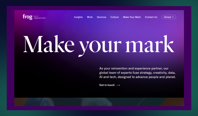
Frog is the ultimate partner for remarkable user experience design, combined with tech, data, and AI technologies to connect planets and people.
Within the latest customer-driven approach to emerging UX technologies, Frog delivers an intuitive design that goes beyond customer expectations.Their technical expertise and end-to-end design services are the most multinational companies, and Unilever and IKEA partner with them.
Bonus: Navigate and find the best UI/UX design agency near Atlanta.
3. IDEO
Location: San Francisco, California
Key services: UI/UX design, Product Design, Branding, UX consulting
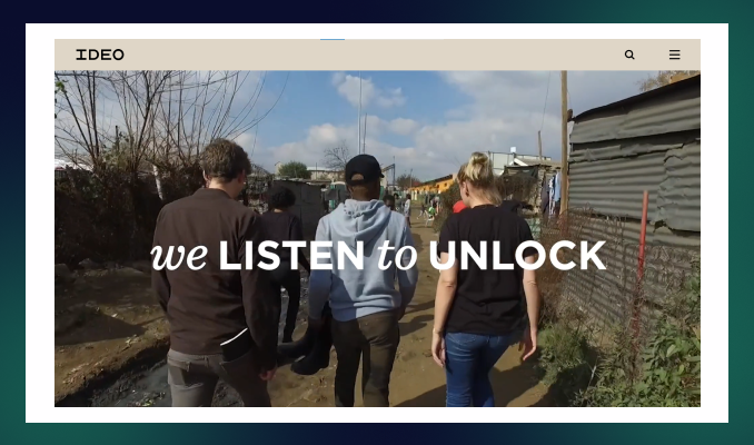
IDEO is a leading UI UX design service because of its innovative ideas and human-centred design that build a long-lasting digital product and overall user experience.
They help most reputable brands like Acer, Ford, and H&M to get a comprehensive digital experience with a complete branding approach and business consultation.
IDEO has served many industries with its exceptional future strategy, quick prototyping, and restless usability testing, accelerating transformation into new heights.
At IDEO, you'll get unique strategic marketing solutions, user experience design, and web and app development services for a long-term business.
4. Cleveroad
Location: Delaware, USA
Key services: Product design, branding, and information architecture.
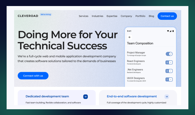
Cleveroad is a UI UX front-end development company designing exceptional mobile and web products.
Their unique motto is to design digital products while ensuring responsiveness across all devices.
Another thing is that Cleveroad provides a time-tested user experience, user interface design, and post-launch support—which is what many design services lack!
5. Think Company
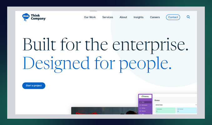
Location: Philadelphia, PA
Key services: UI and UX design, technology strategy and consulting, and accessibility and inclusion consulting.
Think Company is an ultimate UI UX design consulting service that provides world-class digital experiences for enterprise businesses.
Combining strategy, creation, and growth: Think Company excels in user research, redesigning existing final products, and creating digital concepts.
Even for complex industries such as finance, pharmaceuticals, telecommunications, and healthcare, their exceptional expertise gives them a new edge over competitors.
6. Intellectsoft
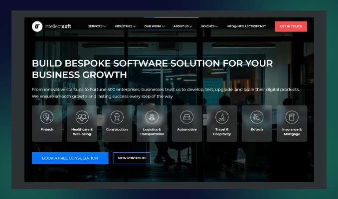
Location: New York, USA
Key services: UI/UX design and consulting, Mobile App development, Custom software development,
Intellectsoft is the best choice for UI & UX design services, specializing in potential software development solutions in today's AI technologies.
From simple mobile apps to cloud-based enterprise-level products, Intellectsoft excels in every complex product design with an innovative approach.
Their refined design process and seamless cross-platform utility accelerate revenue-generating web and mobile applications—no doubt.
7. Zazz
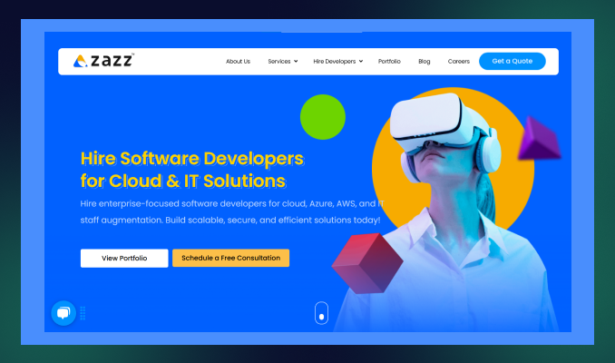
Location: Texas, USA
Key services: UI/UX development, information architecture, branding, and web development.
Zaaz is a leading UI/UX design service specializing in creating digital experiences within human psychology, user persona, and data-driven expertise.
Their high-fidelity prototype, cross-platform UX design, and brand-specific app solution reflect the dedication of the team Zaaz!
Within 14 years of experience, Zaaz earned an award-winning UI/UX design agency that released 763+ mobile apps successfully.
8. Designli

Location: Greenville, South Carolina
Key services: UX/UI design, mobile app development, cross-platform development.
The last UI/UX design services company on our list is Designli. This agency embraces new challenges by understanding development frustrations and providing the best possible solutions.
Designli has a full-time, dedicated product team and follows agile methodologies to bring transparent communication and faster delivery—which most agencies lack.
Designli specializes in in-depth user research, creating wireframes, responsive user experience design, and custom solutions to create a strong brand identity.
How to Find the Best UI/UX Design Service in the USA
See reviews and case studies
Check their expertise and experience within real customer reviews.
Identify how this service for designing user experiences solves the potential challenges and needs of the business.
Assess their portfolio
Track their previous projects and portfolios to investigate their design's visual appeal and usability.
Look for industry specialization
Industry expertise: The more crucial fact is before selecting the right design agency.
Partner with a UI/UX design agency with expertise in your industry-specific niche.
See their process and technical expertise
Check if they follow agile methodologies and robust design processes.
Do they conduct user research, prototyping, wireframing, UX audits, and user testability? Additionally, look for post-launch support and testing services.
Compare pricing and values.
Do not get caught in the trap of mouthwatering offers that may have hidden costs. Always go for a consultation first and then get a price transparency before handing over the project.
Why Choose ideapeel as the Best UI/UX Design Services & Consulting in the USA?
With thousands of options available, why should you choose ideapeel? Here's what sets us apart:
Proven records of completing 70+ projects
At ideapeel, we have helped over 70 business owners launch their products with the best user experience design and measurable, ROI-driven solutions.
Expertise across 15+ industries
We've worked with clients in diverse industries, including tech, SaaS, real estate, and 10+ more.
Our industry expertise solution helps us create the best UI/UX design that resonates with targeted audiences and maximizes engagement.
Custom UI/UX design services
Our dedicated team first schedules a free design consultation to understand your business goals and objectives.
Then, we provide a custom strategic approach that aligns with your brand identity and budget.
Robust design process and methodologies
We follow agile methodologies, a user-centric approach, and data-driven insights to ensure a seamless design process.
From user research to wireframing, prototyping, and user testability, our design team ensures that every step is optimized for performance and user satisfaction.
Technical proficiency
In the design process, we use industry-leading tools like Figma, Adobe XD, and Sketch, which are combined with front-end technologies.
Communication and Collaboration
We prioritize transparent communication and real-time feedback to eliminate any delay and frustration.
Therefore, we utilize tools like Asana, Trello, and Jira to streamline project management. So you can have real-time data on what's going on!
Comprehensive service offering
Besides UI/UX design services, ideapeel provides a wide range of services, including web development, SaaS development, branding, and SEO.
Partner with ideapeel and Get a Seamless UI/UX Design
Don’t let your user interface get stuck in heavy coding or overwhelming layouts without a clear, data-driven plan.
Share your project with us and watch your business grow.
Contact Us Today.
[[last-cta]]
Frequently Asked Questions (FAQs)
Enter your website URL to receive a detailed website analysis report in just 5 minutes!

Want to discuss your project?
Grow your project with Webflow Experts
Related Articles


Website redesign companies rebuild or rework an existing site to fix usability, speed, search visibility, and conversion problems. Most offer UX research, UI design, development, SEO migration, and support after launch. The right partner depends on your platform, industry, budget, and whether you need a full rebuild or targeted fixes.
That is the short version. Below you will find what redesign services actually include, a profile of well-known agencies, realistic costs and timelines, and a simple way to choose.
What does a website redesign company do?
A website redesign company takes a site that is already live and improves it. That usually means reworking the structure, layout, copy, visual design, and code, while protecting the search traffic the site has already earned.
A solid agency does not just change colors and fonts. It starts by finding out why the current site underperforms. Is the navigation confusing? Do visitors leave the pricing page? Is the site slow on mobile? The redesign then targets those problems.
If you are not sure what is broken, a UI/UX audit is a sensible first step. An audit diagnoses the problems and ranks them. A redesign fixes them. Many teams skip the audit and pay for a full redesign when a handful of targeted fixes would have done the job.
Website redesign services: what you are actually buying
Service lists look similar from agency to agency, so it helps to know what each item does for you.
SEO migration deserves extra attention. Google's own guidance on site moves with URL changes is a good benchmark. If an agency cannot explain its redirect and migration process clearly, treat that as a warning sign.
Top website redesign companies to consider
This list is not a ranking. Each agency is good at something different, so the useful question is which one fits your project. Figures such as ratings and minimum budgets come from public listings and change often, so check each agency's current profile on Clutch before you shortlist.
Here is the section with a few light additions, nothing heavy.
Top website redesign companies to consider in 2026
This list is not a ranking. Each agency is good at something different, so the useful question is which one fits your project, your budget, and your stage of growth. A few of these teams work best with early-stage startups, while others are built for large, multi-region rollouts. Read the "best for" line first, then check services against what your project actually needs.
ideapeel
.webp)
Best for: SaaS and B2B companies that want a UX-led redesign, especially on Webflow.
Services: website redesign, UI/UX design, Webflow development, UX audits, SEO-aware migration.
Why consider it: The process starts with diagnosis, then moves to design and build, so the redesign is tied to real usability findings instead of guesswork. This tends to shorten revision cycles later, since decisions are backed by data from the start.
What to expect: ideapeel combines UX research, data-driven design, Webflow development, and SEO considerations in one redesign process. Its portfolio includes SaaS, fintech, compliance, and other B2B projects, making it a practical option for companies that need more than a visual refresh.
When to choose it: Choose ideapeel if you want your redesign to improve usability, conversion potential, and search performance while keeping the entire design-to-development process connected.
[[inner-cta]]
Excited
Best for: SaaS, AI, and fintech companies.
Services: Web design, UX/UI design, UX research, branding, motion design.
Why consider it: It treats the website as part of the product experience and designs for clarity and conversion. Public listings show a minimum project size around $10,000.
Halo Lab
Best for: Startups and growth-stage tech companies that need speed.
Services: Web design, UX/UI, branding, front-end development.
Why consider it: A faster, leaner production model than large agencies, with a public starting budget near $10,000. Useful when you need a working redesign fast rather than a long strategic engagement.
Eleken
Best for: SaaS teams that want ongoing design help instead of a one-off project.
Services: UX/UI design, product design, interface design.
Why consider it: It works in a subscription style, so designers join your team's workflow. Good if your site and product need to look and feel consistent over time, not just at launch.
Brightscout
Best for: Developer tools and technology startups with complex products to explain.
Services: Web design, branding, UX/UI, product design.
Why consider it: Strong on messaging clarity. Listings show a starting budget around $25,000.
Ramotion
Best for: Tech companies that want branding and web design handled together.
Services: Web design, branding, UI/UX, product design.
Why consider it: Polished visual systems and consistent brand work across web and product. Expect a higher entry point, often cited near $50,000.
Huge
Best for: Large enterprises with multi-region sites and complex integrations.
Services: Web design, digital strategy, experience design, engineering.
Why consider it: Built for big stakeholder groups and long programs. Projects tend to be long and expensive, but the process is set up for that scale.
R/GA
Best for: Global brands running large digital platforms and campaigns.
Services: Web design, digital strategy, product design, innovation consulting.
Why consider it: Combines strategy, design, and engineering at enterprise scale.
AKQA
Best for: Large brands launching flagship digital experiences.
Services: Web design, experience design, digital innovation, product design.
Why consider it: Known for ambitious, creative work, and part of the WPP network.
ustwo
Best for: Organizations rethinking a digital service, not just a website.
Services: UX design, product design, web design, service design.
Why consider it: Research-heavy, human-centered process that suits complex user journeys, especially when the redesign touches more than just the marketing site.
Fantasy Interactive (Phantasy)
Best for: Consumer and entertainment brands that want expressive, story-driven sites.
Services: Experience design, web design, creative technology.
Why consider it: Visually bold flagship sites. It is less suited to conversion-focused SaaS marketing sites, so weigh this against your actual growth goals.
A quick pattern: if you are a startup or SaaS company with a budget under $50,000, look at Excited, Halo Lab, Eleken, Brightscout, or Ideapeel. If you are an enterprise with global requirements, Huge, R/GA, and AKQA operate at that scale. Somewhere in between, Ramotion and Brightscout can work well if branding and web design need to move together.
How to choose a website redesign company
Skip the "who is best" question and check these seven things instead.
- Industry experience. A team that has redesigned SaaS sites will understand pricing pages, demo flows, and trial funnels faster than a generalist.
- Proof, not portfolios alone. Ask for case studies with before and after numbers, such as conversion rate, load time, or organic traffic.
- Platform fit. If you want Webflow, check that the agency builds in Webflow daily, not occasionally.
- SEO migration process. Ask how they handle redirects, metadata, and internal links. A vague answer is a bad sign.
- Research before design. The best agencies want to see analytics, heatmaps, and user feedback before they open a design tool.
- Clear scope and pricing. You should know what is included, what costs extra, and how revisions work.
- Support after launch. Sites need fixes and iteration in the first 30 to 90 days. Ask what support looks like.
Another useful tip is to talk to a past client. Agencies that are confident in their work will connect you.
How much do website redesign services cost?
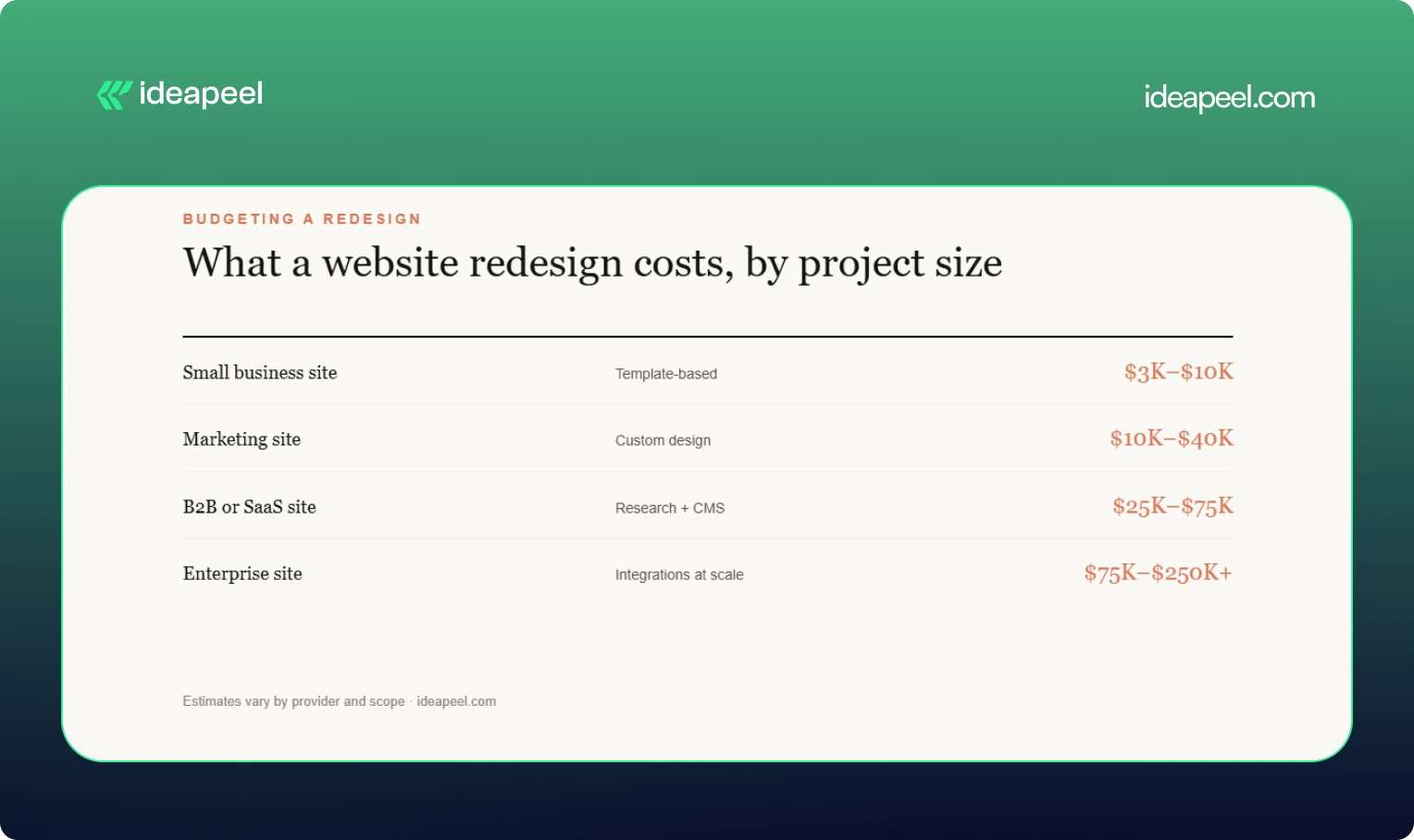
Short answer: most professional redesigns for business sites land between $5,000 and $100,000 or more, depending on scope. Treat the ranges below as estimates, since every provider prices differently.
What moves the price: number of pages, depth of UX research, custom UI design, animation, CMS setup, third-party integrations, copywriting, SEO migration, and ecommerce features.
Agency size matters too. Public listings show hourly rates from about $25 to $50 for lean studios and $150 to $200 or more for large global agencies. See our website redesign cost guide for a fuller breakdown.
How long does a website redesign take?
Most redesigns take between 6 weeks and 6 months. Small sites can launch in 4 to 8 weeks. Marketing and B2B sites usually need 8 to 16 weeks. Enterprise projects with research, migration, and integrations often run 4 to 6 months or longer. Delays mostly come from slow feedback and late content, not design work.
Website redesign vs. new website
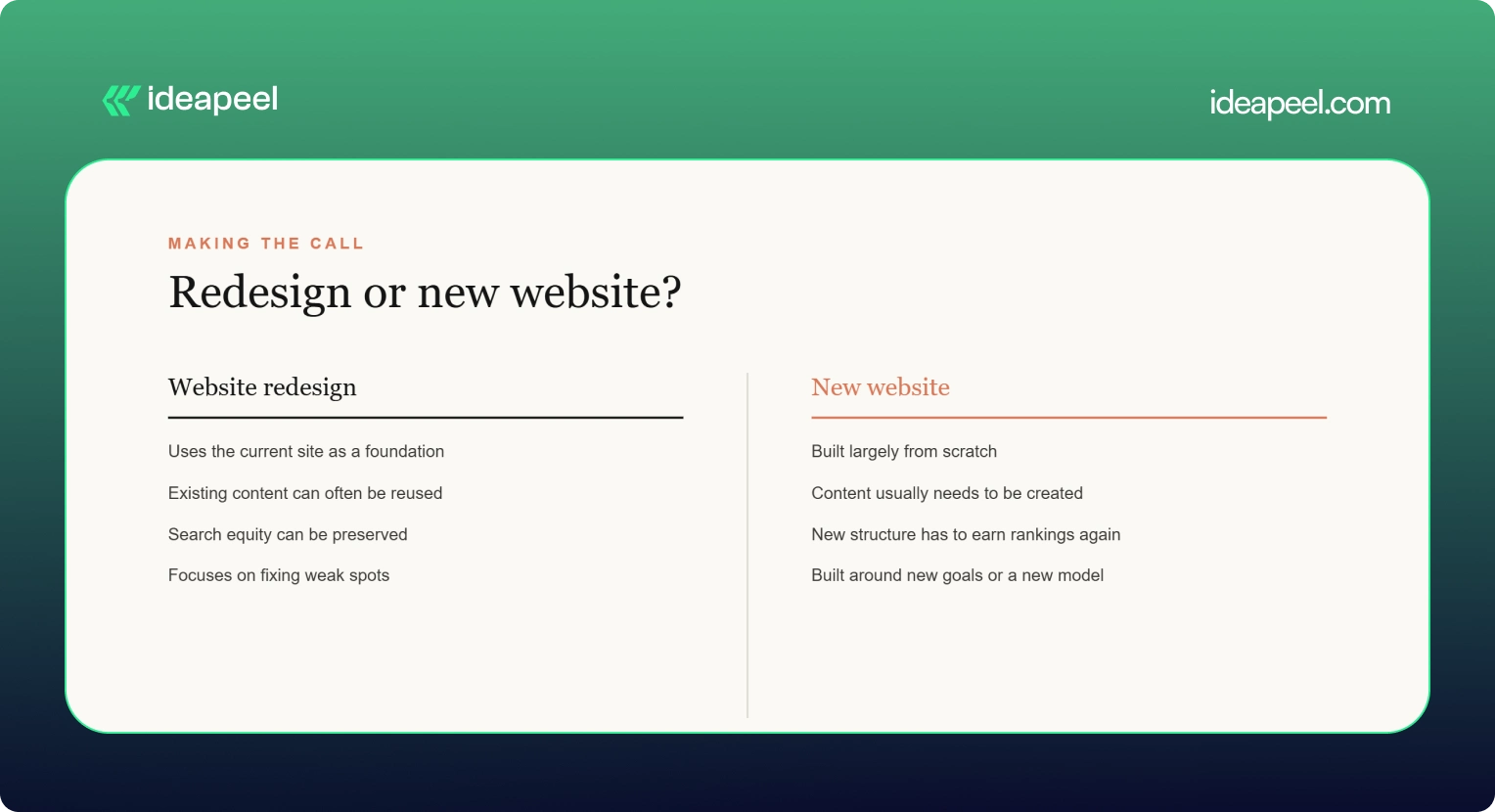
If your brand, product, or audience has changed a lot, a new website may make more sense. If the business is the same but the site underperforms, a redesign is usually cheaper and safer for SEO.
[[question-block]]
Signs it is time to redesign
- Bounce rates are high on key pages
- The site is slow or clumsy on mobile
- Your design looks dated next to competitors
- Leads or sign-ups have flattened
- Your team avoids updating the site because it is painful
- Core Web Vitals fail in PageSpeed Insights (see Google's Core Web Vitals overview)
If several of these apply, start with an audit and decide from there. That is why we suggest running a UX audit before a redesign: it shows whether you need a rebuild or a set of smaller fixes.
Common redesign mistakes to avoid
- Skipping redirects. This is the fastest way to lose organic traffic.
- Designing before researching. Pretty layouts do not fix confusing journeys.
- Ignoring accessibility. Check against WCAG from the start, not after launch.
- Launching without a plan for content. Late copy is the top cause of delays.
- Treating launch as the finish line. Plan for testing and iteration afterward. The Nielsen Norman Group has solid research on why redesigns should be ongoing.
Final thoughts
The best website redesign companies are the ones that match your goals, platform, and budget, not the ones with the biggest names. Diagnose first, shortlist three or four providers, ask hard questions about migration and results, and choose the team that answers clearly.
If you want a partner that starts with diagnosis and builds around real user data, take a look at ideapeel's website redesign services or book a consultation.
[[last-cta]]
If your website or product gets traffic but visitors leave without converting, the problem usually isn't your offer. It's your interface. A UI/UX audit finds exactly where users get stuck, confused, or annoyed, and gives you a clear list of what to fix first.
This guide covers what a UI/UX audit actually includes, how the process works, what it costs based on real market data, and how to pick the right UI/UX audit agency for your website or SaaS product. It's written by the team at ideapeel, a Webflow development agency for B2B, SaaS and enterprise companies that runs UI/UX audits and Webflow builds for growing teams every week.
What Is a UI/UX Audit?
A UI/UX audit is an expert review of your website, product, or app. It checks how the interface looks (UI) and how it actually works for real users (UX), then hands you a prioritized report of what's broken and what to fix first.
A good audit looks at:
- Visual design and layout
- Navigation and information architecture
- User flows and conversion paths
- Mobile experience
- Accessibility
- Page speed and technical friction
- How your site compares to competitors
Any team with live traffic, sign-ups, or users but underwhelming results is a good candidate. That includes SaaS products with high churn, websites with strong traffic but weak conversion, and apps where users drop off mid-flow. A UI/UX audit is usually the fastest, cheapest way to find out why, well before anyone commits to a full redesign.
UI audit vs UX audit. A UI audit looks only at the interface: layout, typography, color, spacing, and consistency. A UX audit looks at the full experience: navigation, flows, usability, and conversion. Most professional audit services combine both, which is why the service is usually called a UI/UX audit rather than just one or the other.
What Does a Professional UI/UX Audit Include?
This is the part that matters most when you're comparing UI/UX audit services, because it tells you exactly what you're paying for.
UI Design Review
A trained eye goes through your visual hierarchy, typography, color use, spacing, and component consistency. This catches the small inconsistencies that quietly make a site feel unpolished or untrustworthy.
UX & Usability Review
This covers navigation, information architecture, friction points, and interaction patterns. Note that a UX audit is not the same thing as usability testing. An audit is an expert review done by a UX professional; usability testing involves watching real users complete tasks on your site. Many full audits include a round of light usability testing as one part of the process, but the two are different services.
User Flow Analysis
The auditor maps your key journeys, sign-up flows, checkout paths, and navigation routes to find exactly where users drop off and why.
Conversion & CTA Review
This looks at CTA visibility, button hierarchy, form design, landing pages, and anything creating friction between a visitor and the action you want them to take.
Mobile UX Review
Since most traffic is mobile, this checks tap targets, responsive layout breakpoints, load speed, and mobile-specific usability issues that desktop testing misses.
Accessibility Review
This checks color contrast, keyboard navigation, screen reader compatibility, and general WCAG alignment. Accessibility issues are also legal and reputational risk, not just a UX nicety.
Analytics & User Behavior Analysis
If you have Hotjar, GA4, or similar tools connected, a good auditor pulls real behavior data, heatmaps, and session recordings to back up their findings with evidence instead of opinion.
Competitive UX Analysis
The auditor benchmarks your product or site against direct competitors, so recommendations are grounded in what's actually working in your market, not generic best practice.
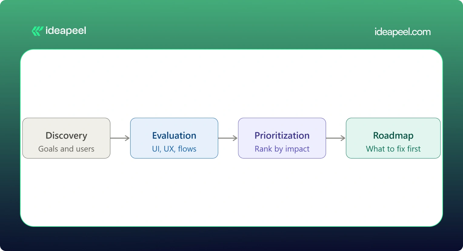
UX Audit Service Process: From Research to Action Plan
Here's what actually happens when you hire someone for a UI/UX audit, step by step:
1. Discovery & Business Goals
The auditor starts by understanding your business goals, not just your interface. What counts as success: more demos booked, higher activation, lower churn, more sign-ups?
2. User & Audience Analysis
Who actually uses your product, and what are they trying to do? This shapes everything that follows.
3. UI Evaluation
A full pass through the visual design against your goals and your users' expectations.
4. UX & Usability Evaluation
A heuristic review of navigation, structure, and usability against established UX principles.
5. User Flow Analysis
Mapping the paths users actually take, and where they abandon them.
6. Conversion Analysis
Looking specifically at where and why conversion drops off.
7. Competitive Benchmarking
Comparing your experience against direct competitors and category leaders.
8. Issue Prioritization
Every issue gets ranked by severity and business impact, not just listed in the order it was found.
9. Recommendations
Specific, actionable fixes tied to each issue, not vague advice like "improve usability."
10. UX Improvement Roadmap
A sequenced plan showing what to fix first, what can wait, and what requires bigger structural changes.
[[inner-cta]]
How Much Does a UI/UX Audit Cost?
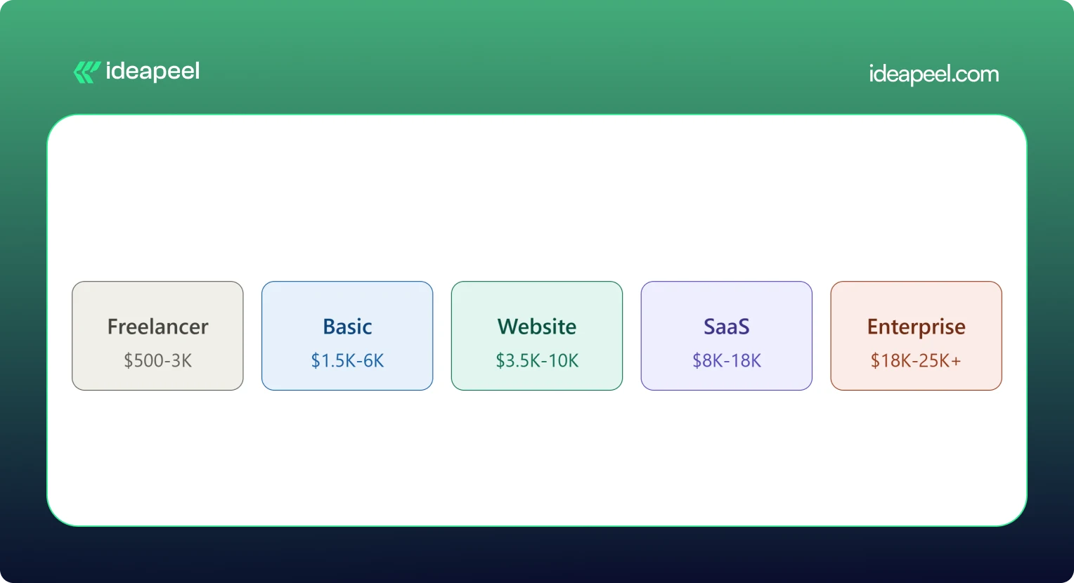
A UI/UX audit typically costs between $500 and $25,000 or more. A solo freelancer doing a single-flow review might charge as little as $500. A full enterprise audit with live user testing and multiple user roles can run $18,000 to $25,000 or higher. Most small and mid-size businesses land somewhere between $3,500 and $18,000 for a complete website or SaaS product audit.
What Factors Affect UI/UX Audit Cost?
Price moves based on:
- Website or product size
- Number of screens and pages
- Number of user flows and personas
- Product complexity (simple marketing site vs. multi-role SaaS dashboard)
- How deep the research goes
- Whether analytics review is included
- Whether live usability testing is included
- Competitive research scope
- Number of deliverables (report only vs. report plus roadmap plus redesign proposals)
Pricing data collected from agency rate cards, freelance marketplaces, and published cost guides shows a consistent pattern: cost scales with scope and testing depth, not agency size alone. A UX audit cost breakdown from Design Studio UI/UX puts full audits with heuristic review, session analysis, and real user testing at $8,000 to $18,000, with enterprise audits running $18,000 to $25,000 and up. Parallel HQ's product design cost guide lists UX audits from $3,500 to $10,000, usually delivered in two to four weeks. On the freelance side, listings on Upwork and Contra show independent UX consultants pricing single-flow or single-page audits from $500 to $3,000. On the agency side, Musemind's UX audit agency pricing starts around $10,000 with hourly rates of $50 to $99, plus subscription-style UX plans from roughly $2,600 a month, and Dribbble's UI/UX agency cost guide puts experienced US agency hourly rates at $100 to $250.
.webp)
Basic UI/UX Audit
$1,500 – $6,000. Covers a heuristic review of your core screens, a prioritized issue list, and general recommendations. Good for a quick gut check before deciding whether a bigger project is worth it.
Website UX Audit
$3,500 – $10,000. Adds user flow mapping, conversion review, and often a light round of usability testing. This is the most common package for marketing sites and lead-gen websites.
SaaS UX Audit
$8,000 – $18,000. Covers multiple user roles, onboarding, dashboard UX, and competitive benchmarking against other SaaS products in your category. Built for B2B products with more than one user type.
Comprehensive UI/UX Audit
$18,000 – $25,000+. Includes live user testing, deep analytics review, multiple personas, and a full improvement roadmap. This is the right fit for enterprise products or platforms where usability issues carry real revenue risk.
If a package price feels too broad for your situation, ask for an hourly or scoped quote instead. Most UI/UX audit companies will price a smaller, single-flow engagement if you only need to hire a UX designer for an audit of one specific part of your product.
What Do You Get From a UI/UX Audit?
This is what separates a real audit from a vague opinion document.
If a provider's audit doesn't include most of this list, ask what you're actually paying for. ideapeel's UI/UX design service builds every audit around this exact structure, so findings turn into a working plan instead of a PDF that sits unread.
When Should You Hire a UI/UX Audit Agency?
Some teams run a quick DIY checklist audit themselves first, which is a fine starting point. But a DIY review usually misses the objectivity, testing tools, and pattern recognition a professional brings from auditing dozens of other products. Here's when it's worth hiring a UI/UX audit agency or consultant:
Your Website Gets Traffic but Does Not Convert
Steady visitors, flat conversion. That gap almost always points to a UX problem, not a traffic problem.
Users Struggle With Navigation
Support tickets or feedback keep mentioning that people "can't find" something. That's a navigation and information architecture issue an audit will surface fast.
Your SaaS Onboarding Has Friction
If new users sign up and never activate, onboarding is usually the leak.
Product Adoption Is Low
Features get built but nobody uses them. Often this is a discoverability problem, not a demand problem.
You Are Planning a Website Redesign
Never redesign blind. An audit tells you what's actually broken before you rebuild it.
Paid Traffic Is Not Converting
If you're paying for clicks that don't turn into leads, the landing experience is the first place to look.
Customers Report Usability Problems
Direct feedback is a strong signal. An audit turns scattered complaints into a structured fix list.
Your Website Looks Outdated
Dated design quietly erodes trust, especially for B2B buyers comparing vendors.
You Are Launching a New SaaS Product
A pre-launch audit catches usability issues while they're still cheap to fix.
You Need an External UX Perspective
Internal teams get too close to their own product. A fresh, objective review often finds what everyone inside the company has stopped noticing. [[question-block]]
UI/UX Audit vs. Website Redesign
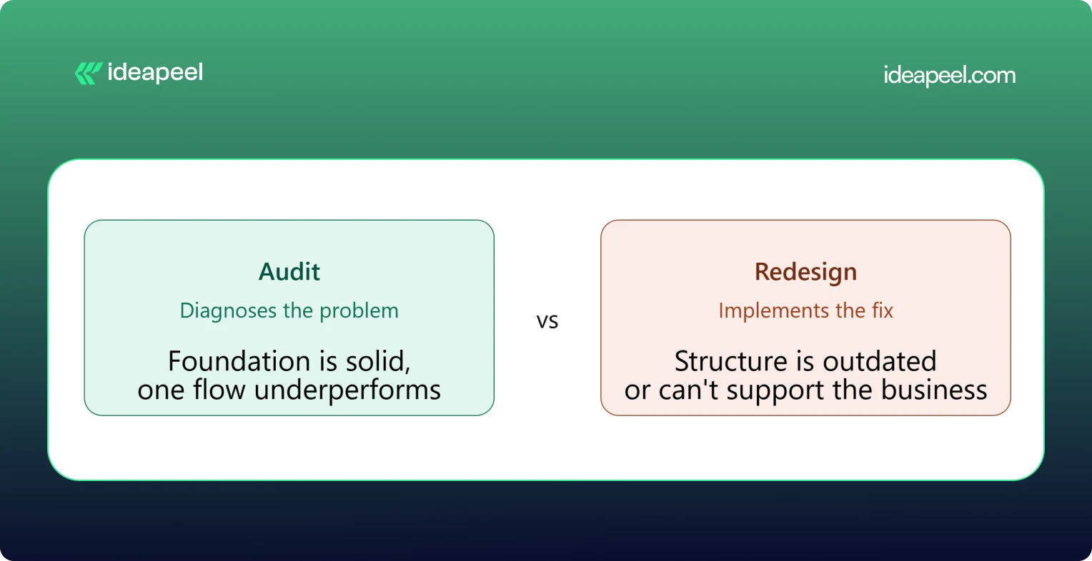
The simplest way to think about this: an audit diagnoses, a redesign implements.
When You Only Need a UI/UX Audit
Your foundation is solid but something specific is underperforming, like a checkout flow or a signup form. Fix the specific problem rather than rebuilding everything around it.
When You Need a Website Redesign
The structure itself is outdated, the brand has changed, or the site can't support what the business needs now. A patch won't fix a foundational problem.
When You Need an Audit Before a Redesign
This is the smart default for most teams. An audit tells you exactly what to change and why, so the redesign budget goes toward fixing real problems instead of guessing.
UI/UX Audit Agency vs. Freelancer
Both can do good work. The right choice depends on your product's complexity and what you need beyond the audit itself.
Neither option is universally better. A freelancer can be the right call for a single-flow review on a tight budget. An agency tends to make more sense for a multi-role SaaS product, where UI, UX, research, and implementation all need to work together.
How to Choose a UI/UX Audit Agency
This is the section that matters most once you're actually comparing providers.
Check Their UX Methodology
Ask how they structure an audit. A vague answer is a warning sign. A strong provider can walk you through their process step by step.
Review Previous Audit Work
Ask to see a sample report. This tells you more than any pitch deck about the quality and depth you'll actually get.
Look for Industry Experience
A UX audit company that's worked on B2B SaaS products understands onboarding, activation, and dashboard UX in a way a general design shop may not.
Check Their UI + UX Expertise
Some providers are strong on visuals but weak on usability, or the reverse. You want both covered.
Ask What the Deliverables Include
Compare this against the deliverables table above. Screenshots, severity ratings, and a roadmap should be standard, not an upsell.
Understand Their Pricing Model
Flat project fee, hourly rate, or retainer? Match the model to how you actually want to work and budget.
Ask How Findings Are Prioritized
A pile of 40 unranked issues isn't useful. You want to know what to fix first and why.
Check Whether They Support Implementation
Some UI/UX audit services stop at the report. Others, like ideapeel, can move straight from findings into Webflow development and design implementation, so the fixes actually ship.
UI/UX Audit for B2B SaaS
SaaS products carry extra UX complexity that a generic website audit won't catch. A dedicated SaaS UX audit should cover:
SaaS Website UX
How the marketing site sets expectations before someone ever logs in.
Product Interface
The core UI users interact with daily once they're inside the product.
Dashboard UX
Whether the dashboard surfaces the right information without overwhelming the user.
SaaS Onboarding
The first-run experience that determines whether a trial user ever becomes a paying customer.
Signup Experience
Friction in the signup form is one of the most common, and most fixable, leaks in a SaaS funnel.
Pricing UX
Whether your pricing page actually helps people choose a plan, or just confuses them.
Feature Discovery
Whether users can find the features that would make them stick around.
Navigation
How easily users move between the areas of a complex, multi-role product.
User Activation
The specific moment a new user experiences real value for the first time.
Conversion Flows
Every point where a free user is nudged toward becoming a paying one.
Teams building or scaling B2B products can see how this fits into a broader growth plan on ideapeel's SaaS design and development page.
Webflow UI/UX Audit
If your site or product runs on Webflow, a Webflow-specific UX audit adds a few extra layers on top of a standard review: CMS structure, symbol and component consistency, interaction and animation performance, responsive breakpoint behavior, and page speed inside the Webflow environment.
This matters because a Webflow UX audit doesn't just tell you what to fix, it tells you how to fix it inside the platform you're already using, without a rebuild. ideapeel runs UI/UX audits and Webflow design and development work side by side, so audit findings turn directly into shipped Webflow changes instead of a report that needs a second agency to execute.
What Makes a Good UI/UX Audit?
A strong audit should be:
- Evidence-based
- Prioritized
- Actionable
- Business-focused
- User-focused
- Specific
- Easy to implement
The real value of a UI/UX audit isn't a long list of everything that could theoretically be better. It's finding the small number of problems that are actually costing you conversions or users, and giving your team a clear, ordered path to fix them.
Ready to See What's Costing You Conversions?
A UI/UX audit is one of the fastest ways to find out why your traffic, sign-ups, or trials aren't turning into revenue. ideapeel, a Webflow development agency for B2B, SaaS & Enterprise, has delivered 170+ branding, Webflow, and UI/UX projects with a 98% client satisfaction rate and $500M+ in revenue generated and influenced for clients.
Book a free strategy call to talk through your website or product and find out what a UI/UX audit would look like for your team.
[[last-cta]]

The best B2B websites don't win because they look modern. They win because they explain a complex offer in seconds, build trust before anyone talks to sales, and give every visitor an obvious next step. That combination of clarity, credibility, and a clear path forward is what separates a good-looking B2B website from one that actually generates pipeline.
Below are 10 real B2B website design examples worth studying, each broken down the same way: what the company does, why the design works, and the one design lesson you can steal for your own site. Four are Webflow redesign projects from our own studio, ideapeel, and the rest are well-known B2B and SaaS brands chosen because their homepages are genuinely instructive, not just pretty.
What Makes a Great B2B Website?
A great B2B website clearly explains what the company does, who it's for, and why it's credible then makes the next step obvious. In practice, that usually comes down to seven things:
- A clear value proposition in the hero section, readable in under five seconds
- Simple, jargon-light messaging that doesn't assume the visitor already understands the product
- A logical information hierarchy that goes from "what is this" to "how does it work" to "why should I trust you"
- Easy navigation that doesn't force visitors to hunt for pricing, product details, or contact info
- Trust signals client logos, testimonials, case studies, certifications, or real metrics
- Product or service clarity, especially for technical or unfamiliar offerings
- Conversion-focused CTAs that match where the visitor actually is in their decision, not just "Book a Demo" on every button
B2B buying decisions usually involve multiple stakeholders and a longer sales cycle than B2C, so the website has to do more persuading before a human ever gets involved. Every example below earns its place because it handles at least one of these jobs unusually well.
10 Best B2B Website Design Examples
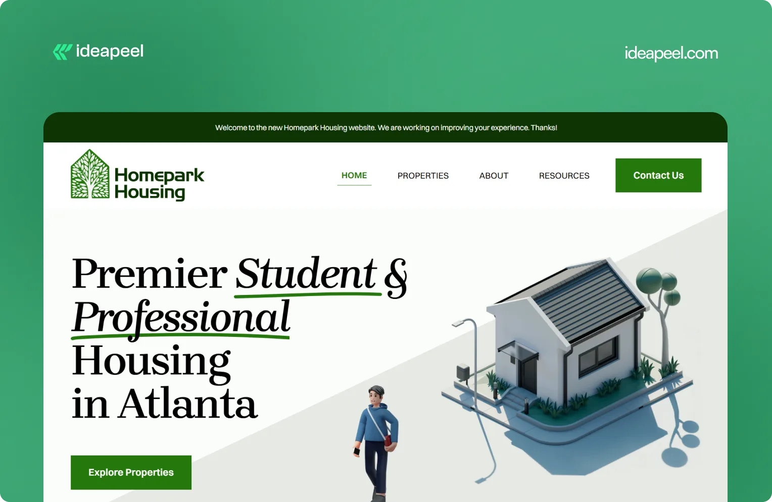
1. Homepark Housing: Comfortable Living
Industry: Real estate
What they do: Homepark Housing provides secure, modern, and strategically located housing designed around the needs of young professionals. Its offering includes affordable housing, flexible leasing options, personalized tenant support, and 24/7 maintenance.
Why the design works: Real estate is a high-consideration purchase. Visitors need to know where the properties are, whether the pricing works for them, what support is available, and whether they can trust the company to deliver a reliable living experience. Homepark's website puts those practical needs at the center of the experience instead of relying only on property imagery.
Key design lesson: When visitors are making a decision involving money, location, and long-term commitment, answer their practical questions early. Clear information about support, pricing, location, and the overall experience can build more trust than visual design alone.
View the Homepark Housing case study
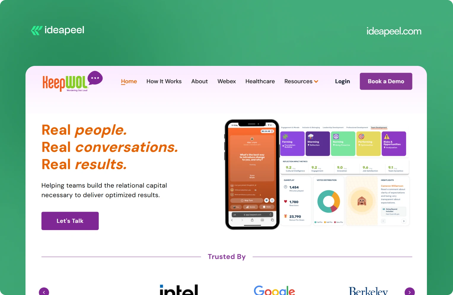
2. KeepWOL: SaaS Team Analytics Platform
Industry: SaaS, team performance, and people analytics
What they do: KeepWOL helps organizations improve team performance, relationships, engagement, and development through interactive experiences, analytics, and action plans. Its platform combines live sessions with measurable insights across areas such as team dynamics, engagement, innovation, cultural intelligence, and job satisfaction.
Why the design works: KeepWOL has a difficult product to communicate because team relationships and workplace culture aren't as visually obvious as a CRM dashboard or payment platform. The website solves this by turning abstract benefits into a structured journey: experience, reflect, and grow.
Key design lesson: If your product solves an intangible problem, make the value measurable. Show the process, outcomes, metrics, and evidence that connect your product to a business result.
View KeepWOL
3. CarWise: AutoTech Marketplace
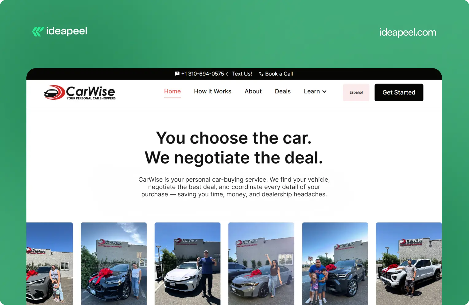
Industry: AutoTech and automotive services
What they do: CarWise helps people navigate the car-buying process through expert negotiation, pricing guidance, financing support, and personal assistance.
Why the design works: Buying a car involves money, uncertainty, and a lot of competing information. That makes trust one of the most important parts of the website experience.
CarWise approaches the problem by making the process easier to understand. Instead of overwhelming visitors with automotive terminology, the experience focuses on the practical journey from finding a vehicle to negotiating and completing the purchase.
Key design lesson: In industries where visitors naturally have trust concerns, transparency should be part of the design. Explain the process, show how the service works, and make the human value behind the product obvious.
View the CarWise case study
4. Glo Dollar: Fintech / Stablecoin Platform
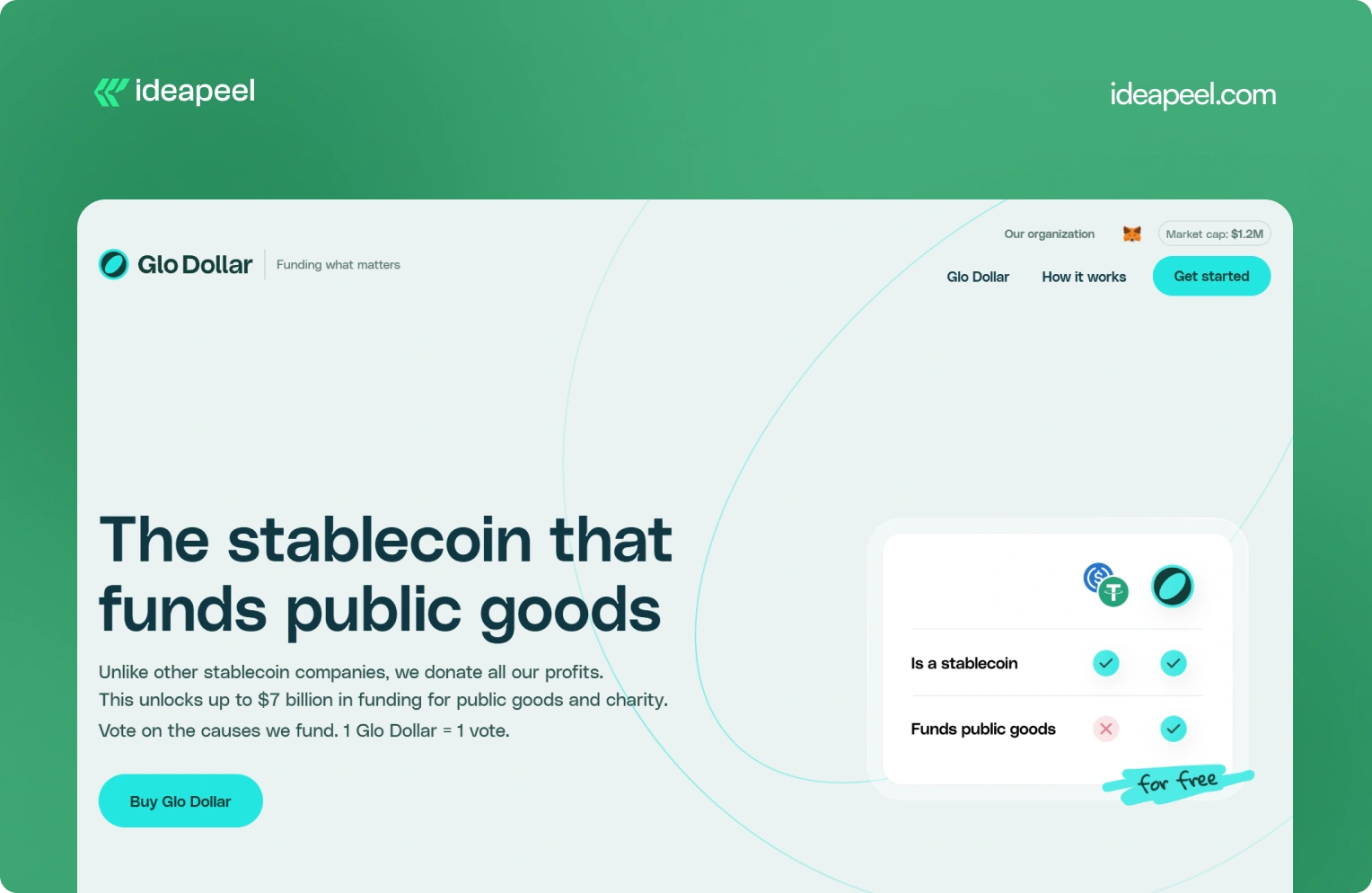
Industry: Fintech, blockchain, and stablecoins
What they do: Glo Dollar is a stablecoin designed so that profits from its reserves are donated to public goods and charitable causes. The website explains the model as a sequence: the fiat backing generates revenue, the profits are donated, and users can support causes at no additional cost.
Why the design works: Financial products are already difficult to explain. Add blockchain and philanthropy to the equation and the communication challenge becomes even bigger.
Glo Dollar handles that complexity by breaking the concept into smaller ideas. Instead of asking visitors to understand the entire financial model immediately, the website explains how the product works step by step.
Key design lesson: When your product combines several unfamiliar concepts, don't explain everything in one block of content. Sequence the information. One clear idea per section makes complicated products much easier to understand.
Visit Glo Dollar
5. BrickYard: Crafting Modern Architecture
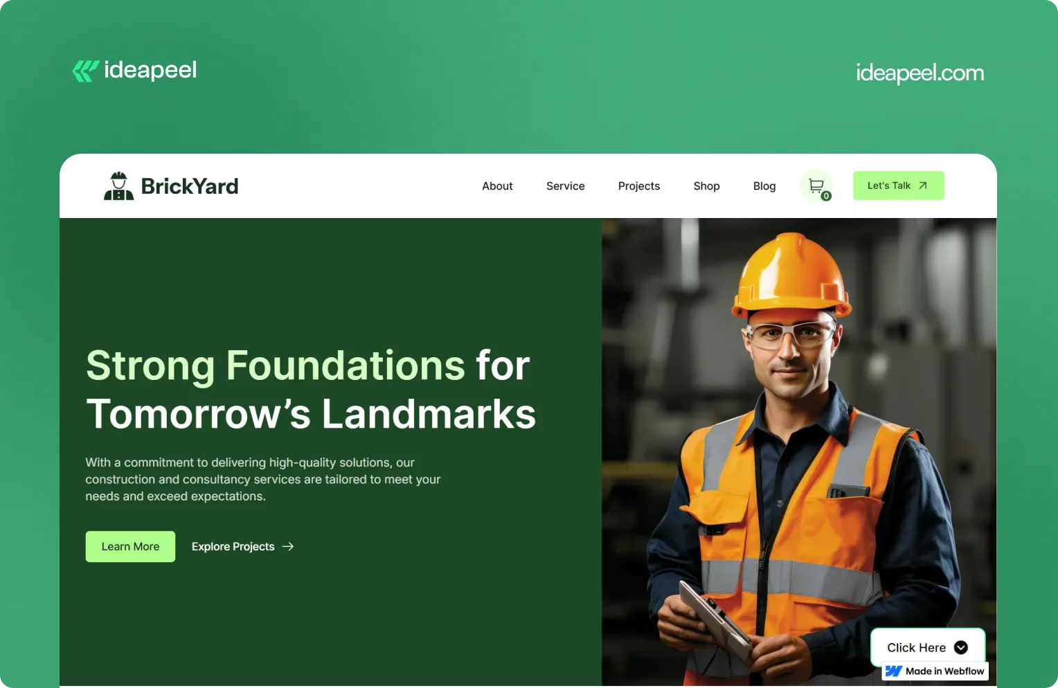
Industry: Construction, architecture, and design
What they do: BrickYard is a modern Webflow template designed for construction companies, architects, and design professionals. It focuses on showcasing services, projects, and professional work through a clean, responsive structure.
Why the design works: Construction and architecture websites need to balance two things: visual presentation and practical information. The work needs to look impressive, but potential clients also need to understand services, previous projects, capabilities, and how to get in touch.
BrickYard handles that through a minimalist visual system combined with dedicated pages for services, projects, blog content, contact information, and other business needs. The template is also designed to be customizable, responsive, SEO-focused, and CMS-ready.
That structure makes it useful beyond a single visual concept. Businesses can adapt the framework to their own services and content without rebuilding the entire site.
Key design lesson: Good website design isn't only about the homepage. Build a flexible structure that gives visitors the information they need while making it easy for the business to expand the site later.
View the live BrickYard template
6. Reliacare: Health and Wellness Website Template
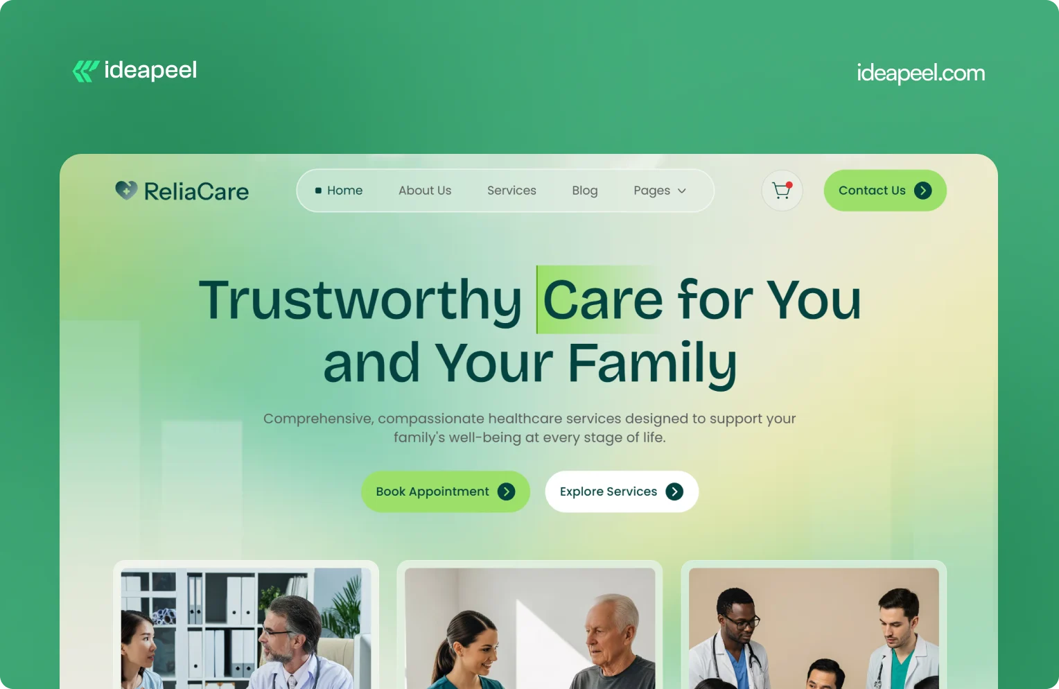
Industry: Health, wellness, and medical
What they do: Reliacare is a Webflow website template designed for health, wellness, and medical businesses that need a professional digital presence.
Why the design works: Health-related websites have a different trust challenge from many other industries. Visitors may already be uncertain, concerned, or looking for reliable information. A website that feels chaotic or overly decorative can make that uncertainty worse.
Reliacare takes a cleaner approach. The design gives services, information, and credibility room to breathe instead of filling every section with visual elements.
Key design lesson: For healthcare, wellness, and other trust-sensitive industries, restraint can be a design advantage. A clean interface with clear information often communicates confidence better than unnecessary visual complexity.
View Reliacare
7. StagePro: Events and Conference Website Template
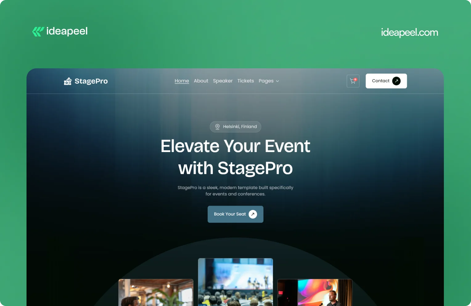
Industry: Events, conferences, summits, and workshops
What they do: StagePro is a Webflow template designed for event organizers, conference teams, summits, workshops, and other event-based businesses. It includes CMS-powered speakers, schedules, sponsors, blogs, ticket pages, and registration sections.
Why the design works: Event websites have to do several jobs at once. They need to create excitement, communicate important information, introduce speakers, explain schedules, and ultimately encourage people to register.
StagePro separates these needs into clear sections instead of trying to put everything into one message. The CMS structure also makes it easier to manage speakers, sessions, sponsors, and other event content as the website grows.
The result is a website structure that supports both the emotional side of an event and the practical information visitors need before registering.
Key design lesson: When a website has multiple conversion goals, don't mix everything together. Give each major goal a clear place in the information hierarchy.
8. Famous Tracker: Grow Fast Connection
Industry: SaaS and influencer marketing intelligence
What they do: Famous Tracker helps brands detect notable influencer purchases in real time and turn those signals into outreach opportunities. The platform provides automated detection, real-time notifications, influencer profiles, and tools for brand engagement.
Why the design works: Famous Tracker is built around a workflow that many visitors may not immediately understand. The website therefore needs to explain not just what the product is, but what happens after someone uses it.
The design makes the workflow easier to follow by connecting detection, notification, influencer information, and outreach. That helps turn an unfamiliar product category into a practical business process.
Key design lesson: If your product automates a process that visitors currently handle manually, show the workflow. Make it clear what happens before the product, what the product changes, and what the user can accomplish afterward.
View the Famous Tracker case study
[[question-block]]
9. Metrocard: Technology Website Template
Industry: Fintech and financial technology
What they do: Metrocard is a Webflow template designed for fintech, banking, investment, and financial service businesses. It uses a streamlined single-page structure with responsive design, intuitive navigation, SEO-focused structure, and customizable components.
Why the design works: Financial websites need to communicate credibility without making the experience difficult to navigate. Metrocard keeps the structure relatively focused, making it suitable for businesses that need to present a financial product or service without requiring a large multi-page website.
Its Webflow structure includes responsive navigation, CMS functionality, reusable components, forms, interactions, and responsive layouts.
Key design lesson: Not every B2B website needs dozens of pages. If the business has a focused offer, a well-structured single-page or compact website can communicate the value proposition without unnecessary complexity.
10. Moontide: Turning Dreams Into Reality
Industry: SaaS, founder funding and support
What they do: Moontide Capital connects immigrant founders with funding, legal support, and community networks to help them launch and scale startups.
Why the design works: This site has to build trust with a genuinely underserved audience while also proving credibility to investors and partners. The design keeps the process transparent from first meeting through due diligence, and leads with mission and impact before asking anything of the visitor..
[[inner-cta]]
B2B Website Design Best Practices
If you're planning a new B2B site or a redesign, these are the practices that show up consistently across the examples above:
- Lead with a specific value proposition, not a generic tagline. "We help B2B teams cut deal cycles by 40%" beats "The future of sales."
- Put your hero section to work. It's the highest-traffic real estate on the entire site. Don't waste it on abstract imagery with no message.
- Design for multiple stakeholders. B2B buying decisions often involve a technical evaluator, a budget owner, and an end user. Make sure each can find what they need.
- Use real product visuals wherever possible instead of stock photography or generic illustration; it builds more trust and helps visitors understand the actual product.
- Keep navigation goal-oriented. Organize menus around what visitors are trying to do (see pricing, understand the product, read case studies), not around internal department names.
- Add trust signals throughout the page, not just in one "logos" section testimonials and proof work best when they appear near the claim they're supporting.
- Make load speed part of the design brief. A fast, clean site reinforces credibility before a single word is read.
- Match your CTA to buyer intent. A first-time visitor and a returning, bottom-funnel visitor shouldn't see the same "Book a Demo" button in the same place.
How to Apply These Ideas to Your Own Website
You don't need to redesign everything at once. A practical way to start:
- Audit your homepage against the list above. Can a first-time visitor explain what you do after five seconds on the page?
- Identify your biggest trust gap. Is it a lack of proof, unclear pricing, or too much jargon? Fix the single biggest gap first.
- Map your navigation to buyer goals, not your internal team structure.
- Simplify one complex page at a time, following the "one idea per section" approach used by ZipID and Glo Dollar.
- Test your CTAs by funnel stage rather than repeating the same button everywhere.
Final Thoughts
The common thread across every example above isn't a specific color palette or layout trend, it's clarity. The best B2B websites make it easy to understand the offer, easy to trust the company, and easy to know what to do next. That's a strategy decision as much as a design one.
Need a B2B website that converts? If your current site isn't doing that job or you're planning a redesign and want it built around UX and conversion from the start, explore ideapeel's B2B website design work or book a strategy call to talk through your project.
Related Reading
- The UX Design Process: An Easy-to-Follow 8-Step Guide
- 10 Different Types of Websites With Examples
- Webflow Development Cost in 2026
- UI/UX Audit Checklist for B2B & SaaS
- ideapeel's UI/UX Design Services
- ideapeel's Webflow Development Services
[[last-cta]]