Wix to Webflow Migration: [8 Easy Steps]


Key Takeaways
The global low-code platform market is forecast to amount to approximately 65 billion U.S. dollars by 2027, highlighting the growing reliance on such technologies in today's marketing landscape.
When the conversation turns to low-code or no-code website builder opinions, two names often emerge as tough contenders: Wix and Webflow.
While both platforms feature an intuitive layout and a beginner-friendly platform, Wix users like you struggle with website issues like unresponsive design, slow site speed, and fewer customization options.
Webflow is a power-packed solution that addresses these issues by offering every feature that is somewhere missing in Wix! So, how do you migrate from Wix to Webflow?
In this article, you'll get a quick guideline on effortless Wix to Webflow migration with practical tips. So, stay tuned.
Benefits of Using Webflow Over Wix
Is migrating a Wix website to Webflow a worthy decision? Let's decide clearly with a scenario of Webflow advantages over Wix.
1. More design flexibility
Wix is a user-friendly and quick option to create generic websites. And its advantages stop here.
Meanwhile, Webflow enables the creation of highly bespoke and responsive designs with plenty of customization. It is user-friendly, and you have complete control over layout, styling, and animation. Webflow offers more design flexibility and custom code to build a unique website.
2. Responsive design
One area where Wix often falls short is responsive design, where Webflow excels.
Generally, Wix doesn't produce responsive websites. Their builder relies on an old model where they used to create two separate websites—one for desktop and another for mobile users.
In contrast, Webflow features a fully responsive design. It is designed with device-specific breakpoints and tools like Flexbox or Grids that ensure elements resize perfectly.
3. Better SEO control
Again, Webflow offers convenient on-page editing and advanced SEO settings like custom meta tags, alt attributes, and 301 redirects, all with complete control over HTML.
Wix has limited control over SEO from its journey. So, switching from Wix to Webflow can benefit you by generating traffic and driving sales.
4. Fast-loading performance
Faster loading speed is another crucial factor for SEO rankings.
Webflow provides cleaner code, which results in faster loading speed. It's a fully power-packed website design with HTML, CSS, and JavaScript. So, you don't have issues with slow performance at all.
Wix is considered a heavier codebase platform that leads to slower site speed.
5. Offers scalability
Webflow offers excellent scalability for growing businesses or complex projects.
With Webflow, you'll get an advanced CMS collection, e-commerce features, and a high level of integration to grow your business. Wix is a good choice for small- to medium-sized business websites.
Explore more on Wix vs. Webflow to get valuable insights!
How to Migrate from Wix to Webflow: Step-by-Step Guide
Moving your website from Wix to Webflow requires a complex procedure that is only managed through technical expertise.
From redesigning the entire website to exporting all content to Webflow, ideapeel maintains a tight schedule and quality transformation without hassle.
Let's find out how the migration project works with ideapeel:
Step 1. Planning your migration
Before moving the website from Wix to Webflow, back up your data first; it'll ensure that you won't leave anything that needs to be exported.
- Go to CMS in your site's dashboard.
- Select More Action
- Now, click Backup
In this stage, we first analyze your current Wix site. Then, outline your website conversion challenges and the desired outcome so that your business goal remains the same without the effect of transition.
Step 2. Export content from Wix
Next, list the URLs, content, images, and videos you want to export from Wix.
Since Wix doesn't offer the ability to migrate your content directly to Webflow, we manually export all selected content to Webflow, ensuring a smooth transition and speeding up the content migration process.
Step 3: Design your Webflow site
You can either redesign a fresh, structured Webflow design. Or, recreate the current Wix website on Webflow.
At ideapeel, our Webflow developer team closely works with your assistance and approaches the best design strategy that aligns with your brand identity.
While redesigning or recreating a new design, we implement the same structure and aesthetics of your existing Wix site. Your regular visitor will get the same vibrancy on the new website. It'll make it easier for users to find older content or information as before.
That's not all. We focused more on the failings of existing website design and then improved the navigational and visual quality.
Step 4: Import content to Webflow
We import your site's content to Webflow and ensure nothing is left behind. Also, we assure you about the maintenance of specific website features.
Text: Move text from Wix to Webflow CMs and static pages.
Images: Download images and re-upload them to the Webflow Asset Manager.
Blog post: Export blog posts into a CSV file and import the CSV file into the CMS collection of Webflow.
Step 5: Ensure website SEO performance
We ensure your website ranking on search engines remains consistent after migrating from Wix to Webflow.
Therefore, we use SEO best practices to boost website traffic to your website and stand out on SERP (Search Engine Ranking Page)
Meta title and description: Setup SEO tags for each page
Alt tags for images: Add descriptive text for each image for better rankings
Sitemap and Robot.txt: Enable sitemap and robot.txt from Webflow settings
Step 6: Set up 301 redirects
Another crucial part of migrating a website from Wix to Webflow is to set up 301 redirects.
Well, you don't have to worry about this technical step. We redirect all the crucial links to your new website so your visitors directly reach you without finding 404 pages.
Step 7: Test your site
Before publishing a website, our experts test your website's performance and ensure all things have been done perfectly. The checklist is:
- Page layout
- Responsiveness
- Internal and external link
- Interactive elements
- Load speed and performance
Step 8: Launch your website
After successful migration to the Webflow site, we are ready to launch your website. With your confirmation, the new Webflow site will finally go live.
We don't end up only launching your website. As a Webflow agency, we believe in long-term relationships to help you with your website's journey. We monitor and troubleshoot any issues at any time in the future. So, you can contact us without any hesitation.
Wix to Webflow Migration: How We Ensure Smooth Transition
Want to migrate your website to Webflow? No more delay! Our expert Webflow agency team will handle all the complex migration processes excellently. Here's how we deal with the migration process:
Initial Consultation: We first analyze your current site and outline your needs. Then, our expert team proposes a strategic plan and schedule that reflect your brand.
Mapping out custom design: Our experienced team ensures that a fresh and unique design matches your brand identity and is optimized for SEO.
Export and import content: We ensure a seamless migration from Wix without missing any URL, blogpost or images
Real-time feedback and communication: You'll get real-time updates about what's happening while migrating your website. You can share your feedback on what changes you need in specific designs or elements. Our team will prioritise your thoughts and try to give you the expected result.
Partner with ideapeel to migrate from a Wix website to a Webflow website:
As an expert Webflow agency, we specialize in custom coding, template design, and visual elements to deliver the fully optimised website you envision.
We've successfully helped 50+ renowned businesses migrate to Webflow, achieving stunning results. See the transformation in our latest projects.
Contact ideapeel today and take your website to the next level
FAQs
How to migrate Wix to Webflow?
You can migrate Wix to Webflow with the following simple steps:
Step 1: Planning your migration
Step 2: Export content from Wix
Step 3: Design your Webflow site
Step 4: Import content to Webflow
Step 5: Ensure website SEO performance
Step 6: Set up 301 redirects
Step 7: Test your site
Step 8: Launch your website.
Is Webflow better than Wix?
Webflow is better than Wix in terms of responsive and customized design, better SEO, advanced CMS collection, and speed performance. Wix is a good choice for a generic website, with most template options and affordability.
Can I sell products on Webflow?
Yes, you can sell products with Webflow e-commerce. You can create a shop with a customized design, manage products and orders, use a payment gateway, and use the dynamic CMS of the Webflow platform.
Final thoughts
The transition from Wix to Webflow is not at all challenging. With the proper guidance, expertise, and support, you'll go far with Webflow!
One challenge you may face is the learning curve of Webflow. Coding knowledge can make the journey smoother and unlock Webflow's full potential.
Again, the struggle behind transferring your domain is also a matter. No worries.
Our expert team will assist you in connecting your domain from Wix to Webflow after migration.
However, migrating from Wix to Webflow is just the beginning. True success lies in creating a visually stunning and functional design that attracts visitors and enhances their experience. And that's where Ideapeel comes in—we ensure your design is gorgeous and user-friendly.
Let's restart a journey to Webflow and bring success together.

Enter your website URL to receive a detailed website analysis report in just 5 minutes!
Want to discuss your project?
Grow your project with Webflow Experts
Related Articles

Webflow is widely recognized as one of the most powerful modern website builders for SEO. If Webflow is properly configured, you don't need any seo plugin for Webflow.
One of the biggest advantages of Webflow seo because of its clean HTML structure, fast hosting, and built-in SEO features. These features make it easier to optimize websites without using heavy plugins (e.g., WordPress).
So, if you make a top responsive and pixel-perfect website in Webflow, and also get seo friendly webflow website, it will be a double bonus offer.
Webflow is also considered one of the top CMS platforms in the market today, ranking among the leading content management systems globally.
If you want to succeed with SEO for Webflow, you must combine platform features with a solid strategy. In this guide, we will explain everything to you.
Is Webflow Really Good for SEO?
Yes, Webflow is SEO-friendly when configured correctly.
It is a no-code website builder that generates clean, semantic HTML. That means search engines can easily crawl and understand your content structure.
By maintaining the webflow seo strategy:
- Proper on-page optimization
- Strong keyword strategy
- Technical SEO setup
- Performance improvements
- Structured internal linking
When these elements are aligned, Webflow performs extremely well for organic growth.
On-Page SEO in Webflow
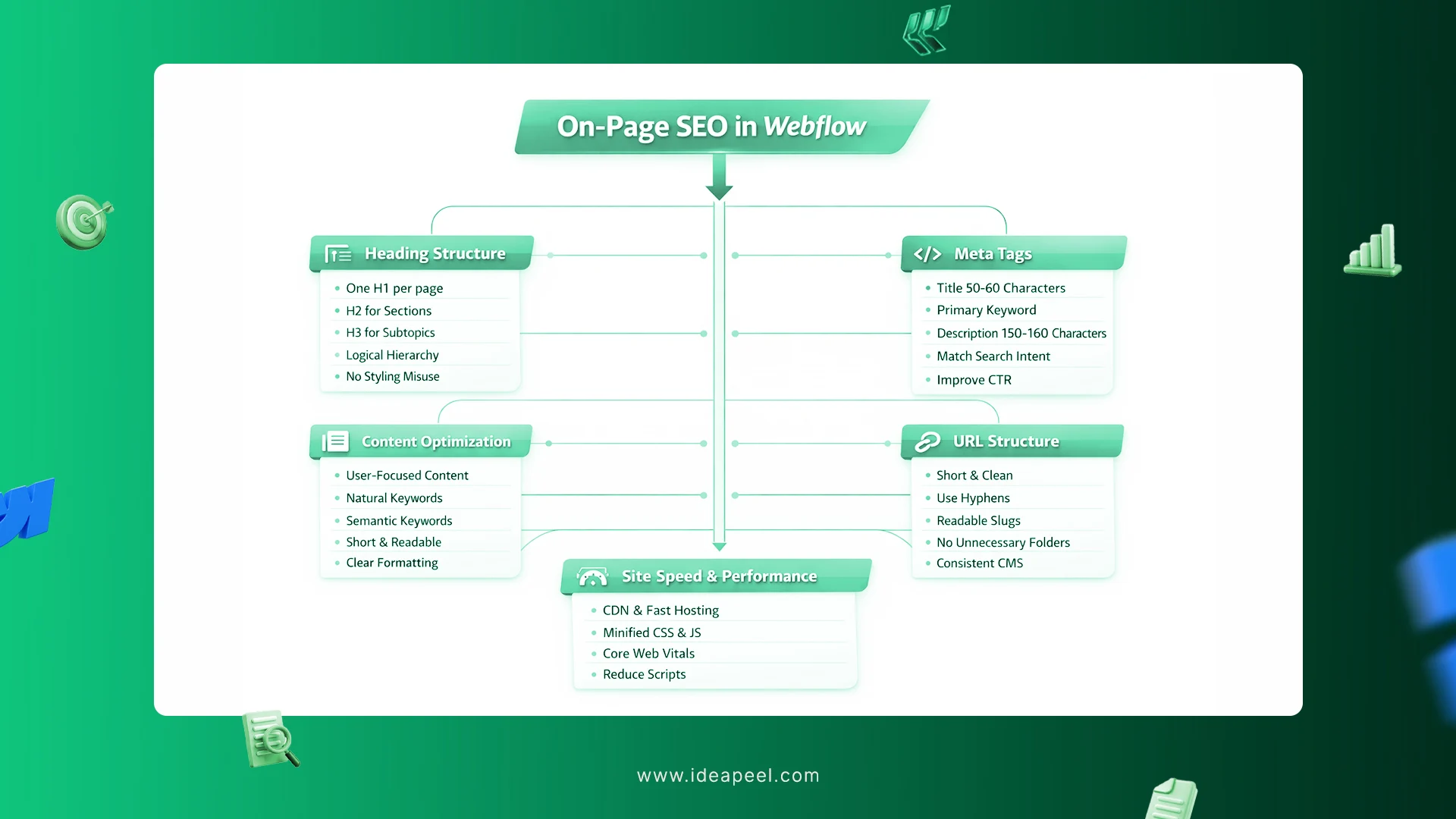
On-page SEO is essential for ranking.
1. Heading Structure
Follow clear hierarchy rules:
- One H1 per page
- Use H2 for main sections
- Use H3 for subtopics
- Do not use headings for styling purposes
Search engines use headings to understand page structure.
2. Content Optimization
Your content should be:
- Helpful and user-focused
- Keyword-focused but not keyword-stuffed
- Structured in short sections
- Written naturally
- Include your primary keyword in the H1.
- Use related semantic keywords in subheadings.
For example, if targeting Webflow SEO services, naturally include related terms like:
- Webflow SEO agency
- Webflow SEO expert
- Webflow SEO company
- Webflow SEO tools
- SEO for Webflow
This improves semantic relevance.
3. Meta Titles & Descriptions
In Webflow, you can edit:
- Static pages via Page Settings
- Dynamic pages via CMS fields
Best practices:
Meta Title
- 50–60 characters
- Include primary keyword
- Optional brand name at the end
Meta Description
- 150–160 characters
- Match search intent
- Highlight benefits clearly
Strong meta tags improve click-through rate.
4. URL Structure
Keep URLs:
- Short
- Descriptive
- Clean
- Easy to read
Best practices:
- Use hyphens
- Avoid underscores
- Avoid unnecessary folders
- Keep CMS slugs consistent
Clean URLs support better crawlability and user experience.
5. Image SEO
Optimize images by:
- Writing descriptive alt text
- Using natural keywords
- Compressing image sizes
- Using modern formats like WebP
- Avoiding oversized background images
Image optimization improves performance and accessibility.
6. Site Speed & Performance
What Webflow Already Includes
- Global CDN for fast content delivery worldwide
- Optimized, high-performance hosting
- Automatic CSS & JavaScript minification
- Secure and scalable infrastructure
How to Optimize Site Speed
- Compress and resize images (use WebP format)
- Remove unused scripts, CSS, and old integrations
- Limit heavy animations and background videos
- Reduce unnecessary redirects and extra code
[[question-block]]
Technical SEO in Webflow
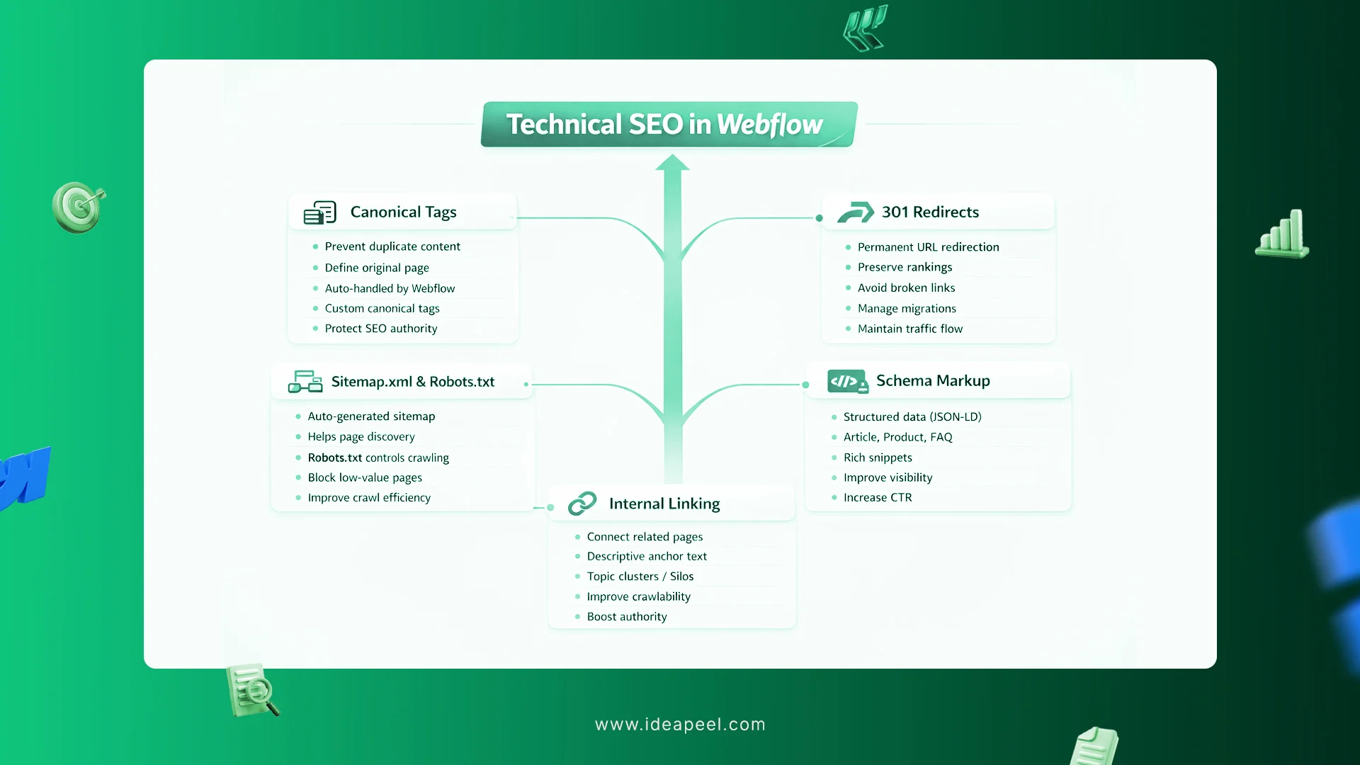
Technical SEO plays a major role in how well your Webflow website performs in search results. While Webflow provides strong built-in SEO features, proper setup is essential to maximize visibility and rankings.
1. Canonical Tags
Canonical tags help search engines understand the original version of a page when similar or duplicate content exists.
Webflow automatically handles most canonical settings, which reduces duplicate content issues. However, if you publish syndicated articles or near-identical pages, you can manually add custom canonical tags to ensure search engines index the correct version. This helps protect your SEO authority and prevents ranking dilution.
2. Sitemap.xml and Robots.txt
Webflow automatically generates both sitemap.xml and robots.txt, making it easier for search engines to crawl and understand your website structure.
The sitemap helps search engines discover all important pages, while the robots.txt file allows you to control which pages should or should not be crawled. Advanced users can block low-value pages or restrict access to specific sections to improve crawl efficiency.
3. 301 Redirects
When URLs change, 301 redirects are critical. They permanently redirect users and search engines from an old URL to a new one.
In Webflow, you can easily manage redirects to preserve search rankings, maintain traffic, and avoid broken links. Proper redirect management is especially important during website redesigns, migrations, or content restructuring.
4. Schema Markup optimize
Schema markup helps search engines better understand your content and can improve visibility in search results with rich snippets.
In Webflow, schema can be added using custom code embeds (JSON-LD format). Common types include:
- Article
- Product
- FAQ
- Organization
Adding structured data improves search clarity and enhances click-through rates.
5. Internal Linking
Strong internal linking improves both user experience and SEO performance.
Connect related pages naturally using descriptive anchor text. This helps search engines understand page relationships and strengthens topic authority. Building content clusters or topic silos is one of the most effective strategies for long-term organic growth.
[[inner-cta]]
Common SEO Mistakes to Avoid in Webflow
Building a website on Webflow is easy, but even a good-looking site can struggle to show up on Google if SEO basics are ignored. Here are the most common mistakes and how to fix them so your site can rank higher and get more visitors.
1. Skipping SEO Settings in Webflow
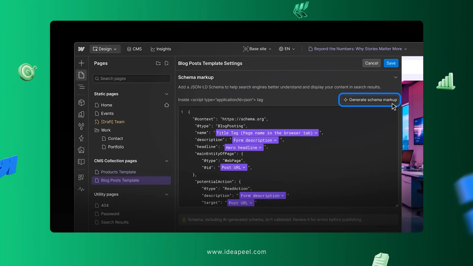
Webflow has built-in SEO settings, but many people forget to use them. Sometimes pages are left unindexed, canonical tags are missing, or staging pages accidentally show up in search results.
Tip: Always check your SEO settings before publishing. Make sure the right pages are visible to search engines.
2. Weak Keywords and Thin Content
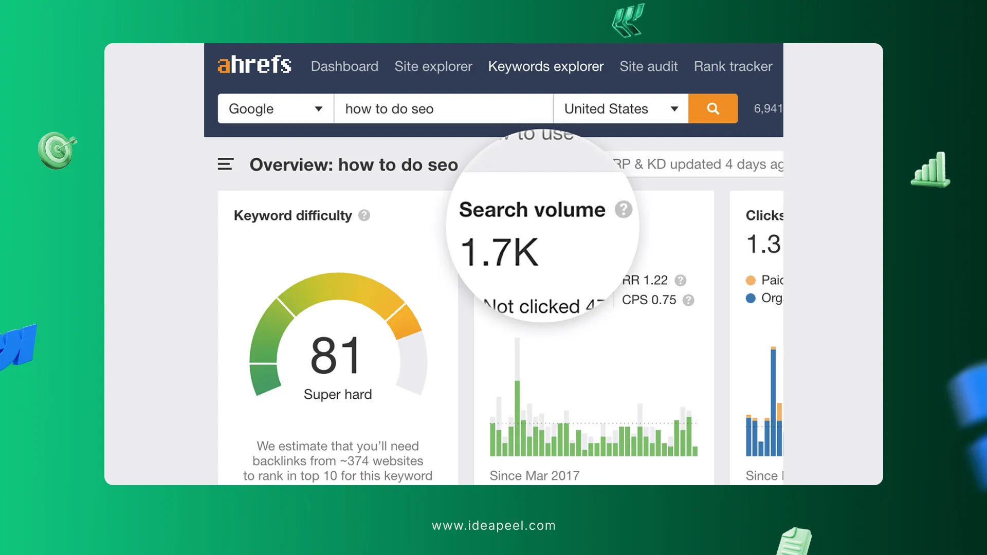
Your website needs content that actually helps visitors. Pages with no clear keywords or very little useful content won’t rank well. Generic words don’t attract the right audience.
Tip: Pick one main keyword for each page. Write helpful content that answers what people are searching for. For example, if you are in Atlanta, use “Webflow website design in Atlanta.”
3. Poor Titles, Meta Descriptions, and Headers
Titles, meta descriptions, and headings are important for Google and your visitors. Mistakes include:
- Generic or repeated titles
- Missing meta descriptions
- Headers (H1, H2, H3) in the wrong order
Tip: Make titles clear and unique, write short meta descriptions that explain the page, and organize headers logically.
4. Duplicate Content and Missing Canonicals
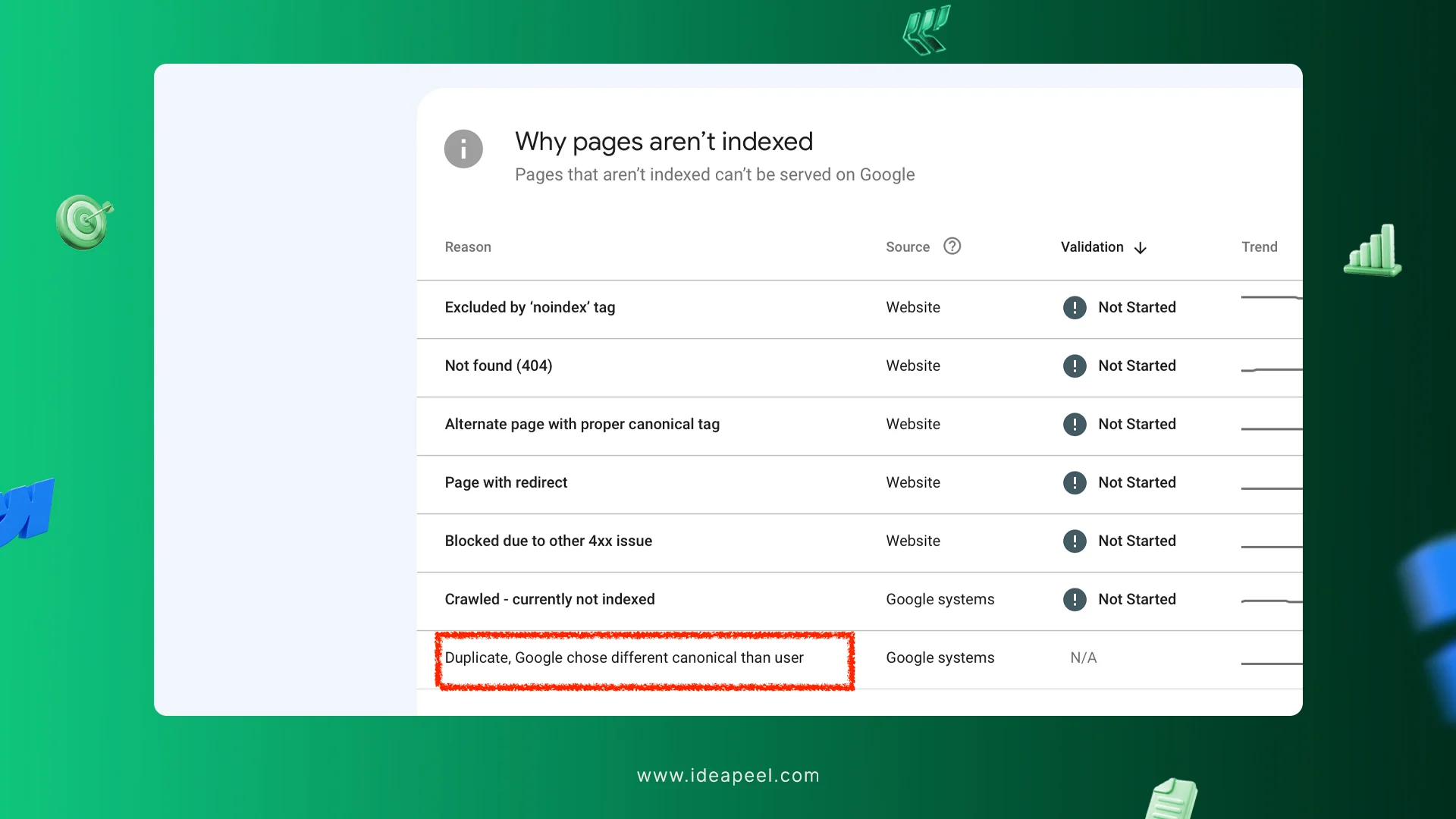
Duplicate content confuses Google and can hurt your rankings. This happens when the same page appears in multiple URLs or when CMS pages overlap.
Tip: Use canonical links to show the main page. Make each page unique, especially if you have location-specific pages.
5. Weak Internal Links and Hard-to-Find Navigation
Links between pages help Google understand your site and help visitors find more content. Many sites have poor navigation or no links between related pages.
Tip: Add links between related pages and make menus simple and easy to use. For example, link your “Atlanta Webflow SEO services” page to your main “Webflow website design” page.
Is Webflow a Smart Choice for SEO?
Yes, especially for:
- SaaS companies
- B2B businesses
- Agencies
- Healthtech websites
- Startup brands
- Design-focused companies
Webflow works extremely well for:
- SEO-focused websites
- Content marketing strategies
- Structured landing pages
- Scalable CMS systems
- Migration projects
When compared in discussions like Framer vs Webflow vs WordPress SEO, Webflow often offers more advanced technical control if you are migrating WordPress to Webflow.
How Do Webflow and WordPress Compare in Terms of SEO?
Bonus Resources: Free Webflow SEO Checklist :
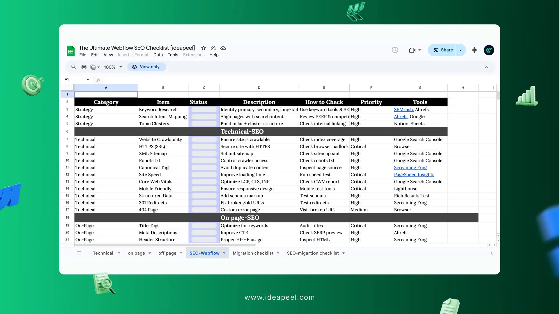
The free seo checklist will be helpful for beginners to experts to make a complete review.
Don't miss the chance to check it: The Ultimate Webflow SEO checklist
Conclusion:
Hope this guide will help with the proper process and instructions for webflow seo function.
So, in Webflow 2 things are included with the top-class CMS system that is free with the SEO function.
There are many top rated webflow seo services providers at your fingertips, and you are also in the legal profession and have law firm seo- marketing services
[[last-cta]]

Finding the best Webflow agency for your SaaS, tech, or service business can be overwhelming.
That’s why we reviewed over 200 Webflow agencies across Australia and ranked the top 10 based on experience, client satisfaction, design quality, technical expertise, and proven results.
Whether you’re looking for a high-performing website, seamless WordPress-to-Webflow migration, or custom design and development, this list helps you make an informed decision with confidence.
Why Australian Businesses Are Switching to Webflow
Faster time to market: Australian businesses operate in highly competitive markets, so Webflow helps them launch websites quickly and stay ahead of competitors.
Better performance for SEO: Webflow’s clean code and fast loading speeds help Australian companies rank higher on Google and attract more local and global traffic.
No technical debt: Unlike traditional platforms, Webflow reduces the risk of bugs, outdated plugins, and system conflicts.
Scalable for growing brands: Startups and SaaS companies in Australia prefer Webflow because it grows with their business without requiring a full rebuild.
Easy content updates: Teams can quickly update landing pages, blogs, and service pages without technical knowledge.
Secure and reliable hosting: Webflow provides built-in security, SSL, and hosting, which reduces operational complexity.
Better collaboration: Agencies and in-house teams can work together more efficiently on a single platform, improving workflow and delivery speed.
Top 10 Webflow Agencies in Australia
1. Limehub
%20(1).webp)
Limehub is a Webflow design agency delivering high-quality Webflow projects, including branding, Webflow design, migration, integration, and optimisation. Based in Brisbane, they support Australian businesses with a marketing-first approach, enabling teams to manage and scale websites without heavy technical dependency.
As an enterprise Webflow Partner, Limehub specialises in scalable Webflow CMS architecture, SEO-friendly development, and conversion-focused UI/UX design. They also handle seamless Webflow migrations and integrate tools such as CRMs, automation, and analytics platforms.
Their structured workflows and optimisation strategies make them a strong choice for businesses seeking long-term scalability, performance, and easy content management without relying on developers.
2.ideapeel
.jpg)
ideapeel is the best Webflow Agency for SaaS and Tech Brands, partnered with 40+ Australian local businesses and has earned a 98% retention rate.
From custom Webflow Design and Development, WordPress to Webflow Migration, Product Design, Motion Design, Website conversion optimisation, ideapeel delivers full-scale Webflow services.
Australian SaaS and services brands like Kodi, FastFlow, MotorX and 35+ businesses trusted us for clear communication, faster development, easy CMS configuration, and consistent support without technical debt.
Our team focuses on creating SEO-friendly, fast-loading websites with intuitive UI/UX design, helping brands not only look professional but also generate measurable business results.
[[inner-cta]]
3. Qagency
%20(1).webp)
Qagency is an award-winning Webflow development company in Australia, known for delivering high-performance and scalable websites that align with business growth goals.
Their team combines strategy, design, and development to create custom Webflow solutions tailored to each brand, rather than relying on templates or generic builds.
They specialise in SEO-ready, conversion-focused Webflow websites, ensuring strong site structure, responsive performance, and user-centric design from the start.
Qagency also supports seamless migrations from platforms like WordPress, Wix, and Squarespace, with careful handling of SEO, URL mapping, and performance benchmarking to avoid ranking loss.
4. Teko
.webp)
Teko is one of the leading Webflow design agencies in Sydney, specialising in pixel-perfect, no-code web design and development.
Every website they build is template-free and fully responsive, ensuring a seamless user experience across all devices.
According to Teko, using Webflow allows their team to develop websites up to 60% faster than traditional methods, with no ongoing bugs or monthly maintenance required.
They have delivered projects for clients across government, eCommerce, hospitality, and corporate sectors, collectively handling $2 billion+ in project value.
Teko is a top choice for startups, enterprises, and SaaS companies looking for high-performance Webflow websites.
5. Rythmdigital
.webp)
Rythmdigital provides Webflow website solutions in regional businesses across Australia. They understand the challenges local businesses face, so their approach is practical and results-driven.
Their services include Webflow design, web development, optimisation, and ongoing support, helping local brands build a strong and reliable online presence without unnecessary complexity.
Their streamlined workflows and user-first mindset make them a solid choice for small to mid-sized businesses looking for consistent growth and easy website management.
6. Onetoo
.webp)
Onetoo is a Melbourne‑based Webflow development agency and full‑service creative partner that blends brand strategy, website design, and Webflow development to help companies scale and stand out online.
Trusted by 100+ founders, they focus on engaging, conversion‑oriented digital experiences that go beyond visuals to tell a brand’s story and drive meaningful results.
Onetoo’s team builds websites that leverage Webflow’s visual CMS, dynamic interactions, and reliable AWS‑powered hosting to ensure fast load times, easy content management, and strong search visibility.
7. Refokus
.webp)
Refokus is the best webflow agency specialising in high-end design, brand storytelling, and interactive UI/UX.
They build visually striking and scalable Webflow websites that are easy to manage and optimise.
Refokus has completed projects for diverse clients, highlighting their ability to deliver bespoke Webflow builds that balance aesthetics with functionality. This makes them a strong choice for businesses that want a creative first, technically sound Webflow website that aligns closely with brand identity and growth goals.
8. Finsweet
.webp)
Finsweet is not just a Webflow agency. It’s basically a Webflow ecosystem builder.
They’ve delivered 500+ projects and created industry-standard tools like Client-First and Attributes that thousands of developers use daily.
Their strength is deep technical development. If your project involves complex logic, Webflow apps, or scalable systems, Finsweet is one of the top choices. They typically work with SaaS and enterprise brands like Dropbox and GitHub.
9. Flow.ninja
.webp)
Flow Ninja is a full-service, systems-driven Webflow web design agency focused on performance, scalability, and long-term growth.
They’ve delivered 200+ projects and work with brands like Upwork and Checkout.com.
Flow.ninja introduced them as a WebOp team for global startups and enterprise businesses. From branding, development, and business growth, they serve marketing teams to deliverable results.
10. Creative Corner Studio
.webp)
Creative Corner is the best webflow development agency with 35–50+ team members and 300+ brands served.
They serve B2B, SaaS startups and AI businesses with strategic Webflow design, development and Webflow migration, SEO.
With a strong emphasis on clean CMS architecture, fast-loading performance, and scalable systems, Creative Corner is a solid choice for startups and growing B2B brands that want a long-term digital asset.
Conclusion
Choosing the best Webflow agency ultimately comes down to your business stage, goals, and technical requirements. Some agencies on this list stand out for enterprise-level development and complex systems, while others excel in startup launches, migrations, or conversion-focused design.
Whether you need a Webflow migration agency, a Webflow web design agency for SaaS, or a conversion-focused Webflow design company, the agencies listed above offer proven expertise across different use cases.
Haven’t decided yet? Reach out to the ideapeel team for your free Webflow project brief.
[[last-cta]]
Businesses are leaving WordPress due to maintenance costs, plugin conflicts, security, and performance issues. As a result, more B2B, SaaS, and tech founders are considering a switch to Webflow.
But the biggest concern is Webflow migration cost, typical timeline and SEO preservation and is it all worth the migration decision.
This guide breaks down what Webflow agency real pricing ranges and realistic project timelines for startups, SaaS, and enterprise brands.
You can consider our WordPress to Webflow migration services, including redesign, SEO preservation, CRO optimization, complete CMS setup and training.
WordPress to Webflow Migration Cost in 2026: Quick Overview
WordPress to Webflow migration typically costs between $7,000– $15,000. Depending on website pages, CMS complexity, blog volume, redesign, and CRO optimization, Webflow migration packages vary.
Small Marketing Sites
Small marketing sites cost less than 10,0000. Probably most small sites have 4-8 unique pages, a light CMS setup, and 2-4 collections.
Moving a light blog content from WordPress to Webflow site, it needs fewer steps. Like, move fewer pages easily, maintain URL redirects, and refresh pages without integration complexity.
And, thus cost remains lower compared to CMS heavy sites.
Mid-size Websites
Mid-size B2B and SaaS websites relying heavily on WordPress mostly have larger blogs, resource pages and impressive SEO ranking.
Migrating from WordPress to Webflow without losing SEO is crucial for SaaS, Fintech and B2B marketing sites.
That's why mapping URL, preserving SEO are the main step that need complex migration process. And, custom rebuild on new Webflow CMS architecture, integration setup, SEO and AEO-ready structure, redesign plus migration makes the mid-tier pricing from $10,000– $12,000 suitable.
Enterprise Website
Enterprise business has CMS heavy sites with huge blog volume, resources, content types, custom fields, massive plugins and so on.
That means, Webflow migration agencies need to work heavily on manual mapping, 301 redirects, exporting large numbers of content and WordPress data, rebuilding, reconfiguring multiple API integration and that complex situation justifies 15,000+ migration quotes.
Not sure if moving from WordPress to Webflow is worth it? Read the challenges and benefits of migrating to Webflow.
What Affects Webflow Migration Cost?
Webflow migration project cost increase factors are the total number of website pages, CMS collection, restructuring or full rebuild of UX, CRM integration, CRO and AEO optimize structure.
1. Number of Pages
The number of static pages of your WordPress website influences the migration pricing.
For a startup website with 20-30 pages costs less than an enterprise site with 200-400 pages migration.
Webflow website migration experts give quotes based on your website pages. The more pages, the more planning and QA needed.
2. Content Management Complexity
WordPress website often has CMS collections like blogs, resources, location pages, case studies, team, custom post types, careers, etc.
CMS collection complexity increases the cost of migration. Webflow agencies need to be rebuilt using a structured Webflow CMS collection.
3. Blog Migration and Content Restructuring
Wordpress to Webflow blog migration also drives the overall cost.
When migrating from WordPress, Webflow agencies need to preserve SEO, mapping existing content, category restructuring, backup WordPress image and media files, author mapping and internal link juice review.
Most Enterprise sites have at least 200–300+ blog posts. So, it needs complex steps for SEO migration and website content to be safe.
So, blog volume is definitely a crucial factor that increases Webflow migration costs.
Read WordPress to Webflow Migration Guide for 2026 to preserve SEO and traffic.
4. Webflow Redesign vs Exact Replica
Planning to rebuild the exact design on Webflow or want to redesign full UI/UX for better performance and CRO?
This can turn the cost either lower or massive.
Simply, redesigning plus WordPress to Webflow migration costs more than a simple pixel-perfect design from Figma to Webflow.
5. Custom WordPress Functionality Rebuild
Many WordPress sites rely heavily on plugins and custom post types.
If your website also has a WordPress plugin for sliders, poppers or filtering, it should be rebuilt in Webflow with third-party tools like Memberstack, Finsweet, or Jetboost.
The more plugin-dependent your WordPress setup is, the more engineering is required, and the cost will increase.
6. Integrations Complexity
SaaS and enterprise websites integrate with CRM and automation tools.
SaaS Website migration may include reconnecting HubSpot, Salesforce, payment processor, WordPress admin dashboard, analytics, and tracking systems. Each integration requires setup and testing. Complex automation workflows increase project cost.
7. CRO and Conversion Improvements
Most B2B and growth-focused businesses don't actually migrate platforms. They are migrating for better conversion optimization, better SEO and better ROI.
Instead of simply moving content, the site is redesigned to generate more leads and revenue. Ongoing CRO optimization after migration strategy increases overall cost.
Webflow Hosting and Platform Costs in 2026
When migrating from WordPress, Webflow's hosting and platform pricing become a key decision factor.
Unlike WordPress hosting, where hosting cost is separate, Webflow includes hosting within its site plans.
However, Webflow maintenance, hosting and builder subscription fees are typically not included in an agency’s project cost and must be purchased separately by the client.
So, how much does a Webflow website cost in 2026? Here's a clear breakdown:
Webflow Plans and Pricing
Webflow offers tiered website plans, including
- Basic Plan – $14/month
Best for static marketing sites or landing pages without CMS functionality. - CMS Plan – $23/month
Designed for blogs, resource hubs, and content-driven websites. - Business Plan – $38/ month
Suitable for higher-traffic websites and growing businesses that need increased bandwidth and CMS capacity. - Enterprise Plan – Custom Pricing
Built for large organizations requiring custom infrastructure, enhanced security, SLA guarantees, and scalable bandwidth.
Impact of Webflow Price Increase
In recent years, Webflow has updated its pricing structure, including adjustments to bandwidth allocations, SEO tools evolving, workspace/seat pricing, and feature availability across plans.
These changes directly affect long-term cost planning. As your website traffic scales, hosting expenses may increase due to bandwidth limits. Adding more team members can raise workspace subscription costs. In some cases, growing content or traffic may require upgrading to a higher-tier plan sooner than expected.
When budgeting for a 2026 Webflow migration, it’s important to evaluate not only your current site requirements but also your projected growth over the next 12–24 months to avoid unexpected cost jumps.
Typical Timeline to Move a WordPress Site to Webflow
Most migration from WordPress to Webflow takes 3-4 weeks, including migrating CMS, Webflow design and development, preserving SEO, URL redirection and launch.
Here's a complete breakdown of Webflow enterprise migration agencies like ideapeel's Webflow migration timeline.
Week 1: Audit and SEO Mapping
- Full site crawl
- Traffic & ranking analysis
- Backlink mapping
- 301 Redirect strategy planning
- CMS structure documentation
- Technical SEO risk assessment
Note: Skipping this stage is the main reason Webflow migrations lose SEO and traffic.
Week 2: Design and Development
- CMS collection mapping
- Component-based design system
- Webflow development & CMS migration
- Dynamic templates and blog migration
- On-page SEO & structured data
- Speed optimization
Note: Complex sites with multi-language, gated content, and enterprise CMS may take longer.
Week 3: Testing and Launch
- 301 redirect implementation
- Redirect testing
- Technical SEO audit
- Core Web Vitals testing
- Schema validation
- XML sitemap setup
- Google Search Console monitoring
Note: After launch, rankings may fluctuate temporarily, but proper execution minimizes downtime and impact.
ideapeel's WordPress to Webflow Migration Package
Basic Tier
Pricing: $7,000–$10,000
Best For: Startups or small businesses needing a simple, cost-effective migration without redesign.
Includes:
- Simple rebuild in Webflow
- Migration of 4–8 static pages
- Basic CMS migration (2–4 collections)
- SEO preservation setup
- 301 redirects
- Responsive design
- Basic integrations
Standard Tier
Pricing: $10,000–$12,000
Best For: B2B SaaS or mid-size companies with blogs and SEO-heavy content.
Includes:
- Full rebuild with improved design
- Dynamic CMS migration upto 10
- SEO preservation + 301 redirects
- Responsive design across devices
- Custom integrations
- Optional basic CRO improvements
Enterprise Tier
Pricing: $12,000–$15,000
Best For: Large SaaS platforms or enterprise sites with complex CMS and integrations.
Includes:
- Advanced UI/UX redesign with custom animations
- Large-scale CMS migration
- SEO and analytics tracking setup
- Complex integrations
- Internal team training
[[inner-cta]]
How to Get an Accurate WordPress to Webflow Migration Quote
You can get an exact WordPress to Webflow migration quote by giving the details below details.
- Current website URL: Agency can audit your site
- Total page count: Determines the scope of CMS migration
- Blog size: How many WordPress blogs need to be migrated
- Integrations: Third-party tools or plugins your sites have that need to be rebuilt
- Traffic volume: To plan Webflow SEO and performance preservation
- SEO expectations: Redirects, ranking retention, structured data you expect
- Redesign or replica: Whether the site will be rebuilt or copied.
Providing these upfront ensures a more accurate Webflow migration pricing and timeline estimate.
At ideapeel, you can start by giving us your current WordPress website URL. We'll review, then give you migration quotes with detailed pricing and timeline. Get a custom quote now.
Start with an SEO-Safe Webflow Migration
Don't risk your SEO authority with a cheap migration quote. You should hire an experienced Webflow Migration Services provider who has a proven track record, successful results and clear pricing and timeline details.
You can consider ideapeel for SEO safe Webflow Migration at a budget.
We have migrated 65+ WordPress sites to Webflow without counting broken links, SEO loss or missing content.
Ready to migrate your website? Contact with ideapeel team for a detailed migration plan.
[[last-cta]]
Ready to turn your website into a growth asset?


