10 Best Free and Premium Finance Webflow Website Templates in 2025


Summarize with Ai


Key Takeaways
In 2025, the demand for high-quality finance web templates continues to grow as businesses seek to establish a solid online presence. The financial sector is highly competitive, and having an attractive, functional website is essential for attracting and retaining clients. Whether you're a fintech startup, an investment firm, or a financial consultant, the right web template can significantly enhance your website's functionality and aesthetics. This guide explores some of the best free and premium finance Webflow templates available this year, detailing their features, advantages, and intended uses to help you make an informed decision.
1. Vestox -Financial free website template

Price: Free
The Vestox website template is specifically designed for financial management professionals, offering a comprehensive solution tailored to meet the needs of financial advisors, investment firms, and fintech companies.
Key features
The Vestox template features a structured layout that enhances user experience through intuitive navigation. It includes dedicated sections for services offered, allowing financial professionals to clearly outline their areas of expertise, such as investment management, retirement planning, and tax strategies. The template also incorporates a client testimonials section, which helps build trust by showcasing positive feedback from previous clients.
Pages Included:
The Vestox website template features a structured Home Page that introduces the brand and highlights key services, while the About Us Page shares the firm's story, mission, and values to connect with potential clients and the Client Testimonials Page showcases positive feedback to build credibility. Additionally, the Team Profiles Page highlights team qualifications and the Blog Page provides insights relevant to the financial industry, enhancing the firm's authority.
2.Metrocard - Fintech premium website template

Prize:29 $
Metrocard is a sleek, single-page Webflow template explicitly designed for fintech companies. It offers a seamless browsing experience, ensuring your visitors stay engaged with your product from start to finish.
Key Features:
Several key features in the Metrocard template enhance usability and performance for users looking to create a financial website. One of its standout features is intuitive class naming, which allows users to easily find and modify sections with precise, logical class names, streamlining the design process. Additionally, it incorporates Webflow Optimization, utilizing best practices to guarantee seamless performance on the Webflow platform. The template is 100% mobile responsive, ensuring that it looks great and functions perfectly on any device, from desktops to smartphones.
Pages Included
The Metrocard template features essential pages that enhance the user experience, including a Home page to introduce services and a Style Guide for design consistency. The Licenses page builds client trust by detailing necessary certifications, while the Changelog updates users on changes. A 404 Not Found page manages broken links, and a 401 Protected Page secures restricted content. Together, these elements create a robust framework for financial websites.
3.Rocket pay- Finance premium website template

Prize:29$
This single-page template provides visitors a smooth and engaging experience as they explore your product. The Rocket Pay template offers a smooth and engaging experience for visitors exploring your product.
Features
Key features include intuitive class naming for easy navigation, full optimization for Webflow to ensure seamless performance, and 100% mobile responsiveness for an excellent user experience across all devices. No coding knowledge is required for customization, and the template undergoes SEO optimization to boost search engine visibility.
Pages Overview
The template includes a Home page to introduce your services, a Style Guide for maintaining design consistency, and a Licenses page detailing necessary certifications. Additionally, it features a Changelog to keep users informed about updates, a 404 Not Found page for managing broken links, and a 401 Protected Page for restricted content. Finally, it includes a cookies policy and a privacy policy to ensure compliance with regulations.
4.Finexcel - Financial webflow template for startups

Prize:49 $
For marketing startups, SaaS platforms, and studios, Finexcel is a premium Webflow template. Finexcel showcases your product professionally and effectively with its sleek, polished layout and custom graphics.
Key features
This template boasts several key features that aim to enhance the user experience, including full responsiveness for seamless performance across all devices, dynamic content readiness with symbols, and a CMS structure for easy updates. It offers professional design elements for polished visuals, a customizable style guide for effortless changes to fonts and colors, and integrated contact forms across multiple pages.
Pages Overview
The template features a Homepage, Features Page, About Us Page, Pricing Page, and Contact Page, along with a News Page and News Details Page. Additional pages include Sign In, Sign Up, and Forgot Password Pages, as well as an Access Denied Page, a User Account Page, and an Update Password Page. Finally, it includes a Style Guide Page, a License Page, a Changelog Page, a Protected Page, and a 404 Error Page.
5. Zoé- Finance premium website template

Price: $49
Key features
We crafted the Zoé template for financial, fintech, and business services websites. It features prebuilt pages that are responsive and optimized for SEO, making it an excellent choice for businesses involved in financing, insurance, payments, and investment advisory services. The design elements are modern and professional, allowing users to create a visually appealing website that effectively communicates their offerings.
Pages Overview:
This template includes a variety of comprehensive page options, ensuring that users can cover all necessary aspects of their business online. The pages, which range from service descriptions to contact information, aim to boost user engagement and furnish crucial information.
6. Fintech 128- Finance premium website template

Price: $49
It is a popular finance Webflow website without Webflow CMS.
Key features
The Fintech 128 template is ideal for launching technology and fintech websites. It boasts three unique homepages and over 27 inner pages, all optimized for SEO to enhance visibility in search engine results. This template includes CMS functionality and e-commerce capabilities, making it versatile enough to cater to various business needs.
Pages Overview:
The structure of the pages is designed to engage users effectively, providing a seamless experience as they navigate through the site. With dedicated sections for product features, pricing plans, and user testimonials, this template supports a comprehensive online presence.
7. Hamburg- Finance premium website template

Price: $59
Key features
Specifically designed for startups and credit card companies, the Hamburg template is a top-tier option. It offers a modern design that ensures a flawless browsing journey for users. This template focuses on delivering an intuitive user experience while showcasing financial products and services effectively.
Pages Overview:
The Hamburg template includes all necessary pages to present offerings comprehensively. Each page, from the homepage to the detailed service descriptions, aims to improve user engagement and satisfaction.
8. Finance X- Finance premium website template

Price: $79
Key features
Specifically designed for finance organizations, the Finance X template is a professional website solution. It ensures fast loading times and adheres to the latest design trends, which is crucial for maintaining user interest and improving search engine rankings.
Pages Overview:
This template provides a comprehensive structure tailored to various financial services. Users can expect well-organized pages that facilitate easy navigation and effective communication of their services.
9. Slope- Finance premium website template

Price: $79
Features
The Slope template is designed for modern financial firms, featuring a clean aesthetic and interactive financial data displays that engage visitors effectively. Its dynamic design ensures easy navigation while showcasing services attractively. Fully responsive and customizable without coding, Slope is also optimized for speed and SEO, enhancing online visibility and performance.
Pages Overview
Slope includes a comprehensive set of pages tailored for financial businesses, such as a visually appealing Homepage, an informative About Us page, and a dedicated Features page to highlight key offerings. The Pricing and Contact pages facilitate client communication, while the Blog and Career pages support content sharing and talent acquisition. This robust framework ensures an engaging and professional online presence in the financial sector.
10. Bnker X-Finance premium website template

Price: $129
Key features
The Bnker X template is tailored specifically for online banking platforms, featuring a modern design with rapid loading times and advanced CMS tools that enhance the user experience. With 34 pages included—three of which are dedicated homepages—this template provides a robust framework for banks and financial institutions.
Pages Overview:
The BnkerX template includes various pages designed to present services effectively. From account management interfaces to detailed service descriptions, the customizable elements allow organizations to adapt the template to their specific branding needs while ensuring a cohesive look across all pages.
FAQ: Choose the best financial in 2025.
When considering which template to choose from the list above, several frequently asked questions can help guide your decision:
1. What are the benefits of using Webflow templates?
Webflow templates offer customizable designs that require no coding knowledge, enabling users to create professional websites quickly and efficiently.
2. Are there any free options available?
Yes, several high-quality free templates are available that cater to different finance-related needs, allowing startups to establish an online presence without initial investment.
3. Can I customize these templates?
Absolutely! Most Webflow templates allow extensive customization to fit your brand’s identity and specific requirements.
4. Which template is best for a startup?
Templates like Financer or MoneyCo are ideal for startups due to their modern designs and essential features tailored specifically for new businesses in the finance sector.
5. How do I choose between free and premium templates?
Consider your budget, required features, and the level of customization you need when deciding between free and premium options.
Conclusion
Choosing the right finance Webflow template in 2025 can significantly impact your online presence. With options ranging from free templates like Financer and Slope to premium choices like Zoé and Finance X, you can find a solution that fits your needs. Evaluate each template's features, advantages, and intended purposes to make an informed decision that aligns with your business goals. Whether launching a fintech startup or enhancing an existing site, these templates provide the foundation you need to succeed in the competitive financial landscape.
Enter your website URL to receive a detailed website analysis report in just 5 minutes!
Want to discuss your project?
Grow your project with Webflow Experts
Related Articles
.webp)
AI website builders are faster to launch. Webflow is faster to run. AI wins the first version; Webflow wins every version after it. The right choice depends on who updates your site next month, a marketer or a developer, more than any feature comparison.
That single question decides more of these projects than any pricing page or feature list. Here's the full breakdown, so you can answer it for your own team.
What AI Website Builders Actually Do
AI website builders generate a working website from a prompt or a short brief. Tools like Claude, Lovable, Cursor, v0, and Bolt.new can produce a real, deployable codebase in minutes. Consumer-facing tools like Wix ADI, Framer AI, and Squarespace AI generate a site inside their own platform using the same idea: describe the business, get a layout.
They're genuinely good at a specific set of jobs: a landing page to validate an idea, an internal tool prototype, a portfolio, a placeholder site while a product or funding round comes together. For those cases, shipping something in under an hour beats a multi-week build every time.
The category struggles once a site has to do more than exist, once it has to convert, scale, and get updated constantly by people who don't write code.
What a Real Webflow Build Includes
A custom Webflow build is a different kind of deliverable. It bundles design, hosting, a native CMS, and forms into one platform, built visually rather than generated from a prompt. The output is production-grade code your team can actually maintain: clean HTML, exposed SEO fields, and a component system a marketer can edit without touching a line of it.
The distinction that matters here isn't "AI vs. no AI." Most serious Webflow teams (ours included) use AI heavily too, for wireframing, for content, for component generation that gets imported into the platform. The distinction is whether the site ends up as generated output or as an owned, editable system.
AI Website Builders vs. Webflow: Feature-by-Feature Comparison
Design Quality & Brand Differentiation
.webp)
AI builders pull from the same training data every other user's prompt draws from. They've seen the same hero sections, the same pricing layouts, the same testimonial carousels, so the output is competent but rarely distinctive.
Two competitors using the same tool with a similar prompt can end up with sites that look like siblings. For a company trying to signal credibility to a discerning buyer, that's not just an aesthetic problem. Buyers notice templated design, and they conclude the business behind it.
A custom Webflow build starts from brand and positioning rather than a template library, so nothing on the page is borrowed from a pattern thousands of other sites are also using.[[inner-cta]]
The best comparison key points between AI Website Builder vs Webflow builder
1. SEO Performance & Technical Foundation
.webp)
Are AI website builders SEO friendly?
They can be, but inconsistently, and it depends heavily on the specific tool and how much technical control you take. SEO isn't just keywords; it's site architecture, semantic HTML, Core Web Vitals, schema markup, internal linking, and crawlability.
AI-coded sites built with tools like Claude, Cursor, or v0 and hosted on Vercel can actually reach the highest technical ceiling available, because you control the raw HTML, meta tags, and structured data directly. Consumer AI builders sit at the other end. They frequently ship bloated code, weak heading hierarchy, and slower load times baked into the platform itself.
Webflow sits in between by default and pushes toward the strong end without requiring a developer: titles, meta descriptions, alt text, redirects, sitemaps, and schema are all exposed and editable by a non-technical team.
The honest takeaway: both approaches can rank well. For most businesses, content quality and site structure decide rankings more than the platform does, but the platform decides how easily your team can act on that.
2. AEO & Answer Engine Readiness: The Comparison Nobody Else Is Running
.webp)
This is the part most comparisons skip entirely, and it's quickly becoming the more important one. Ranking on Google is no longer the only goal. Increasingly, the site needs to be structured so ChatGPT, Gemini, Perplexity, and AI Overviews can extract and cite it directly.
That readiness comes down to three things: clean structured data (schema markup), self-contained answer-first content blocks, and semantic HTML that an AI crawler can parse without guessing at hierarchy.
Consumer AI builders generally lose here. They optimize for visual output, not markup quality, so schema is often missing or generic, and heading structure gets flattened for design reasons. AI-coded builds can reach full AEO readiness, but only if a developer deliberately implements it; it isn't automatic. Webflow is the one platform of the three that exposes FAQ schema, Article schema, and clean semantic tags natively,
which means a non-technical content team can build AEO-ready pages without waiting on engineering for every markup change. If AI search visibility matters to your business, and for most B2B and content-driven sites in 2026 it does, this is a real, underweighted factor in the decision.
3. CMS & Content Management
This is the part people forget when they build with AI: a generated codebase has no content editor built in. You add a headless CMS- Strapi, Sanity, or Contentful are the common picks- and someone has to model the content, wire it to the site, and keep it running.
That's real, ongoing work, and it's exactly what Webflow bundles by default. For a content-heavy site (a large blog, a resource library, multiple languages), the CMS question often is the platform decision, not a footnote to it.
4. Performance & Maintenance Over Time
If you only take one thing from this article, take this: the deciding factor is rarely how the site gets built. It's who changes it every week.
With an AI-coded stack, a copy change or a new page usually routes back to a developer, even with a headless CMS wired in. Fast to build, slow to hand over. With Webflow, marketing edits content, ships new sections, and hits publish- no developer, no deploy, no ticket.
Play it forward: a team shipping ten web changes a week gets ten self-serve edits on Webflow, or ten engineering tickets on an AI-built site. That queue, not the initial build, is where the real cost and frustration live.
5. Customization & Scalability Ceiling
AI-coded builds have effectively no design ceiling; anything you can describe, a developer can build. But every new section is a code change, a review, and a deploy. Webflow lets a team build new sections visually from existing components, within a system that's bounded but, for the vast majority of marketing sites, far above what the site actually needs. The ceiling only becomes a real constraint for highly interactive, app-like experiences, which usually belong on a custom stack anyway.[[question-block]]
6. Total Cost of Ownership
Sticker price is the least useful number here.
AI-coded stack costs:
- Build: developer time (senior review isn't free, even with AI speeding up the first draft)
- Hosting: usage-based (cheap at low traffic, unpredictable at scale)
- Services: a separate CMS, forms, sometimes search, each its own subscription
- Every change: more developer time
Webflow costs:
- One flat plan covering site, hosting, and CMS
- Predictable, bundling what the AI stack bills separately
- No extra charge when the team makes changes
Rule of thumb: the AI-coded stack can win on cost if you already have in-house engineers who'd be maintaining a codebase anyway. Webflow usually wins on predictable total cost of ownership for a marketing site.
When an AI Website Builder Is the Right Call
- You're pre-revenue and validating an idea with a minimal landing page
- The site is an internal tool prototype, not customer-facing
- You need a placeholder while a product or funding round comes together
- It's a personal portfolio or single-page site with no conversion requirements
- You're racing a hard deadline for a short-lived campaign or event page
When a Custom Webflow Build Is the Better Choice
- It's a marketing site, blog, or set of campaign pages a non-technical team will update often
- Speed of ongoing change matters more than owning the raw code
- You don't want engineering to be the bottleneck for every piece of web content
- Predictable, bundled cost matters more than maximum technical flexibility
- The site needs to support real content operations: a growing blog, multiple markets, a resource library
- AI search visibility (AEO/GEO) matters, and you need a non-technical team to maintain that structure over time
Where Squarespace, Wix AI, and Framer AI Fit In
.webp)
Webflow vs AI builders isn't really a two-horse race. Squarespace and Wix AI sit at the easy end of website building: type a prompt, and the platform generates a full site in seconds, complete with a hero section, a few landing pages, and a working sitemap, no design skills needed. Framer AI is a builder like Webflow in spirit, closer on design control, and closer to a complete design tool than a template generator, which is why it's often the AI website many small teams reach for when they just need to launch a website quickly. For a startup building a first version, or a marketing team testing a new website before committing budget, that's a fair way to use AI.
The comparison businesses actually need to make in 2026 isn't AI builder vs Webflow in the abstract. It's whether the site has to scale. An AI agent or AI assistant genuinely helps early: it drafts copy, suggests a design system, and can produce a complete website from almost nothing. But few AI-generated sites stay consistent once a team starts shipping fast. Webflow's CMS keeps every CMS item, the hosting and CMS setup, and the sitemap update in one place, with clean CSS that's simple to optimize for both classic search and AI-generated answers. For e-commerce, SaaS, or any business planning to scale, that's what separates a live website from a scalable one.
So when people ask if AI website builders are worth it, or try to compare AI options against each other, the honest answer is: use AI to draft, then refine and build inside a platform designed to hold up. Choose Webflow, or another platform like Webflow, when brand consistency, a real design system, and long-term analytics matter more than how fast the first, beautiful website went live. Builders like Squarespace and Wix AI are a fine place to start; websites with Webflow are where most businesses end up once the site has to actually perform.
The Hybrid Approach Most Teams Actually Use
.webp)
The either-or framing is usually wrong. The pattern that works splits the decision by surface, not by company:
- Product, app, or anything behind a login: a custom stack, built fast with AI tools and owned in code.
- Marketing site, blog, and campaign pages: Webflow, so marketing owns it without filing engineering tickets.
Each surface lives where it performs best, and the two connect cleanly. This is why most companies that get past the first six months end up running both: a custom, AI-assisted product alongside a Webflow marketing site, rather than migrating from one to the other.
Final Verdict
Both paths can produce a genuinely good website. The real question was never which one looks better at launch; it's who's maintaining and updating it three years from now. AI wins on speed to a first version. Webflow wins on speed to the hundredth change, with a predictable cost structure, native AEO-ready markup, and no engineering queue standing between your team and a published page. Most companies, once they think it through honestly, end up using both: a custom product built with AI, and a marketing site on Webflow, rather than forcing one tool to do both jobs.
Ready to Build the Right Way? Talk to ideapeel
If you're weighing this decision for your own site, the fastest way to get a straight answer is to map out who's actually going to be making changes next month, and let that person's skill set decide the platform. That's the exact conversation we have with clients every week.
At ideapeel, we build both sides of this equation: custom, AI-assisted products for teams that need to own their code, and fully custom Webflow marketing sites for teams that need to move fast without an engineering queue. We'll tell you plainly which parts of your site belong where, with no incentive to push you toward one tool over the other.
Explore more from ideapeel:
- Webflow Development Services: see how we plan, design, and build production-ready Webflow sites end to end
- SEO & AEO Services: the technical and content setup we run so your site ranks on Google and gets cited in AI answers
- UI/UX Design Services: the research-led design process behind every custom build, not just a visual pass
- Webflow vs. Wix: Which One Is Better?: a deeper platform comparison if you're still weighing your options
- Webflow Development Agency Guide: what to look for when choosing a Webflow partner, including AEO and GEO capability
Book a free discovery call, and we'll map out exactly which parts of your site should be Webflow, which should be custom, and why, before you spend a dollar on either.[[last-cta]]
.webp)
AI won't replace your web designer in 2026 - but it has already replaced half their busywork. Over the past year, we ran real client projects through nearly every AI web design tool worth testing.
Some earned a permanent spot in our stack. Others quietly dropped after a few weeks. This is the honest version of that list: what we kept, what we cut, and whether AI can actually replace a human designer.
In this article: what AI web design actually means, the tools we use every week, the five we walked away from, free vs. paid picks, and a straight answer to the question everyone in this industry is asking right now.
Key Takeaways
- AI web design tools are excellent at production work - wireframes, layout variants, first-draft copy, color systems - and still weak at brand nuance, hierarchy judgment, and strategic decisions.
- Our internal wireframing phase dropped from roughly 3 days to under a day once we standardized on AI-assisted layout tools.
- No tool we tested reliably replaces a human designer end-to-end. The best ones speed up the first 70% of a project and hand the last 30% back to a person.
- Best overall for design teams: Figma AI. Best for prompt-to-live-site: Framer AI. Best free option: Relume's free tier for sitemaps and wireframes.
- If a tool promises a "complete website in seconds" with zero human review, treat the output as a first draft, not a final product.
What Is AI Web Design?
AI web design is the use of machine learning models to generate, suggest, or automate parts of the website creation process - layout structure, visual hierarchy, copy, imagery, and in some cases, deployable code - based on a text prompt or existing brand input, reducing the manual production time a human designer would otherwise need.
It's different from a traditional website builder. A template-based builder (think classic drag-and-drop platforms) starts you with a fixed layout you customize by hand. An AI-native design tool starts from a prompt or a business description and generates a layout, palette, and copy specific to that input - no template selection required. Some tools stop at the design/mockup stage; others go all the way to a deployable, hosted site. That distinction matters more than almost any other feature comparison, and it's the first thing to check before you commit to a tool.
How Does AI Web Design Actually Work?
Most AI web design tools follow the same basic loop, regardless of how polished the interface is:
.webp)
- Input: describe the business, paste a brand brief, or upload existing assets.
- Generation: the model proposes a layout, copy, and visual system based on that input.
- Refinement: you (or the tool's AI) adjust spacing, hierarchy, and content by hand or by re-prompting.
- Export or deploy: the result becomes editable design files, exportable code, or a live hosted page.
The tools mostly differ in where step 3 happens and how much control you get over it. That's the real basis for comparison - not how fast step 2 looks in a demo video.[[inner-cta]]
The AI Web Design Tools We Actually Use
These are the tools that survived past the trial period and are still part of our weekly workflow.
.webp)
Figma AI
Figma AI handles smart layout suggestions, auto-tidies components, and generates responsive variant screens across breakpoints. What changed for us: when a homepage needs to adapt across mobile, tablet, and desktop, we get a starting set of layout variations in minutes instead of manually rebuilding each breakpoint by hand. Best for: design teams already living inside Figma who want AI as a layout accelerator, not a replacement for the design system. Limitation: credit-based usage on paid tiers means heavy exploration can burn through your monthly allowance fast.
Framer AI
Framer takes a written prompt and generates a styled, interactive, deployable landing page - not just a mockup. What changed for us: it's now our default for fast client concept pages, since a prompt like "modern SaaS landing page, dark theme, minimal typography" produces something close to presentation-ready on the first pass. Best for: designers and small teams who want to go from prompt to live page without a separate dev handoff. Limitation: deep customization still requires learning Framer's own editor, which has a real learning curve.
Relume
Relume solves the blank-page problem at the planning stage. You describe the project goals, it generates a full sitemap, then converts approved pages into high-fidelity wireframes populated with realistic (not lorem-ipsum) placeholder copy. What changed for us: client presentations got noticeably more effective once wireframes had real-sounding copy instead of filler text. Best for: the planning and sitemap phase, before any visual design begins. Limitation: it's a planning tool, not a design tool - you still need Framer, Webflow, or Figma to finish the job.
Webflow AI
Webflow's AI features assist with CSS styling, class generation, and prompt-based component creation, while still respecting Webflow's precise HTML/CSS box model. What changed for us: for client work that needs pixel-accurate, developer-friendly output, this is the only tool on this list we'd hand directly to an engineering team without a rebuild. Best for: technical designers and teams that need production-grade code, not just a visual approximation. Limitation: the precision comes with a steeper setup and learning curve than prompt-first tools.
Midjourney
Midjourney doesn't touch layout at all - it generates visual assets. What changed for us: hero images and on-brand illustrations that used to require a stock photo budget or a photoshoot now come from a well-written prompt, and the quality regularly beats stock photography for hero sections. Best for: hero imagery, icon sets, and illustration concepts that get dropped into a real design tool afterward. Limitation: it's an asset generator, not a web design tool - it never touches structure or code.
Uizard
Uizard turns rough sketches - including genuinely bad hand-drawn ones - into structured prototypes fast. What changed for us: early-stage concepting with a client in the room went from a whiteboard sketch to a clickable prototype in the same meeting. Best for: early-stage concepting and client workshops where speed matters more than polish. Limitation: output quality drops noticeably once you move past simple screens into complex, data-heavy interfaces.
[[question-block]]
How to Use AI Web Design Tools
.webp)
1. Define Your Website Goals
Start by deciding what you want your website to achieve. Identify your target audience, business goals, and the pages you need. A clear plan helps AI generate more accurate layouts and content.
2. Create Your First Design
Use an AI web design tool to generate a sitemap, wireframe, or homepage from a simple prompt. Include details about your business, brand style, and preferred design to get better results.
3. Customize the Design
Don't rely on the AI output as your final website. Edit the layout, colors, typography, images, and content so the design reflects your brand and creates a better user experience.
4. Optimize for SEO and Performance
Before publishing, improve your website by using clear headings, optimized images, internal links, meta titles, meta descriptions, and a mobile-friendly layout. A fast, well-structured website performs better in both search engines and AI search results.
5. Review Before You Publish
Test your website on different devices, check all links and forms, and make sure the content is accurate and easy to understand. AI speeds up the design process, but a final human review ensures your website looks professional and delivers the best results.
Pro Tip: AI works best as a design assistant, not a replacement. Use it to speed up planning, wireframing, and first drafts, while relying on human creativity for branding, UX, and final design decisions.
The 5 We Dropped (and Why)
Nobody publishes this part, which is exactly why it's worth reading. These all looked promising in testing and didn't survive contact with a real project.
None of these are bad tools in isolation. They just didn't earn their place once weighed against the time they cost us versus the tools above.
Free vs. Paid AI Web Design Tools - What's Worth Paying For
The pattern across nearly every tool here: free tiers are genuinely useful for testing and single small projects, but professional, repeated use pushes you to a paid plan within the first month.
AI Web Design vs. Traditional Web Design - What's Actually Different
- Speed: AI-assisted wireframing and layout exploration can cut early-stage timelines from days to hours. Final polish still takes roughly the same amount of time either way.
- Cost: Lower upfront cost for simple sites; the gap narrows fast once a project needs custom branding, complex functionality, or accessibility work.
- Customization ceiling: Template and AI-generated sites both hit a wall when a brand needs something genuinely unique. Human-led design still wins for high-stakes, brand-defining work.
- Who it's best for: AI-first tools suit startups, solo founders, and agencies handling high volumes of simpler sites. Traditional, human-led design still wins for complex, brand-critical, or highly regulated projects.
Will AI Replace Web Designers?
No - but it has already absorbed the parts of the job that used to eat the most time. That's the honest, unhedged answer.
We've watched our own wireframing phase shrink from about three days to under one. That time didn't disappear - it moved. Designers on our team now spend it on strategy conversations, content architecture, and revision rounds that used to get rushed at the end of a project. The tools didn't cut headcount; they changed what the headcount does.
The honest risk isn't "AI replaces designers." It's that designers who refuse to use these tools will lose client work to designers who deliver the same quality faster. The shift already happening is competitive, not existential - and it rewards the people willing to treat AI as a production accelerator, not a creative director.
How to Choose the Right AI Web Design Tool for Your Project
Run through these four questions before picking a tool:
- Are you designing or deploying?
If you need a live, hosted site, look at Framer or Webflow. If you need mockups for a client or dev team, Figma or Uizard fit better. - Solo or team?
Team-based tools (Figma AI, Webflow) justify their learning curve when multiple people share the file. Solo freelancers often get more value from faster, prompt-first tools like Framer. - What's the budget?
Free tiers are fine for a single small project. Repeated professional use almost always needs a paid plan within the first month. - How brand-complex is the project?
The more unique the brand needs to feel, the more the project needs human-led design with AI as an assistant - not the other way around.
Quick cheat sheet: Planning a sitemap → Relume. Need a live site fast → Framer. Working inside an existing design system → Figma AI. Need pixel-accurate developer handoff → Webflow. Need hero imagery → Midjourney. Early client workshop → Uiza
Ready to Build a Better Website?
AI web design tools can help you build websites faster, but great design still needs human creativity and strategy. The best results come from combining AI with experienced designers.
Need a website that looks great and performs even better? Explore Ideapeel's Webflow Development, UI/UX Design, and Figma to Webflow services, or visit the ideapeel Blog for more web design and AI insights. Ready to start? Contact ideapeel today and let's build something exceptional together.
[[last-cta]]
.webp)
If you built your website on Webflow two years ago and have not looked at what the platform can do in 2026, you are working with a completely different tool than what you think you have.
Webflow is no longer just a design tool. Since the beginning of 2026, it has evolved into what the company now calls an "agentic web marketing platform." That is not marketing language. It reflects a real, fundamental shift in what the platform does and who it is built for.
This guide covers everything that changed in 2026: the new AEO suite, the Claude connector, the next-generation CMS, the pricing restructure, and what all of it means for your search visibility in a world where AI is answering questions before users ever click a link.
What Is AEO and Why Does It Matter More Than Traditional SEO Right Now?
.webp)
What is Answer Engine Optimization (AEO)?
Answer Engine Optimization (AEO) is the practice of structuring your website content so that AI-powered search tools like Google's AI Overviews, ChatGPT, and Perplexity can find, understand, and cite your pages as authoritative answers. Unlike traditional SEO, which focuses on ranking in a list of blue links, AEO focuses on becoming the source that AI models pull from when a user asks a question.
What is the difference between SEO and AEO?
Traditional SEO optimizes for search engine crawlers and click-through rankings. AEO optimizes for AI models that extract, summarize, and cite content in conversational responses. SEO brings traffic to your site. AEO makes your brand the answer before a user even reaches your site.
Both matter. In 2026, you need both, and Webflow is one of the first platforms to build native tools for both at the same time.
Webflow's AEO Suite: What It Is and What It Actually Does
Webflow's AEO tools are built into the platform's Audit panel. They sit inside your Workspace, alongside your existing SEO controls, and they are designed to help your site get cited by AI models, not just ranked by search engines.
Here is what the AEO suite covers:
LLM Visibility Tracking: Webflow's built-in analytics now include an AEO dashboard that shows you traffic and conversions referred by large language models. You can see which AI tools are sending people to your site, which pages they are landing on, and whether those visits convert.
AEO Agents: These are native AI agents inside Webflow that scan your site and identify gaps in schema markup, content structure, and page architecture. They flag what is hurting your citeability the likelihood that an AI model will pull from your content and prioritize fixes by impact.
Competitive Benchmarking: The AEO suite includes tools to compare your AI visibility against competitors. You can see whether a competitor's page is being cited more frequently than yours for a shared topic, and understand structurally why that is happening.
Who gets AEO features? AEO agents are available on the Team plan and Enterprise. Basic AEO audit functionality is available to paid Workspace users across plans.
How Do You Actually Use AEO to Win AI Overviews?
How do you format content to appear in Google's AI Overviews?
To appear in Google AI Overviews, format each section of your content with a question as the H2 or H3 heading, followed immediately by a direct, concise answer of 40 to 80 words. Use schema markup to declare the content type. Write in plain, declarative language; avoid vague claims and opinion-heavy sentences that AI models cannot cleanly extract.
A few things that consistently improve citeability across AI tools:
Write one clear answer per section. AI models are not looking for nuanced paragraphs they are looking for the most direct, quotable response to a specific question. The faster your content gives them that, the better.
Use FAQ sections on every product and service page. A well-structured FAQ block is one of the highest-returning investments you can make for AEO. Short questions. Direct answers. Plain language.
Use structured data. FAQ schema, HowTo schema, and Article schema all signal to AI crawlers that your content is organized, factual, and citation-worthy.
Keep your content current. AI models favor recently updated, high-authority pages. A blog post from 2022 with no updates is being outcompeted by content that reflects what is happening now.
[[inner-cta]]
The Claude + Webflow Integration: What It Actually Unlocks
.webp)
What is the Webflow MCP connector? The Webflow MCP connector is an official integration between Webflow and Claude, launched on February 9, 2026. It uses Anthropic's Model Context Protocol (MCP) an open standard that lets AI models interact with external tools through a common protocol. The connector gives Claude direct read and write access to your Webflow CMS, metadata, pages, and variables, without custom code or complex configuration.
This is not a Zapier workflow. It is a first-party integration you can activate in under three minutes from the Claude interface.
What Can You Actually Do With the Claude + Webflow Connector?
Once connected, Claude can interact with your Webflow site through two sets of tools:
The Designer API handles everything: visual element creation, style management, CSS variables, components, and responsive breakpoints.
The Data API handles your content layer: CMS collections, items, fields, localization, SEO metadata, and custom code.
In practical terms, here is what marketing teams are using it for right now:
Bulk SEO Audits in Minutes: Claude reads your CMS pages through the connector, finds meta titles over 60 characters or missing target keywords, proposes corrected versions, and applies fixes. Tasks that previously took a team half a day can now run in under 30 minutes.
Bulk CMS Content at Scale: You can generate dozens or hundreds of CMS items from a single prompt session. One agency used the connector to produce 50 coherent property listing pages in 30 minutes after Claude analyzed the structure of their existing entries.
Schema and Metadata Management: Claude can audit your entire site for schema gaps, flag missing alt text, check canonical tags, and apply fixes across hundreds of pages at once.
Self-Optimizing Content Loops: Marketing teams are using the connector to run ongoing SEO maintenance without involving developers in every update. Claude audits, identifies, recommends, and applies all through the same interface where you run your content strategy.
One important operational note: for production sites, set the connector to manual approval mode at first. This way Claude asks for your confirmation before applying any changes, so you can review exactly what is happening before it goes live.
[[question-block]]
AI Code Components: Why Webflow Deprecated App Gen
On April 27, 2026, Webflow deprecated its earlier "App Gen" feature and replaced it with AI Code Components. This was a deliberate strategic decision, not a feature removal.
App Gen was a site generation tool: describe a site, get a generated layout. It worked well as a starting point, but it sat outside your design system. What it produced needed significant cleanup before it could live in a real production site.
AI Code Components work differently. You describe a complex element in plain language a custom pricing calculator, an interactive comparison table, a filterable resource library and Webflow generates production-ready React code that integrates natively with your existing design system.
Why does this matter for SEO and AEO?
Custom interactive components built with AI Code Components can be structured with clean semantic HTML, proper schema markup, and readable content architecture all from the start. There is no post-generation cleanup required to make the output search-engine readable. You build the component, it integrates with your system, and the SEO and AEO foundations are already there.
The Next-Gen CMS: Why Structured Content Is the Foundation of GEO
.webp)
What is Generative Engine Optimization (GEO)? Generative Engine Optimization (GEO) is the practice of structuring your website's content and data in a way that makes it easy for AI-powered generative search tools to understand, use, and recommend your brand. While AEO focuses on being cited in AI answers, GEO focuses on the underlying data architecture that makes your site readable and authoritative to AI systems in the first place.
AI systems need structured, relational data to work with. They are not just reading your pages; they are parsing the relationships between your content, your entities, and your authority signals. The stronger your content architecture, the more usable your site becomes for generative tools.
Webflow's next-generation CMS was built with this in mind.
What Changed in the Next-Gen CMS?
Increased Scale: The new Premium plan includes 20,000 CMS items and 40 Collections as standard. Previous plans capped at 10,000 items and required paid add-ons to go higher. For content-heavy sites resource libraries, feature pages, blog archives, dynamic landing pages this removes a ceiling that was causing real operational friction.
Deep Nesting: Webflow now supports three-layer nesting and up to 10 nested collection lists per page. This allows for content architectures that were previously impossible on the platform: complex relational structures like content hubs, interlinked use-case pages, and multi-tiered resource libraries.
Why does deep nesting matter for GEO?
AI search tools do not just read pages. They understand the relationships between pages, which topics connect, which content clusters around which entities, and which sites have genuine depth on a subject versus thin coverage across many topics. A site with three levels of relational content is architecturally more authoritative to a generative AI model than a site with flat, disconnected pages.
What is an llms.txt file?
An llms.txt file works like a robots.txt file, but instead of directing search engine crawlers, it directs AI language models. It tells AI tools which pages on your site are most authoritative, what your preferred citation details are, and how to interpret your content. It is a direct signal to AI crawlers about where to focus when they are deciding what to read and potentially cite.
Webflow is among the first major website platforms to offer native support for this file. For sites that want to influence how AI tools discover and use their content, this is not a small thing. You are giving AI models a structured map to your most important content on your terms.
Technical SEO in 2026: What Webflow Handles Out of the Box
Technical SEO has changed. In 2025 and 2026, Google's ranking signals include how fast your pages respond, how stable your layout is as it loads, and how well your site performs for real users on real devices. These are not soft signals; they are direct ranking factors.
What are Core Web Vitals and why do they affect rankings?
Core Web Vitals are three performance metrics that Google uses to measure real-user page experience: LCP (Largest Contentful Paint) measures how long the main content takes to appear; INP (Interaction to Next Paint) measures how quickly the page responds to user actions; and CLS (Cumulative Layout Shift) measures how much the page layout moves while loading. Sites that pass Core Web Vitals thresholds rank higher and provide better user experiences that keep visitors on the page longer.
Here is what Webflow handles automatically in 2026:
Global CDN Hosting: Webflow sites run on Fastly's Tier 1 global CDN with over 100 data centers. This means Time to First Byte (TTFB) how quickly a server responds to a request is handled at the infrastructure level, not at the configuration level. You do not need to set up a CDN. It is already there.
Image Optimization: Webflow automatically converts images to WebP and AVIF formats and applies lazy loading by default. Unoptimized images are one of the most common causes of poor Core Web Vitals scores. Webflow removes that problem from your to-do list entirely.
Canonical Tags and Noindex Controls: As of mid-2025, native canonical tag management and page-level noindex controls are built into the platform. You no longer need custom code or third-party plugins to handle these technical SEO fundamentals.
Alt Text Generation: Webflow's AI tools can generate descriptive alt text for images across your site. This matters for accessibility compliance and for how AI search tools interpret your visual content.
Clean Semantic HTML: Webflow's output produces clean, structured HTML that both search engines and AI crawlers can read easily. For sites using AI Code Components, the React output integrates with this clean foundation.
Webflow 2026 Pricing: What Actually Changed
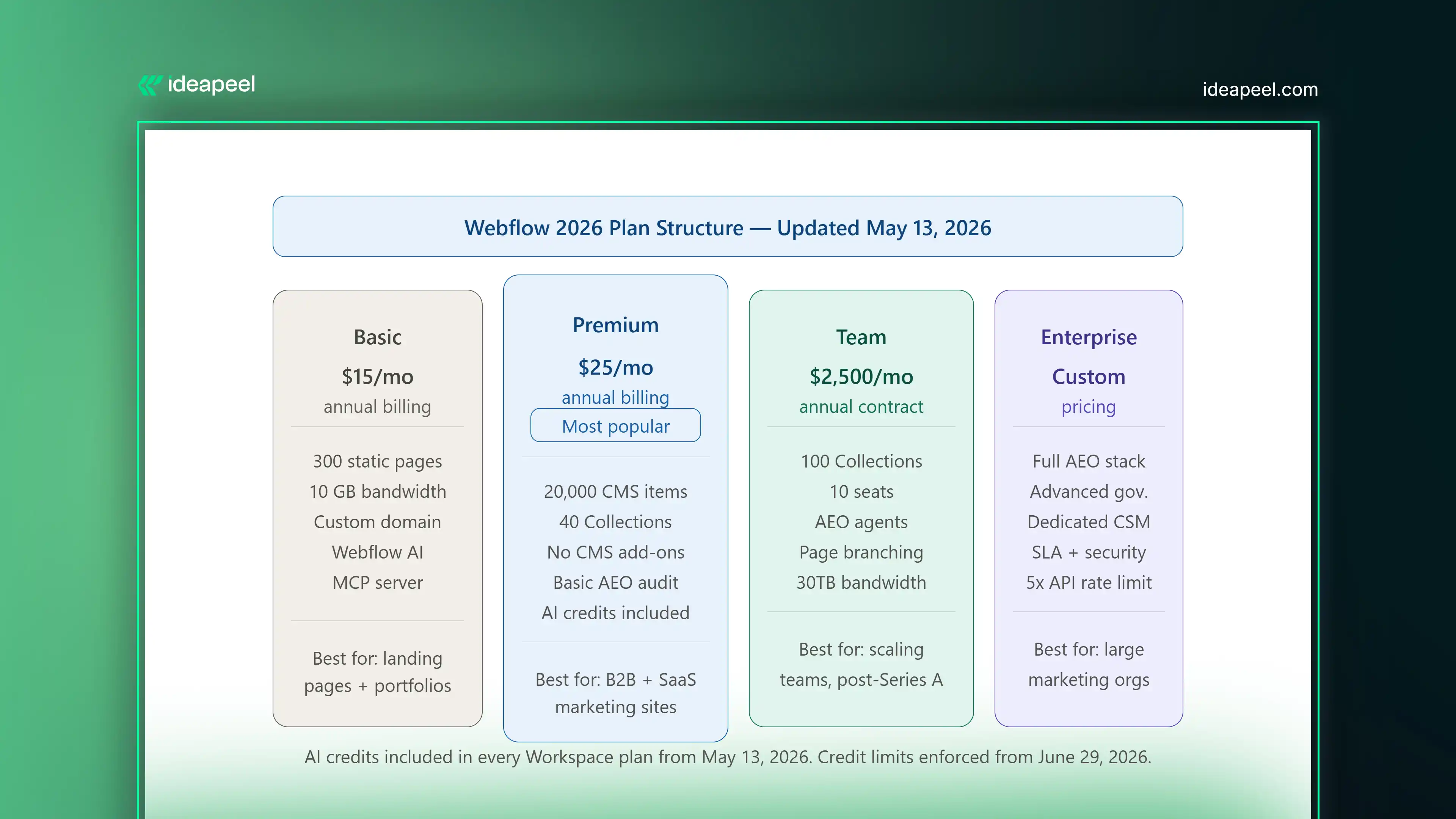
What changed in Webflow's 2026 pricing? On May 13, 2026, Webflow merged the legacy CMS and Business site plans into a single new Premium plan, introduced a new Team plan between Premium and Enterprise, and added AI credits to all Workspace plans. The changes affect new accounts immediately and existing accounts at their next renewal date.
Here is a clear breakdown of the current plan structure:
Basic Plan ($15/month, annual): For landing pages, portfolios, and sites that do not need a CMS. Includes 300 static pages, 10 GB bandwidth, custom domain, Webflow AI, and MCP server access.
Premium Plan ($25/month, annual): The main plan for content-heavy marketing sites. Includes 20,000 CMS items, 40 Collections, and removes the need for CMS add-ons entirely. This is the right starting point for most B2B marketing sites and SaaS websites.
Team Plan ($2,500/month, annual contract): A new all-in-one plan for teams that have outgrown self-serve but are not ready for Enterprise. Includes 100 CMS Collections, 10 seats, Localization, AEO agents, page branching, single-page publishing, publishing workflows, a site activity log, custom SSL certificates, security headers, and 30TB of bandwidth. Requires reaching out to Webflow directly; not available as a self-serve purchase.
What Is Webflow Optimize and Do You Need It?
Webflow Optimize is a separate add-on that starts at $299 per month and scales by page views. It adds native A/B testing, multivariate testing, and AI-driven personalization directly inside the platform.
For conversion-focused B2B and SaaS marketing sites, this matters because it removes a key reason to use a third-party testing tool. Your A/B tests run inside the same interface where you build and manage your site. Your personalization logic is connected to the same CMS that powers your content.
When do you actually need Optimize? If you are running a meaningful volume of traffic through key landing pages and you are not systematically testing variations, Optimize pays for itself quickly. For sites below 25,000 monthly page views on conversion-critical pages, the standard plan tier is the starting point.
Webflow vs. Framer in 2026: What Is the Actual Difference?
This is a question that comes up constantly, and the honest answer is that they are solving different problems.
Framer is excellent for design speed. If you want a beautiful landing page or a portfolio site built and live quickly, Framer is a strong choice. Its AI generation tools are fast, its template ecosystem is strong for visual work, and the learning curve is lower for designers who have not worked in a CMS-heavy environment.
Webflow is the right choice when your website is a business growth system rather than a design deliverable. If your site needs a real CMS architecture, deep content relationships, AEO optimization, a Claude integration, custom interactive components, team publishing workflows, or scalable data structure, Framer is not built for that in the same way.
The bottom line: Framer is a design tool with publishing capabilities. Webflow in 2026 is a growth platform with design capabilities. Which one you need depends on what problem you are actually trying to solve.
What Is a Relational Authority Hub and Why Should You Build One?
Traditional SEO advice focuses on individual pages. Rank page A for keyword A. Rank page B for keyword B. In 2026, that approach is insufficient on its own.
AI search tools do not just evaluate individual pages. They evaluate sites as entities, looking at the breadth and depth of your coverage on a topic, the relationships between your content, and whether your site reflects genuine expertise on a subject or just a collection of keyword-targeted pages.
What is a relational authority hub? A relational authority hub is a content architecture where your core topic pages, subtopic pages, supporting articles, case studies, and FAQ content are all interconnected through deliberate internal linking, shared schema vocabulary, and consistent entity references. Instead of a flat structure of individual pages, you build a web of connected content that signals depth and expertise to both human readers and AI systems.
Here is what this looks like in practice on a Webflow site:
Your main product or service page links to three or four deep-dive supporting pages on specific aspects of that service. Those supporting pages link to relevant case studies and FAQ pages. Your FAQ pages link back to relevant product pages. Your blog content links to all of the above. Every page uses consistent terminology, entity naming, and schema markup.
Webflow's Next-Gen CMS makes this architecture significantly easier to build and maintain than it was on previous versions of the platform. Three-layer nesting and 10 nested collection lists per page means you can model complex relational content without needing a custom CMS or a headless architecture to do it.
Webflow AEO Checklist: What to Do on Your Site Right Now
If you are using Webflow in 2026 and you want to improve your visibility in AI-powered search, here is a practical starting checklist:
Content Structure
- Format each major section with a question-based H2 or H3 heading, followed by a direct 40 to 80 word answer
- Add a dedicated FAQ section to every product, service, and landing page
- Write in plain, declarative language; avoid vague claims that AI models cannot extract cleanly
- Keep your most important pages updated; AI models favor recent, accurate content
Technical Signals
- Enable schema markup for FAQ, HowTo, and Article content types
- Set up your llms.txt file to direct AI crawlers to your most authoritative pages
- Check that every image has descriptive alt text; use Webflow's AI alt text generation if you have a backlog
- Run a Core Web Vitals check in Google Search Console and resolve any failing pages
CMS and Architecture
- Map your internal linking structure; make sure your most important pages receive links from multiple related content pieces
- Use Webflow's AEO audit panel to identify schema gaps and content structure issues
- If you are on the Team or Enterprise plan, run your AEO agents on key page clusters and action the priority recommendations
Monitoring
- Set up the AEO analytics dashboard to track LLM-referred traffic separately from organic search traffic
- Note which pages are receiving AI-referral visits and what content format those pages use; this tells you what is working and where to replicate it
How does Webflow compare to WordPress for SEO and AEO in 2026?
Webflow's technical SEO foundations are handled at the platform level; image optimization, CDN performance, canonical tags, and page speed are built in. WordPress requires plugin management, hosting configuration, and ongoing maintenance to achieve comparable baselines. For AEO specifically, Webflow's native AEO agents and Claude integration currently have no direct equivalent in the WordPress ecosystem. The tradeoff is that WordPress has a larger plugin and developer ecosystem; Webflow offers a tighter, more managed platform with fewer moving parts to maintain.
The Bottom Line on Webflow in 2026
Webflow's 2026 updates make it more than a website builder. With AI-powered SEO, AEO tools, Claude integration, and smarter CMS features, it's built for the future of AI search.
To stay ahead, optimize your website for both Google and AI search by improving your content structure, using llms.txt, and creating high-quality, connected content.
Need help building an AI-ready Webflow website? Explore ideapeel's Webflow Development, Webflow SEO Services, and UI/UX Design Services to create a faster, smarter, and search-optimized website that drives real business growth.
[[last-cta]]
Ready to turn your website into a growth asset?
