Top Webflow Design Trends to Watch in 2025


Summarize with Ai


Key Takeaways
Introduction
Did you know that every second, three new websites are launched? That equates to a staggering 252,000 new websites every single day. With such intense competition, staying relevant and eye-catching is more important than ever. The website design landscape is constantly evolving, and 2025 promises a wave of exciting trends that combine cutting-edge technology with user-focused innovation.
To stand out in this crowded digital arena, you need to embrace these trends. From enhancing user experience (UX) to integrating stunning aesthetics, these innovations can help your website not only attract but retain visitors. Let’s dive into the top web design trends in 2025 and explore how they can transform your online presence.
Top Emerging Web Design Trends 2025
1. Dynamic Cursors

Dynamic cursors are transforming navigation into a more interactive and personalized experience. These cursors adapt and change their appearance based on user actions, providing intuitive guidance. For example:
- Purpose: They can highlight clickable areas or signal important interactions, making navigation smoother.
- Design: Dynamic cursors can reflect a website's brand identity, using custom animations and effects to align with the overall aesthetic.
- Caution: While engaging, overuse of effects can distract users. The key is to strike a balance between creativity and functionality.
2. Nature-Inspired Design

Websites in 2025 are embracing the organic, drawing inspiration from nature. This trend emphasizes:
- Organic Shapes: Asymmetrical and irregular shapes replace rigid grids, adding a sense of warmth and approachability to sustainable design elements.
- Applications: Organic elements can enhance layouts, buttons, and visual storytelling, offering a more inviting feel.
- User Impact: These design processes resonate emotionally, making brands appear more human and relatable.
3. Full-Page Headers

Full-page headers, also known as hero sections, are becoming a minimalist design feature. Their benefits include:
- Visual Impact: Bold imagery paired with compelling text grabs attention immediately.
- Clear Messaging: Strategically placed CTAs (calls to action) guide users toward desired actions.
- Storytelling: These headers allow brands to connect emotionally by presenting their narrative visually and textually.
4. Parallax Scrolling
Parallax scrolling enhances user engagement by creating an immersive experience for web development. Key features include:
- Interactive Storytelling: Backgrounds that move slower than foreground elements create depth and intrigue.
- Engagement: This technique captivates users and encourages them to explore more.
- Optimization: Ensure smooth animations across all devices to prevent lag and enhance usability.
5. Custom Illustrations

Custom illustrations are a versatile tool to elevate web design trends for 2025. Their benefits include:
- Enhanced Branding: Tailored visuals communicate a brand’s unique personality.
- Simplifying Complex Ideas: Illustrated visuals can break down intricate concepts into digestible content.
- SEO Boost: Engaging digital design keeps users on your site longer, improving search engine rankings.
Webflow Design Color Trends to Watch in 2025

Colors in 2025 reflect a dynamic spectrum of possibilities, with a diverse range of color palettes catering to various design aesthetics and objectives. Here are some key trends and their applications:
1. Bold Hues
Vibrant colors take center stage in 2025. These energetic tones command attention and inspire action to sustainable web design.
- Characteristics: Bright, energetic colors like electric blue, fiery red, and lime green.
- Applications: Perfect for call-to-action buttons, headlines, and promotional elements.
- Examples: Neon pink (#FF0090), solar yellow (#FFD700), cobalt blue (#0047AB).
2. Soft Pastels
Subtle and calming, pastels bring a touch of sophistication. These hues create an elegant, minimalistic aesthetic.
- Characteristics: Muted tones like lavender, baby blue, and mint green offer a serene aesthetic.
- Applications: Ideal for backgrounds, subtle accents, and minimalist themes.
- Examples: Powder blue (#B0E0E6), soft peach (#FFDAB9), mint green (#98FB98).
3. Gradients and Duotones
Depth and movement define the gradient trend. Use these tones to create modern, inclusive design and tech-savvy visuals.
- Characteristics: Blending colors creates depth and a tech-savvy feel.
- Applications: Best for hero sections, overlays, and dynamic visuals.
- Examples: Purple to pink (#6A0DAD → #FF77FF), blue to turquoise (#1E90FF → #40E0D0).
4. Monochromatic Schemes
Simple yet striking, monochromatic designs focus attention. Use these palettes to emphasize content over design.
- Characteristics: Single-color variations ensure harmony and focus.
- Applications: Suited for minimalist and content-focused eco-friendly design.
- Examples: Grayscale (#D3D3D3 → #4F4F4F), shades of blue (#ADD8E6 → #00008B).
5. Earthy and Neutral Tones
Inspired by nature, these palettes ground designs with warmth. Perfect for brands embracing sustainability.
- Characteristics: Nature-inspired colors like terracotta and sage green create warmth.
- Applications: Perfect for eco-friendly brands and lifestyle sites.
- Examples: Burnt sienna (#E97451), sage green (#B2AC88), sand beige (#F5DEB3).
6. Metallic Finishes
Luxurious and eye-catching, metallic tones exude elegance. Highlight premium features with these reflective hues.
- Characteristics: Luxurious gold, silver, and bronze add elegance.
- Applications: Premium brands and upscale product highlights.
- Examples: Gold (#FFD700), silver (#C0C0C0), rose gold (#B76E79).
7. High-Contrast Pairings
Bold and striking, high-contrast combinations draw attention. These dynamic palettes make a lasting impression.
- Characteristics: Bold combinations like black and yellow make designs pop.
- Applications: Tech sites, sports brands, and modern layouts.
- Examples: Black and yellow (#000000 → #FFFF00), navy and white (#001F54 → #FFFFFF).
8. Translucent and Glass Effects
Futuristic and sleek, glass effects blend transparency and color. Add depth and sophistication to any design.
- Characteristics: Transparent layers with gradients add a futuristic look.
- Applications: Overlays, popups, and modern UI elements.
- Examples: Frosted blue (#E6F7FF with 60% opacity) and smoky gray (#A8A8A8 with 40% opacity).
By incorporating these trends into your digital landscape, you can stay ahead of the curve and create visually compelling websites that resonate with audiences in 2025.
Trends Carried Over from 2024
Some design trends stand the test of time, evolving with new applications and innovations. These are still essential in 2025 for creating impactful, user-friendly websites.
1. Dark Mode
Dark mode continues to dominate as a favorite among users. It offers aesthetic appeal, functional advantages, and a sleek, modern design approach.
- User Comfort: Reduces eye strain, especially in low-light settings.
- Battery Efficiency: Prolongs battery life on mobile devices.
- Customization: Brands can integrate unique palettes within dark themes.
2. Mobile-First Design
With mobile usage at an all-time high, prioritizing mobile-first design is essential. Responsive designs ensure accessibility and engagement across all devices.
- Responsive Layouts: Websites must adapt seamlessly to various screen sizes.
- SEO Benefits: Mobile-friendly designs rank higher in search results.
- Enhanced UX: Simplifies navigation for on-the-go users.
3. Micro-Interactions
Subtle yet effective, micro-interactions enrich user experiences. They add personality to websites while providing valuable feedback.
- Boost Engagement: Keep users entertained and informed.
- Provide Feedback: Confirm actions, such as form submissions.
- Guide Users: Highlight important features or next steps.
4. White Space
Less is more when it comes to white space. This timeless trend ensures clarity and focus, enhancing both aesthetics and usability.
- Improved Readability: Makes text and images stand out.
- Better Navigation: Creates a sense of structure and clarity.
- Mobile Optimization: Ensures uncluttered interfaces for smaller screens.
5. AI Chatbots
AI chatbots are redefining customer service, offering 24/7 support and personalized experiences. They’re an invaluable tool for modern websites.
- 24/7 Support: Instant responses to user queries.
- Enhanced Experience: Guides visitors through the site and assists with purchases.
- Efficiency: Reduces the need for extensive customer service teams.
Advanced Web Design Innovations
Pushing creative boundaries, these advanced techniques are shaping the future of web design. Stand out with futuristic, interactive, and dynamic visuals.
1. Futuristic Gaming Aesthetics
Inspired by gaming UIs, this trend combines immersive elements with modern UI design. Perfect for engaging tech-savvy audiences.
- Immersive Interfaces: Sci-fi-inspired designs with holographic elements.
- Dynamic Interactions: Engaging micro-interactions and 3D visuals.
- Appeal: Perfect for tech-savvy audiences and innovative brands.
2. Window and Shadow Overlays
Add realism and depth to your designs with layered overlays. This trend creates tactile visuals that captivate users.
- Visual Depth: Mimics natural light and shadows for a tactile feel.
- Hierarchy: Creates a structured and layered appearance.
- Elegance: Blends modern aesthetics with organic textures.
3. Glow Effects
Glow effects are dynamic and captivating. They highlight interactive elements, giving websites a futuristic and vibrant look.
- Application: Highlight interactive elements or emphasize brand identity.
- Visual Feedback: Adds responsiveness and energy to interactions.
- Modern Appeal: Reflects advancements in display technology.
4. Flash-Era Nostalgia
This trend revives playful and creative web elements from the early internet, blending retro vibes with modern tools.
- Playful Animations: Dynamic, 3D design, unpredictable interactions.
- Retro Vibes: Blends nostalgia with cutting-edge tools like GSAP.
- Human Connection: Creates engaging, digital interfaces and memorable experiences.
5. Sophisticated Scroll Animations
Scrolling becomes an interactive journey with dynamic animations. Use this trend to tell compelling stories through design.
- Dynamic Content: Elements animate and transform as users scroll.
- Engagement: Encourages exploration and interaction.
- Applications: Ideal for data visualizations and product showcases.
6. AI-Generated Imagery
AI tools are revolutionizing visual creation, offering both efficiency and customization. Perfect for unique, high-quality visuals.
- Cost-Effective Creativity: Generates high-quality images quickly.
- Customization: Tailored visuals for unique brand needs.
- Controversy: Balancing AI tools with traditional design methods.
Preparing Your Website for 2025
Integrating these trends effectively requires strategic planning. Adapt your design to stay relevant and create lasting impressions.
- Align with Branding: Choose trends that enhance your identity.
- Work with Experts: Collaborate with professionals for seamless implementation.
- Stay Adaptive: Continuously monitor performance and update as needed.
Conclusion
The web design trends of 2025 highlight an exciting fusion of creativity, technological advancements, and user-focused innovations. From dynamic cursors and parallax scrolling to bold color palettes and nature-inspired designs, these trends push the boundaries of what’s possible in digital design practices. As competition grows in the digital space, staying ahead requires embracing these changes to captivate users and ensure a seamless experience for making web design.
Whether through immersive storytelling, visually striking animations, or responsive layouts, these trends offer tools to make your website stand out. The adoption of advanced techniques like AI-generated imagery and sophisticated scroll animations further underscores the importance of leveraging cutting-edge tools to maintain relevance.
Enter your website URL to receive a detailed website analysis report in just 5 minutes!
Want to discuss your project?
Grow your project with Webflow Experts
Related Articles
.webp)
If you built your website on Webflow two years ago and have not looked at what the platform can do in 2026, you are working with a completely different tool than what you think you have.
Webflow is no longer just a design tool. Since the beginning of 2026, it has evolved into what the company now calls an "agentic web marketing platform." That is not marketing language. It reflects a real, fundamental shift in what the platform does and who it is built for.
This guide covers everything that changed in 2026: the new AEO suite, the Claude connector, the next-generation CMS, the pricing restructure, and what all of it means for your search visibility in a world where AI is answering questions before users ever click a link.
What Is AEO and Why Does It Matter More Than Traditional SEO Right Now?
.webp)
What is Answer Engine Optimization (AEO)?
Answer Engine Optimization (AEO) is the practice of structuring your website content so that AI-powered search tools like Google's AI Overviews, ChatGPT, and Perplexity can find, understand, and cite your pages as authoritative answers. Unlike traditional SEO, which focuses on ranking in a list of blue links, AEO focuses on becoming the source that AI models pull from when a user asks a question.
What is the difference between SEO and AEO?
Traditional SEO optimizes for search engine crawlers and click-through rankings. AEO optimizes for AI models that extract, summarize, and cite content in conversational responses. SEO brings traffic to your site. AEO makes your brand the answer before a user even reaches your site.
Both matter. In 2026, you need both, and Webflow is one of the first platforms to build native tools for both at the same time.
Webflow's AEO Suite: What It Is and What It Actually Does
Webflow's AEO tools are built into the platform's Audit panel. They sit inside your Workspace, alongside your existing SEO controls, and they are designed to help your site get cited by AI models, not just ranked by search engines.
Here is what the AEO suite covers:
LLM Visibility Tracking: Webflow's built-in analytics now include an AEO dashboard that shows you traffic and conversions referred by large language models. You can see which AI tools are sending people to your site, which pages they are landing on, and whether those visits convert.
AEO Agents: These are native AI agents inside Webflow that scan your site and identify gaps in schema markup, content structure, and page architecture. They flag what is hurting your citeability the likelihood that an AI model will pull from your content and prioritize fixes by impact.
Competitive Benchmarking: The AEO suite includes tools to compare your AI visibility against competitors. You can see whether a competitor's page is being cited more frequently than yours for a shared topic, and understand structurally why that is happening.
Who gets AEO features? AEO agents are available on the Team plan and Enterprise. Basic AEO audit functionality is available to paid Workspace users across plans.
How Do You Actually Use AEO to Win AI Overviews?
How do you format content to appear in Google's AI Overviews?
To appear in Google AI Overviews, format each section of your content with a question as the H2 or H3 heading, followed immediately by a direct, concise answer of 40 to 80 words. Use schema markup to declare the content type. Write in plain, declarative language; avoid vague claims and opinion-heavy sentences that AI models cannot cleanly extract.
A few things that consistently improve citeability across AI tools:
Write one clear answer per section. AI models are not looking for nuanced paragraphs they are looking for the most direct, quotable response to a specific question. The faster your content gives them that, the better.
Use FAQ sections on every product and service page. A well-structured FAQ block is one of the highest-returning investments you can make for AEO. Short questions. Direct answers. Plain language.
Use structured data. FAQ schema, HowTo schema, and Article schema all signal to AI crawlers that your content is organized, factual, and citation-worthy.
Keep your content current. AI models favor recently updated, high-authority pages. A blog post from 2022 with no updates is being outcompeted by content that reflects what is happening now.
[[inner-cta]]
The Claude + Webflow Integration: What It Actually Unlocks
.webp)
What is the Webflow MCP connector? The Webflow MCP connector is an official integration between Webflow and Claude, launched on February 9, 2026. It uses Anthropic's Model Context Protocol (MCP) an open standard that lets AI models interact with external tools through a common protocol. The connector gives Claude direct read and write access to your Webflow CMS, metadata, pages, and variables, without custom code or complex configuration.
This is not a Zapier workflow. It is a first-party integration you can activate in under three minutes from the Claude interface.
What Can You Actually Do With the Claude + Webflow Connector?
Once connected, Claude can interact with your Webflow site through two sets of tools:
The Designer API handles everything: visual element creation, style management, CSS variables, components, and responsive breakpoints.
The Data API handles your content layer: CMS collections, items, fields, localization, SEO metadata, and custom code.
In practical terms, here is what marketing teams are using it for right now:
Bulk SEO Audits in Minutes: Claude reads your CMS pages through the connector, finds meta titles over 60 characters or missing target keywords, proposes corrected versions, and applies fixes. Tasks that previously took a team half a day can now run in under 30 minutes.
Bulk CMS Content at Scale: You can generate dozens or hundreds of CMS items from a single prompt session. One agency used the connector to produce 50 coherent property listing pages in 30 minutes after Claude analyzed the structure of their existing entries.
Schema and Metadata Management: Claude can audit your entire site for schema gaps, flag missing alt text, check canonical tags, and apply fixes across hundreds of pages at once.
Self-Optimizing Content Loops: Marketing teams are using the connector to run ongoing SEO maintenance without involving developers in every update. Claude audits, identifies, recommends, and applies all through the same interface where you run your content strategy.
One important operational note: for production sites, set the connector to manual approval mode at first. This way Claude asks for your confirmation before applying any changes, so you can review exactly what is happening before it goes live.
[[question-block]]
AI Code Components: Why Webflow Deprecated App Gen
On April 27, 2026, Webflow deprecated its earlier "App Gen" feature and replaced it with AI Code Components. This was a deliberate strategic decision, not a feature removal.
App Gen was a site generation tool: describe a site, get a generated layout. It worked well as a starting point, but it sat outside your design system. What it produced needed significant cleanup before it could live in a real production site.
AI Code Components work differently. You describe a complex element in plain language a custom pricing calculator, an interactive comparison table, a filterable resource library and Webflow generates production-ready React code that integrates natively with your existing design system.
Why does this matter for SEO and AEO?
Custom interactive components built with AI Code Components can be structured with clean semantic HTML, proper schema markup, and readable content architecture all from the start. There is no post-generation cleanup required to make the output search-engine readable. You build the component, it integrates with your system, and the SEO and AEO foundations are already there.
The Next-Gen CMS: Why Structured Content Is the Foundation of GEO
.webp)
What is Generative Engine Optimization (GEO)? Generative Engine Optimization (GEO) is the practice of structuring your website's content and data in a way that makes it easy for AI-powered generative search tools to understand, use, and recommend your brand. While AEO focuses on being cited in AI answers, GEO focuses on the underlying data architecture that makes your site readable and authoritative to AI systems in the first place.
AI systems need structured, relational data to work with. They are not just reading your pages; they are parsing the relationships between your content, your entities, and your authority signals. The stronger your content architecture, the more usable your site becomes for generative tools.
Webflow's next-generation CMS was built with this in mind.
What Changed in the Next-Gen CMS?
Increased Scale: The new Premium plan includes 20,000 CMS items and 40 Collections as standard. Previous plans capped at 10,000 items and required paid add-ons to go higher. For content-heavy sites resource libraries, feature pages, blog archives, dynamic landing pages this removes a ceiling that was causing real operational friction.
Deep Nesting: Webflow now supports three-layer nesting and up to 10 nested collection lists per page. This allows for content architectures that were previously impossible on the platform: complex relational structures like content hubs, interlinked use-case pages, and multi-tiered resource libraries.
Why does deep nesting matter for GEO?
AI search tools do not just read pages. They understand the relationships between pages, which topics connect, which content clusters around which entities, and which sites have genuine depth on a subject versus thin coverage across many topics. A site with three levels of relational content is architecturally more authoritative to a generative AI model than a site with flat, disconnected pages.
What is an llms.txt file?
An llms.txt file works like a robots.txt file, but instead of directing search engine crawlers, it directs AI language models. It tells AI tools which pages on your site are most authoritative, what your preferred citation details are, and how to interpret your content. It is a direct signal to AI crawlers about where to focus when they are deciding what to read and potentially cite.
Webflow is among the first major website platforms to offer native support for this file. For sites that want to influence how AI tools discover and use their content, this is not a small thing. You are giving AI models a structured map to your most important content on your terms.
Technical SEO in 2026: What Webflow Handles Out of the Box
Technical SEO has changed. In 2025 and 2026, Google's ranking signals include how fast your pages respond, how stable your layout is as it loads, and how well your site performs for real users on real devices. These are not soft signals; they are direct ranking factors.
What are Core Web Vitals and why do they affect rankings?
Core Web Vitals are three performance metrics that Google uses to measure real-user page experience: LCP (Largest Contentful Paint) measures how long the main content takes to appear; INP (Interaction to Next Paint) measures how quickly the page responds to user actions; and CLS (Cumulative Layout Shift) measures how much the page layout moves while loading. Sites that pass Core Web Vitals thresholds rank higher and provide better user experiences that keep visitors on the page longer.
Here is what Webflow handles automatically in 2026:
Global CDN Hosting: Webflow sites run on Fastly's Tier 1 global CDN with over 100 data centers. This means Time to First Byte (TTFB) how quickly a server responds to a request is handled at the infrastructure level, not at the configuration level. You do not need to set up a CDN. It is already there.
Image Optimization: Webflow automatically converts images to WebP and AVIF formats and applies lazy loading by default. Unoptimized images are one of the most common causes of poor Core Web Vitals scores. Webflow removes that problem from your to-do list entirely.
Canonical Tags and Noindex Controls: As of mid-2025, native canonical tag management and page-level noindex controls are built into the platform. You no longer need custom code or third-party plugins to handle these technical SEO fundamentals.
Alt Text Generation: Webflow's AI tools can generate descriptive alt text for images across your site. This matters for accessibility compliance and for how AI search tools interpret your visual content.
Clean Semantic HTML: Webflow's output produces clean, structured HTML that both search engines and AI crawlers can read easily. For sites using AI Code Components, the React output integrates with this clean foundation.
Webflow 2026 Pricing: What Actually Changed
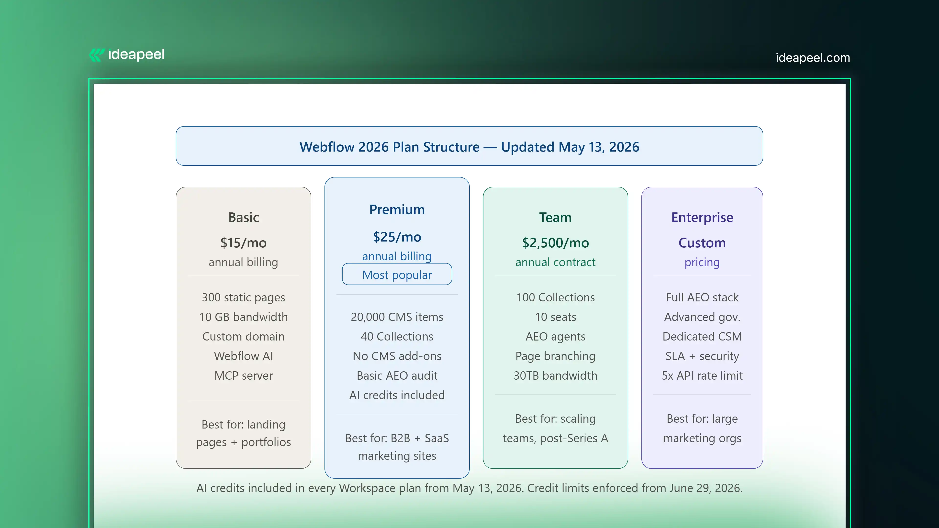
What changed in Webflow's 2026 pricing? On May 13, 2026, Webflow merged the legacy CMS and Business site plans into a single new Premium plan, introduced a new Team plan between Premium and Enterprise, and added AI credits to all Workspace plans. The changes affect new accounts immediately and existing accounts at their next renewal date.
Here is a clear breakdown of the current plan structure:
Basic Plan ($15/month, annual): For landing pages, portfolios, and sites that do not need a CMS. Includes 300 static pages, 10 GB bandwidth, custom domain, Webflow AI, and MCP server access.
Premium Plan ($25/month, annual): The main plan for content-heavy marketing sites. Includes 20,000 CMS items, 40 Collections, and removes the need for CMS add-ons entirely. This is the right starting point for most B2B marketing sites and SaaS websites.
Team Plan ($2,500/month, annual contract): A new all-in-one plan for teams that have outgrown self-serve but are not ready for Enterprise. Includes 100 CMS Collections, 10 seats, Localization, AEO agents, page branching, single-page publishing, publishing workflows, a site activity log, custom SSL certificates, security headers, and 30TB of bandwidth. Requires reaching out to Webflow directly; not available as a self-serve purchase.
What Is Webflow Optimize and Do You Need It?
Webflow Optimize is a separate add-on that starts at $299 per month and scales by page views. It adds native A/B testing, multivariate testing, and AI-driven personalization directly inside the platform.
For conversion-focused B2B and SaaS marketing sites, this matters because it removes a key reason to use a third-party testing tool. Your A/B tests run inside the same interface where you build and manage your site. Your personalization logic is connected to the same CMS that powers your content.
When do you actually need Optimize? If you are running a meaningful volume of traffic through key landing pages and you are not systematically testing variations, Optimize pays for itself quickly. For sites below 25,000 monthly page views on conversion-critical pages, the standard plan tier is the starting point.
Webflow vs. Framer in 2026: What Is the Actual Difference?
This is a question that comes up constantly, and the honest answer is that they are solving different problems.
Framer is excellent for design speed. If you want a beautiful landing page or a portfolio site built and live quickly, Framer is a strong choice. Its AI generation tools are fast, its template ecosystem is strong for visual work, and the learning curve is lower for designers who have not worked in a CMS-heavy environment.
Webflow is the right choice when your website is a business growth system rather than a design deliverable. If your site needs a real CMS architecture, deep content relationships, AEO optimization, a Claude integration, custom interactive components, team publishing workflows, or scalable data structure, Framer is not built for that in the same way.
The bottom line: Framer is a design tool with publishing capabilities. Webflow in 2026 is a growth platform with design capabilities. Which one you need depends on what problem you are actually trying to solve.
What Is a Relational Authority Hub and Why Should You Build One?
Traditional SEO advice focuses on individual pages. Rank page A for keyword A. Rank page B for keyword B. In 2026, that approach is insufficient on its own.
AI search tools do not just evaluate individual pages. They evaluate sites as entities, looking at the breadth and depth of your coverage on a topic, the relationships between your content, and whether your site reflects genuine expertise on a subject or just a collection of keyword-targeted pages.
What is a relational authority hub? A relational authority hub is a content architecture where your core topic pages, subtopic pages, supporting articles, case studies, and FAQ content are all interconnected through deliberate internal linking, shared schema vocabulary, and consistent entity references. Instead of a flat structure of individual pages, you build a web of connected content that signals depth and expertise to both human readers and AI systems.
Here is what this looks like in practice on a Webflow site:
Your main product or service page links to three or four deep-dive supporting pages on specific aspects of that service. Those supporting pages link to relevant case studies and FAQ pages. Your FAQ pages link back to relevant product pages. Your blog content links to all of the above. Every page uses consistent terminology, entity naming, and schema markup.
Webflow's Next-Gen CMS makes this architecture significantly easier to build and maintain than it was on previous versions of the platform. Three-layer nesting and 10 nested collection lists per page means you can model complex relational content without needing a custom CMS or a headless architecture to do it.
Webflow AEO Checklist: What to Do on Your Site Right Now
If you are using Webflow in 2026 and you want to improve your visibility in AI-powered search, here is a practical starting checklist:
Content Structure
- Format each major section with a question-based H2 or H3 heading, followed by a direct 40 to 80 word answer
- Add a dedicated FAQ section to every product, service, and landing page
- Write in plain, declarative language; avoid vague claims that AI models cannot extract cleanly
- Keep your most important pages updated; AI models favor recent, accurate content
Technical Signals
- Enable schema markup for FAQ, HowTo, and Article content types
- Set up your llms.txt file to direct AI crawlers to your most authoritative pages
- Check that every image has descriptive alt text; use Webflow's AI alt text generation if you have a backlog
- Run a Core Web Vitals check in Google Search Console and resolve any failing pages
CMS and Architecture
- Map your internal linking structure; make sure your most important pages receive links from multiple related content pieces
- Use Webflow's AEO audit panel to identify schema gaps and content structure issues
- If you are on the Team or Enterprise plan, run your AEO agents on key page clusters and action the priority recommendations
Monitoring
- Set up the AEO analytics dashboard to track LLM-referred traffic separately from organic search traffic
- Note which pages are receiving AI-referral visits and what content format those pages use; this tells you what is working and where to replicate it
How does Webflow compare to WordPress for SEO and AEO in 2026?
Webflow's technical SEO foundations are handled at the platform level; image optimization, CDN performance, canonical tags, and page speed are built in. WordPress requires plugin management, hosting configuration, and ongoing maintenance to achieve comparable baselines. For AEO specifically, Webflow's native AEO agents and Claude integration currently have no direct equivalent in the WordPress ecosystem. The tradeoff is that WordPress has a larger plugin and developer ecosystem; Webflow offers a tighter, more managed platform with fewer moving parts to maintain.
The Bottom Line on Webflow in 2026
Webflow's 2026 updates make it more than a website builder. With AI-powered SEO, AEO tools, Claude integration, and smarter CMS features, it's built for the future of AI search.
To stay ahead, optimize your website for both Google and AI search by improving your content structure, using llms.txt, and creating high-quality, connected content.
Need help building an AI-ready Webflow website? Explore ideapeel's Webflow Development, Webflow SEO Services, and UI/UX Design Services to create a faster, smarter, and search-optimized website that drives real business growth.
[[last-cta]]
.webp)
If your B2B or SaaS website is getting traffic but not enough leads, demo requests, or sign-ups, the problem is usually not your ads or your offer. Most of the time, it is the experience your website gives people when they land on it.
A UI/UX audit helps you find exactly where that experience breaks down. It shows you what is confusing visitors, what is slowing them down, and what is stopping them from taking action.
This guide covers everything you need to run a proper UI/UX audit for your B2B or SaaS website. You will learn what a UI audit checks, what a UX audit looks at, how both connect to conversion rate optimization (CRO), SEO, and website speed, and you will get a full checklist you can use right away.
What Is a UI/UX Audit?
A UI/UX audit is a structured review of your website or product. It looks at how your site looks, how it works, and how easy it is for visitors to do what they came to do.
The audit identifies design problems, usability issues, slow performance, confusing navigation, and anything else that gets in the way of a good user experience.
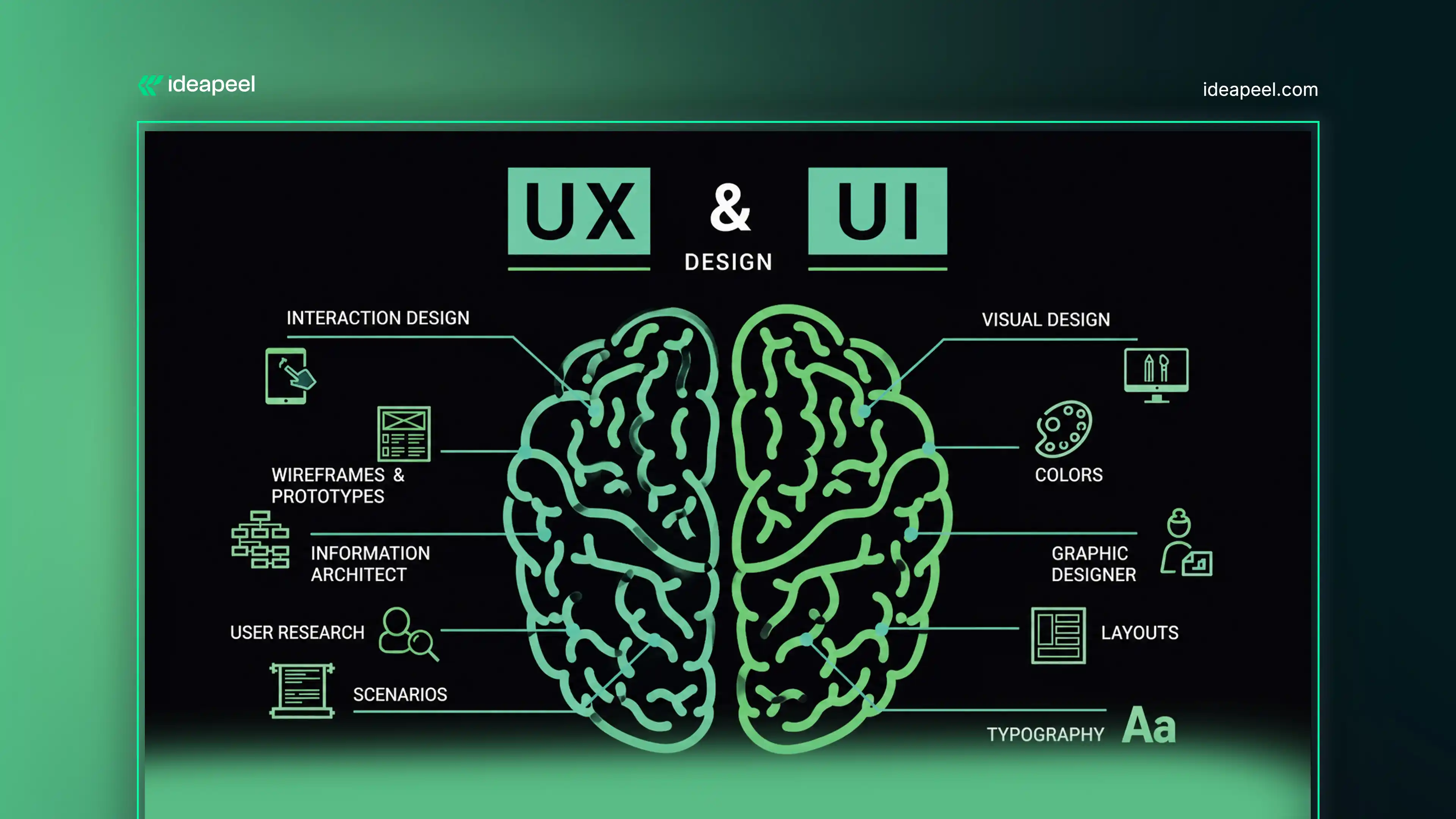
Definition of a UI Audit
A UI (User Interface) audit reviews the visual side of your website. It looks at colors, fonts, buttons, images, icons, spacing, and design consistency. The goal is to make sure your website looks professional, clear, and on-brand on every page.
Definition of a UX Audit
A UX (User Experience) audit reviews how people move through your website. It looks at how easy tasks are to complete, whether the journey from landing page to conversion is smooth, and where visitors drop off or get stuck.
Why UI/UX Audits Matter for B2B & SaaS Companies
B2B buyers do a lot of research before they make a decision. If your website is hard to navigate, confusing to read, or slow to load, they will leave and check your competitor instead.
For SaaS companies, the website is often the product's first impression. If your site does not clearly explain what the product does and make it easy to sign up or book a demo, you lose the user before they even try the product.
In B2B, 80% of purchase decisions are influenced by customer experience rather than price alone. That means how your website feels to use directly affects your revenue.
Signs Your Website Needs a UI/UX Audit
Here is a quick snapshot to check whether your site is due for an audit right now.
Quick Snapshot Checklist
✓ High bounce rates, visitors are leaving without engaging
✓ Low demo requests, people are not clicking your main CTA
✓ Poor lead generation, forms are not converting
✓ Low engagement, users are not clicking deeper into the site
✓ Navigation issues, people are getting lost or confused
✓ Slow page speed, pages are taking too long to load
✓ Mobile usability problems, the site does not work well on phones
If you are seeing even two or three of these signs, a UI/UX audit will tell you exactly what to fix.
Understanding UI Before Starting Your Audit
What Is UI (User Interface)?
UI is everything a visitor sees on your website. It includes your colors, fonts, buttons, images, icons, spacing, and layout. Good UI design makes a site look clean, professional, and easy to scan at a glance.
Bad UI design creates confusion. When buttons are different sizes on different pages, or when the color scheme clashes, or when text is too small to read, visitors feel something is off, even if they cannot name what it is. They leave.
Core UI Elements to Audit
When you audit your UI, you look at these specific elements:
Colors: Does the color palette match your brand? Are colors used consistently across all pages? Does the main CTA button stand out from the background?
Typography: Are fonts easy to read on both desktop and mobile? Is there a clear visual difference between headings, subheadings, and body text?
Buttons: Do all buttons follow the same style, shape, and size? Is there one clear primary button per section?
Forms: Are forms simple? Do they only ask for information that is actually needed right now?
Icons: Are icons easy to understand? Do they match the style of the rest of the design?
Images: Are images high quality? Do they show real product value or real people? Are they optimized so they do not slow the page down?
Visual hierarchy: Can a visitor quickly tell what is most important on each page? Is the headline bigger than the body text? Does the CTA stand out?
Design consistency: Does every page look like it belongs to the same website?
Why UI Matters for SaaS and B2B Websites
SaaS and B2B buyers judge your product by the look of your website. If the design feels outdated or inconsistent, they wonder if your software has the same problems. A clean, consistent UI builds trust before a single word is read.
UI Audit Checklist
✓ Brand colors and fonts are consistent across all pages
✓ Typography is readable on all screen sizes
✓ Button styles are consistent, one clear primary style per section
✓ Spacing between elements is even and intentional
✓ Design meets basic WCAG accessibility standards
✓ Website looks good and works correctly on mobile devices
[[question-block]]
Understanding UX Before Starting Your Audit
What Is UX (User Experience)?
UX is how your website feels to use. It is not about how it looks; it is about whether people can actually accomplish what they came to do. Can they find your pricing page easily? Can they fill out a contact form without friction? Can they understand your product in 30 seconds?
Good UX is invisible. When it works, people flow through your site naturally and reach the outcome they were looking for. When it fails, they bounce.
Key UX Factors to Evaluate
Usability: Can visitors complete key tasks quickly and without confusion?
Accessibility: Can people with visual or motor impairments use your site?
User flow: Is there a clear path from the landing page to the conversion point?
Navigation: Can users find what they need without hunting?
Performance: Does the site load fast enough to keep people from leaving?
User satisfaction: After using your site, do visitors feel like it was easy and worth their time?
Why UX Impacts Revenue
70% of users abandon signup flows due to friction or confusion, and 44% of users who experience usability issues do not return. These are not small numbers. Every piece of friction on your site is quietly costing you sign-ups, demo requests, and revenue.
Every second of load time delay reduces conversions by 7%. That alone makes performance a UX issue, not just a technical one.
UI vs UX, What's the Difference During an Audit?
This is one of the most common questions people ask when they first hear about audits. The short answer: UI is what you see, UX is what you feel.
What is the difference between a UI audit and a UX audit? A UI audit focuses on the visual design of a website: colors, typography, buttons, icons, images, and design consistency.
A UX audit focuses on the user's experience, whether navigation is easy, whether tasks can be completed without friction, and whether the site guides users naturally toward conversion. Both audits are needed because a site can look good but be hard to use, or be easy to use but look unprofessional.
UI vs UX Comparison Table
Read the full guide ui vs ux
[[inner-cta]]
How UI and UX Work Together
UI and UX are two sides of the same coin. A strong UI creates the right first impression. Strong UX keeps the visitor engaged and moves them toward action. When both are working well together, your website converts.
When UI is strong but UX is weak, the site looks great, but visitors get lost and leave. When UX is strong, but UI is weak, the flow is logical, but the site looks untrustworthy, and visitors still leave.
Common UI and UX Problems Found During Audits
These are the issues that come up most often in real B2B and SaaS website audits:
- Buttons that are too small or too similar to the background
- Menus that use internal jargon instead of plain language
- Hero sections that talk about the company, not the customer's problem
- Forms with too many required fields on the first step
- Pages that work fine on desktop but break on mobile
- CTAs that appear in only one place per page
- Slow load times caused by large uncompressed images
Step 1 – Audit Website Design Components
Good website design for a B2B or SaaS company is not about being flashy. It is about being clear. Every design element on your page should either help a visitor understand something or move them toward taking action.
Header Design
Your header is the first thing people see. It needs to do three things well: show your logo, provide a clear way for visitors to navigate, and include a visible CTA, whether that is "Book a Demo," "Start Free Trial," or "Get a Quote."
Check that your header stays consistent across all pages. Check that it is readable on mobile. Check that the CTA in the header is actually visible without scrolling.
Hero Section
The hero section, the first thing visitors see below the header, needs to answer three questions immediately: What does this product do? Who is it for? What should I do next?
If your hero section starts with "Welcome to [Company Name]" or focuses on your story instead of your customer's problem, it needs to change.
Calls-to-Action (CTAs)
Your CTAs tell visitors what to do next. Every page needs at least one clear CTA. The language should be specific and action-focused. "Start Free Trial" works better than "Learn More." "Book a 15-Minute Demo" works better than "Contact Us."
CTAs should be visually distinct. They should stand out from the rest of the page through color and size.
Forms and Lead Capture Elements
Long forms kill conversions. If your contact form asks for 10 fields on the first step, most people will leave without filling it in. Ask for the minimum amount of information needed right now. You can collect more later.
Reducing form fields significantly decreases friction and improves conversion rates at the critical first touchpoint.
Footer Design
Your footer should not be an afterthought. It is where visitors go when they want to find something they could not find in the main navigation. Include key links, contact information, social profiles, and a secondary CTA.
Trust Elements
B2B buyers need to feel confident before they take any action. Trust elements help with this. These include:
- Customer testimonials with real names and company logos
- Case study links
- Industry awards or recognitions
- Security certifications (especially important for SaaS)
- Well-known client logos
Step 2 – Audit Navigation and Information Architecture
Navigation is one of the most common reasons people leave B2B and SaaS websites. If visitors cannot find what they need quickly, they will not look for long. They will leave.
Main Navigation
Your main menu should be clean and simple. Use language that your customer would use, not language your internal team uses. "Reports" is clearer than "Analytics Engine." "Team Settings" is clearer than "User Management Configuration."
The main navigation menu should be in the same position on every page, use the same labels, and always be accessible. Users should never lose their sense of "where am I?"
Mobile Navigation
On mobile, your navigation needs to be just as functional as on desktop. Hamburger menus are acceptable on mobile. However, the most important links, pricing, demo CTA, and product overview should not be buried three taps deep.
Test your mobile navigation by actually using it on a phone. If it takes more than two taps to reach your most important pages, simplify it.
Mega Menus
For larger SaaS products with multiple features or use cases, a mega menu can help. But keep it organized. Group links into logical categories. Use icons or short descriptions to help visitors quickly find where they need to go.
Mega menus that are too large or too crowded create their own confusion. If you have a mega menu, audit it separately.
Breadcrumb Navigation
Breadcrumbs show visitors where they are within your site structure. They are especially important on deep content pages, like individual blog posts, feature pages, or case studies. They reduce the feeling of being lost and make it easy to go back a level.
Search Functionality
If your site has a lot of content, documentation, multiple product features, a large blog, a search function is not optional. It is essential. Visitors who cannot find something with search will leave.
Test your search. Search for your main product features, your pricing page, your contact page. If results are inaccurate or missing, that is an audit finding.
User Journey Flow
Map out the three or four most important journeys on your site. For a SaaS company, these are usually:
- Visitor lands on homepage → reads about product → visits pricing → starts free trial
- Visitor lands on a blog post → reads content → sees a relevant CTA → books a demo
- Visitor searches for a specific feature → lands on a feature page → signs up
Walk through each journey yourself. Count every click. Every extra step is friction you can remove.
Step 3 – Audit Website Content Experience
Content is not just about SEO. It is about whether the right person, at the right stage of their journey, reads the right thing and takes action.
Homepage Messaging
Your homepage needs to communicate your value proposition in 10 seconds or less. If a first-time visitor cannot tell what you do, who you help, and why they should care, your homepage is not doing its job.
Avoid vague statements like "We help businesses grow." Get specific. "We help B2B SaaS companies reduce churn through better onboarding UX" says something real.
Product and Service Pages
Product pages for SaaS need to explain features in terms of outcomes, not just capabilities. Instead of "Advanced reporting dashboard," write "See exactly which features your users love, and which ones they ignore."
Each product or service page needs a clear audience, a clear problem it solves, and a clear next step.
SaaS Feature Pages
If your product has multiple features, each major feature deserves its own page. This is good for SEO, but it is also good for users. Buyers who are researching a specific capability need a focused page, not a long all-in-one overview.
Landing Pages
Landing pages for paid ads, email campaigns, or gated content need to match the message and design of wherever the visitor came from. If your ad says "Free UX Audit Template," the landing page needs to deliver that immediately, without distraction.
Blog Content
Your blog builds trust and drives organic traffic. But a blog that publishes generic content just to fill a calendar does not build trust. Every post should answer a real question your target audience is searching for, and it should link to relevant product pages or service pages.
Case Studies
Case studies are one of the most powerful trust signals for B2B buyers. They should follow a clear structure: the client's problem, what you did, and the measurable result. Specific numbers, "reduced time-to-value from 47 minutes to 18 minutes", are far more convincing than vague claims.
FAQ Content
FAQ sections on product pages and landing pages serve two purposes. They answer the questions buyers have before they convert, and they give Google clear, direct answers it can pull into AI Overviews and Featured Snippets.
Write FAQ answers in plain language. Keep each answer between two and four sentences. Structured, specific answers get cited.
Step 4 – Audit Conversion Rate Optimization (CRO)
What Is CRO?
CRO (Conversion Rate Optimization) is the process of improving your website so that a higher percentage of visitors take the action you want them to take, whether that is booking a demo, starting a free trial, or filling out a contact form.
It is not about getting more traffic. It is about getting more results from the traffic you already have.
Why CRO Is Part of Every UX Audit
UX and CRO are closely connected. Every usability problem on your site is also a conversion problem. A form that is too long, a CTA that is not visible, a page that loads slowly- these are UX issues, and they all cost you conversions.
A proper UI/UX audit always includes CRO as part of the review, because fixing the experience fixes the numbers.
Conversion Paths to Review
For most B2B and SaaS websites, the most important conversion paths are:
Demo requests: Is the "Book a Demo" flow smooth? How many fields does it ask for? Does a confirmation email go out immediately?
Free trials: How many steps does it take to start a trial? Does the user reach value quickly after signing up?
Contact forms: Are forms short enough that people actually complete them? Is there a clear expectation of what happens after they submit?
Newsletter signups: Is the value of subscribing obvious? Is the form in the right places on the page?
CRO Metrics to Measure
Before and after any audit, track these numbers:
- Conversion rate by page and by CTA
- Bounce rate, how many visitors leave without engaging
- Average session duration, how long visitors are staying
- Exit rate, which pages visitors leave from most
- Form completion rate, how many people start a form vs. finish it
Step 5 – Audit SEO and guide to improving userWebsite Performance
Why SEO Impacts User Experience
SEO and UX are not separate disciplines anymore. Google's ranking signals now include how people experience your site, how fast it loads, how easy it is to use on mobile, how long people stay, and whether they click back to search results immediately.
Nearly 60% of Google searches in the US end without a click. If your content is not structured to be featured in AI-powered snippets or summaries, it risks being overlooked entirely.
Website Speed and UX
Page speed is a direct UX factor. Slow pages frustrate users. They also hurt rankings.
A page that takes more than 3 seconds to load will lose a large portion of its visitors before they ever read a word. For SaaS and B2B sites, where the cost per visitor from paid channels is high, slow pages are an expensive problem.
Core Web Vitals
Google's Core Web Vitals are three performance metrics that measure real user experience:
LCP (Largest Contentful Paint): How long it takes for the main content of the page to load. Aim for under 2.5 seconds.
INP (Interaction to Next Paint): How quickly the page responds when a user clicks or taps. Aim for under 200 milliseconds.
CLS (Cumulative Layout Shift): How much the page layout shifts while loading. Aim for a score under 0.1.
These three scores directly affect your Google rankings. Check them in Google Search Console or PageSpeed Insights.
Mobile Performance
More than half of B2B research starts on a mobile device. If your site has a poor mobile experience- small text, buttons that are hard to tap, content that overflows the screen- you are losing a significant portion of your audience.
Mobile cart abandonment rates reach up to 85.7%, largely due to unoptimized layouts and cluttered conversion flows. Simplifying the mobile experience can lift conversions by up to 35%.
Internal Linking Structure
Internal links help search engines understand your site's structure. They also help visitors navigate to related content. Every blog post should link to relevant product or service pages. Every product page should link to related case studies or feature pages.
Broken internal links, links that go to 404 pages, hurt both UX and SEO. Run a broken link check as part of every audit.
Technical SEO Review
Beyond speed and Core Web Vitals, a technical SEO review covers:
- HTTPS security: your site must be on HTTPS, not HTTP
- Structured data: schema markup helps Google understand your content and can get it featured in rich results
- Clean URL structure: URLs should be readable, short, and descriptive
- Proper use of canonical tags to avoid duplicate content issues
- XML sitemap is up to date and submitted to Google Search Consol
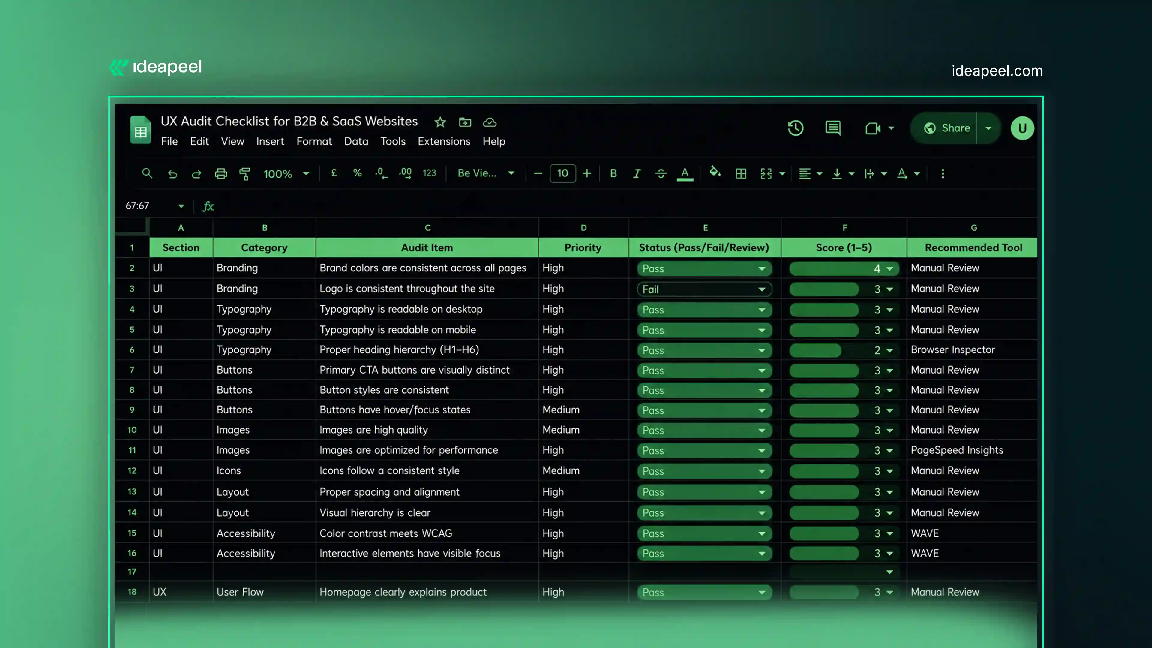
Complete UI/UX Audit Checklist for B2B & SaaS Websites
Use this master checklist to run a full audit of your website. Work through each section and mark each item as Pass, Fail, or Needs Review.
Design
- Branding is consistent across all pages, colors, fonts, and logo treatment
- Typography is readable on all screen sizes
- Visual hierarchy makes key information easy to find
- Design meets WCAG 2.1 AA accessibility standards
- Website is fully responsive on mobile and tablet
Navigation
- Main menu structure is logical and uses plain language
- Search functionality returns accurate results
- Mobile navigation is easy to use
- Breadcrumbs are in place on deep content pages
- Key user flows can be completed in 3 clicks or fewer
Content
- Homepage value proposition is clear in 10 seconds
- Product and feature pages focus on outcomes
- Blog content answers real customer questions
Case studies include specific, measurable results
- FAQ sections give clear, direct answers
- Internal links connect related content naturally
CRO
- CTAs are specific, visible, and action-focused
- Forms are short and low-friction
- Social proof is visible near conversion points
- Trust signals appear close to CTAs and forms
- Conversion tracking is active and accurate
SEO & Performance
- Pages load in under 3 seconds
- Core Web Vitals pass
- Site is mobile-optimized
- Internal links are active, no 404 errors
- Structured data is in place for key pages
UI/UX Audit Snapshot Template
After running your audit, score each area out of 5 and use the table below to get your overall UX health score.
Check the master sheet: Free ui/ ux audit checklist
Common UX Audit Mistakes Found on B2B & SaaS Websites
These are the problems that come up in almost every B2B and SaaS website audit. Check if any of these apply to your site.
Confusing Navigation
When visitors cannot find your pricing page, your product features, or your contact form quickly, they leave. The fix is not always a redesign. Often it is just renaming menu items, reducing the number of top-level options, or adding a sticky header on mobile.
Weak Value Propositions
Too many SaaS websites open with "The #1 platform for [category]" or "Empower your team with [product name]." These headlines say nothing. A strong value proposition is specific. It names who the product is for, what problem it solves, and what result the user gets.
Poor Mobile Experience
Even if your desktop experience is excellent, if the mobile version has small text, overlapping elements, or CTAs that are hard to tap, you are losing a large portion of your audience. Mobile is not optional for B2B or SaaS anymore.
Slow Website Speed
Page load times and response times are a critical part of any UX assessment. Slow performance creates friction that affects every other part of the user experience. Start with image compression, then look at third-party scripts and hosting.
Inconsistent UI Design
When different pages of your site look like they were designed by different teams , and sometimes they were, it breaks trust. Visitors notice inconsistency, even if they cannot explain why something feels off. Establish a clear design system and apply it consistently.
Low-Converting CTAs
A CTA that says "Submit" or "Learn More" gives the visitor no information about what happens next. Specific CTAs convert better. "Get My Free Audit," "Start My 14-Day Trial," "Book a 20-Minute Demo" , these tell the user exactly what they are getting.
Complex Signup Flows
Trial limitations that prevent users from experiencing the product's core value can hurt conversion more than help it. If your trial is so restricted that users cannot reach the "aha moment," the trial itself becomes a barrier.
Simplify your signup flow. Reduce required fields. Let people explore before asking them to commit.
Recommended UX Audit Checklist Tools
You do not need expensive enterprise software to run a solid audit. Here are the best tools organized by category.
Analytics Tools
Google Analytics 4: Shows traffic sources, bounce rates, page engagement, and conversion events. Free and essential.
Mixpanel: Better for tracking in-product behavior and funnel drop-off. Useful for SaaS audits specifically.
Heatmap Tools
Hotjar: Shows where visitors click, scroll, and hover. Heatmaps reveal which parts of your page people actually engage with versus ignore.
Microsoft Clarity: Free heatmap and session recording tool with strong filtering options.
Session Recording Tools
Hotjar or FullStory: Record real user sessions so you can watch where people get confused, where they rage-click, and where they abandon forms.
Session recordings are one of the most valuable inputs in any UX audit. They show you reality, not assumptions.
SEO Audit Tools
Google Search Console: Tracks your search performance, Core Web Vitals, and any indexing issues.
Ahrefs or Semrush: Check for broken links, keyword rankings, and technical SEO issues. Essential for a full audit.
Performance Testing Tools
Google PageSpeed Insights Scores your page speed and Core Web Vitals with specific suggestions for improvement.
GTmetrix gives a detailed breakdown of what is slowing your site down and how to fix it.
Accessibility Testing Tools
WAVE (WebAIM) checks your site for WCAG accessibility violations and gives specific recommendations.
axe DevTools A browser extension that runs accessibility audits directly in Chrome or Firefox.
Why Choose ideapeel for UI/UX Audits?
Running a UI/UX audit takes time, experience, and the right tools. Ideapeel combines all three.
Data-Driven Analysis
Every recommendation in an Ideapeel audit is backed by real data, analytics, heatmaps, session recordings, and performance benchmarks. Not guesswork.
B2B & SaaS Expertise
Generic UX advice does not work for B2B and SaaS websites. Ideapeel specializes in the specific challenges these companies face: long sales cycles, multiple buyer personas, complex product messaging, and high-value conversion paths.
SEO + UX + CRO Approach
Most agencies audit one thing. Ideapeel audits how SEO, UX, and CRO work together, because fixing only one piece of the puzzle will not get you the results you need.
Actionable Recommendations
An audit that gives you a 90-page PDF with 200 observations is not useful if you do not know where to start. Ideapeel delivers prioritized, actionable recommendations, organized by impact and effort so your team knows exactly what to do first.
Continuous Optimization Support
A UI/UX audit is a starting point, not a finish line. Ideapeel works with B2B and SaaS teams on an ongoing basis to test, refine, and improve their websites over time.
[[last-cta]]
.webp)
Artificial intelligence has become a core part of modern Webflow workflows. From planning site architecture and writing landing page copy to generating custom code and improving SEO, AI assistants are helping designers and developers work faster than ever before.
Among the many AI tools available today, two names consistently stand out: Claude and ChatGPT. Both can assist with Webflow projects, but they excel in different areas. Choosing the right one depends on whether your priority is coding, content creation, documentation, CMS planning, or agency productivity.
In this guide, we'll compare Claude vs ChatGPT for Webflow across real-world tasks, including website planning, custom code generation, CMS architecture, SEO optimization, client documentation, and day-to-day development workflows. By the end, you'll have a clear understanding of which AI is the better fit for your projects in 2026.
Quick Answer: Which AI Is Better for Webflow?
For most Webflow professionals, ChatGPT is the stronger all-around choice. It combines coding assistance, SEO support, content creation, design brainstorming, workflow automation, and image generation in a single platform. Claude performs exceptionally well when working with large documents, comprehensive audits, and long-form project planning.
If you're a freelancer or agency building and optimizing Webflow websites every day, ChatGPT typically offers the most complete workflow. If your work involves analyzing extensive documentation or creating detailed reports, Claude is an excellent complementary tool.
Why Webflow Professionals Are Using AI in 2026
The demand for faster website delivery and higher-quality digital experiences has pushed AI into the center of Webflow development.
Teams now use AI to:
- Generate HTML, CSS, and JavaScript snippets.
- Plan CMS collections and dynamic content structures.
- Create SEO-friendly blog posts and landing pages.
- Brainstorm layouts and UX improvements.
- Produce client proposals and project documentation.
- Debug custom code and streamline development workflows.
Rather than replacing designers and developers, AI accelerates repetitive tasks so professionals can focus on strategy, creativity, and user experience.
Understanding Claude and ChatGPT
What Is Claude?
Claude is an AI assistant known for its ability to process lengthy documents and provide structured, thoughtful responses. It performs particularly well when reviewing design systems, technical documentation, project briefs, and large content libraries.
For Webflow teams managing enterprise projects or extensive client documentation, Claude can help organize information and produce detailed analyses without losing context.
What Is ChatGPT?
ChatGPT is a versatile AI assistant that supports coding, writing, brainstorming, SEO, automation, and image generation within one ecosystem. It is widely used by Webflow developers and designers to create custom code embeds, improve site content, plan CMS structures, and speed up production workflows.
Its combination of technical capabilities and creative assistance makes it especially useful for agencies and freelancers handling multiple client projects.
What Makes an AI Useful for Webflow?
Not every AI assistant delivers the same value for Webflow projects. The best tools typically excel in five areas.
Design Assistance
Strong AI tools can suggest landing page structures, user flows, style guides, accessibility improvements, and conversion-focused layouts before development begins.
Development Support
Developers often rely on AI for:
- HTML generation
- CSS optimization
- JavaScript snippets
- Custom embed code
- Responsive fixes
- API integration guidance
CMS Planning
For content-heavy websites, AI can simplify:
- Collection planning
- Multi-reference fields
- Dynamic content structures
- Blog architecture
- Scalable information models
SEO Optimization
AI can also assist with:
- Keyword-focused outlines
- Meta titles and descriptions
- Schema suggestions
- Internal linking ideas
- Content briefs
- Search optimization strategies
Client Workflow
Beyond design and development, AI improves productivity by helping create proposals, technical documentation, onboarding materials, meeting summaries, and project plans.
Claude vs ChatGPT: Quick Comparison
ChatGPT for Webflow Development
Better Front-End Development Support
ChatGPT consistently performs well when generating custom CSS, JavaScript interactions, responsive layouts, animation logic, and Webflow embed code. Developers can iterate quickly by refining prompts and debugging snippets within the same conversation.
Strong SEO Workflows
Webflow agencies frequently use ChatGPT to create:
- Blog outlines
- SEO briefs
- Meta descriptions
- Structured content
- Schema recommendations
- Internal linking ideas
Because it combines technical understanding with marketing knowledge, it is especially valuable for SEO-driven websites.
Design Brainstorming
During planning stages, ChatGPT can suggest:
- SaaS landing page structures
- Homepage layouts
- UX improvements
- Conversion-focused sections
- Content hierarchy
- Navigation ideas
These recommendations help teams move from concept to execution more efficiently.
Visual Content Creation
One notable advantage is built-in image generation, allowing designers to rapidly create hero concepts, marketing visuals, illustrations, and creative inspiration without switching tools.
Claude for Webflow Development
Long-Form Analysis
Claude shines when processing extensive design documentation, content inventories, project requirements, and large website audits. It maintains context across long inputs and produces organized outputs that are easy to review.
Documentation and Reporting
Many agencies use Claude to create:
- Technical specifications
- Standard operating procedures
- Client reports
- Design documentation
- Project summaries
Its structured writing style makes it particularly effective for collaborative environments.
Strategic Planning
When planning CMS architecture or information hierarchy, Claude often produces detailed explanations and methodical reasoning that can help teams make informed implementation decisions.
Real-World Webflow Testing
Building a CMS Structure
ChatGPT
- Faster recommendations
- Practical examples
- Scalable collection planning
Claude
- Thorough documentation
- Logical organization
- Detailed planning
Winner: Tie
Writing Custom JavaScript
ChatGPT
- Faster iteration
- Strong debugging
- Practical implementation
Claude
- Clear explanations
- Conservative coding style
Winner: ChatGPT
Creating SEO Content
ChatGPT
- Better keyword optimization
- Conversion-focused writing
- Marketing-oriented structure
Claude
- Natural language
- Strong readability
Winner: ChatGPT
Website Audits
ChatGPT
- Actionable recommendations
- Fast technical insights
Claude
- More comprehensive reviews
- Better handling of lengthy reports
Winner: Claude
Which AI Is Best for Different Webflow Users?
Freelance Designers
Best Choice: ChatGPT
Freelancers benefit from faster coding assistance, content creation, design ideation, and client communication within one platform.
Webflow Agencies
Best Choice: ChatGPT + Claude
Many agencies use ChatGPT for production tasks while relying on Claude for audits, documentation, and large-scale planning.
Developers
Best Choice: ChatGPT
Its strengths in JavaScript, HTML, CSS, debugging, and API guidance make it an effective coding assistant.
Content Teams
Best Choice: Claude
Its long-context capabilities and structured writing style make it valuable for documentation-heavy workflows and extensive content reviews.
Final Verdict
For most Webflow professionals in 2026, ChatGPT provides the most complete end-to-end experience. It supports coding, SEO, design ideation, automation, research, and content creation within a single workflow, reducing the need to jump between multiple tools.
Claude remains an outstanding option for documentation, enterprise-scale planning, and large project analysis. Teams handling complex requirements or extensive audits can benefit significantly from its strengths.
The best choice ultimately depends on your workflow, but many agencies find that combining ChatGPT for execution with Claude for analysis delivers the highest productivity and quality.
Ready to turn your website into a growth asset?
