Generative Engine Optimization (GEO) for B2B SaaS: How to Get Cited in AI Search
%20for%20B2B%20SaaS_%20How%20to%20Get%20Cited%20in%20AI%20Search%20(1).webp)


Summarize with Ai





Key Takeaways
More B2B buyers are starting their research in ChatGPT, Perplexity, and Google AI Overviews before they ever open a search results page. If your SaaS company isn't structured for those systems to find, understand, and cite it, you're invisible at the exact moment someone is deciding who to shortlist.
This guide breaks down what Generative Engine Optimization actually means for a B2B SaaS company, how it's different from (and connected to) SEO and AEO, and what to change on your website so AI systems can accurately represent your product - and hopefully recommend it.
Quick answer
Generative Engine Optimization (GEO) for B2B SaaS is the practice of structuring your website, content, and external presence so AI systems like ChatGPT, Perplexity, and Google AI Overviews can understand what your product does, who it's for, and why it's credible enough to cite. It builds on SEO fundamentals but adds a heavier emphasis on entity clarity, evidence, and machine-readable structure.
Key takeaways
- GEO isn't a replacement for SEO - it's what happens when SEO, entity clarity, and evidence-backed content work together for AI systems instead of just search rankings.
- AI search engines don't rank pages the way Google does. They gather evidence, compare it, and decide what's worth citing. That changes what "good content" looks like.
- Comparison pages, case studies, and author pages carry more weight in GEO than in traditional SEO, because they give AI systems something concrete to evaluate.
- No platform - not ChatGPT, not Perplexity, not Google - guarantees citations. The realistic goal is improving your eligibility and likelihood of being cited, not forcing a result.
- Webflow now ships native AEO tooling (Enterprise tier) and an MCP server (available on every plan, including the free tier) that both play into a GEO strategy in different ways.
What is Generative Engine Optimization for B2B SaaS?
.webp)
Traditional SEO helps your SaaS website compete for rankings on a results page. GEO helps make your company easier for AI systems to understand, evaluate, and potentially cite when someone asks for a recommendation.
The difference matters because the underlying task is different. A search engine matches a query to a set of pages and ranks them. A generative engine has to do more work: it interprets what the user actually needs, pulls together information from multiple sources, compares options, and produces an answer - with citations attached, if it's confident enough in what it found.
Take a query like "best Webflow development agencies for a B2B SaaS company." To answer that well, an AI system has to:
- Understand what the user actually needs (not just match keywords)
- Identify companies that plausibly fit
- Compare them against each other
- Evaluate the evidence available for each one
- Decide which sources are trustworthy enough to cite
- Generate a recommendation
- Attribute it to specific pages
Every one of those seven steps is a place where a well-structured SaaS website has an advantage over a vague one - and where GEO work actually pays off.
[[inner-cta]]
GEO vs. SEO vs. AEO vs. LLM optimization
These terms get used interchangeably a lot, which causes confusion. They're related, not identical, and none of them replaces the others.
A strong SEO foundation feeds AEO, which feeds GEO, which feeds how well LLMs represent your brand when someone asks about you in a completely different context. Treat them as layers on the same foundation, not four separate strategies competing for budget.
Why GEO matters for B2B SaaS specifically
B2B SaaS buying decisions involve research, comparison, and validation - which happens to be exactly the kind of query AI search engines are built to answer. Someone evaluating a new tool isn't typing one search and clicking the top result. They're asking follow-up questions, comparing named competitors, and asking an AI system to summarize the trade-offs.
If your product only exists as marketing copy with no comparison content, no evidence, and no clear entity definition, an AI system has very little to work with. It'll either skip you or, worse, describe you inaccurately based on scraps of information from third-party sites you don't control.
The 6E framework for GEO readiness
.webp)
Most GEO advice stops at "write good content." That's not specific enough to act on. Here's a framework built around what AI systems actually need to extract and trust information about a B2B SaaS company.
Entity - Clearly identify the company, the product, the people behind it, and the concepts it's associated with. An AI system needs to know what category you belong to before it can decide whether you're relevant to a query.
Explanation - State plainly what the company does. Not "we help companies grow," but a specific, checkable description of the product, who it serves, and the problem it solves.
Evidence - Back up claims with something concrete: numbers, named clients, measurable outcomes, third-party validation. Claims without evidence are easy for an AI system to ignore.
Experience - Show first-hand knowledge. Case studies, original research, documented projects. This is what separates a company that clearly does the work from one that's just describing a service category.
Ecosystem - Connect your company to the broader landscape: technologies, industries, partners, and related concepts. Isolated pages read as thin. Pages embedded in a network of related content read as authoritative.
Extraction - Structure content so a specific, useful answer can be pulled out cleanly. Clear headers, direct answers near the top, tables where comparison is the point.
Put together: GEO readiness = Entity + Explanation + Evidence + Experience + Ecosystem + Extraction.
How to structure a B2B SaaS website for GEO
.webp)
Generic advice to "create quality content" doesn't tell you what to build. Here's the actual architecture.
Homepage - Company description, core value proposition, primary services, target customers, industry expertise, differentiators, and proof (logos, numbers, testimonials).
Service or product pages - What it is, who it's for, the problem it solves, the process, deliverables, pricing context where it makes sense, FAQs, related case studies.
Case studies - Client, industry, the specific problem, the solution, how it was implemented, the results, the technology used, and a timeline. Vague case studies ("we improved their results") give an AI system nothing to cite.
Comparison pages - Product A vs. Product B, honest use cases, real limitations, pricing context, and who each option is actually best for.
Author pages - Name, role, expertise, experience, credentials, publications, and relevant work. This matters more than most companies realize - AI systems weigh author credibility as part of trust signals.
[[question-block]]
How to create content AI search engines can cite
.webp)
AI systems cite specific claims, not vague marketing language. Compare these three versions of the same statement:
Weak: "ideapeel builds high-converting Webflow websites."
Stronger: "ideapeel specializes in Webflow development for SaaS and technology companies, combining UI/UX design, Webflow development, CMS architecture, and SEO."
Evidence-rich: "ideapeel specializes in Webflow development for SaaS and technology companies. Its portfolio includes [named project], where the team handled [specific scope of work] and achieved [a verifiable, specific outcome]."
The third version is the only one an AI system can actually use as a citable claim, because it's specific enough to check.
Why comparison content matters more than you'd think
A large share of AI search queries are inherently comparative: "which is better," "what's the best tool for X," "alternatives to Y," "X vs. Y." That's the natural language version of how B2B buyers actually shop.
That means comparison pages, alternative pages, "best for" pages, and use-case pages carry real weight in a GEO strategy. The catch: thin competitor pages built purely to manipulate rankings don't hold up. Give readers genuine differences, real limitations, honest use cases, and pricing context. AI systems (and skeptical B2B buyers) can tell the difference between an honest comparison and a sales pitch dressed up as one.
.webp)
Optimizing for Perplexity
Perplexity describes itself as a web-first answer engine that provides cited answers, and it weighs site-level trust factors - including whether a site identifies its authors and corrects mistakes - as part of its source evaluation.
Its crawler, PerplexityBot, follows robots.txt directives. Block it, and Perplexity won't index the page's text content, though it may still index the domain, headline, and a brief factual summary pulled from elsewhere.
A practical checklist:
- Confirm robots.txt allows PerplexityBot
- Use clear, specific page titles
- Include visible author information
- Publish original information, not repackaged summaries
- Build external authority and third-party mentions
- Keep content dated and current
Optimizing for ChatGPT Search
OpenAI's current documentation states that public websites can appear in ChatGPT Search and recommends allowing OAI-SearchBot to crawl your content - but it also explicitly says placement isn't guaranteed.
That's the honest framing to use: you can't force ChatGPT to cite your site. You can improve your eligibility and likelihood by making content accessible, relevant, clear, authoritative, and easy to verify.
Optimizing for Google AI Overviews
Google's own guidance for generative AI features is consistent on one point: existing SEO best practices still matter. There's no separate playbook where schema markup alone earns you a spot in an AI Overview.
The formula holds up: a solid SEO foundation, useful content, entity clarity, original information, strong internal linking, structured data, and authority combine into AI-search readiness. Schema markup helps, but it's a supporting signal, not a shortcut.
How LLMs understand your brand
Entity clarity is the single biggest lever here. Compare:
"We help companies grow." - An LLM has almost nothing to work with. No category, no audience, no service.
"ideapeel is a Webflow development and digital design agency that helps SaaS and technology companies build, redesign, and optimize marketing websites." - Entity, category, audience, and service, all in one sentence.
Keep your core positioning language consistent across the site. If you're a "Webflow development agency," don't randomly switch to "website company," "digital agency," or "design studio" in different places. Natural variation is fine; inconsistent core positioning confuses entity recognition.
Internal linking as GEO architecture
Internal links aren't just for crawl paths anymore - they're how you signal topical relationships to AI systems parsing your site. A logical chain might look like:
Webflow Development → Webflow SaaS Websites → SaaS Website Design → SaaS Conversion Optimization → Webflow SEO → AEO for Webflow → GEO for B2B SaaS → AI Search Optimization
Each link in that chain reinforces what the next page is about, and builds a network an AI system can traverse to understand the full scope of what you do.
External authority matters as much as your own site
Your website shouldn't be the only source an AI system uses to understand your company. Build a broader evidence network: industry publications, LinkedIn, product directories, review platforms, partner sites, interviews, podcasts, guest contributions, and third-party mentions.
Your website is one part of your entity's online evidence - not the whole thing.
Schema and structured data
Structured data helps, but it's a supporting signal rather than the deciding factor. Prioritize:
- Organization and Person schema for entity clarity
- Article and FAQ schema on blog and resource content
- Product or Service schema where applicable
- BreadcrumbList schema to reinforce site structure
Technical GEO checklist
- Site is crawlable by major AI bots (verify robots.txt for GPTBot, PerplexityBot, ClaudeBot, and Google-Extended)
- Fast load times and clean mobile rendering
- Clear, unique page titles and meta descriptions
- Consistent entity naming across every page
- Author bylines with real credentials on published content
- Regularly updated dates on evergreen content
- Comparison, case study, and author pages actually exist (not just service pages)
GEO for B2B SaaS in Webflow
Webflow has become genuinely relevant to this conversation in 2026, though it's worth being precise about what's available to whom.
Webflow AEO launched in April 2026 as a closed-loop, agent-driven product: it measures AI citation activity, recommends fixes, and helps execute them from inside Webflow. It's a real, useful product - but it currently sits on the Enterprise tier as part of the Analyze add-on, so it isn't something every SaaS company on Webflow has access to out of the box.
Webflow MCP, on the other hand, is available on every Site plan, including the free Starter tier. It's an open-source (MIT-licensed) server that connects AI tools like Claude, Cursor, and ChatGPT directly to your Webflow site, letting you manage CMS collections, pages, and content through natural language instead of manual work in the Designer.
It's worth keeping these two straight: GEO is about optimizing your website so AI systems can discover and cite it. Webflow MCP is about letting AI tools help you build and maintain that website. They support the same goal from different directions, and the MCP server in particular is a practical entry point for smaller SaaS teams who won't have Enterprise-tier AEO access.
A GEO-ready CMS structure in Webflow typically includes:
- Services - name, description, target audience, benefits, process, related case studies
- Case studies - client, industry, challenge, solution, results, technology, related services
- Authors - name, role, expertise, bio, experience
- Industries - industry, problems, solutions, related services and case studies
- Blog - primary topic, search intent, a short direct answer near the top, full content, author, sources, related articles, updated date
Structured this way, the website functions less like a marketing brochure and more like a queryable information system - which is exactly what AI search engines are built to work with.
How to measure GEO performance
There's no single dashboard that tells you "GEO is working," but a few methods together give a reasonably clear picture:
- Manual prompt testing. Regularly ask ChatGPT, Perplexity, Gemini, and Google AI Overviews the questions your buyers would ask, and track whether and how you're mentioned or cited.
- AI-referral traffic. Check analytics for referral traffic from chat.openai.com, perplexity.ai, and similar sources - a signal that's grown from negligible to meaningful for most B2B sites over the past year.
- Third-party AI visibility tools. Platforms built specifically for tracking brand mentions across AI answers can automate what manual prompt testing does at a small scale.
- Webflow AEO analytics (if you're on Enterprise) - native tracking of citation frequency and the specific prompts triggering them.
- Citation source audits. When you are cited, note which page got cited and why. That tells you what kind of content is actually working, so you can build more of it.
GEO vs. traditional SEO
Common GEO mistakes
- Treating GEO as a checklist of keywords instead of a structural and evidentiary problem
- Publishing thin competitor comparison pages that read as manipulative rather than useful
- Inconsistent entity naming across the site, which confuses how AI systems categorize the brand
- No author information on published content
- Promising or implying guaranteed AI citations to clients or stakeholders
- Skipping case studies and evidence in favor of generic claims
B2B SaaS GEO checklist
- Clarify your brand entity and keep positioning language consistent
- Build out service, case study, comparison, and author pages - not just a homepage and blog
- Publish original evidence: data, named results, real case studies
- Create honest comparison content for your category
- Strengthen internal linking between related topics
- Build external authority through third-party mentions and publications
- Confirm crawlability for AI bots
- Set up a regular process for measuring AI visibility
GEO for B2B SaaS: The Final Step
In 2026, Generative Engine Optimization (GEO) is becoming essential for B2B SaaS brands that want stronger AI search visibility. Unlike traditional SEO, which focuses mainly on ranking and organic search, GEO focuses on helping AI systems, search engines, and large language models understand your brand, content, and expertise.
An effective GEO strategy helps SaaS companies get cited by AI, increase AI visibility, earn more AI citations and brand mentions, and improve their chances of appearing in AI-generated answers across platforms like Perplexity, Gemini, and ChatGPT.
The fundamentals are simple: optimize content, structure content clearly, use structured data, strengthen internal and external authority, support claims with evidence, and make your website accessible to AI crawlers. Google confirms that traditional SEO best practices still support visibility in Google AI Overviews, while platforms such as Perplexity evaluate web content when generating cited answers. Google AI Features guidance, Perplexity crawler documentation
For SaaS companies and B2B brands, GEO is not about manipulating an AI platform. It is about building trustworthy content that AI tools can understand, verify, and confidently reference. Track citation frequency, AI referral traffic, share of voice, AI mentions, and how your brand appears in AI responses across platforms.
Ideapeel can help you build an AI-ready SaaS website through Webflow development, AEO for Webflow, and Webflow SEO for B2B SaaS.
Want to get your B2B SaaS brand cited in AI search? Get an AI Search & GEO Audit →
[[last-cta]]
Frequenly Asked Qestion on GEO for B2B SaaS
Enter your website URL to receive a detailed website analysis report in just 5 minutes!

What is the difference between GEO and AEO?
AEO focuses on getting a direct answer surfaced by answer engines. GEO is broader, covering how generative AI systems understand and potentially cite a brand across a wider range of queries.
Want to discuss your project?
Grow your project with Webflow Experts
Related Articles



What are the biggest UI/UX design trends in 2026?
The biggest UI/UX design trends in 2026 are AI as an optional copilot, adaptive personalization, purposeful motion, accessibility controlled by the user, fluid typography, raw and structured layouts, and design systems built to scale. The common thread is intent. Interfaces are judged less by how they look and more by whether they build trust and help people finish a task.
That is the short answer. The rest of this guide explains each trend, who it suits, and where it can go wrong, so you can pick the ones worth your budget.
How we picked these trends
Most trend lists read like a mood board. They show pretty screens and stop there. We took a different route. We compared what several leading design publications are saying, then checked which topics people actually search for, and finally asked a simple question of each trend: does it change a business result?
So every trend below includes the user problem it solves and the business effect to expect. If a trend is mostly decoration, we say so.
A quick note on terms. UI is what people see and touch. UX is how the whole experience feels and performs. In 2026 the two are hard to separate, which is why we treat them together.
The trends at a glance
- AI as a copilot, not an autopilot
- Hyper-personalized, adaptive interfaces
- Conversational and multimodal interaction
- Predictive UX with restraint
- Purposeful motion
- Raw, structural aesthetics
- Accessibility with user control
- Fluid typography
- Anti-glass: the pushback on Liquid Glass
- Crafted over prompted
- Smarter dashboards for SaaS
- Dark mode as a system preference
- Mobile-first, thumb-first design
- Privacy and ethics built into the flow
- Design systems that scale with AI
1. AI as a copilot, not an autopilot
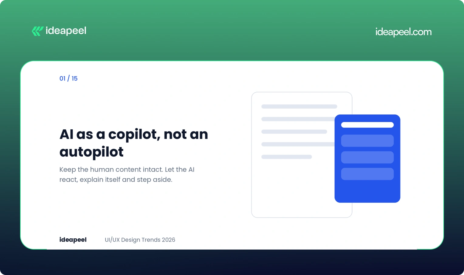
The strongest AI interfaces right now do not take over the page. They sit in a side panel and wait to be asked.
Google's Gemini in Chrome is a good example. Someone reading a cake recipe asks how to make it dairy-free. The original recipe stays untouched. A panel opens beside it with swaps, such as plant-based butter or oat milk, and the person decides what to use. Nothing is overwritten and the panel can be closed.
The lesson for product teams is simple. Keep the human's content intact, let the AI react instead of interrupt, and always give a way out. The scale of the shift is real: in Figma's 2025 AI report, 51% of Figma users working on AI products were building agents, up from 21% the year before.
Business impact: Copilots that respect control earn trust, and trust is what moves a person from trying a feature to depending on it. Explain what the AI did and why, and adoption goes up.
2. Hyper-personalized, adaptive interfaces
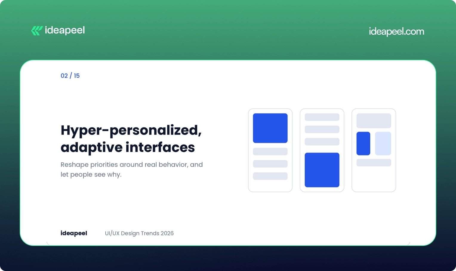
Static layouts built for an average user are losing ground. Interfaces now reshape content and priorities around real behavior, not around personas drawn up in a workshop.
The risk is overreach. A screen that rearranges itself without warning feels broken, not smart. Good personalization is visible, reversible and consistent in structure. Let people see why something was shown and let them turn it off.
Business impact: Relevant experiences raise engagement and retention. This matters most for digital products with several user types, where one fixed layout always fails somebody.
3. Conversational and multimodal interaction
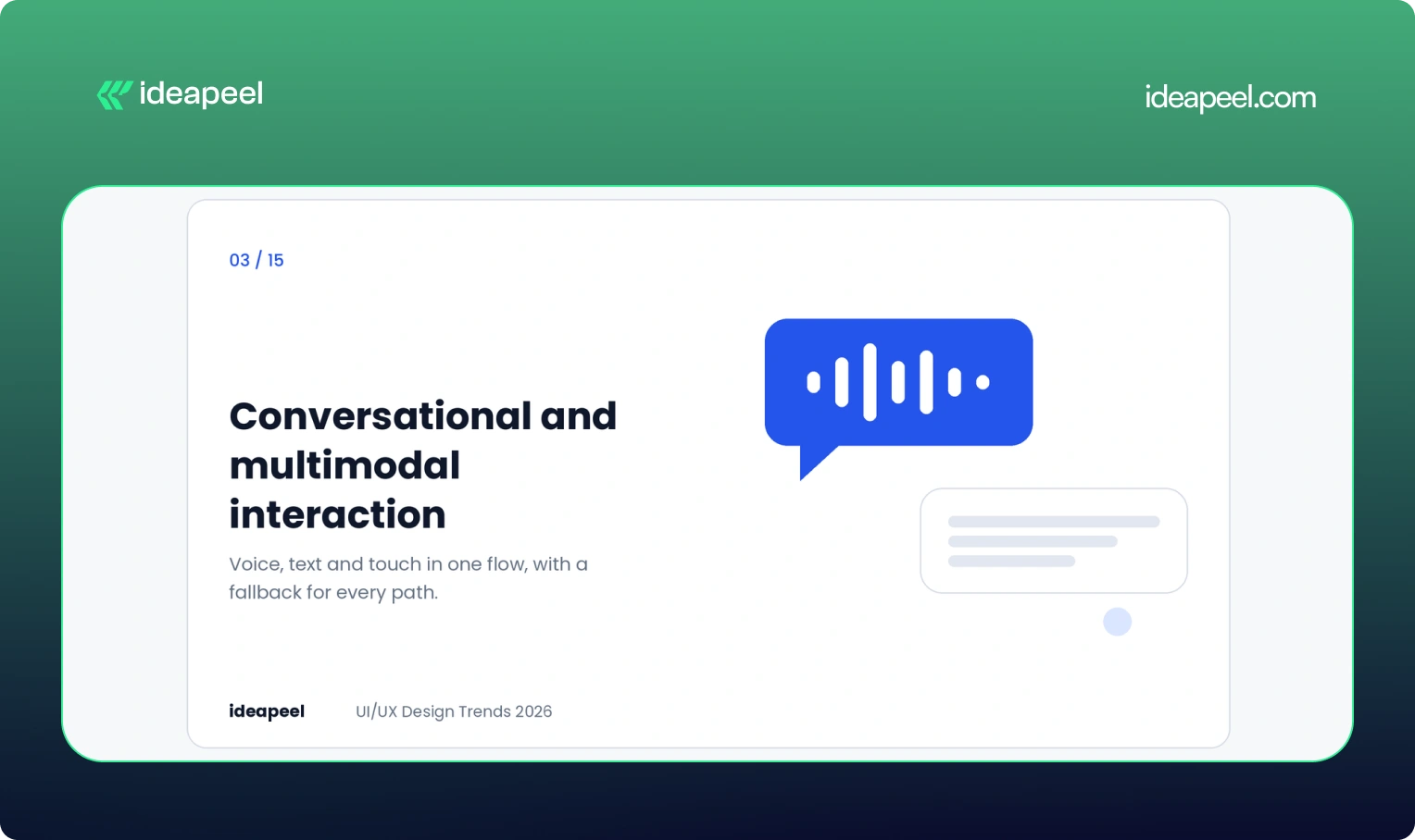
Voice, text, touch and gesture are blending into one flow. A person might speak a request, tap to refine it and type a correction, all in the same task.
Designing for this means designing conversations, not just screens. Think about what happens when the system mishears, when someone interrupts, and when voice is not an option. The fallback path is as important as the happy path.
Business impact: Lower effort in hands-busy or complex tasks, and better access for people who cannot use a standard mouse and keyboard.
4. Predictive UX with restraint
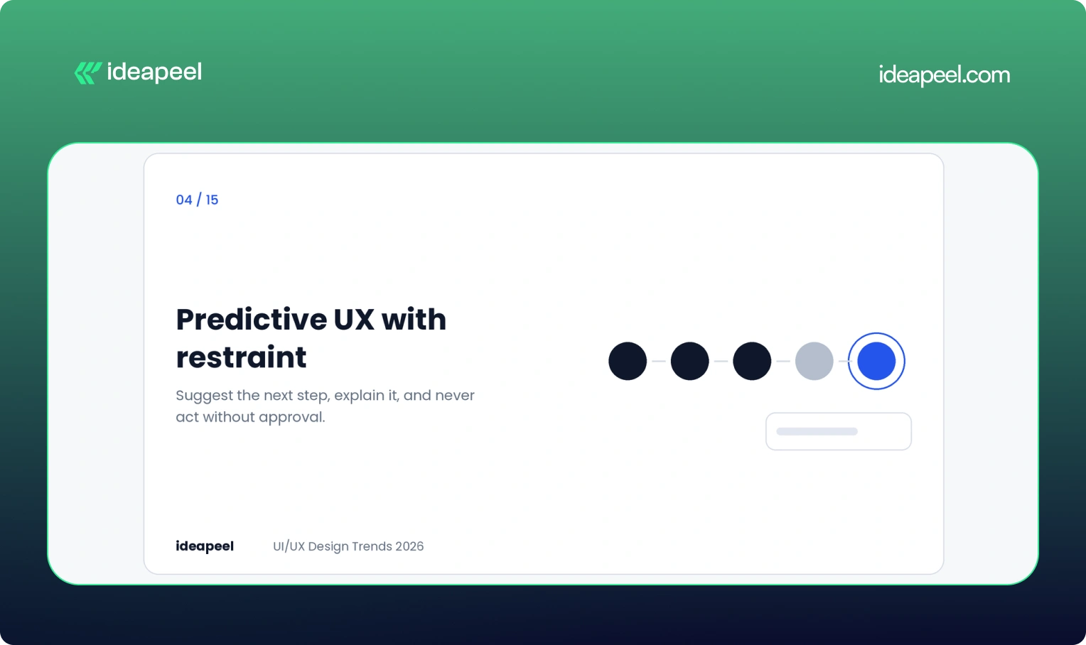
Prediction is easy now. Restraint is the hard part. An interface that surfaces the right shortcut at the right moment feels helpful. One that guesses wrong and cannot be undone feels pushy.
Three rules keep prediction honest. Explain the suggestion in plain words. Make it easy to dismiss. Never take an action the person did not approve.
Business impact: Fewer steps to value, as long as suggestions stay accurate. A bad guess costs more trust than a good guess earns.
5. Purposeful motion
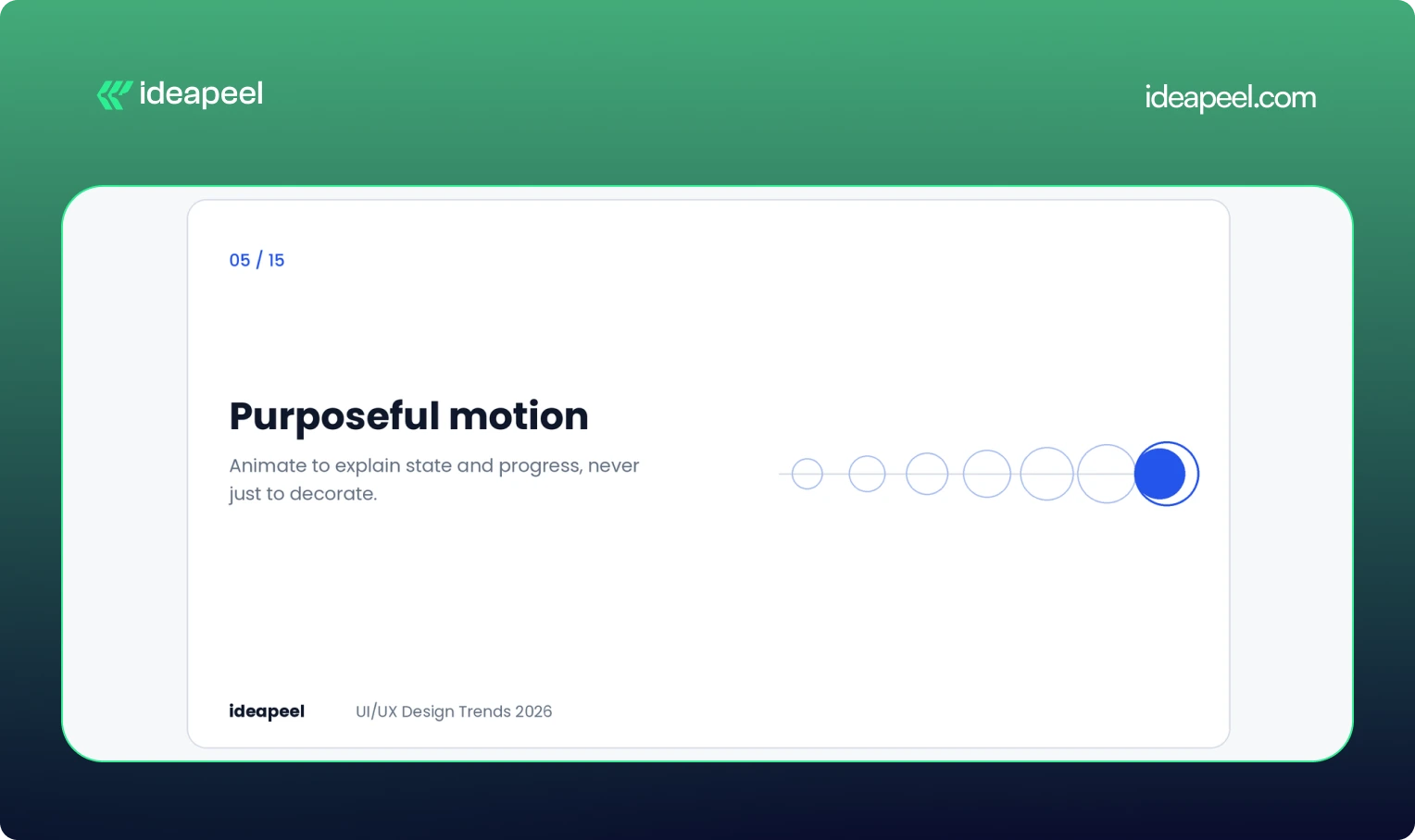
Motion in 2026 has to earn its place. Bouncing buttons and sparkling hover states are fading. Animation that explains state, structure or progress is staying.
Here is a detail many teams miss. Product designer Emil Kowalski has shown that a short, deliberate delay on form submissions can make people more confident their change went through. Two identical submit buttons, one confirming instantly and one pausing briefly with a processing state, produced different levels of belief. The instant one can feel like nothing happened.
This is not a rule for everything. In high-frequency tools, speed still wins. For rare and important actions like payments or password changes, a visible beat of feedback reads as reliability.
Business impact: Fewer double submissions, fewer support tickets and more confidence at checkout and signup.
6. Raw, structural aesthetics
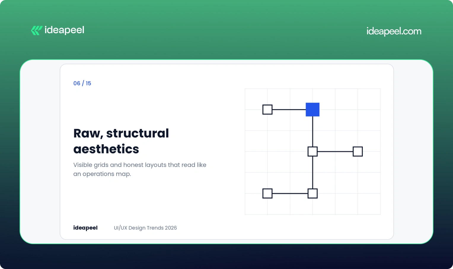
After years of pastel gradients, rounded toggles and friendly illustration, many professional products now look the same. The response is a return to visible grids, monospaced type and wireframe logic.
We saw this work well on a fintech project for Crezco, a product that moves money between banks and accounting tools. The diagram showed a total amount flowing through a central engine and splitting into tax and payroll payments, with square nodes and hard connectors. It read like an operations map, not a marketing page. Finance teams could scan it in seconds.
This is not ugliness on purpose. It is clarity treated as a visual style, and it suits products where the audience values accuracy over charm.
Business impact: Faster comprehension and a more serious, trustworthy tone for B2B and fintech buyers.
7. Accessibility with user control
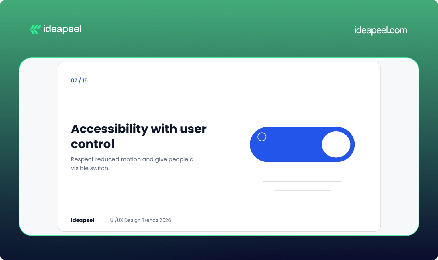
Accessibility has moved from a compliance task to a design default. The sharpest 2026 example is giving users control over motion.
Some people get dizzy or distracted by animation, especially those with vestibular conditions. Respecting the system setting called prefers-reduced-motion is the baseline. Adding a visible toggle on top of it is a strong signal of care. You can read how the setting works in the MDN documentation on prefers-reduced-motion.
Beyond motion, the basics still decide outcomes: readable contrast, full keyboard navigation, clear focus states and plain language. The W3C WCAG guidelines remain the reference point. These choices also help people who are tired, stressed, on a bad connection or using one hand, so they improve the experience for nearly everyone.
Business impact: A wider audience, lower legal risk and better usability scores across the board.
8. Fluid typography
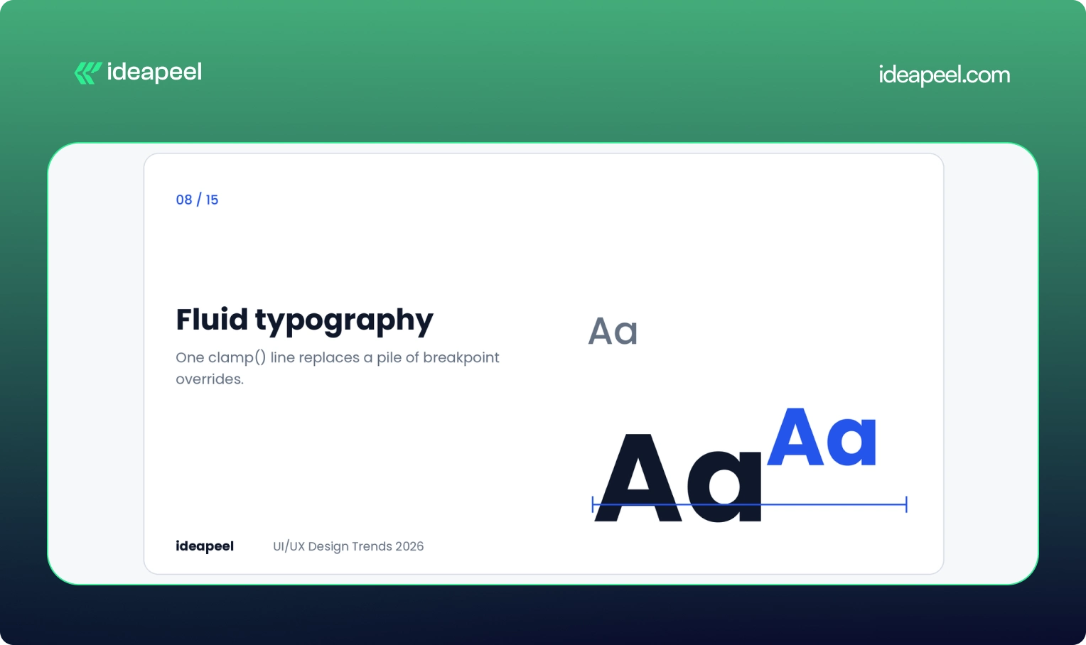
For years, responsive type meant a pile of media queries. One size on desktop, another on mobile, and a forgotten tablet in between. Screens now come in every width, so fixed steps feel clumsy.
The modern answer is the CSS clamp() function. It sets a minimum size, a maximum size and a formula for growing smoothly between them. For example:
font-size: clamp(1rem, 2vw + 0.5rem, 2.25rem);
One line replaces many overrides. Headings can scale aggressively while body text stays steady, and each style gets its own curve. Many teams generate these scales as CSS variables so every component inherits them.
Business impact: Cleaner code, fewer layout bugs across devices and better readability, which supports both usability and search performance.
9. Anti-glass: the pushback on Liquid Glass
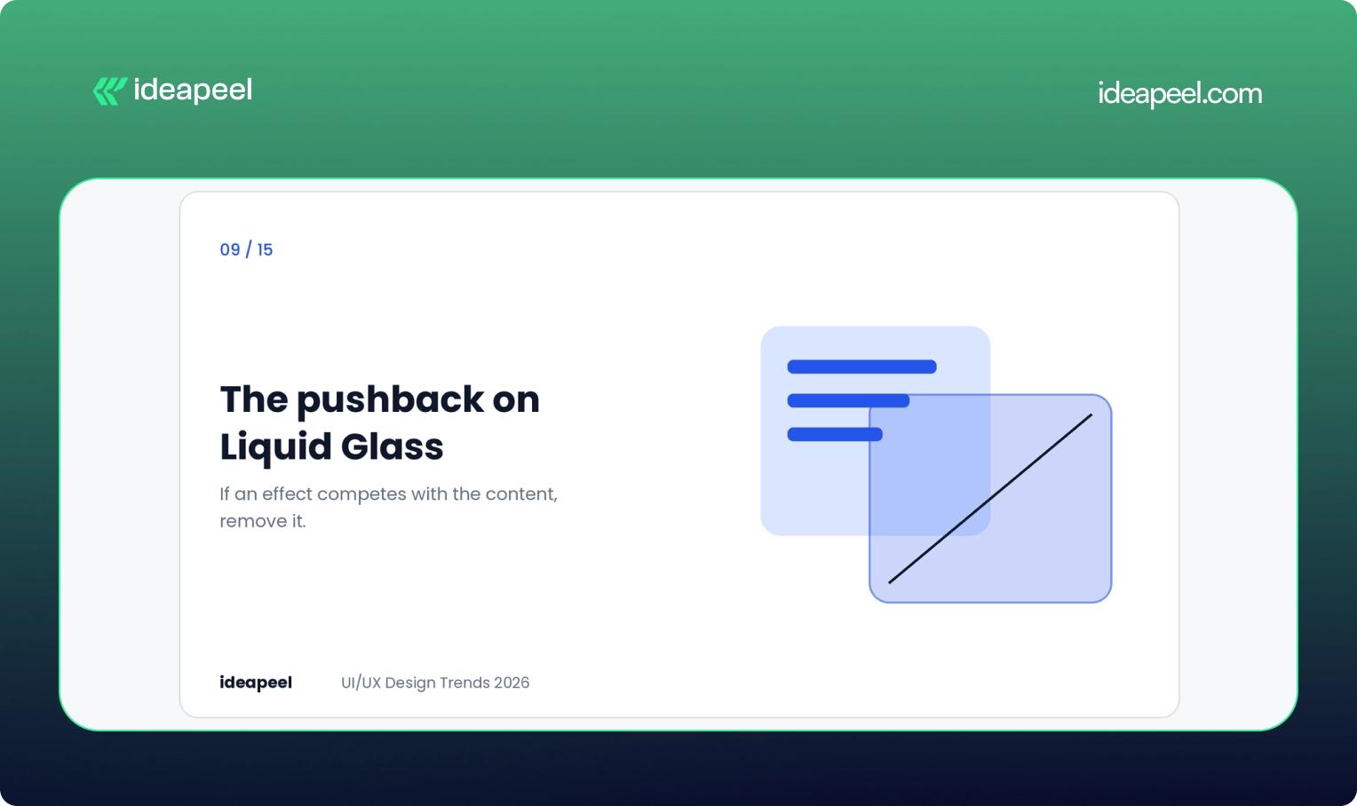
Apple's Liquid Glass look made translucent layers and glossy depth a hot topic, and it is one of the most searched visual terms in this space. But in 2026 the more interesting story is the pushback.
Linear, the product management tool, rebuilt glass effects for its own interface and deliberately left out the refraction that hurts legibility in dense screens. Their rule was simple: if an effect competes with the content, remove it.
The takeaway is not that glass is bad. It is that borrowed styles need testing against your actual use case. A blur that looks lovely in a demo can wreck contrast in a data-heavy dashboard.
Business impact: Avoids the cost of a trendy redesign that quietly hurts readability and conversions.
10. Crafted over prompted
As generative tools improve, people can no longer tell who made what. A quiet counter-trend has appeared. Designers and studios are labeling their process, showing work-in-progress files and stating when something was drawn, coded or animated by hand.
Most teams still use AI for repetitive work like resizing assets or drafting copy. What they are protecting is a recognizable voice. Figma's State of the Designer 2026 report found 72% of designers now use generative AI in their workflow, and 91% of them say it improves the quality of their output. Use of the tools is high. What stands out is the human point of view on top.
Business impact: In a crowded market, a distinct voice is harder to copy than a clean layout.
11. Smarter dashboards for SaaS
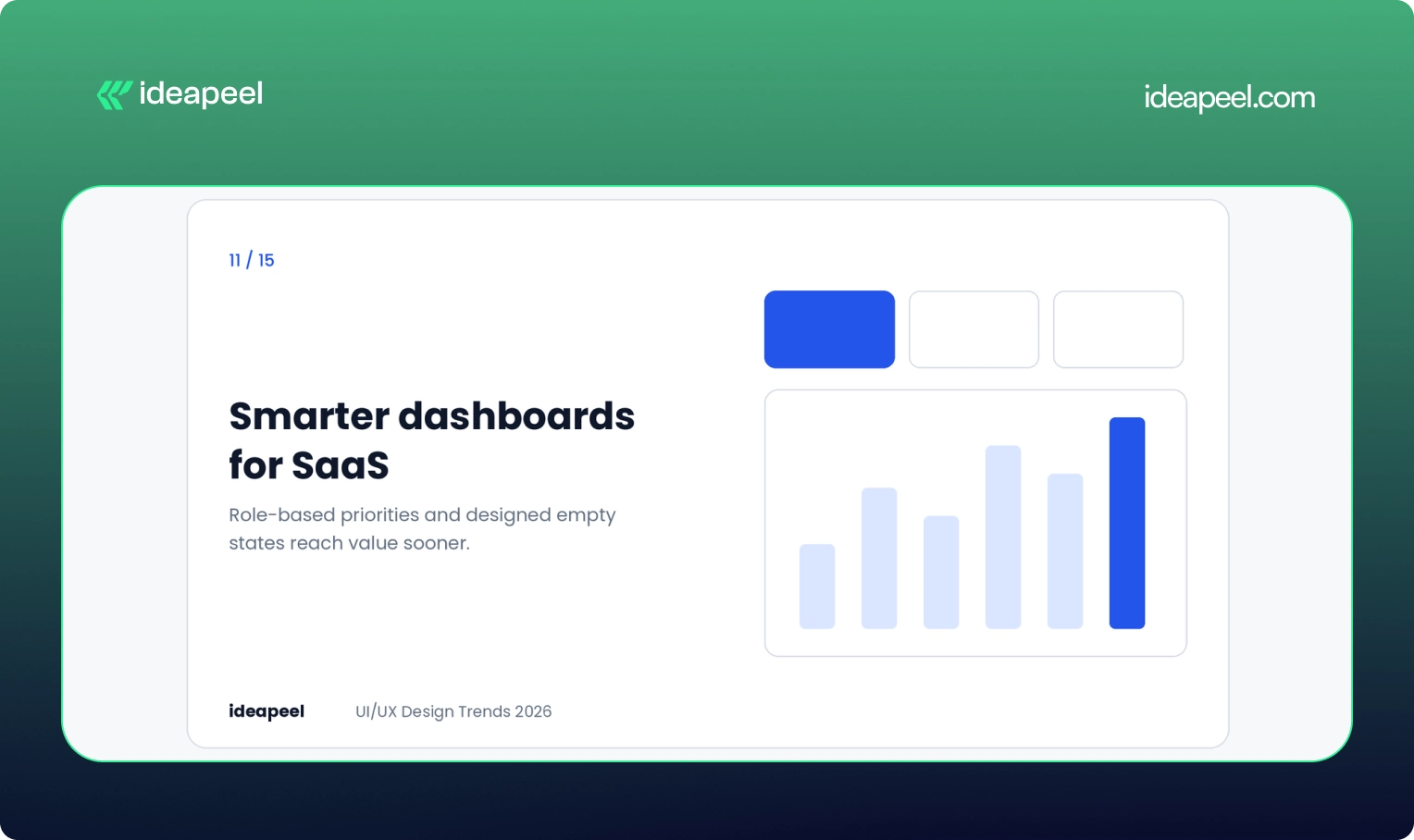
Dashboards are where many SaaS products win or lose. A static screen that shows every user the same data forces people to do the interpreting themselves.
Better dashboards in 2026 do a few things. They put the most relevant numbers first based on role. They let users rearrange and filter. They design the empty state, which is what a new user sees before any data exists, as a guide and not a blank box. And they stay readable on smaller screens.
If you are building a product like this, our SaaS UI/UX design service covers dashboard structure, onboarding and data visualization.
Business impact: Users reach their first useful insight sooner, which improves activation and trial-to-paid conversion.
12. Dark mode as a system preference
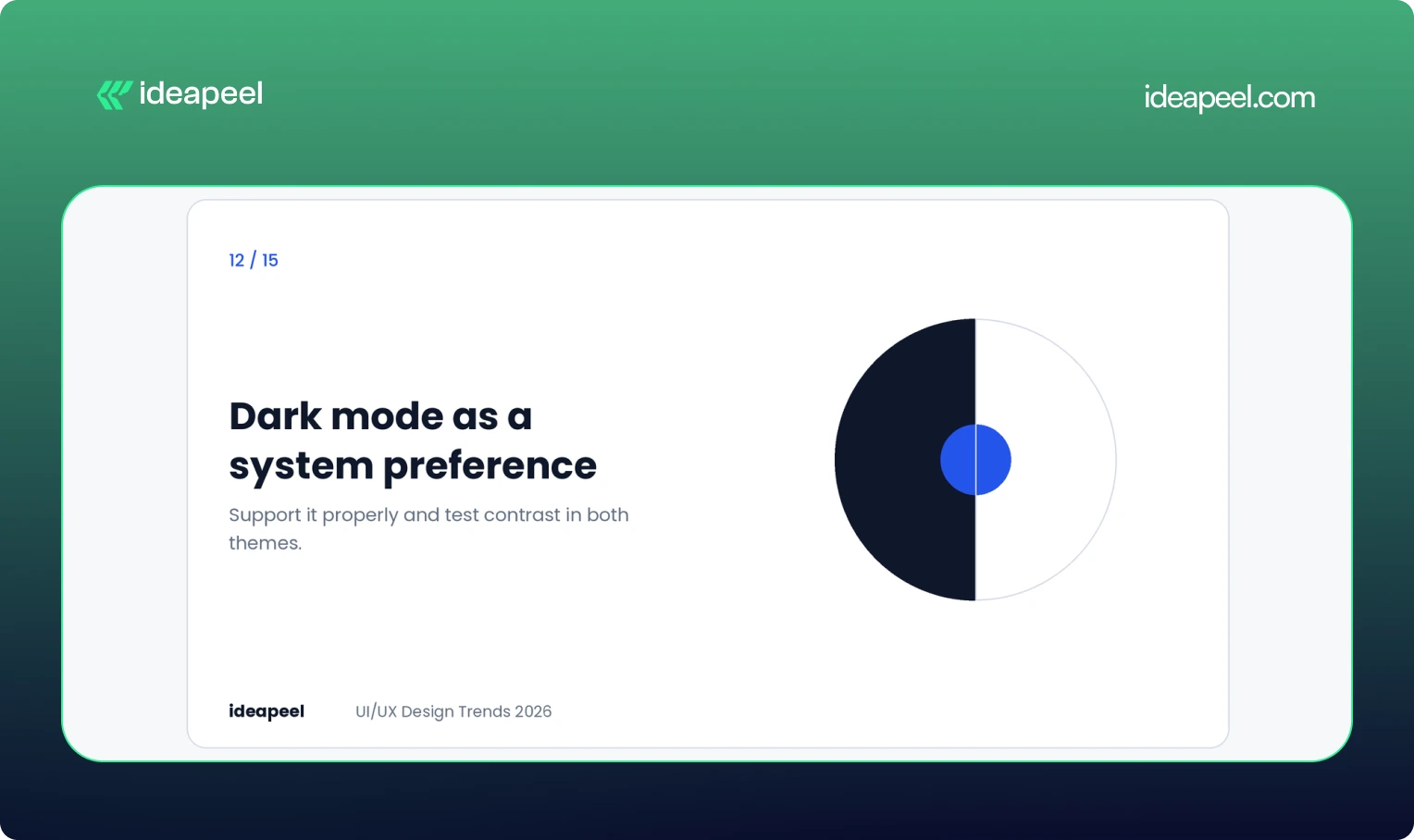
Dark mode is no longer a feature to show off. It is an expectation, and many people set it once at the operating system level and never think about it again.
The strategic move is to support it properly: check contrast in both themes, test charts and status colors, and respect the user's setting by default. It suits dashboards, developer tools and media products especially well, where people spend long sessions reading.
Business impact: Comfort during long sessions and fewer complaints about eye strain.
13. Mobile-first, thumb-first design
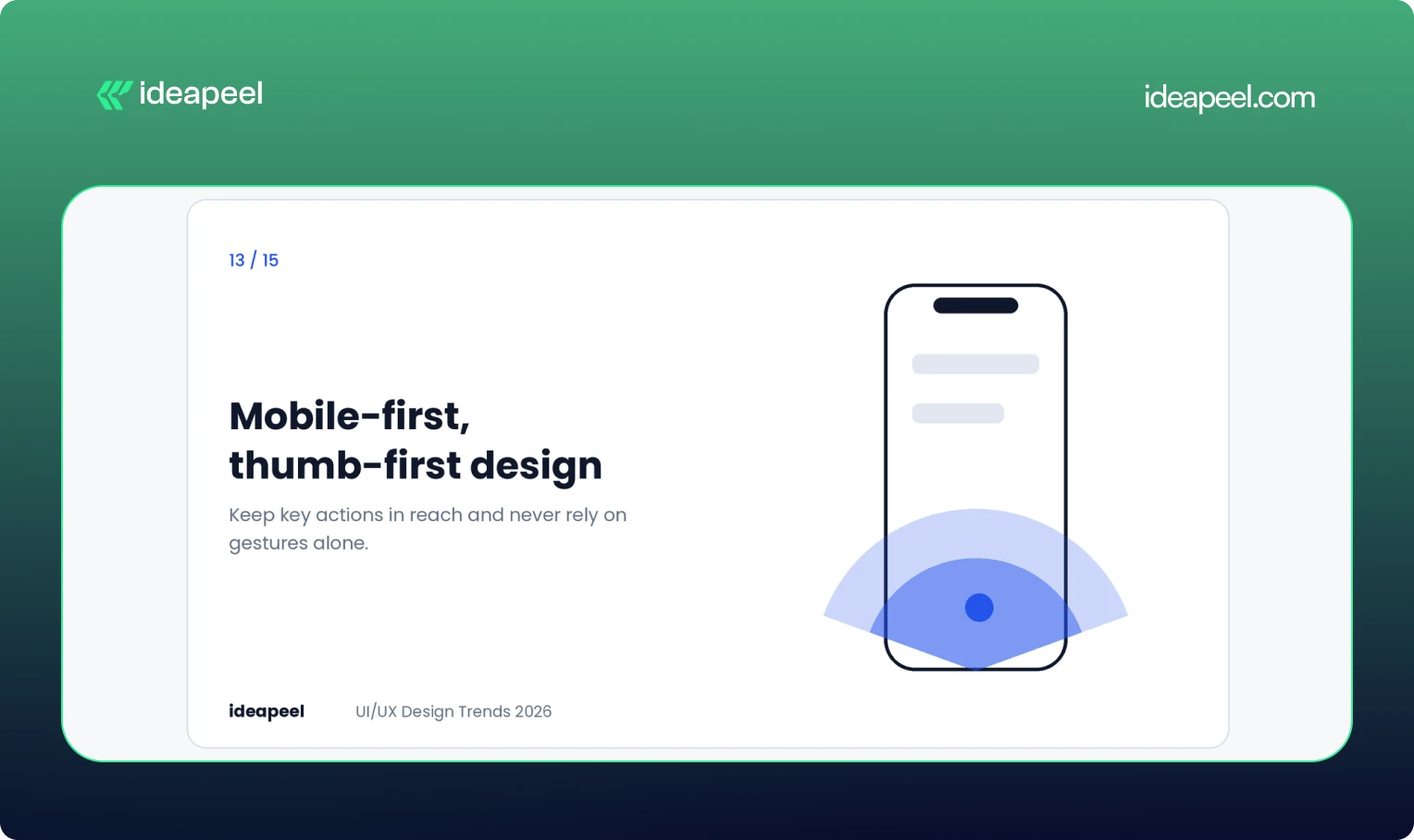
For many products, the phone is the main screen. That changes layout decisions. Key actions belong within thumb reach, navigation needs to stay simple, and gestures should never be the only way to do something.
Taller cards are one visible shift. They give content more room and invite scrolling, which fits how people actually use their phones. The Apple Human Interface Guidelines are a useful reference for touch targets and spacing.
Speed belongs in this conversation too. People judge quality by how quickly a screen responds, and Google's Core Web Vitals give you measurable targets.
Business impact: Better mobile conversion and stronger page experience signals.
14. Privacy and ethics built into the flow
Hidden logic and manipulative patterns are becoming expensive. Regulation is tightening and people are more aware of how their data is used.
The design response is to treat consent as part of the experience. Use plain language, clear defaults and choices that can be reversed. Explain what an AI feature does with someone's data before it does it. Avoid dark patterns, such as confusing cancel flows, even when short-term numbers might look better.
Business impact: Trust is a growth lever. Products that are open about data use tend to keep customers longer and earn more referrals.
15. Design systems that scale with AI
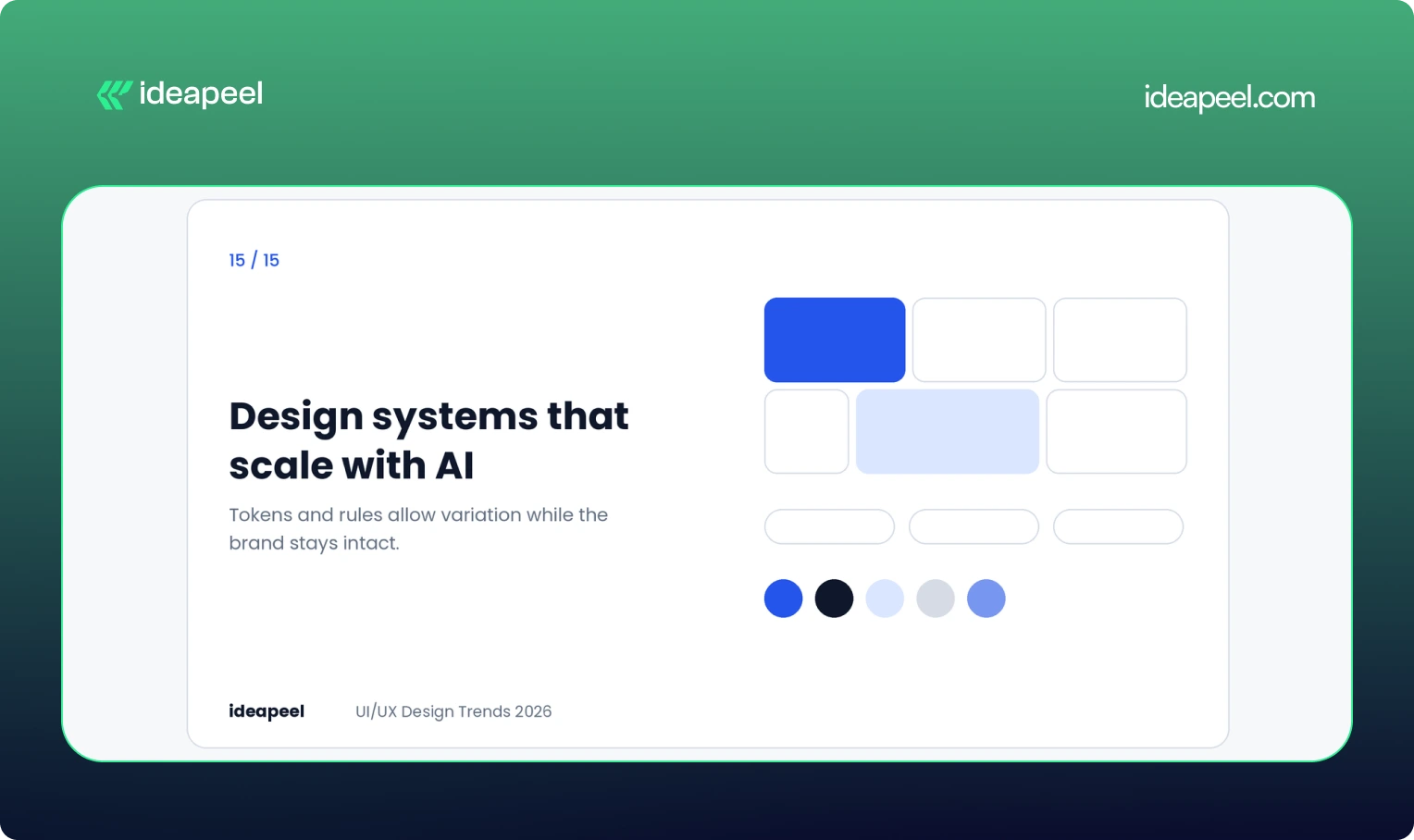
Traditional design systems aimed for consistency. Newer ones aim for controlled variation. Components are built from tokens and rules, so layouts, density and behavior can adapt while the brand and usability stay intact.
This matters because AI tools now generate interface pieces. A system with clear naming, semantic tokens and flexible patterns lets that output stay coherent. A messy system lets it fragment.
Business impact: Faster shipping, less rework and a consistent product as it grows across platforms.
Which trends are fading?
A few patterns are losing relevance:
- Static dashboards that show everyone the same thing
- Feature-heavy screens that show every option at once
- One-size-fits-all experiences
- Decorative animation with no job to do
- Over-minimal navigation that hides important actions behind icons or gestures
If your product still leans on these, they are the cheapest places to start improving.
How to choose the right trends for your product
Not every trend fits every team. A quick filter helps.
Start with your biggest friction. If users drop off at onboarding, look at adaptive onboarding and purposeful feedback before anything visual. If support tickets pile up around one screen, fix that screen first.
Match the trend to your audience. Raw, structural design suits finance and operations buyers. Vibrant, expressive styles suit lifestyle and youth brands. Copying the wrong one will hurt more than it helps.
Test before committing. Prototype the change, check contrast and performance, and watch a few real users try it. A trend that tests badly is not a trend for you.
Measure outcomes, not outputs. Track activation, retention, conversion and support volume. A redesign that looks fresh but moves none of those numbers has not worked.
For a deeper look at the process, see our guide to how we run a UX audit and our breakdown of design system basics.
Final thoughts
The design world in 2026 is moving past the glow-up phase. The best interfaces feel calm, honest and useful. They explain what they are doing, respect people's limits and get out of the way.
If you want help deciding which of these trends belong in your product or website, talk to the ideapeel team. We will look at your actual users and numbers first, and recommend only what moves them.
Website redesign companies rebuild or rework an existing site to fix usability, speed, search visibility, and conversion problems. Most offer UX research, UI design, development, SEO migration, and support after launch. The right partner depends on your platform, industry, budget, and whether you need a full rebuild or targeted fixes.
That is the short version. Below you will find what redesign services actually include, a profile of well-known agencies, realistic costs and timelines, and a simple way to choose.
What does a website redesign company do?
A website redesign company takes a site that is already live and improves it. That usually means reworking the structure, layout, copy, visual design, and code, while protecting the search traffic the site has already earned.
A solid agency does not just change colors and fonts. It starts by finding out why the current site underperforms. Is the navigation confusing? Do visitors leave the pricing page? Is the site slow on mobile? The redesign then targets those problems.
If you are not sure what is broken, a UI/UX audit is a sensible first step. An audit diagnoses the problems and ranks them. A redesign fixes them. Many teams skip the audit and pay for a full redesign when a handful of targeted fixes would have done the job.
Website redesign services: what you are actually buying
Service lists look similar from agency to agency, so it helps to know what each item does for you.
SEO migration deserves extra attention. Google's own guidance on site moves with URL changes is a good benchmark. If an agency cannot explain its redirect and migration process clearly, treat that as a warning sign.
Top website redesign companies to consider
This list is not a ranking. Each agency is good at something different, so the useful question is which one fits your project. Figures such as ratings and minimum budgets come from public listings and change often, so check each agency's current profile on Clutch before you shortlist.
Here is the section with a few light additions, nothing heavy.
Top website redesign companies to consider in 2026
This list is not a ranking. Each agency is good at something different, so the useful question is which one fits your project, your budget, and your stage of growth. A few of these teams work best with early-stage startups, while others are built for large, multi-region rollouts. Read the "best for" line first, then check services against what your project actually needs.
ideapeel
.webp)
Best for: SaaS and B2B companies that want a UX-led redesign, especially on Webflow.
Services: website redesign, UI/UX design, Webflow development, UX audits, SEO-aware migration.
Why consider it: The process starts with diagnosis, then moves to design and build, so the redesign is tied to real usability findings instead of guesswork. This tends to shorten revision cycles later, since decisions are backed by data from the start.
What to expect: ideapeel combines UX research, data-driven design, Webflow development, and SEO considerations in one redesign process. Its portfolio includes SaaS, fintech, compliance, and other B2B projects, making it a practical option for companies that need more than a visual refresh.
When to choose it: Choose ideapeel if you want your redesign to improve usability, conversion potential, and search performance while keeping the entire design-to-development process connected.
[[inner-cta]]
Excited
Best for: SaaS, AI, and fintech companies.
Services: Web design, UX/UI design, UX research, branding, motion design.
Why consider it: It treats the website as part of the product experience and designs for clarity and conversion. Public listings show a minimum project size around $10,000.
Halo Lab
Best for: Startups and growth-stage tech companies that need speed.
Services: Web design, UX/UI, branding, front-end development.
Why consider it: A faster, leaner production model than large agencies, with a public starting budget near $10,000. Useful when you need a working redesign fast rather than a long strategic engagement.
Eleken
Best for: SaaS teams that want ongoing design help instead of a one-off project.
Services: UX/UI design, product design, interface design.
Why consider it: It works in a subscription style, so designers join your team's workflow. Good if your site and product need to look and feel consistent over time, not just at launch.
Brightscout
Best for: Developer tools and technology startups with complex products to explain.
Services: Web design, branding, UX/UI, product design.
Why consider it: Strong on messaging clarity. Listings show a starting budget around $25,000.
Ramotion
Best for: Tech companies that want branding and web design handled together.
Services: Web design, branding, UI/UX, product design.
Why consider it: Polished visual systems and consistent brand work across web and product. Expect a higher entry point, often cited near $50,000.
Huge
Best for: Large enterprises with multi-region sites and complex integrations.
Services: Web design, digital strategy, experience design, engineering.
Why consider it: Built for big stakeholder groups and long programs. Projects tend to be long and expensive, but the process is set up for that scale.
R/GA
Best for: Global brands running large digital platforms and campaigns.
Services: Web design, digital strategy, product design, innovation consulting.
Why consider it: Combines strategy, design, and engineering at enterprise scale.
AKQA
Best for: Large brands launching flagship digital experiences.
Services: Web design, experience design, digital innovation, product design.
Why consider it: Known for ambitious, creative work, and part of the WPP network.
ustwo
Best for: Organizations rethinking a digital service, not just a website.
Services: UX design, product design, web design, service design.
Why consider it: Research-heavy, human-centered process that suits complex user journeys, especially when the redesign touches more than just the marketing site.
Fantasy Interactive (Phantasy)
Best for: Consumer and entertainment brands that want expressive, story-driven sites.
Services: Experience design, web design, creative technology.
Why consider it: Visually bold flagship sites. It is less suited to conversion-focused SaaS marketing sites, so weigh this against your actual growth goals.
A quick pattern: if you are a startup or SaaS company with a budget under $50,000, look at Excited, Halo Lab, Eleken, Brightscout, or Ideapeel. If you are an enterprise with global requirements, Huge, R/GA, and AKQA operate at that scale. Somewhere in between, Ramotion and Brightscout can work well if branding and web design need to move together.
How to choose a website redesign company
Skip the "who is best" question and check these seven things instead.
- Industry experience. A team that has redesigned SaaS sites will understand pricing pages, demo flows, and trial funnels faster than a generalist.
- Proof, not portfolios alone. Ask for case studies with before and after numbers, such as conversion rate, load time, or organic traffic.
- Platform fit. If you want Webflow, check that the agency builds in Webflow daily, not occasionally.
- SEO migration process. Ask how they handle redirects, metadata, and internal links. A vague answer is a bad sign.
- Research before design. The best agencies want to see analytics, heatmaps, and user feedback before they open a design tool.
- Clear scope and pricing. You should know what is included, what costs extra, and how revisions work.
- Support after launch. Sites need fixes and iteration in the first 30 to 90 days. Ask what support looks like.
Another useful tip is to talk to a past client. Agencies that are confident in their work will connect you.
How much do website redesign services cost?
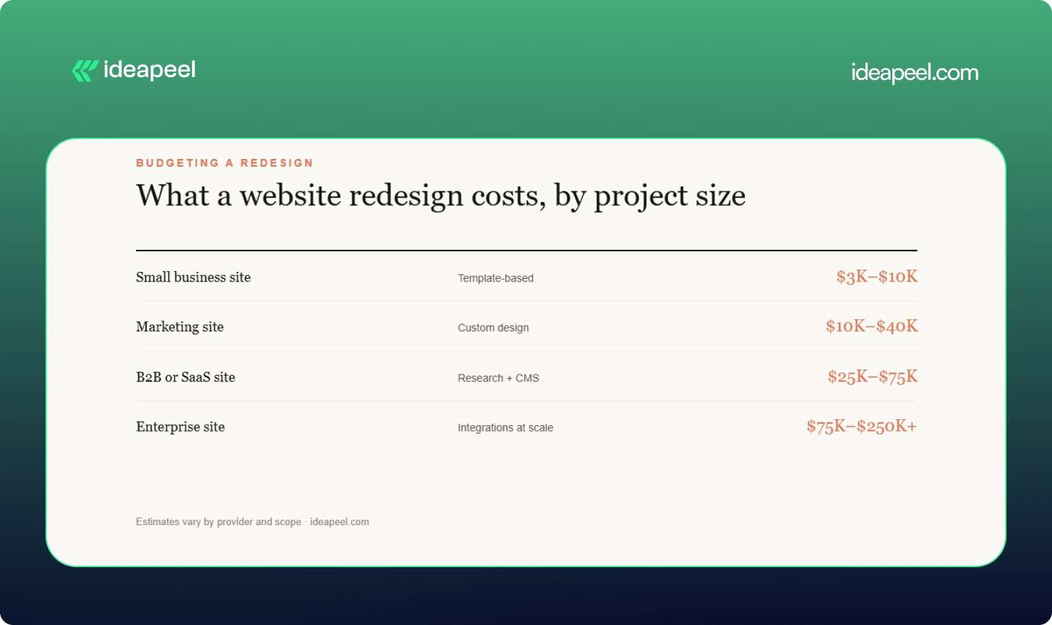
Short answer: most professional redesigns for business sites land between $5,000 and $100,000 or more, depending on scope. Treat the ranges below as estimates, since every provider prices differently.
What moves the price: number of pages, depth of UX research, custom UI design, animation, CMS setup, third-party integrations, copywriting, SEO migration, and ecommerce features.
Agency size matters too. Public listings show hourly rates from about $25 to $50 for lean studios and $150 to $200 or more for large global agencies. See our website redesign cost guide for a fuller breakdown.
How long does a website redesign take?
Most redesigns take between 6 weeks and 6 months. Small sites can launch in 4 to 8 weeks. Marketing and B2B sites usually need 8 to 16 weeks. Enterprise projects with research, migration, and integrations often run 4 to 6 months or longer. Delays mostly come from slow feedback and late content, not design work.
Website redesign vs. new website
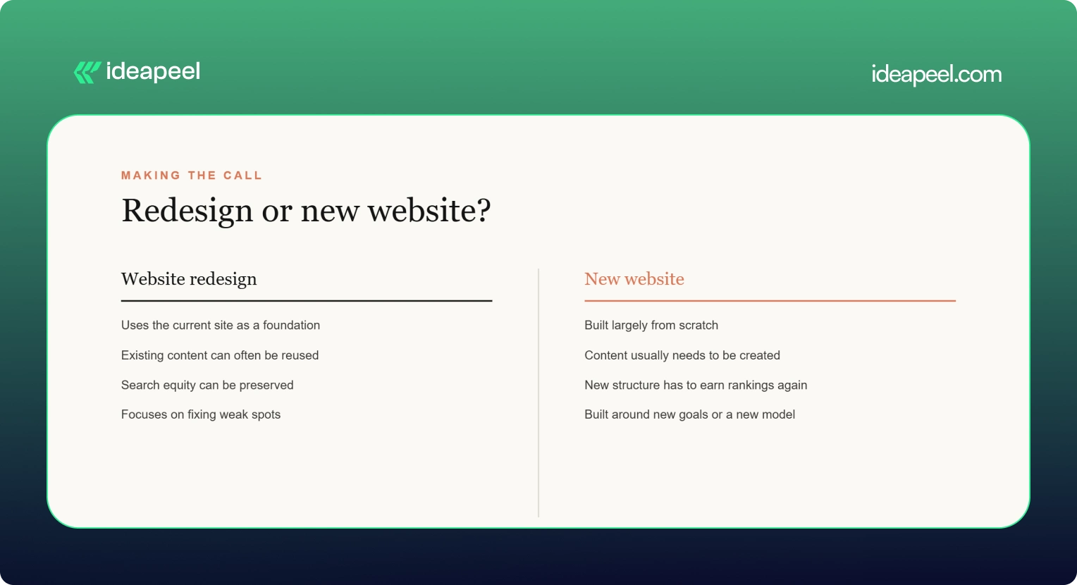
If your brand, product, or audience has changed a lot, a new website may make more sense. If the business is the same but the site underperforms, a redesign is usually cheaper and safer for SEO.
[[question-block]]
Signs it is time to redesign
- Bounce rates are high on key pages
- The site is slow or clumsy on mobile
- Your design looks dated next to competitors
- Leads or sign-ups have flattened
- Your team avoids updating the site because it is painful
- Core Web Vitals fail in PageSpeed Insights (see Google's Core Web Vitals overview)
If several of these apply, start with an audit and decide from there. That is why we suggest running a UX audit before a redesign: it shows whether you need a rebuild or a set of smaller fixes.
Common redesign mistakes to avoid
- Skipping redirects. This is the fastest way to lose organic traffic.
- Designing before researching. Pretty layouts do not fix confusing journeys.
- Ignoring accessibility. Check against WCAG from the start, not after launch.
- Launching without a plan for content. Late copy is the top cause of delays.
- Treating launch as the finish line. Plan for testing and iteration afterward. The Nielsen Norman Group has solid research on why redesigns should be ongoing.
Final thoughts
The best website redesign companies are the ones that match your goals, platform, and budget, not the ones with the biggest names. Diagnose first, shortlist three or four providers, ask hard questions about migration and results, and choose the team that answers clearly.
If you want a partner that starts with diagnosis and builds around real user data, take a look at ideapeel's website redesign services or book a consultation.
[[last-cta]]
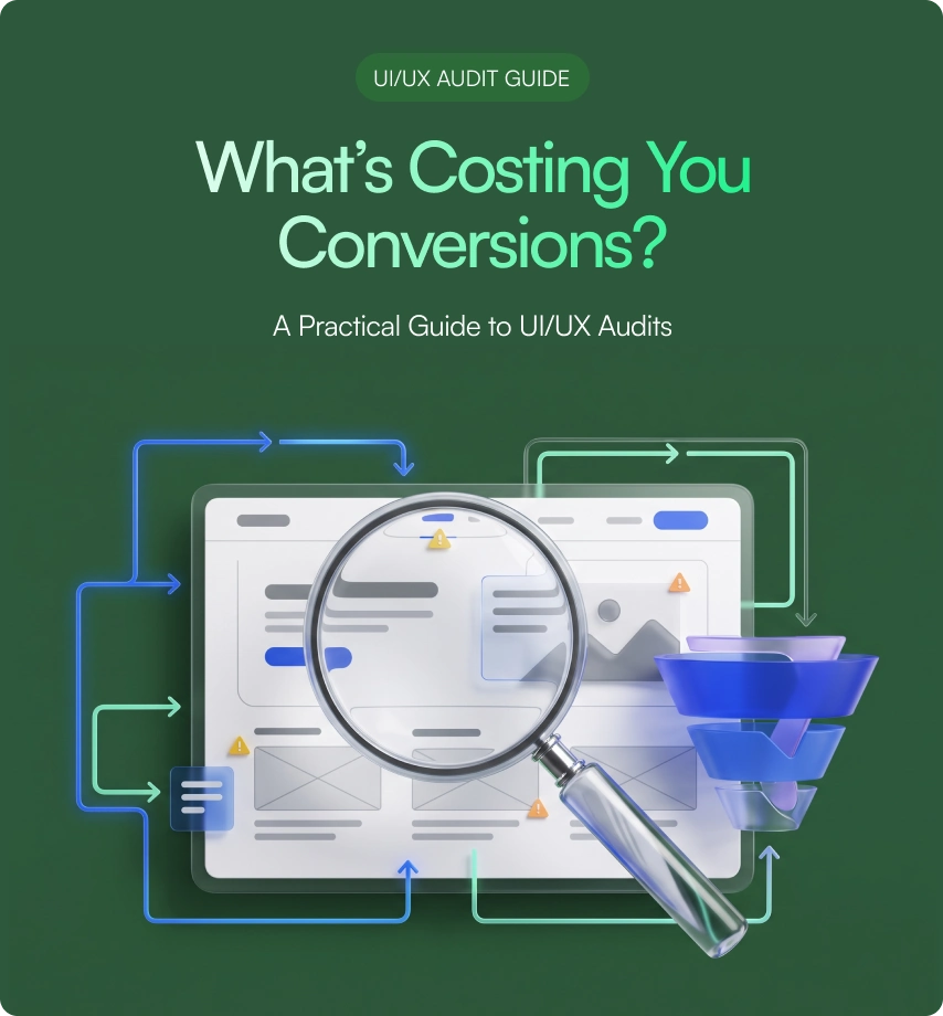
If your website or product gets traffic but visitors leave without converting, the problem usually isn't your offer. It's your interface. A UI/UX audit finds exactly where users get stuck, confused, or annoyed, and gives you a clear list of what to fix first.
This guide covers what a UI/UX audit actually includes, how the process works, what it costs based on real market data, and how to pick the right UI/UX audit agency for your website or SaaS product. It's written by the team at ideapeel, a Webflow development agency for B2B, SaaS and enterprise companies that runs UI/UX audits and Webflow builds for growing teams every week.
What Is a UI/UX Audit?
A UI/UX audit is an expert review of your website, product, or app. It checks how the interface looks (UI) and how it actually works for real users (UX), then hands you a prioritized report of what's broken and what to fix first.
A good audit looks at:
- Visual design and layout
- Navigation and information architecture
- User flows and conversion paths
- Mobile experience
- Accessibility
- Page speed and technical friction
- How your site compares to competitors
Any team with live traffic, sign-ups, or users but underwhelming results is a good candidate. That includes SaaS products with high churn, websites with strong traffic but weak conversion, and apps where users drop off mid-flow. A UI/UX audit is usually the fastest, cheapest way to find out why, well before anyone commits to a full redesign.
UI audit vs UX audit. A UI audit looks only at the interface: layout, typography, color, spacing, and consistency. A UX audit looks at the full experience: navigation, flows, usability, and conversion. Most professional audit services combine both, which is why the service is usually called a UI/UX audit rather than just one or the other.
What Does a Professional UI/UX Audit Include?
This is the part that matters most when you're comparing UI/UX audit services, because it tells you exactly what you're paying for.
UI Design Review
A trained eye goes through your visual hierarchy, typography, color use, spacing, and component consistency. This catches the small inconsistencies that quietly make a site feel unpolished or untrustworthy.
UX & Usability Review
This covers navigation, information architecture, friction points, and interaction patterns. Note that a UX audit is not the same thing as usability testing. An audit is an expert review done by a UX professional; usability testing involves watching real users complete tasks on your site. Many full audits include a round of light usability testing as one part of the process, but the two are different services.
User Flow Analysis
The auditor maps your key journeys, sign-up flows, checkout paths, and navigation routes to find exactly where users drop off and why.
Conversion & CTA Review
This looks at CTA visibility, button hierarchy, form design, landing pages, and anything creating friction between a visitor and the action you want them to take.
Mobile UX Review
Since most traffic is mobile, this checks tap targets, responsive layout breakpoints, load speed, and mobile-specific usability issues that desktop testing misses.
Accessibility Review
This checks color contrast, keyboard navigation, screen reader compatibility, and general WCAG alignment. Accessibility issues are also legal and reputational risk, not just a UX nicety.
Analytics & User Behavior Analysis
If you have Hotjar, GA4, or similar tools connected, a good auditor pulls real behavior data, heatmaps, and session recordings to back up their findings with evidence instead of opinion.
Competitive UX Analysis
The auditor benchmarks your product or site against direct competitors, so recommendations are grounded in what's actually working in your market, not generic best practice.
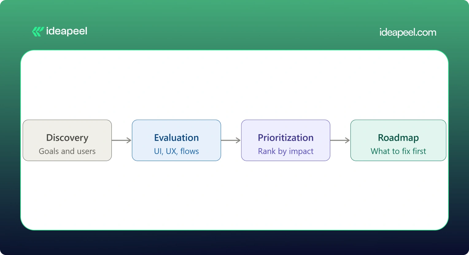
UX Audit Service Process: From Research to Action Plan
Here's what actually happens when you hire someone for a UI/UX audit, step by step:
1. Discovery & Business Goals
The auditor starts by understanding your business goals, not just your interface. What counts as success: more demos booked, higher activation, lower churn, more sign-ups?
2. User & Audience Analysis
Who actually uses your product, and what are they trying to do? This shapes everything that follows.
3. UI Evaluation
A full pass through the visual design against your goals and your users' expectations.
4. UX & Usability Evaluation
A heuristic review of navigation, structure, and usability against established UX principles.
5. User Flow Analysis
Mapping the paths users actually take, and where they abandon them.
6. Conversion Analysis
Looking specifically at where and why conversion drops off.
7. Competitive Benchmarking
Comparing your experience against direct competitors and category leaders.
8. Issue Prioritization
Every issue gets ranked by severity and business impact, not just listed in the order it was found.
9. Recommendations
Specific, actionable fixes tied to each issue, not vague advice like "improve usability."
10. UX Improvement Roadmap
A sequenced plan showing what to fix first, what can wait, and what requires bigger structural changes.
[[inner-cta]]
How Much Does a UI/UX Audit Cost?
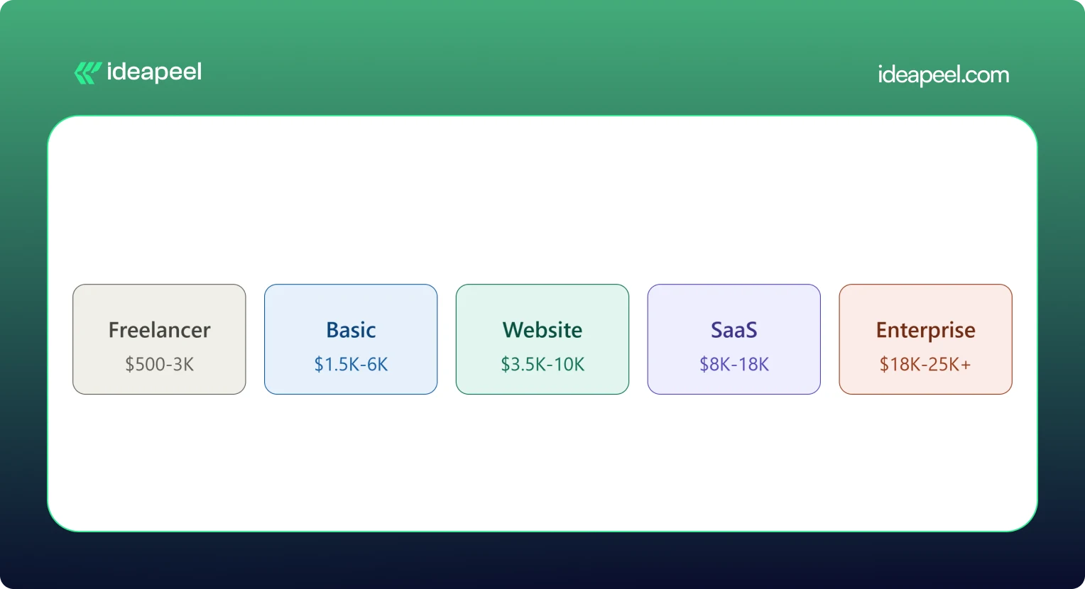
A UI/UX audit typically costs between $500 and $25,000 or more. A solo freelancer doing a single-flow review might charge as little as $500. A full enterprise audit with live user testing and multiple user roles can run $18,000 to $25,000 or higher. Most small and mid-size businesses land somewhere between $3,500 and $18,000 for a complete website or SaaS product audit.
What Factors Affect UI/UX Audit Cost?
Price moves based on:
- Website or product size
- Number of screens and pages
- Number of user flows and personas
- Product complexity (simple marketing site vs. multi-role SaaS dashboard)
- How deep the research goes
- Whether analytics review is included
- Whether live usability testing is included
- Competitive research scope
- Number of deliverables (report only vs. report plus roadmap plus redesign proposals)
Pricing data collected from agency rate cards, freelance marketplaces, and published cost guides shows a consistent pattern: cost scales with scope and testing depth, not agency size alone. A UX audit cost breakdown from Design Studio UI/UX puts full audits with heuristic review, session analysis, and real user testing at $8,000 to $18,000, with enterprise audits running $18,000 to $25,000 and up. Parallel HQ's product design cost guide lists UX audits from $3,500 to $10,000, usually delivered in two to four weeks. On the freelance side, listings on Upwork and Contra show independent UX consultants pricing single-flow or single-page audits from $500 to $3,000. On the agency side, Musemind's UX audit agency pricing starts around $10,000 with hourly rates of $50 to $99, plus subscription-style UX plans from roughly $2,600 a month, and Dribbble's UI/UX agency cost guide puts experienced US agency hourly rates at $100 to $250.
.webp)
Basic UI/UX Audit
$1,500 – $6,000. Covers a heuristic review of your core screens, a prioritized issue list, and general recommendations. Good for a quick gut check before deciding whether a bigger project is worth it.
Website UX Audit
$3,500 – $10,000. Adds user flow mapping, conversion review, and often a light round of usability testing. This is the most common package for marketing sites and lead-gen websites.
SaaS UX Audit
$8,000 – $18,000. Covers multiple user roles, onboarding, dashboard UX, and competitive benchmarking against other SaaS products in your category. Built for B2B products with more than one user type.
Comprehensive UI/UX Audit
$18,000 – $25,000+. Includes live user testing, deep analytics review, multiple personas, and a full improvement roadmap. This is the right fit for enterprise products or platforms where usability issues carry real revenue risk.
If a package price feels too broad for your situation, ask for an hourly or scoped quote instead. Most UI/UX audit companies will price a smaller, single-flow engagement if you only need to hire a UX designer for an audit of one specific part of your product.
What Do You Get From a UI/UX Audit?
This is what separates a real audit from a vague opinion document.
If a provider's audit doesn't include most of this list, ask what you're actually paying for. ideapeel's UI/UX design service builds every audit around this exact structure, so findings turn into a working plan instead of a PDF that sits unread.
When Should You Hire a UI/UX Audit Agency?
Some teams run a quick DIY checklist audit themselves first, which is a fine starting point. But a DIY review usually misses the objectivity, testing tools, and pattern recognition a professional brings from auditing dozens of other products. Here's when it's worth hiring a UI/UX audit agency or consultant:
Your Website Gets Traffic but Does Not Convert
Steady visitors, flat conversion. That gap almost always points to a UX problem, not a traffic problem.
Users Struggle With Navigation
Support tickets or feedback keep mentioning that people "can't find" something. That's a navigation and information architecture issue an audit will surface fast.
Your SaaS Onboarding Has Friction
If new users sign up and never activate, onboarding is usually the leak.
Product Adoption Is Low
Features get built but nobody uses them. Often this is a discoverability problem, not a demand problem.
You Are Planning a Website Redesign
Never redesign blind. An audit tells you what's actually broken before you rebuild it.
Paid Traffic Is Not Converting
If you're paying for clicks that don't turn into leads, the landing experience is the first place to look.
Customers Report Usability Problems
Direct feedback is a strong signal. An audit turns scattered complaints into a structured fix list.
Your Website Looks Outdated
Dated design quietly erodes trust, especially for B2B buyers comparing vendors.
You Are Launching a New SaaS Product
A pre-launch audit catches usability issues while they're still cheap to fix.
You Need an External UX Perspective
Internal teams get too close to their own product. A fresh, objective review often finds what everyone inside the company has stopped noticing. [[question-block]]
UI/UX Audit vs. Website Redesign
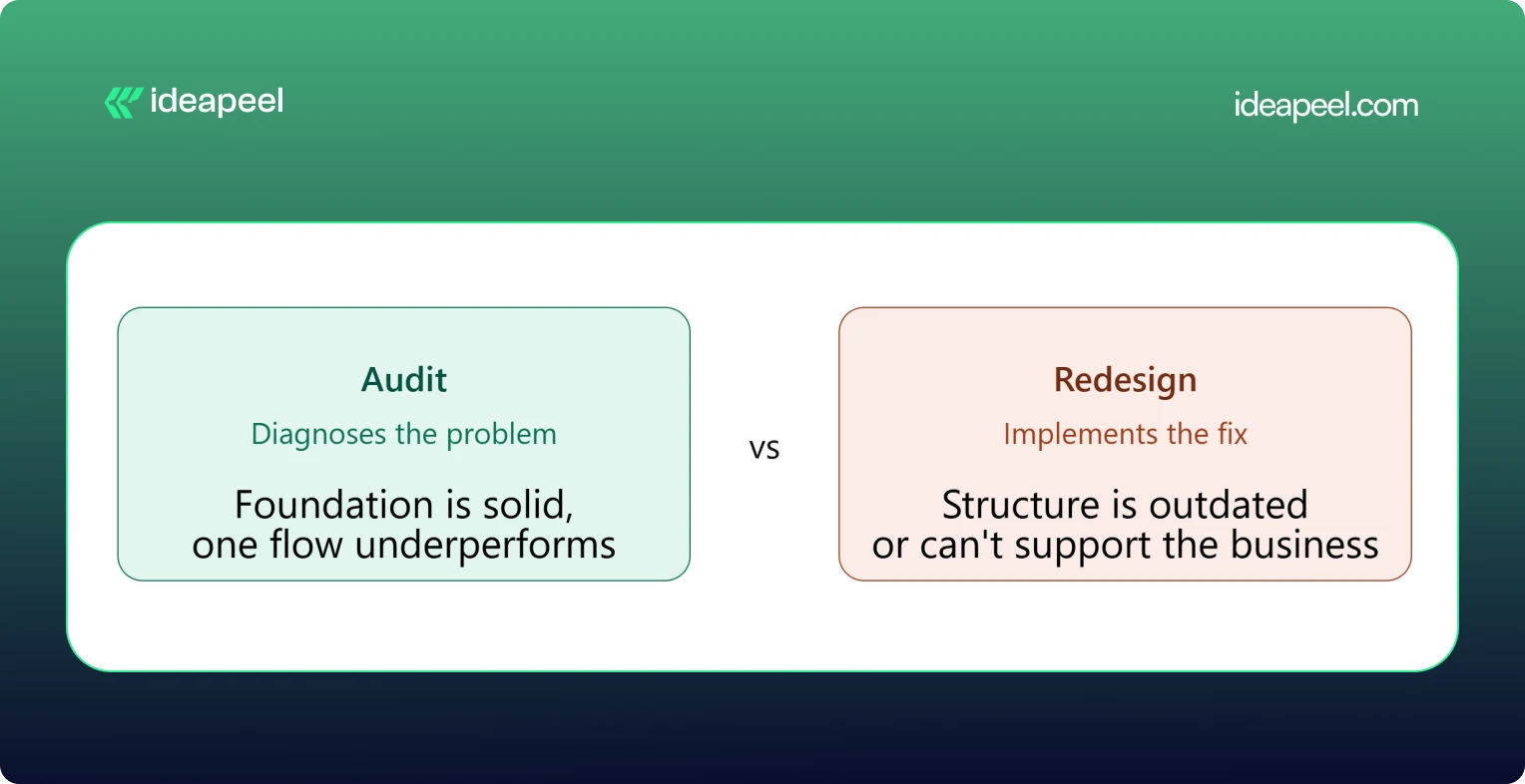
The simplest way to think about this: an audit diagnoses, a redesign implements.
When You Only Need a UI/UX Audit
Your foundation is solid but something specific is underperforming, like a checkout flow or a signup form. Fix the specific problem rather than rebuilding everything around it.
When You Need a Website Redesign
The structure itself is outdated, the brand has changed, or the site can't support what the business needs now. A patch won't fix a foundational problem.
When You Need an Audit Before a Redesign
This is the smart default for most teams. An audit tells you exactly what to change and why, so the redesign budget goes toward fixing real problems instead of guessing.
UI/UX Audit Agency vs. Freelancer
Both can do good work. The right choice depends on your product's complexity and what you need beyond the audit itself.
Neither option is universally better. A freelancer can be the right call for a single-flow review on a tight budget. An agency tends to make more sense for a multi-role SaaS product, where UI, UX, research, and implementation all need to work together.
How to Choose a UI/UX Audit Agency
This is the section that matters most once you're actually comparing providers.
Check Their UX Methodology
Ask how they structure an audit. A vague answer is a warning sign. A strong provider can walk you through their process step by step.
Review Previous Audit Work
Ask to see a sample report. This tells you more than any pitch deck about the quality and depth you'll actually get.
Look for Industry Experience
A UX audit company that's worked on B2B SaaS products understands onboarding, activation, and dashboard UX in a way a general design shop may not.
Check Their UI + UX Expertise
Some providers are strong on visuals but weak on usability, or the reverse. You want both covered.
Ask What the Deliverables Include
Compare this against the deliverables table above. Screenshots, severity ratings, and a roadmap should be standard, not an upsell.
Understand Their Pricing Model
Flat project fee, hourly rate, or retainer? Match the model to how you actually want to work and budget.
Ask How Findings Are Prioritized
A pile of 40 unranked issues isn't useful. You want to know what to fix first and why.
Check Whether They Support Implementation
Some UI/UX audit services stop at the report. Others, like ideapeel, can move straight from findings into Webflow development and design implementation, so the fixes actually ship.
UI/UX Audit for B2B SaaS
SaaS products carry extra UX complexity that a generic website audit won't catch. A dedicated SaaS UX audit should cover:
SaaS Website UX
How the marketing site sets expectations before someone ever logs in.
Product Interface
The core UI users interact with daily once they're inside the product.
Dashboard UX
Whether the dashboard surfaces the right information without overwhelming the user.
SaaS Onboarding
The first-run experience that determines whether a trial user ever becomes a paying customer.
Signup Experience
Friction in the signup form is one of the most common, and most fixable, leaks in a SaaS funnel.
Pricing UX
Whether your pricing page actually helps people choose a plan, or just confuses them.
Feature Discovery
Whether users can find the features that would make them stick around.
Navigation
How easily users move between the areas of a complex, multi-role product.
User Activation
The specific moment a new user experiences real value for the first time.
Conversion Flows
Every point where a free user is nudged toward becoming a paying one.
Teams building or scaling B2B products can see how this fits into a broader growth plan on ideapeel's SaaS design and development page.
Webflow UI/UX Audit
If your site or product runs on Webflow, a Webflow-specific UX audit adds a few extra layers on top of a standard review: CMS structure, symbol and component consistency, interaction and animation performance, responsive breakpoint behavior, and page speed inside the Webflow environment.
This matters because a Webflow UX audit doesn't just tell you what to fix, it tells you how to fix it inside the platform you're already using, without a rebuild. ideapeel runs UI/UX audits and Webflow design and development work side by side, so audit findings turn directly into shipped Webflow changes instead of a report that needs a second agency to execute.
What Makes a Good UI/UX Audit?
A strong audit should be:
- Evidence-based
- Prioritized
- Actionable
- Business-focused
- User-focused
- Specific
- Easy to implement
The real value of a UI/UX audit isn't a long list of everything that could theoretically be better. It's finding the small number of problems that are actually costing you conversions or users, and giving your team a clear, ordered path to fix them.
Ready to See What's Costing You Conversions?
A UI/UX audit is one of the fastest ways to find out why your traffic, sign-ups, or trials aren't turning into revenue. ideapeel, a Webflow development agency for B2B, SaaS & Enterprise, has delivered 170+ branding, Webflow, and UI/UX projects with a 98% client satisfaction rate and $500M+ in revenue generated and influenced for clients.
Book a free strategy call to talk through your website or product and find out what a UI/UX audit would look like for your team.
[[last-cta]]