10 Best B2B Website Design Examples to Inspire Your Next Project


Summarize with Ai





Key Takeaways
The best B2B websites don't win because they look modern. They win because they explain a complex offer in seconds, build trust before anyone talks to sales, and give every visitor an obvious next step. That combination of clarity, credibility, and a clear path forward is what separates a good-looking B2B website from one that actually generates pipeline.
Below are 10 real B2B website design examples worth studying, each broken down the same way: what the company does, why the design works, and the one design lesson you can steal for your own site. Four are Webflow redesign projects from our own studio, ideapeel, and the rest are well-known B2B and SaaS brands chosen because their homepages are genuinely instructive, not just pretty.
What Makes a Great B2B Website?
A great B2B website clearly explains what the company does, who it's for, and why it's credible then makes the next step obvious. In practice, that usually comes down to seven things:
- A clear value proposition in the hero section, readable in under five seconds
- Simple, jargon-light messaging that doesn't assume the visitor already understands the product
- A logical information hierarchy that goes from "what is this" to "how does it work" to "why should I trust you"
- Easy navigation that doesn't force visitors to hunt for pricing, product details, or contact info
- Trust signals client logos, testimonials, case studies, certifications, or real metrics
- Product or service clarity, especially for technical or unfamiliar offerings
- Conversion-focused CTAs that match where the visitor actually is in their decision, not just "Book a Demo" on every button
B2B buying decisions usually involve multiple stakeholders and a longer sales cycle than B2C, so the website has to do more persuading before a human ever gets involved. Every example below earns its place because it handles at least one of these jobs unusually well.
10 Best B2B Website Design Examples
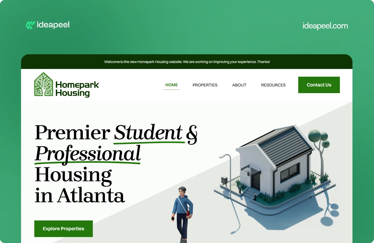
1. Homepark Housing: Comfortable Living
Industry: Real estate
What they do: Homepark Housing provides secure, modern, and strategically located housing designed around the needs of young professionals. Its offering includes affordable housing, flexible leasing options, personalized tenant support, and 24/7 maintenance.
Why the design works: Real estate is a high-consideration purchase. Visitors need to know where the properties are, whether the pricing works for them, what support is available, and whether they can trust the company to deliver a reliable living experience. Homepark's website puts those practical needs at the center of the experience instead of relying only on property imagery.
Key design lesson: When visitors are making a decision involving money, location, and long-term commitment, answer their practical questions early. Clear information about support, pricing, location, and the overall experience can build more trust than visual design alone.
View the Homepark Housing case study
2. KeepWOL: SaaS Team Analytics Platform
Industry: SaaS, team performance, and people analytics
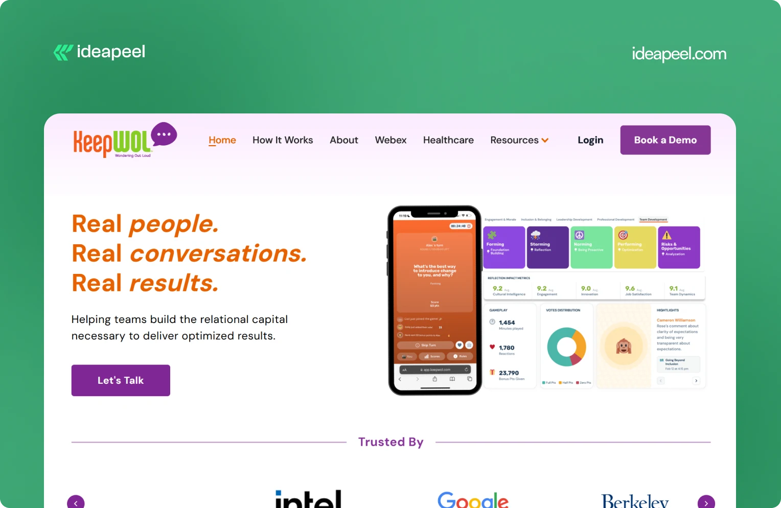
What they do: KeepWOL helps organizations improve team performance, relationships, engagement, and development through interactive experiences, analytics, and action plans. Its platform combines live sessions with measurable insights across areas such as team dynamics, engagement, innovation, cultural intelligence, and job satisfaction.
Why the design works: KeepWOL has a difficult product to communicate because team relationships and workplace culture aren't as visually obvious as a CRM dashboard or payment platform. The website solves this by turning abstract benefits into a structured journey: experience, reflect, and grow.
Key design lesson: If your product solves an intangible problem, make the value measurable. Show the process, outcomes, metrics, and evidence that connect your product to a business result.
View KeepWOL
3. CarWise: AutoTech Marketplace
Industry: AutoTech and automotive services
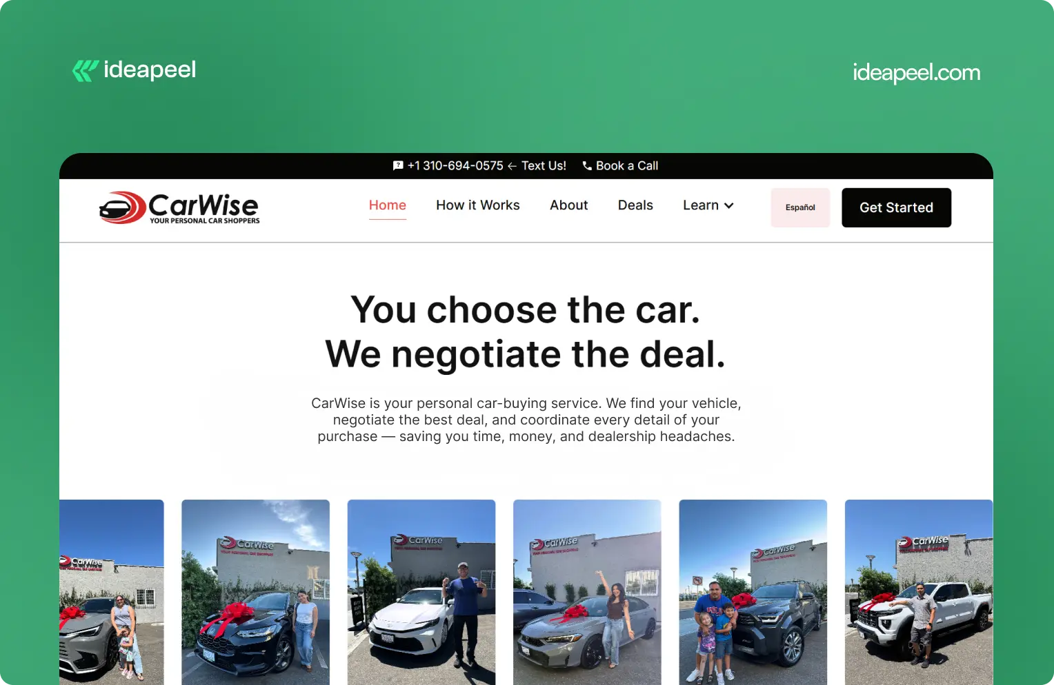
What they do: CarWise helps people navigate the car-buying process through expert negotiation, pricing guidance, financing support, and personal assistance.
Why the design works: Buying a car involves money, uncertainty, and a lot of competing information. That makes trust one of the most important parts of the website experience.
CarWise approaches the problem by making the process easier to understand. Instead of overwhelming visitors with automotive terminology, the experience focuses on the practical journey from finding a vehicle to negotiating and completing the purchase.
Key design lesson: In industries where visitors naturally have trust concerns, transparency should be part of the design. Explain the process, show how the service works, and make the human value behind the product obvious.
View the CarWise case study
4. Glo Dollar: Fintech / Stablecoin Platform
Industry: Fintech, blockchain, and stablecoins
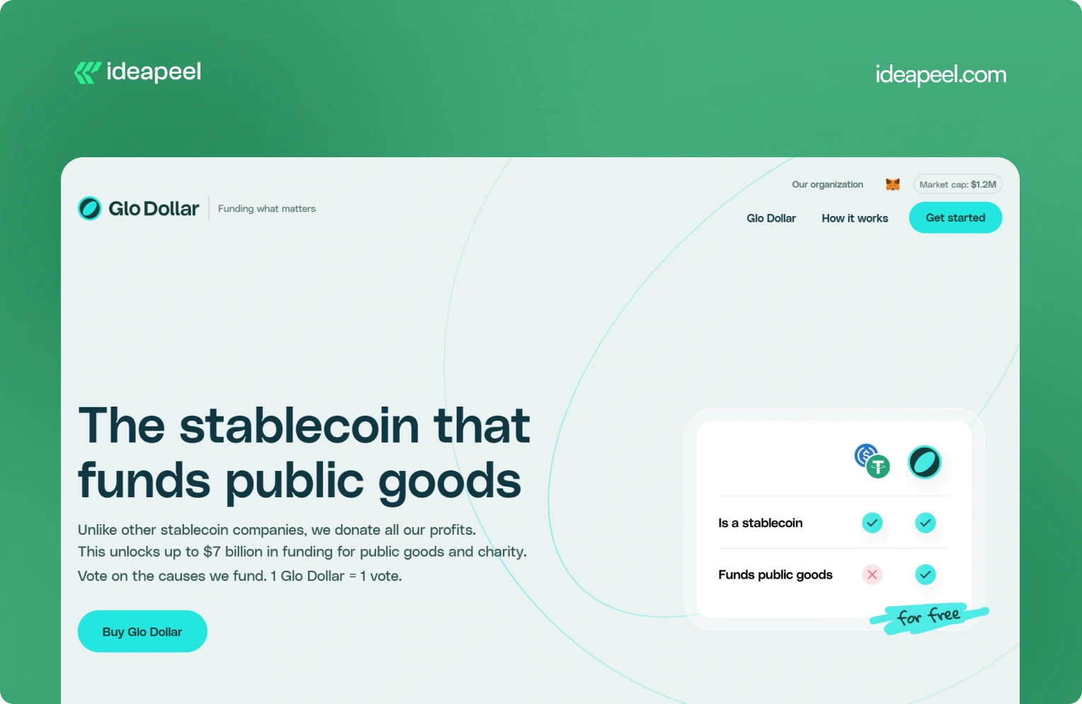
What they do: Glo Dollar is a stablecoin designed so that profits from its reserves are donated to public goods and charitable causes. The website explains the model as a sequence: the fiat backing generates revenue, the profits are donated, and users can support causes at no additional cost.
Why the design works: Financial products are already difficult to explain. Add blockchain and philanthropy to the equation and the communication challenge becomes even bigger.
Glo Dollar handles that complexity by breaking the concept into smaller ideas. Instead of asking visitors to understand the entire financial model immediately, the website explains how the product works step by step.
Key design lesson: When your product combines several unfamiliar concepts, don't explain everything in one block of content. Sequence the information. One clear idea per section makes complicated products much easier to understand.
Visit Glo Dollar
5. BrickYard: Crafting Modern Architecture
Industry: Construction, architecture, and design
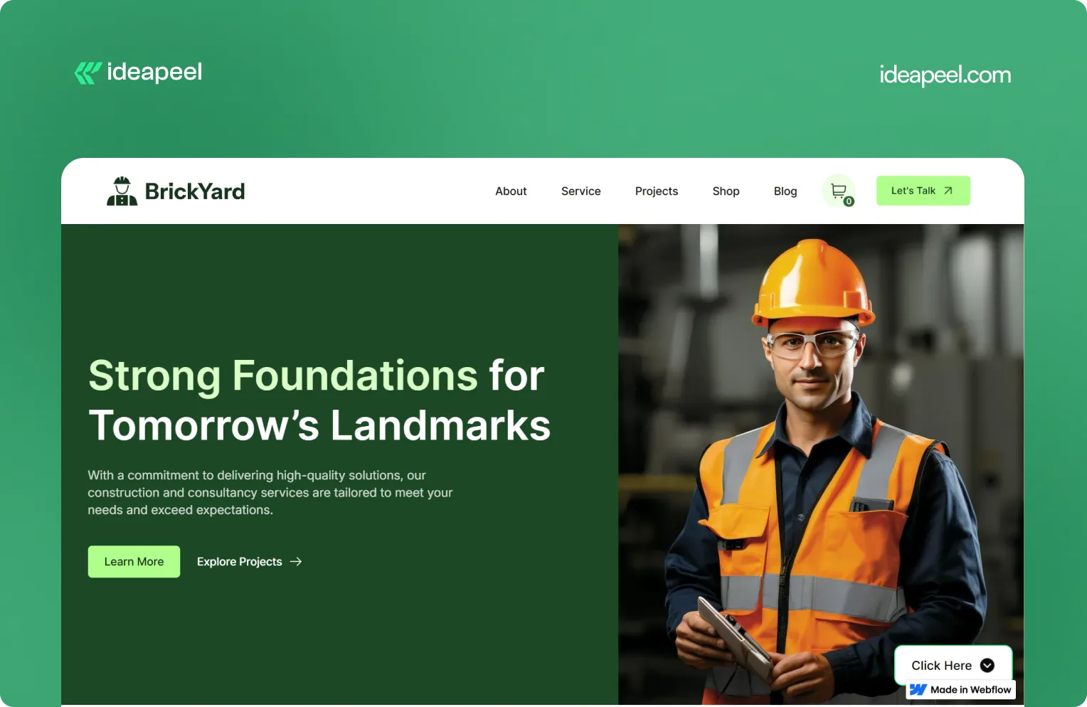
What they do: BrickYard is a modern Webflow template designed for construction companies, architects, and design professionals. It focuses on showcasing services, projects, and professional work through a clean, responsive structure.
Why the design works: Construction and architecture websites need to balance two things: visual presentation and practical information. The work needs to look impressive, but potential clients also need to understand services, previous projects, capabilities, and how to get in touch.
BrickYard handles that through a minimalist visual system combined with dedicated pages for services, projects, blog content, contact information, and other business needs. The template is also designed to be customizable, responsive, SEO-focused, and CMS-ready.
That structure makes it useful beyond a single visual concept. Businesses can adapt the framework to their own services and content without rebuilding the entire site.
Key design lesson: Good website design isn't only about the homepage. Build a flexible structure that gives visitors the information they need while making it easy for the business to expand the site later.
View the live BrickYard template
6. Reliacare: Health and Wellness Website Template
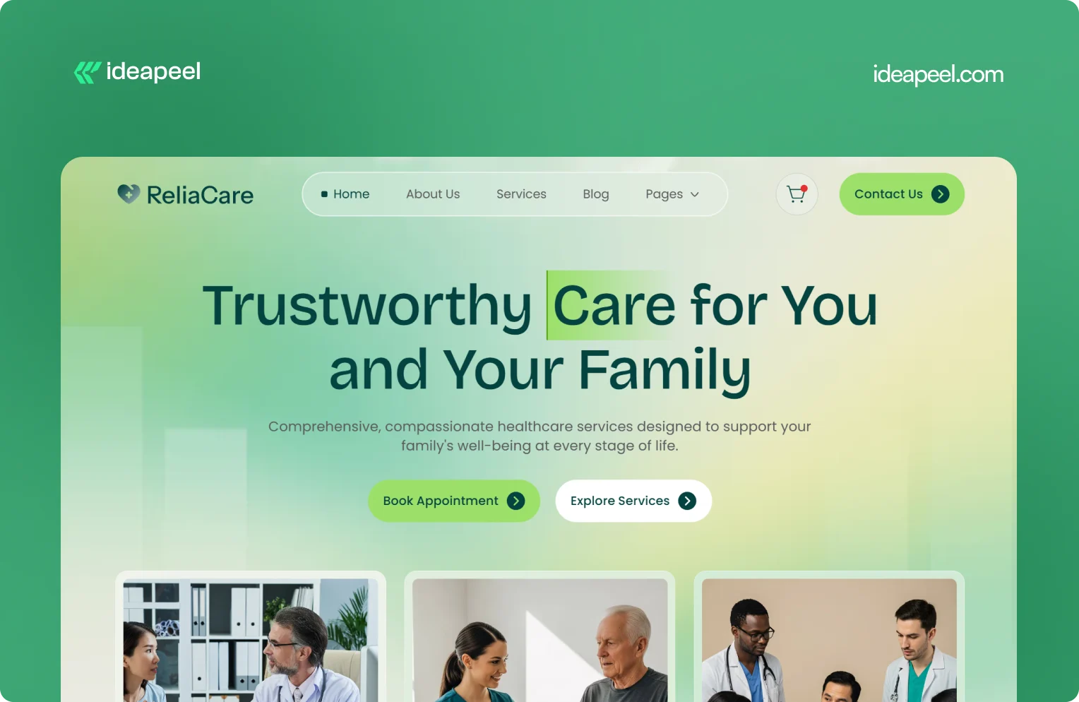
Industry: Health, wellness, and medical
What they do: Reliacare is a Webflow website template designed for health, wellness, and medical businesses that need a professional digital presence.
Why the design works: Health-related websites have a different trust challenge from many other industries. Visitors may already be uncertain, concerned, or looking for reliable information. A website that feels chaotic or overly decorative can make that uncertainty worse.
Reliacare takes a cleaner approach. The design gives services, information, and credibility room to breathe instead of filling every section with visual elements.
Key design lesson: For healthcare, wellness, and other trust-sensitive industries, restraint can be a design advantage. A clean interface with clear information often communicates confidence better than unnecessary visual complexity.
View Reliacare
7. StagePro: Events and Conference Website Template
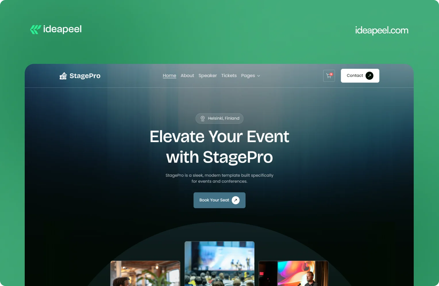
Industry: Events, conferences, summits, and workshops
What they do: StagePro is a Webflow template designed for event organizers, conference teams, summits, workshops, and other event-based businesses. It includes CMS-powered speakers, schedules, sponsors, blogs, ticket pages, and registration sections.
Why the design works: Event websites have to do several jobs at once. They need to create excitement, communicate important information, introduce speakers, explain schedules, and ultimately encourage people to register.
StagePro separates these needs into clear sections instead of trying to put everything into one message. The CMS structure also makes it easier to manage speakers, sessions, sponsors, and other event content as the website grows.
The result is a website structure that supports both the emotional side of an event and the practical information visitors need before registering.
Key design lesson: When a website has multiple conversion goals, don't mix everything together. Give each major goal a clear place in the information hierarchy.
8. Famous Tracker: Grow Fast Connection
Industry: SaaS and influencer marketing intelligence
What they do: Famous Tracker helps brands detect notable influencer purchases in real time and turn those signals into outreach opportunities. The platform provides automated detection, real-time notifications, influencer profiles, and tools for brand engagement.
Why the design works: Famous Tracker is built around a workflow that many visitors may not immediately understand. The website therefore needs to explain not just what the product is, but what happens after someone uses it.
The design makes the workflow easier to follow by connecting detection, notification, influencer information, and outreach. That helps turn an unfamiliar product category into a practical business process.
Key design lesson: If your product automates a process that visitors currently handle manually, show the workflow. Make it clear what happens before the product, what the product changes, and what the user can accomplish afterward.
View the Famous Tracker case study
[[question-block]]
9. Metrocard: Technology Website Template
Industry: Fintech and financial technology
What they do: Metrocard is a Webflow template designed for fintech, banking, investment, and financial service businesses. It uses a streamlined single-page structure with responsive design, intuitive navigation, SEO-focused structure, and customizable components.
Why the design works: Financial websites need to communicate credibility without making the experience difficult to navigate. Metrocard keeps the structure relatively focused, making it suitable for businesses that need to present a financial product or service without requiring a large multi-page website.
Its Webflow structure includes responsive navigation, CMS functionality, reusable components, forms, interactions, and responsive layouts.
Key design lesson: Not every B2B website needs dozens of pages. If the business has a focused offer, a well-structured single-page or compact website can communicate the value proposition without unnecessary complexity.
10. Moontide: Turning Dreams Into Reality
Industry: SaaS, founder funding and support
What they do: Moontide Capital connects immigrant founders with funding, legal support, and community networks to help them launch and scale startups.
Why the design works: This site has to build trust with a genuinely underserved audience while also proving credibility to investors and partners. The design keeps the process transparent from first meeting through due diligence, and leads with mission and impact before asking anything of the visitor..
[[inner-cta]]
B2B Website Design Best Practices
If you're planning a new B2B site or a redesign, these are the practices that show up consistently across the examples above:
- Lead with a specific value proposition, not a generic tagline. "We help B2B teams cut deal cycles by 40%" beats "The future of sales."
- Put your hero section to work. It's the highest-traffic real estate on the entire site. Don't waste it on abstract imagery with no message.
- Design for multiple stakeholders. B2B buying decisions often involve a technical evaluator, a budget owner, and an end user. Make sure each can find what they need.
- Use real product visuals wherever possible instead of stock photography or generic illustration; it builds more trust and helps visitors understand the actual product.
- Keep navigation goal-oriented. Organize menus around what visitors are trying to do (see pricing, understand the product, read case studies), not around internal department names.
- Add trust signals throughout the page, not just in one "logos" section testimonials and proof work best when they appear near the claim they're supporting.
- Make load speed part of the design brief. A fast, clean site reinforces credibility before a single word is read.
- Match your CTA to buyer intent. A first-time visitor and a returning, bottom-funnel visitor shouldn't see the same "Book a Demo" button in the same place.
How to Apply These Ideas to Your Own Website
You don't need to redesign everything at once. A practical way to start:
- Audit your homepage against the list above. Can a first-time visitor explain what you do after five seconds on the page?
- Identify your biggest trust gap. Is it a lack of proof, unclear pricing, or too much jargon? Fix the single biggest gap first.
- Map your navigation to buyer goals, not your internal team structure.
- Simplify one complex page at a time, following the "one idea per section" approach used by ZipID and Glo Dollar.
- Test your CTAs by funnel stage rather than repeating the same button everywhere.
Final Thoughts
The common thread across every example above isn't a specific color palette or layout trend, it's clarity. The best B2B websites make it easy to understand the offer, easy to trust the company, and easy to know what to do next. That's a strategy decision as much as a design one.
Need a B2B website that converts? If your current site isn't doing that job or you're planning a redesign and want it built around UX and conversion from the start, explore ideapeel's B2B website design work or book a strategy call to talk through your project.
Related Reading
- The UX Design Process: An Easy-to-Follow 8-Step Guide
- 10 Different Types of Websites With Examples
- Webflow Development Cost in 2026
- UI/UX Audit Checklist for B2B & SaaS
- ideapeel's UI/UX Design Services
- ideapeel's Webflow Development Services
[[last-cta]]
Frequently Asked Qustion on Best Website Design Example
Enter your website URL to receive a detailed website analysis report in just 5 minutes!

How much does B2B website design cost?
Cost varies widely based on scope, platform, and complexity. A simple redesign on a platform like Webflow typically costs less than a custom enterprise build with extensive integrations. It's worth getting a scoped quote based on your specific goals rather than relying on a general estimate.